# @angulogic/ng-sidebar
[](https://www.npmjs.com/package/@angulogic/ng-sidebar)
[](https://github.com/skarahan35/angulogic/blob/dev/LICENSE)
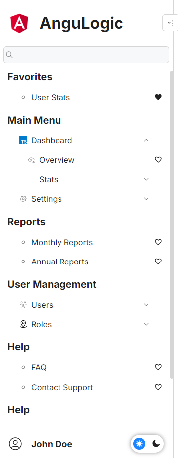
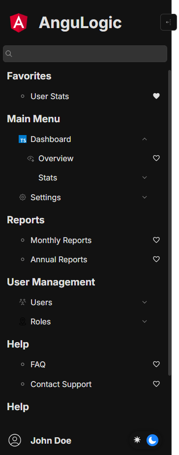
@angulogic/ng-sidebar is a dynamic, interactive, and highly configurable Angular sidebar component designed to provide a rich navigation experience in your Angular applications. It supports nested menus, search functionality, favorites management, theme toggling, responsive view modes, and resizable/auto-position capabilities.
**🚀 Version 2.0.0 - Now with Standalone Components Support!**
This package has been updated to use Angular's standalone components architecture, making it compatible with modern Angular applications (v17+) that use the standalone approach.
---
---
## Table of Contents
- [Features](#features)
- [Installation](#installation)
- [Usage](#usage)
- [Standalone Components Usage](#standalone-components-usage)
- [Basic Usage](#basic-usage)
- [Advanced Configuration](#advanced-configuration)
- [CSS Customization](#css-customization)
- [API Documentation](#api-documentation)
- [Models](#models)
- [Events](#events)
- [Methods](#methods)
- [Development](#development)
- [Contributing](#contributing)
- [License](#license)
- [Maintainers](#maintainers)
---
## Features
- **Dynamic Menu Navigation:**
Create multiple sidebar sections with nested menu items and submenus.
- **Search & Favorites:**
Integrated search functionality with configurable matching strategies (`contains`, `startsWith`, `endsWith`, `equal`) and a favorites management system.
- **Custom Banner & User Profile:**
Display a customizable banner (logo and title) and user profile section with click callbacks.
- **Responsive & Flexible:**
Supports various view modes such as `toggle`, `hover`, `mobile`, and `fix`. Auto-positioning adapts the layout dynamically.
- **Resizable Sidebar:**
End users can resize the sidebar while respecting minimum and maximum width constraints.
- **Theme Switching:**
Built-in light/dark theme support along with an optional theme picker.
- **Extensible Callbacks:**
Provides hooks for events like menu item clicks, toggles, search start/end, resizing events, and theme changes.
- **Standalone Components:**
Built with Angular's standalone components architecture for modern Angular applications.
---
## Installation
Install @angulogic/ng-sidebar via npm:
```bash
npm install @angulogic/ng-sidebar
```
---
## Usage
### Standalone Components Usage
This package now uses Angular's standalone components architecture. You can import and use the components directly in your standalone components:
```typescript
import { NgSidebarComponent } from '@angulogic/ng-sidebar';
import { SidebarModel } from '@angulogic/ng-sidebar';
@Component({
selector: 'app-root',
templateUrl: './app.component.html',
standalone: true,
imports: [NgSidebarComponent]
})
export class AppComponent {
sidebarModel: SidebarModel = {
bannerOptions: {
title: 'My App',
logo: 'assets/logo.png',
},
userOptions: {
name: 'John Doe',
avatar: 'assets/avatar.png',
},
sidebarData: [
{
title: 'Main Menu',
data: [
{ name: 'Dashboard', route: '/dashboard' },
{ name: 'Settings', route: '/settings' },
],
},
],
options: {
expand: true,
theme: 'light',
},
};
}
```
```html
```
### Basic Usage
For traditional NgModule-based applications, you can still use the components by importing them in your module:
```typescript
import { NgSidebarComponent } from '@angulogic/ng-sidebar';
import { SidebarModel } from '@angulogic/ng-sidebar';
@NgModule({
imports: [NgSidebarComponent],
})
export class AppModule {}
@Component({
selector: 'app-root',
templateUrl: './app.component.html',
})
export class AppComponent {
sidebarModel: SidebarModel = {
bannerOptions: {
title: 'My App',
logo: 'assets/logo.png',
},
userOptions: {
name: 'John Doe',
avatar: 'assets/avatar.png',
},
sidebarData: [
{
title: 'Main Menu',
data: [
{ name: 'Dashboard', route: '/dashboard' },
{ name: 'Settings', route: '/settings' },
],
},
],
options: {
expand: true,
theme: 'light',
},
};
}
```
```html
```
### Advanced Configuration
You can customize the sidebar with content projection using directives like:
```html
Custom Banner Content
Custom User Content
Custom Menu Content
```
### Using Individual Components
You can also use individual components separately:
```typescript
import { ThemeTogglerComponent } from '@angulogic/ng-sidebar';
import { TogglerDirective } from '@angulogic/ng-sidebar';
import { AlIconComponent } from '@angulogic/ng-sidebar';
@Component({
selector: 'app-custom',
templateUrl: './custom.component.html',
standalone: true,
imports: [ThemeTogglerComponent, TogglerDirective, AlIconComponent]
})
export class CustomComponent {
// Your component logic
}
```
```html
```
### CSS Customization
You can customize the appearance of the sidebar by overriding CSS variables:
```css
ng-sidebar {
--primary: red !important;
--bg-color: #f0f0f0 !important;
}
```
#### Available CSS Variables
| **Variable** | **Description** | **Default Value** |
|---------------------------------------------|----------------------------------------------------|-------------------------|
| `--radius` | Border radius for UI elements | `6px` |
| `--collapse-width` | Width when the sidebar is collapsed | `100px` |
| `--sidebar-width` | Default width of the sidebar | `250px` |
| `--bg-color` | Background color of the sidebar | `white` |
| `--text-color` | Default text color | `#000000de` |
| `--primary` | Primary color used for highlights | `#1b84ff` |
| `--primary-2` | Secondary shade of primary color | `#4394f1` |
| `--primary-3` | Tertiary shade of primary color | `#5c9be4` |
| `--secondary` | Secondary color | `#d6d6d6` |
| `--secondary-2` | Lighter shade of secondary color | `#e9e9e9` |
| `--secondary-3` | Lightest shade of secondary color | `#f3f3f3` |
| `--default-font-family` | Default font family | `'Inter', sans-serif` |
| `--collapsed-banner-padding-right` | Padding right for the collapsed banner | `1rem` |
| `--resizer-color` | Color of the resizer | `#1b84ff` |
| `--resizer-width` | Width of the resizer | `5px` |
| `--resizer-height` | Height of the resizer | `100%` |
| `--resizer-right` | Positioning from the right | `-3px` |
| `--resiver-top` | Positioning from the top | `0` |
| `--toggle-border-radius` | Border radius of toggle button | `6px` |
| `--toggle-border-color` | Border color of toggle button | `#d6d6d6` |
| `--toggle-bg-color` | Background color of toggle button | `white` |
| `--toggle-border-width` | Border width of toggle button | `1px` |
| `--search-width` | Width of the search bar | `100%` |
| `--search-icon-left` | Left position for search icon | `0.75rem` |
| `--search-icon-top` | Top position for search icon | `50%` |
| `--search-input-border-radius` | Border radius of the search input | `6px` |
| `--search-input-border-color` | Border color of the search input | `#d6d6d6` |
| `--search-input-border-width` | Border width of the search input | `1px` |
| `--search-input-bg-color` | Background color of the search input | `#f6f8fa` |
| `--search-input-color` | Text color of the search input | `#333333` |
| `--search-input-width` | Width of the search input | `100%` |
| `--search-input-height` | Height of the search input | `2rem` |
| `--search-input-padding` | Padding for the search input | `0px 1.5rem` |
| `--search-input-margin` | Margin for the search input | `0px 0.5rem` |
| `--search-cancel-icon-right` | Right position for search cancel icon | `0.75rem` |
| `--search-cancel-icon-top` | Top position for search cancel icon | `50%` |
| `--menu-padding` | Padding for the menu | `0px 1rem` |
| `--menu-margin` | Margin for the menu | `1rem 0px` |
| `--menu-height` | Height of the menu | `100%` |
| `--menu-wrapper-margin-bottom` | Bottom margin for the menu wrapper | `1rem` |
| `--menu-wrapper-collapsed-margin-bottom` | Bottom margin when the menu is collapsed | `0px` |
| `--menu-wrapper-collapsed-color` | Text color for collapsed menu | `#d6d6d6` |
| `--menu-wrapper-title-font-size` | Font size for menu section titles | `20px` |
| `--menu-wrapper-title-padding-bottom` | Bottom padding for menu section titles | `0.5rem` |
| `--user-name-font-weight` | Font weight for the user name | `bold` |
| `--user-name-font-size` | Font size for the user name | `large` |
| `--scrollbar-height` | Height of the scrollbar | `0.4rem` |
| `--scrollbar-width` | Width of the scrollbar | `0.4rem` |
| `--banner-height` | Height of the banner | `10%` |
| `--banner-padding` | Padding for the banner | `1rem` |
| `--banner-logo-height` | Height of the banner logo | `5rem` |
| `--banner-title-font-size` | Font size of the banner title | `xx-large` |
---
## API Documentation
## Models
| **Model** | **Property** | **Type** | **Description** | **Default** |
|-----------------|--------------------------|-------------------------------|-----------------------------------------------------|---------------|
| `SidebarModel` | `bannerOptions` | `Banner` | Configuration for sidebar banner | `undefined` |
| | `userOptions` | `User` | User profile section configuration | `undefined` |
| | `sidebarData` | `SidebarData[]` | Array of sidebar sections and menus | `[]` |
| | `options` | `SidebarOptions` | General sidebar settings | `undefined` |
| | `searchOptions` | `Search` | Configuration for search functionality | `undefined` |
| | `favorites` | `MenuData[]` | List of favorite menu items | `[]` |
| | `theme` | `'light' , 'dark'` | Current sidebar theme | `'light'` |
| | `viewMode` | `'toggle' , 'hover'` | Sidebar display mode | `'toggle'` |
| `Banner` | `logo` | `string` | Sidebar logo URL | `undefined` |
| | `title` | `string` | Sidebar banner title | `undefined` |
| | `onClick` | `(element) => void` | Callback when banner elements are clicked | `undefined` |
| `User` | `avatar` | `string` | User avatar URL | `undefined` |
| | `name` | `string` | Display name for the user | `undefined` |
| | `position` | `'top' , 'bottom'` | Position of the user profile | `'bottom'` |
| | `onClick` | `(element) => void` | Callback when user elements are clicked | `undefined` |
| `SidebarData` | `title` | `string` | Title of the sidebar section | `undefined` |
| | `cssClass` | `string` | Custom CSS class | `undefined` |
| | `visible` | `boolean` | Visibility of the section | `true` |
| | `data` | `MenuData[]` | Array of menu items | `[]` |
| `MenuData` | `name` | `string` | Name of the menu item | `undefined` |
| | `icon` | `string` | Icon URL for the menu item | `undefined` |
| | `route` | `string` | Navigation route | `undefined` |
| | `visible` | `boolean` | Visibility of the menu item | `true` |
| | `isExpanded` | `boolean` | Expansion state for submenus | `false` |
| | `isFavorited` | `boolean` | Favorite status of the menu item | `false` |
| | `children` | `MenuData[]` | Nested submenu items | `[]` |
| | `onClick` | `(event) => void` | Callback for menu item click | `undefined` |
| `SidebarOptions`| `resize` | `boolean` | Enables resizing of the sidebar | `true` |
| | `expand` | `boolean` | Enables sidebar expansion | `true` |
| | `theme` | `'light' , 'dark'` | Sidebar theme | `'light'` |
| | `autoPosition` | `boolean` | Enables automatic positioning | `true` |
| | `minWidth` | `number` | Minimum width of the sidebar | `300` |
| | `maxWidth` | `number` | Maximum width of the sidebar | `500` |
| `Search` | `placeholder` | `string` | Placeholder text for the search bar | `undefined` |
| | `caseSensitive` | `boolean` | Enables case sensitivity in searches | `false` |
| | `strategy` | `'contains' , 'startsWith', 'endsWith' , 'equal'` | Defines search strategy | `'contains'` |
| | `onSearchStart` | `(event) => void` | Callback for search start event | `undefined` |
| | `onSearchEnd` | `(event) => void` | Callback for search end event | `undefined` |
For more details on the available models, refer to the source code documentation.
---
### Methods
| **Method** | **Description** | **Parameters** |
|---------------------|----------------------------------------------|---------------------------------|
| `changeTheme()` | Switches between light and dark themes | None |
---
## Development
### Run Locally
```bash
git clone https://github.com/skarahan35/angulogic.git
npm install
npm run start
```
### Build for Production
```bash
cd projects/ng-sidebar
npm run build
```
---
## Contributing
We welcome contributions to @angulogic/ng-sidebar!
1. Fork the repository.
2. Create a new branch: `git checkout -b feature/your-feature-name`
3. Make your changes and commit: `git commit -m 'Add new feature'`
4. Push to your branch: `git push origin feature/your-feature-name`
5. Open a pull request.
---
## License
@angulogic/ng-sidebar is licensed under the [MIT License](LICENSE).
---
## Maintainers
- [Serkan Karahan](https://github.com/skarahan35)
- [Ergül Ferik](https://github.com/ergulferik)
Enjoy building with **@angulogic/ng-sidebar**! 🚀