
# Split View
Simple `react` split view component with a draggable separator.
Easy to add in your favorite project.
Lightweight library.
## Summary
1. [Installation](#how-to-install-split-view-component)
1. [Adding Split View in your project](#using-split-view-component)
## How to install *Split View* component
---
### With NPM as package manager
**NPM** below 5.0.0
```shell
npm install --save @ashxjs/split-view
```
**NPM** above 5.0.0
```shell
npm install @ashxjs/split-view
```
### With Yarn as package manager
```shell
yarn add @ashxjs/split-view
```
---
## Using Split-View component
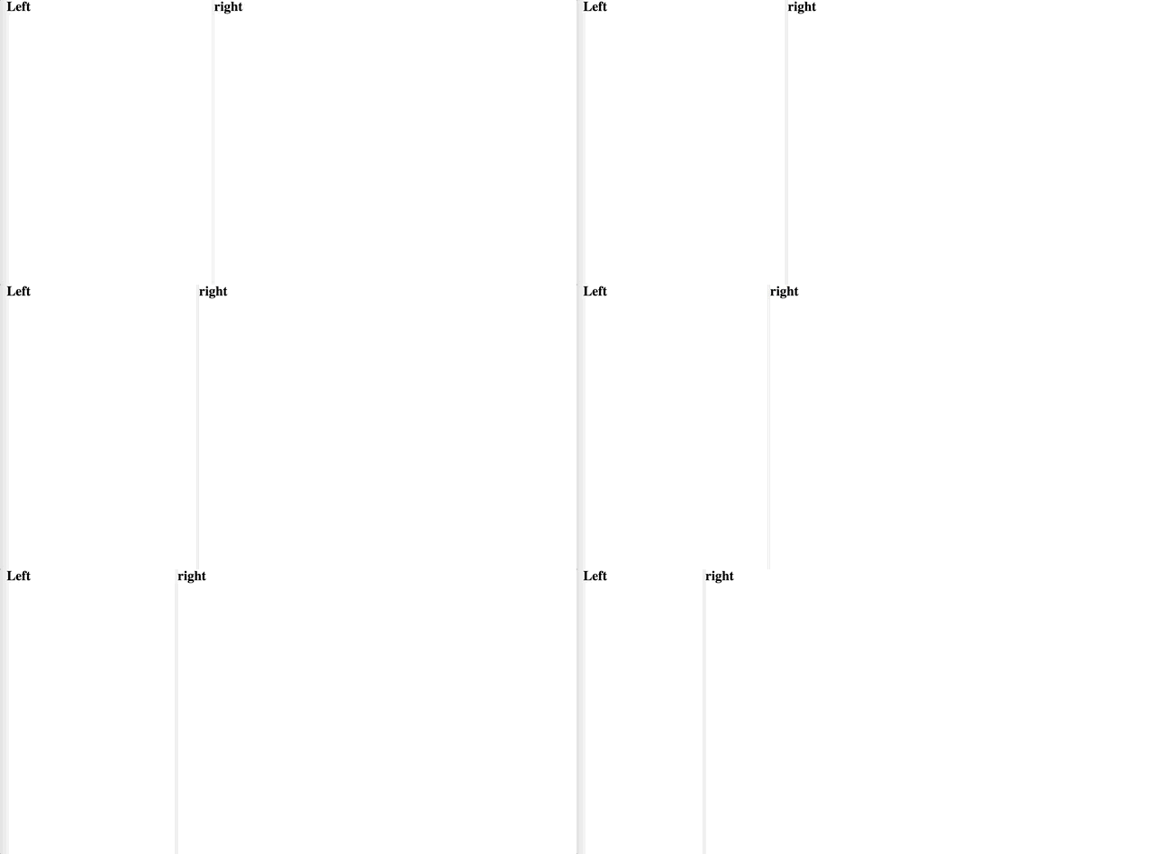
### Easy to use
 ### Code Example
```javascript
import LeftComponent from "./LeftComponent";
import RightComponent from "./RightComponent";
const defaultPanelWidth = window.screen.widh / 3;
<>
```
### Component Props
| Props name | Default value | Description |
| ----------- | ----------- | ----------- |
| `left` | none | Left component to render |
| `right` | none | Right component to render |
| `defaultLeftPanelWidth` | none | Initialize the default left panel size when component first render |
### Code Example
```javascript
import LeftComponent from "./LeftComponent";
import RightComponent from "./RightComponent";
const defaultPanelWidth = window.screen.widh / 3;
<>
```
### Component Props
| Props name | Default value | Description |
| ----------- | ----------- | ----------- |
| `left` | none | Left component to render |
| `right` | none | Right component to render |
| `defaultLeftPanelWidth` | none | Initialize the default left panel size when component first render |