# storybook-formik
A [Storybook](https://storybook.js.org/) Addon and Decorator to wrap Formik Fields and track their state in a Panel.
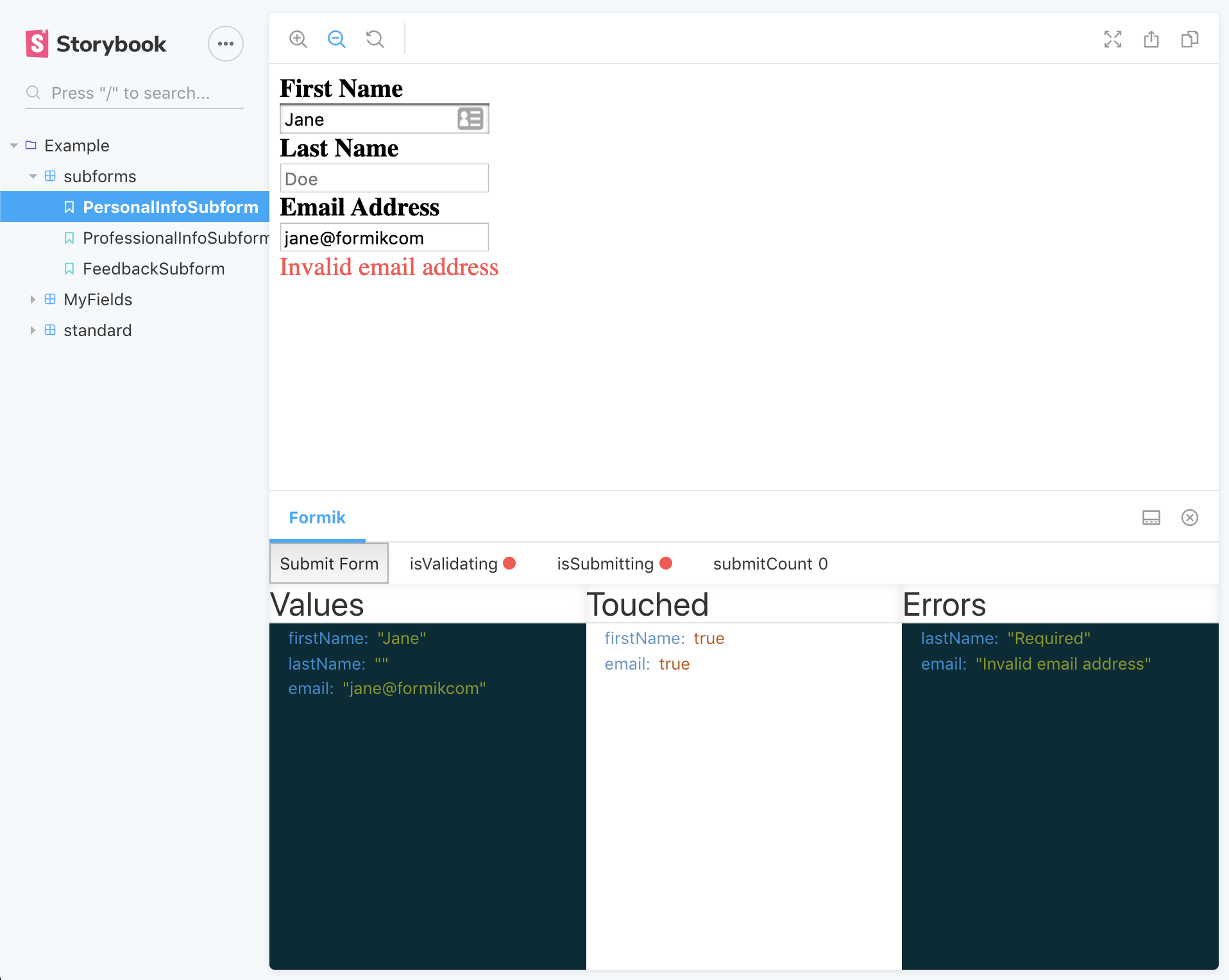
You can see the example stories in action [here](https://bbbtech.github.io/storybook-formik/).
Thanks to [@jaredpalmer](https://jaredpalmer.com/) for giving us the amazing [formik](https://github.com/jaredpalmer/formik) library and making forms great again.
## Migration to BBB Tech
Note, this package has been migrated to the org: [BBB Tech](https://github.com/bbbtech). The only real difference this
means is that the package needs to be installed with a new command, scoped by the org's slug (i.e. `npm i --save-dev @bbbtech/storybook-formik`)
and to update the path when registering the package in your main.js.
It also means that all future versions will be released under the new package, so please migrate your dependency if you
want to get future versions.
## Install
```sh
npm install --save-dev @bbbtech/storybook-formik
```
Then register the addon in `.storybook/main.js`
```ts
module.exports = {
stories: ['../stories/**/*.stories.tsx'],
addons: ['@bbbtech/storybook-formik/register'],
};
```
## Usage
Suppose you split your forms into smaller, re-usable components and these 'subforms' rely on formik context, each of these
sub-forms may be used to build up a larger form, but you still want to test and run them independently. You can use the withFormik
decorator so that we can wrap the subform in a Formik component, which will pass down the context as normal.
Given a simple subform:
```tsx
import React from 'react';
import { Field } from 'formik';
const PersonalInfoSubform = () => (
);
export default PersonalInfoSubform;
```
You add the `withFormik` decorator to your stories and can pass any `Formik` props as a parameter to the individual story.
```tsx
export const personalInfoSubform = () => (
<>
The decorator can wrap Components that include Fields (or anything else
expecting Formik context). This allows us to better componentise our
larger forms.
);
personalInfoSubform.decorators = [withFormik];
// can use the DecoratorParams type and pass a type for type-safety of initialValues
const personalInfoParams: DecoratorParams = {
formik: {
initialValues: personalInfoInitialValues,
validationSchema: personalInfoValidationSchema,
},
};
personalInfoSubform.parameters = personalInfoParams;
```
This gives you the benefit of rendering formik Fields that are expecting formik context, but also to track the key formik state
within the storybook panel below.
See the [example stories](https://github.com/bbbtech/storybook-formik/blob/main/stories/) for further examples
### Legacy story format
Example with the `storiesOf` syntax.
```tsx
import { storiesOf } from '@storybook/react';
import withFormik from '@bbbtech/storybook-formik';
import PersonalInfoSubform from '/PersonalInfoSubform';
storiesOf('Example', module)
.addDecorator(withFormik)
.add('default', () => , {
formik: {
initialValues: {
forename: 'John',
surname: 'Johnerson',
},
},
});
```
## Arguments
You can pass any `Formik` component props (initialValues, validationSchema, validateOnBlur, etc) as arguments to a story.
These props must be passed under the `formik` parameter key.
If no initial values are supplied, `{ enableReinitialize: true, initialValues: StoryContext.args || {} }` will be used.
```tsx
export const myTextInput = () => (
);
myTextInput.parameters = {
formik: {
initialValues: {
formikTweet: '',
},
validationSchema: someSchema,
onSubmit: v => console.log('I want to log these... ', v),
},
};
```
### `formik.castValues` with `formik.validationSchema`
If a `validationSchema` is provided in the `formik` config and `{ castValues: true }`, then `validationSchema.cast(initialValues || StoryContext.args || {})` will be called and the result passed in as `initialValues`.
This is useful if the form fields require a certain format to their values or when automatically converting `StoryContext.args` into a valid set of `initialValues`.
## Using with Controls
If using `@storybook/addon-essentials` and `StoryContext.args`, `withFormik` will syncronize the form values with the storybook controls.
```tsx
export const myTextInput = () => (
);
myTextInput.args = {
formikTweet: '',
};
myTextInput.parameters = {
formik: {
validationSchema: someSchema,
onSubmit: v => console.log('I want to log these... ', v),
},
};
```
## Mature Examples
In time, I will add more mature examples that show the usefulness of the subforms pattern on a larger scale. If anyone
has any good examples then please do submit them.
## Contributing
### Development
You can test changes by building the package locally. The flow would be something like this:
- Make changes to addon
- `npm run build:watch` - builds the dist bundle locally in watch mode
- `npm run storybook` - runs the package storybook with the example forms, preview changes here
- `npm run test` - run unit tests
### Releasing a new version
Deployment is pretty basic/simple right now, all you need to do is: `npm version`, and specify a new version, this will
kick off relevant lifecycle scripts defined in the package.json (including `npm publish` in the `postversion` script)