# @birdwingo/react-native-swipe-modal




## Features 🌟
🕶️ Swipe-to-Close Functionality: Easily close modals with a single swipe gesture, providing an intuitive user experience.
🎨 Customizable Appearance: Adjust the color, size, animation, and more to make it blend seamlessly with your application's design.
💃 Smooth Animations: Enjoy smooth and pleasing animations that offer a polished look and feel.
📱 Responsive Design: Adapts to various screen sizes and orientations, ensuring a consistent appearance across devices.
⚙️ Easy Integration: With minimal code, you can have Swipe Modal up and running in your application.
♿ Accessibility Support: Designed with accessibility in mind, allowing all users to interact with the modal effortlessly.
🌍 Cross-Platform Support: Works seamlessly on both iOS and Android, providing a unified experience.
## About
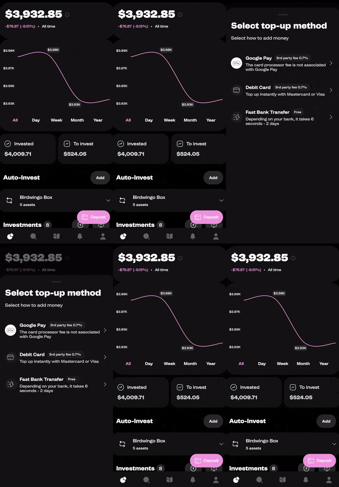
`react-native-swipe-modal` is a customizable and animated modal component that can be used in React Native applications. It provides a smooth swipe-to-close functionality along with various configuration options to suit different use cases. It is used in the [Birdwingo mobile app](https://www.birdwingo.com) to show different kinds of popups and explanations.

## Installation
```bash
npm install react-native-reanimated
npm install react-native-gesture-handler
npm install @birdwingo/react-native-swipe-modal
```
## Usage
To use the `SwipeModal` component, you need to import it in your React Native application and include it in your JSX code. Here's an example of how to use it:
```jsx
import React, { useRef } from 'react';
import { View, Text } from 'react-native';
import SwipeModal, { SwipeModalPublicMethods } from '@birdwingo/react-native-swipe-modal';
const YourComponent = () => {
const modalRef = useRef(null);
const showModal = () => modalRef.current?.show(); // Call this function to show modal
const hideModal = () => modalRef.current?.hide(); // Call this function to hide modal
return (
Swipe Modal
);
};
export default YourComponent;
```
## Props
Name | Type | Default value | Description
-------------------------|-------------------------------|-------------------------|---------------------
`children` | ReactNode\|ReactNode[] | **required** | The content to be rendered inside the modal.
`bg` | string | 'black' | The background color of the modal.
`showBar` | boolean | true | Set to `true` to display a bar at the top of the modal.
`barColor` | string | 'grey' | The color of the bar at the top of the modal.
`barContainerStyle` | ViewStyle\|ViewStyle[] | | Additional styles applied to bar container view.
`maxHeight` | 'max'\|'auto'\|number | 'max' | The maximum height of the modal. If `'auto'` maxHeight of modal will the height modal children need.
`defaultHeight` | number | `maxHeight` | The default height of the modal.
`fixedHeight` | boolean | false | Set to `true` if you want to maintain a fixed height for the modal. It means that the height of the modal will get back to the initial position after swipe, if modal was not closed .
`style` | ViewStyle\|ViewStyle[] | | Additional styles to be applied to the modal.
`closeTrigger` | 'swipeDown'\|'minHeight' | 'swipeDown' | The trigger to close the modal. `'swipeDown'` means that modal will close when modal was swiped down by `closeTriggerValue`. `'minHeight'` means that modal will close when height of modal is less than `closeTriggerValue`.
`closeTriggerValue` | number | 10 | The value that triggers the modal to close when using the `closeTrigger`.
`scrollEnabled` | boolean | false | Set to `true` if you want the modal content to be scrollable.
`scrollContainerStyle` | ViewStyle\|ViewStyle[] | | Additional styles to be applied to the scrollable container.
`scrollContainerProps` | ScrollView['props'] | | Additional props to be passed to the internal ScrollView component.
`headerComponent` | ReactNode | | A custom component to be displayed at the top of the modal. It's placed above scroll content
`footerComponent` | ReactNode | | A custom component to be displayed at the bottom of the modal. It's placed under scroll content
`disableSwipe` | boolean | false | Set to `true` if you don't want allow gesture.
`visible` | boolean | false | Default value for modal visibility. It can be changed dynamically using public methods.
`onShow` | () => void | | A callback function that will be triggered when the modal is shown.
`onHide` | () => void | | A callback function that will be triggered when the modal is hidden.
`closeOnEmptySpace` | boolean | true | Set to `true` to close the modal when the user taps outside the modal's content.
`closeOnPressBack` | boolean | true | Set to `true` to close the modal when the user presses the back button (Android only).
`animationDuration` | number | 300 | The duration of the modal's opening and closing animations, in milliseconds.
`closeSpaceVisibility` | number (0 - 1) | 0.6 | A number representing the opacity of empty space, that will close the modal if `closeOnEmptySpace` is enabled.
`topOffset` | number | 0 | Determines the amount of space that the swipeable content will be offset from the top edge of window.
`containerProps` | ViewProps | | Additional props to be applied to the container.
`hideKeyboardOnShow` | boolean | true | Set to `true` if you want to hide keyboard on show modal if was opened.
`wrapInGestureHandlerRootView`| boolean | false | Set to `true` if you want to wrap content in to GestureHandlerRootView (required if you want to use modal inside react-native Modal component).
`useKeyboardAvoidingView`| boolean | true | Set to `false` if you want to show keyboard over the modal content.
`keyboardAvoidingViewBehavior`| 'height' | 'position' | 'padding'| Platform.OS === 'ios' ? 'height' : undefined| Behavior property for keyboardAvoidingView
`keyboardAvoidingViewProps` | KeyboardAvoidingViewProps | | Additional props to be applied to the KeyboardAvoidingView.
## Public Methods
Name | Description
----------------------|--------------
`show` | Call this method to show the modal.
`hide` | Call this method to hide the modal.
## Sponsor
**react-native-swipe-modal** is sponsored by [Birdwingo](https://www.birdwingo.com).\
Download Birdwingo mobile app to see react-native-swipe-modal in action!