<!-- Title -->
<h1 align="center">@coder-shubh/react-native-pop-up-confirmation</h1>

<!-- Badges -->
<p align="center">
  <img src="https://img.shields.io/npm/v/@coder-shubh/react-native-pop-up-confirmation" alt="npm version">
  <!-- <img src="https://img.shields.io/github.com/coder-shubh/ShubhamPackage" alt="license"> -->
</p>

<div style="display: flex; flex-direction: row; justify-content: space-around; align-items: center;">
  <!-- First GIF -->
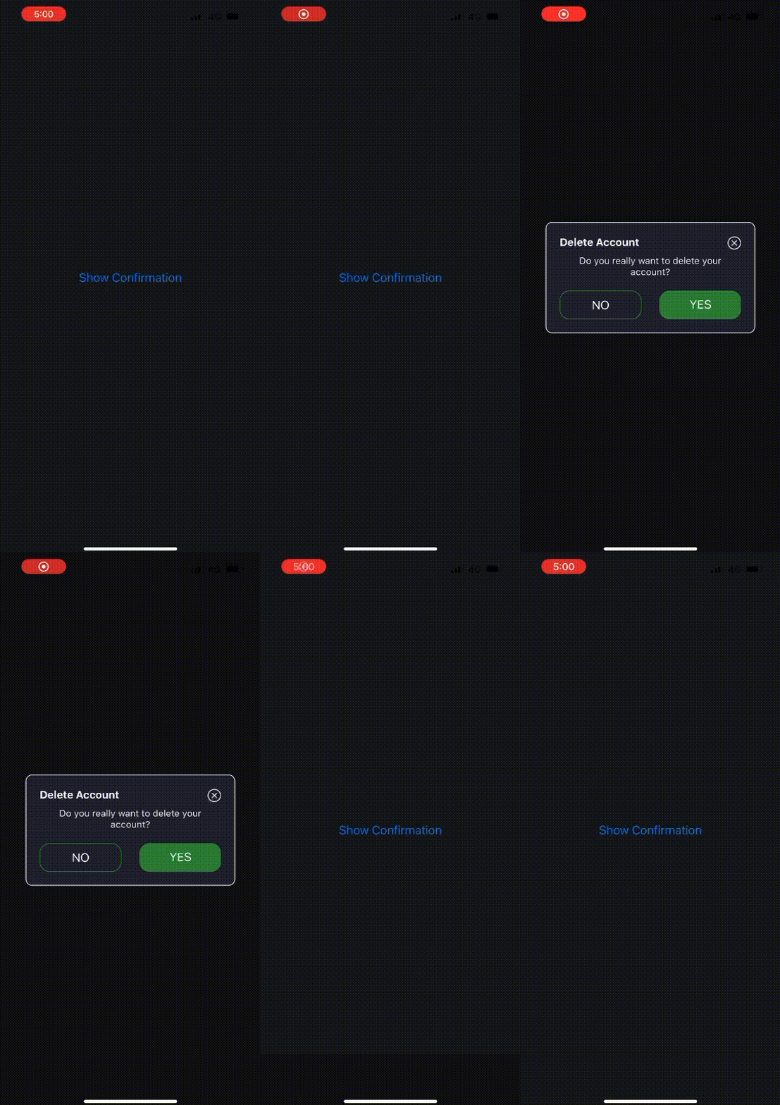
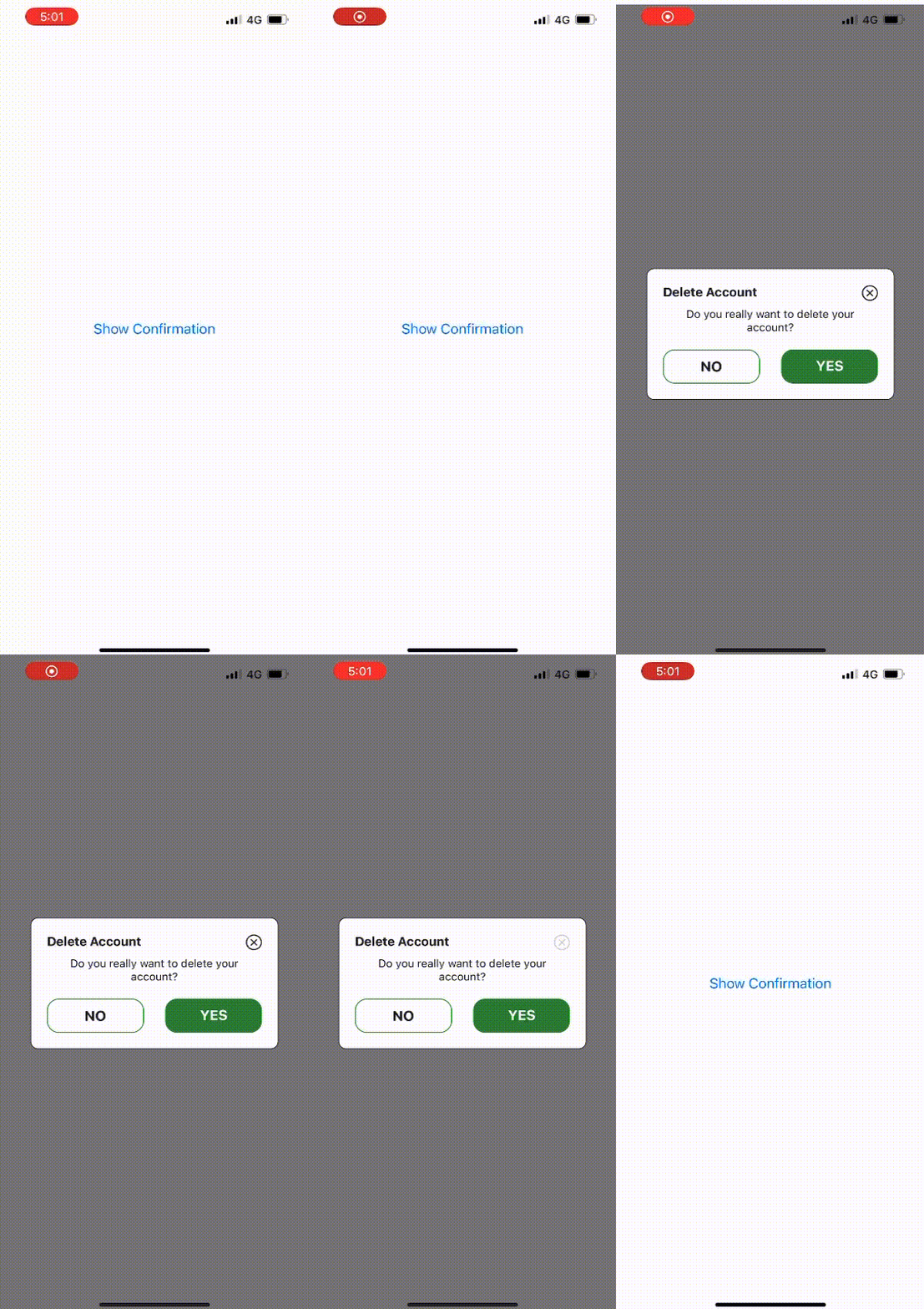
  <img src="https://raw.githubusercontent.com/coder-shubh/react-native-popUp/master/src/assets/vdo.gif" alt="Demo 1" width="45%">
  <!-- Second GIF -->
  <img src="https://raw.githubusercontent.com/coder-shubh/react-native-popUp/master/src/assets/vido.gif" alt="Demo 2" width="45%">
</div>

<!-- Description -->
<p align="center">
  A customizable React Native component for displaying pop-up confirmations.
</p>

<!-- Table of Contents -->
<h2>Table of Contents</h2>

- [Installation](#installation)
- [Usage](#usage)
- [Props](#props)
- [License](#license)

<!-- Installation -->
<h2>Installation</h2>

You can install the `@coder-shubh/react-native-pop-up-confirmation` package using npm or yarn:

```bash
# with npm
npm i @coder-shubh/react-native-pop-up-confirmation react-native-vector-icons

# with yarn
yarn add @coder-shubh/react-native-pop-up-confirmation react-native-vector-icons
```

<!-- Usage -->
<h2>Usage</h2>

```js
import React, { useState } from 'react';
import { View, Button } from 'react-native';
import PopUpConfirmation from '@coder-shubh/react-native-pop-up-confirmation';

const App = () => {
  const [modalVisible, setModalVisible] = useState(false);

  const handleClose = () => {
    setModalVisible(false);
  };

  const handleConfirm = () => {
    // Add your logic for handling confirmation
    console.log('User confirmed');
    setModalVisible(false);
  };

  return (
    <View style={{ flex: 1, justifyContent: 'center', alignItems: 'center' }}>
      <Button title="Show Confirmation" onPress={() => setModalVisible(true)} />

      <PopUpConfirmation
        visible={modalVisible}
        onClose={handleClose}
        press={handleConfirm}
        title="Delete Account"
        subTitle="Do you really want to delete your account?"
        theme="light" // or 'dark'
        animation="fade" // or 'slide' or 'none'
        leftButtonName="NO"
        rightButtonName="YES"
      />
    </View>
  );
};

export default App;
```

<!-- Props -->
<h2>Props</h2>

| Prop              | Type                              | Description                                   | Default Value |
|-------------------|-----------------------------------|-----------------------------------------------|---------------|
| `visible`         | boolean                           | Controls the visibility of the pop-up.        | -             |
| `onClose`         | () => void                        | Function to handle closing the pop-up.        | -             |
| `press`           | () => void                        | Function to handle confirming the action.     | -             |
| `title`           | string                            | Title of the pop-up.                         | -             |
| `subTitle`        | string                            | Subtitle or message of the pop-up.            | -             |
| `theme`           | 'dark' | 'light'                  | Theme of the pop-up (dark or light).          | `'light'`     |
| `animation`       | 'fade' | 'slide' | 'none'        | Animation type for displaying the pop-up.     | `'none'`      |
| `leftButtonName`  | string                            | Label for the left button.                    | `'NO'`        |
| `rightButtonName` | string                            | Label for the right button.                   | `'YES'`       |


In this table:

`Prop`: Name of the prop.
`Type`: Type of the prop.
`Description`: Description of what the prop does.
`Default Value`: Default value of the prop, if any.


<!-- License -->
<h2>License</h2>

This project is licensed under the MIT License - see the LICENSE file for details.

In this version, I've added:

- Title and badges centered at the top.
- Descriptive text centered.
- Table of Contents for easy navigation.
- Stylish section headings.
- Usage code block with syntax highlighting.
- More visual appeal with horizontal lines and section separators.

Feel free to adjust the styles, colors, or any other aspects to better suit your preferences or project branding.