/**
*
* 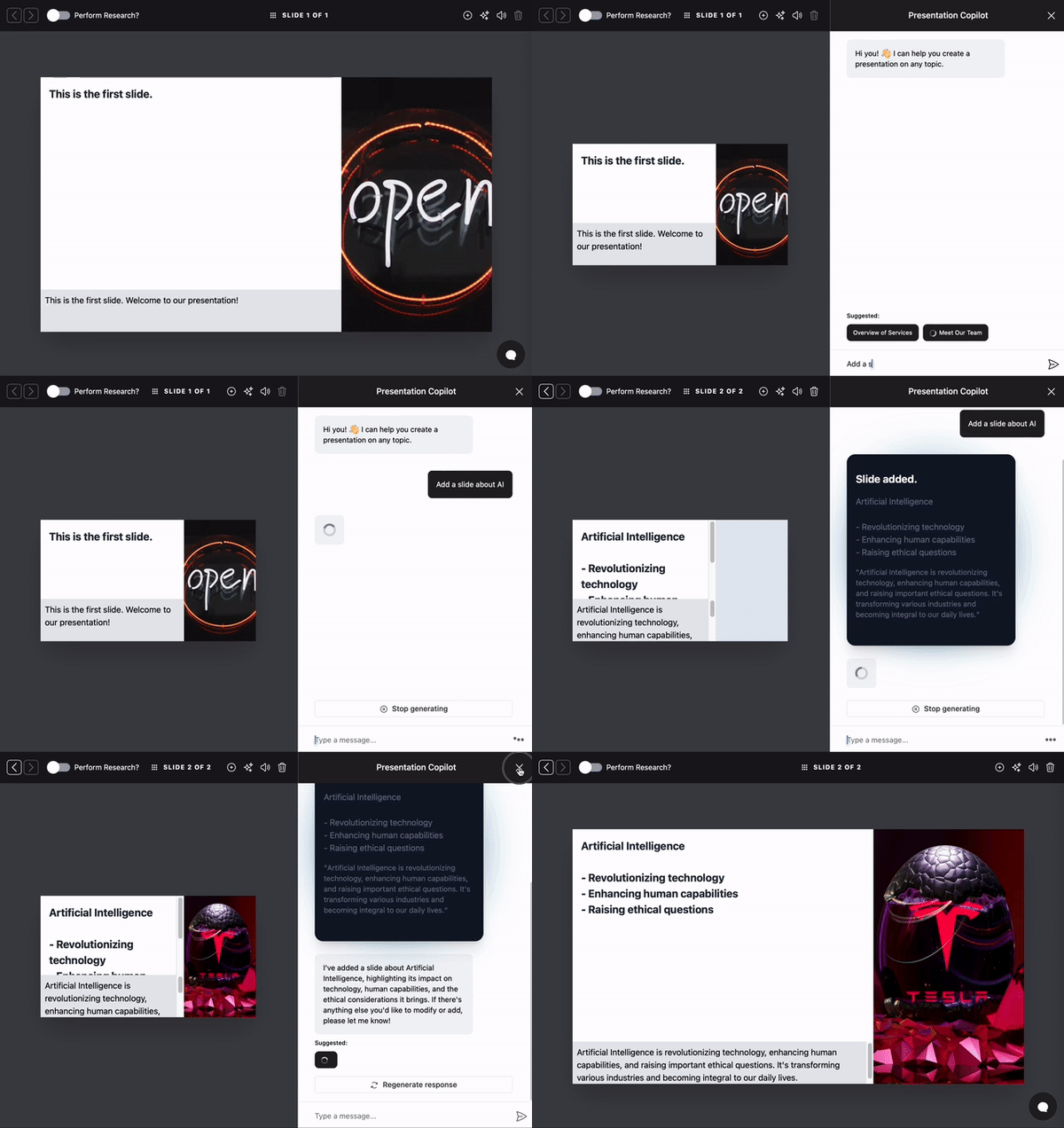 *
* A chatbot sidebar component for the CopilotKit framework. Highly customizable through various props and custom CSS.
*
* See [CopilotPopup](/reference/v1/components/chat/CopilotPopup) for a popup version of this component.
*
* ## Install Dependencies
*
* This component is part of the [@copilotkit/react-ui](https://npmjs.com/package/@copilotkit/react-ui) package.
*
* ```shell npm2yarn \"@copilotkit/react-ui"\
* npm install @copilotkit/react-core @copilotkit/react-ui
* ```
*
* ## Usage
*
* ```tsx
* import { CopilotSidebar } from "@copilotkit/react-ui";
* import "@copilotkit/react-ui/styles.css";
*
*
*
*
* ```
*
* ### With Observability Hooks
*
* To monitor user interactions, provide the `observabilityHooks` prop.
*
* ```tsx
*
* {
* console.log("Sidebar opened");
* },
* onChatMinimized: () => {
* console.log("Sidebar closed");
* },
* }}
* >
*
*
*
* ```
*
* ### Look & Feel
*
* By default, CopilotKit components do not have any styles. You can import CopilotKit's stylesheet at the root of your project:
* ```tsx title="YourRootComponent.tsx"
* ...
* import "@copilotkit/react-ui/styles.css"; // [!code highlight]
*
* export function YourRootComponent() {
* return (
*
* ...
*
* );
* }
* ```
* For more information about how to customize the styles, check out the [Customize Look & Feel](/guides/custom-look-and-feel/customize-built-in-ui-components) guide.
*/
import React, { useState } from "react";
import type { CopilotModalProps } from "./Modal";
import { CopilotModal } from "./Modal";
export function CopilotSidebar(props: CopilotModalProps) {
props = {
...props,
className: props.className
? props.className + " copilotKitSidebar"
: "copilotKitSidebar",
};
const [expandedClassName, setExpandedClassName] = useState(
props.defaultOpen ? "sidebarExpanded" : "",
);
const onSetOpen = (open: boolean) => {
props.onSetOpen?.(open);
setExpandedClassName(open ? "sidebarExpanded" : "");
};
return (
*
* A chatbot sidebar component for the CopilotKit framework. Highly customizable through various props and custom CSS.
*
* See [CopilotPopup](/reference/v1/components/chat/CopilotPopup) for a popup version of this component.
*
* ## Install Dependencies
*
* This component is part of the [@copilotkit/react-ui](https://npmjs.com/package/@copilotkit/react-ui) package.
*
* ```shell npm2yarn \"@copilotkit/react-ui"\
* npm install @copilotkit/react-core @copilotkit/react-ui
* ```
*
* ## Usage
*
* ```tsx
* import { CopilotSidebar } from "@copilotkit/react-ui";
* import "@copilotkit/react-ui/styles.css";
*
*
*
*
* ```
*
* ### With Observability Hooks
*
* To monitor user interactions, provide the `observabilityHooks` prop.
*
* ```tsx
*
* {
* console.log("Sidebar opened");
* },
* onChatMinimized: () => {
* console.log("Sidebar closed");
* },
* }}
* >
*
*
*
* ```
*
* ### Look & Feel
*
* By default, CopilotKit components do not have any styles. You can import CopilotKit's stylesheet at the root of your project:
* ```tsx title="YourRootComponent.tsx"
* ...
* import "@copilotkit/react-ui/styles.css"; // [!code highlight]
*
* export function YourRootComponent() {
* return (
*
* ...
*
* );
* }
* ```
* For more information about how to customize the styles, check out the [Customize Look & Feel](/guides/custom-look-and-feel/customize-built-in-ui-components) guide.
*/
import React, { useState } from "react";
import type { CopilotModalProps } from "./Modal";
import { CopilotModal } from "./Modal";
export function CopilotSidebar(props: CopilotModalProps) {
props = {
...props,
className: props.className
? props.className + " copilotKitSidebar"
: "copilotKitSidebar",
};
const [expandedClassName, setExpandedClassName] = useState(
props.defaultOpen ? "sidebarExpanded" : "",
);
const onSetOpen = (open: boolean) => {
props.onSetOpen?.(open);
setExpandedClassName(open ? "sidebarExpanded" : "");
};
return (
{props.children}
);
}