# @deepbag/react-grid-x







[](https://socket.dev/npm/package/@deepbag/react-grid-x/overview/0.2.7)
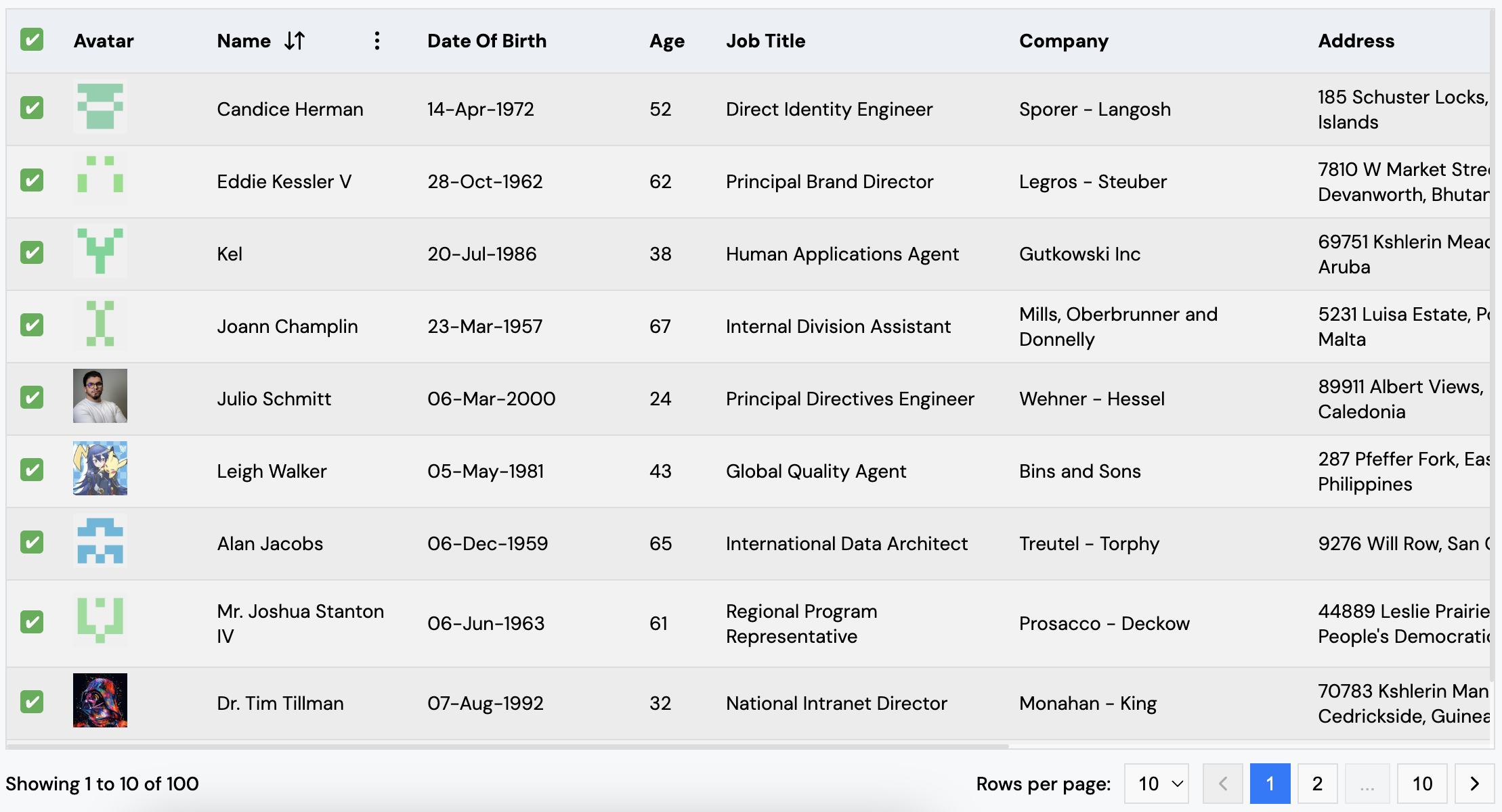
> `@deepbag/react-grid-x` is a customizable and flexible React table component that supports pagination, sorting (client-side and server-side), dynamic rendering of table data, and customizable column rendering. It provides an easy-to-use interface for displaying tabular data with configurable columns, pagination, sorting, and styling.
Check out the live demo of `@deepbag/react-grid-x` [here](https://deepbag.github.io/react-grid-x/#/demo).
## Compatibility
- This package supports **React 18** and higher versions.
- It is optimized to work seamlessly with the latest React features, including Concurrent Mode and Suspense, ensuring smooth performance and improved rendering.
- Make sure your project is using React 18 or a newer version for full compatibility and performance benefits.
## Features
- **Customizable columns**: Define columns with dynamic rendering of data using custom render functions.
- **Sorting support**: Supports sorting by multiple columns, including both numerical and alphabetical sorting and "Clear Sorting" popup is available when sorting is enabled.
- **Server-side sorting**: Optionally support server-side sorting for large datasets.
- **Pagination support**: Choose from different pagination types (`rgx-table-pagination` or `rgx-arrow-pagination`) with configurable rows per page and pagination controls.
- **Customizable styling**: Apply custom themes and styles to the table and pagination components.
- **Server-side pagination**: Optionally support server-side pagination for large datasets.
- **Tooltip support**: Enable tooltips for column headers with customizable content for better user guidance.
- **Row click event**: Capture row clicks using the onRowClick callback to handle user interactions.
- **Expandable rows**: Expand rows with a customizable `expandedComponent` to show additional details or content within the same row.
- **Loader support**: Customize the loader displayed when the table is in a loading state using the `loaderComponent` prop. If not provided, the default loader will be used.
- **Row selection**: Supports row selection with checkboxes, allowing both single and select-all functionality.
- **Light & Dark Mode**: Now supports both light and dark themes for better visual adaptability.
## Installation
To install the library, you can use either npm or yarn:
### Using Yarn
```bash
yarn add @deepbag/react-grid-x
```
### Using npm
```bash
npm install @deepbag/react-grid-x
```
## Usage
Here's a basic example of how to use the `ReactGridX` component in your React project:
```tsx
import React from "react";
import { ReactGridX } from "@deepbag/react-grid-x";
import "@deepbag/react-grid-x/dist/themes/rgx-theme/rgx-theme-combined.css";
const App = () => {
return (
React Grid Example
{data.age},
},
]}
data={[
{ id: 1, name: "John", age: 28 },
{ id: 2, name: "Jane", age: 34 },
]}
rowsPerPageOptions={[5, 10, 15]}
paginationStyle={{
"rgx-table-pagination": { backgroundColor: "#f5f5f5" },
}}
tableStyle={{
"rgx-table": { width: "100%", borderCollapse: "collapse" },
}}
loaderStyle={{
"rgx-loader-container": {},
}}
popupStyle={{ "rgx-popover-content": {} }}
tooltipStyle={{ "rgx-tooltip-container": {} }}
/>
);
};
export default App;
```
## Table Props
| Prop | Type | Description |
| ------------------------------ | ----------------------------------------------------------- | --------------------------------------------------------------------------------------------------------------------------------------------------------- |
| `columns` | `ReactGridXColumnProps[]` | An array of column definitions, each containing a `name` and optional `render` function for custom rendering. |
| `data` | `any[]` | The data to be displayed in the table. Each object should correspond to a row. |
| `theme` | `string` | The theme for the table (default is `"rgx-theme"`). |
| `rowsPerPageOptions` | `number[]` | Options for rows per page (default is `[5, 10, 15]`). |
| `paginationType` | `"rgx-table-pagination" \| "rgx-arrow-pagination"` | The pagination type to use. Options are `"rgx-table-pagination"` or `"rgx-arrow-pagination"`. |
| `paginationStyle` | `Record` | Custom styles for pagination components. |
| `tableStyle` | `Record` | Custom styles for the table and its elements. |
| `loaderStyle` | `Record` | Custom styles for the loader component and its elements. |
| `popupStyle` | `Record` | Custom styles for the popop component and its elements. |
| `tooltipStyle` | `Record` | Custom styles for the tooltip component and its elements. |
| `serverSidePagination` | `boolean` | Flag to indicate if server-side pagination should be used (default is `false`). |
| `onPaginationAndRowSizeChange` | `(page: number, rowsPerPage: number) => void` | Callback function for pagination and row size changes. |
| `totalRows` | `number` | The total number of rows in the database (required for server-side pagination). |
| `sortable` | `boolean` | Enables sorting on a column (default is `false`). |
| `serverSideSorting` | `boolean` | Enables server-side sorting (default is `false`). |
| `onSorting` | `(column:{key: string, direction: "asc" "desc"}[]) => void` | Callback function to handle server-side sorting logic. |
| `onRowClick` | `(rowData: any) => void` | Callback function triggered when a row is clicked, receiving the clicked row's data. |
| `expandedComponent` | `(rowData: any) => JSX.Element` | A function that returns a component to render when a row is expanded, receiving the clicked row's data. |
| `loading` | `boolean` | A boolean value indicating whether the table is in a loading state. When set to `true`, the table will show a loader. |
| `loaderComponent` | `({style}:{style?:{}}) => JSX.Element` | A function returning a custom loader when the table is loading. The `style` prop is optional for custom styling. |
| `selectionCheckbox` | `boolean` | A boolean value that determines whether the table rows will have a checkbox for selection. If set to `true`, checkboxes will be shown for selecting rows. |
| `onSelectionCheck` | `(selectedRows: any[], isAllChecked: boolean) => void` | A callback triggered when the selection state changes, receiving an array of selected rows and a boolean indicating if all rows are selected |
| `mode` | `'light' or 'dark'` | Defines the table's theme mode. Supports both light and dark modes for better visual adaptability. Default is `'light'`. |
## Column Props (`ReactGridXColumnProps`)
The `ReactGridXColumnProps` interface defines the properties that can be set for each column in the `ReactGridX` component.
| Prop | Type | Description |
| ---------------------- | -------------------------------------------------------- | ---------------------------------------------------------------------------- |
| `name` | `string` | The column name displayed in the table header. |
| `key` | `string` | The unique key that matches the data field for this column. |
| `render` | `(data: any) => JSX.Element \| string` | Optional function to customize how cell data is rendered. |
| `sortable` | `boolean` | Determines whether sorting is enabled for this column. |
| `onSort` | `(a: any, b: any, direction: "asc" \| "desc") => number` | Optional custom sorting function. If provided, it overrides default sorting. |
| `tooltip` | `boolean` | Enables tooltips for this column when set to `true`. |
| `tooltipCustomContent` | `(data: any) => string` | Defines custom tooltip content for the column header. |
## Exports
The package exports the following components and props interfaces:
### Components
- `ReactGridX`: The main table component.
- `RGXTablePagination`: Pagination component with table-based navigation.
- `RGXArrowPagination`: Pagination component with arrow-based navigation.
- `RGXTooltip`: The default tooltip component displayed for columns.
- `RGXLoader`: The default loader component displayed when the table is in a loading state, which can be customized using the `loaderComponent` prop.
- `RGXPopover`: The default popover component displayed for sorting and clearing sorting icons in the header.
- `RGXSVGIcon`: The default component for rendering SVG icons used in the table, ensuring consistent styling and performance.
### Interfaces (Props)
- `ReactGridXProps`: Props for the `ReactGridX` component.
- `RGXTablePaginationProps`: Props for the `RGXTablePagination` component.
- `RGXArrowPaginationProps`: Props for the `RGXArrowPagination` component.
- `ReactGridXColumnProps`: Column props for defining columns in the `ReactGridX` component.
- `RGXTooltipProps`: Props for the `RGXTooltip` component.
- `RGXLoaderProps`: Props for the `RGXLoader` component.
- `RGXPopoverProps`: Props for the `RGXPopover` component.
- `SvgIconProps`: Props for the `RGXSVGIcon` component, used for rendering SVG icons consistently.
## License
MIT License - see the [LICENSE](LICENSE) file for details.