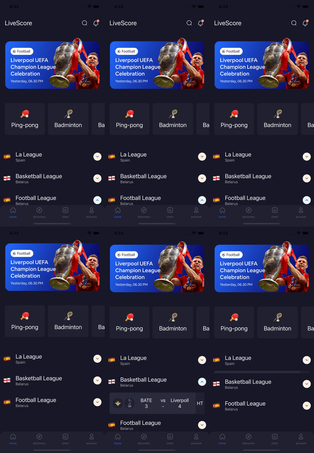
React Native Accordion (Reanimated 2)
On the basis of react-native-maps I provide API for drawing polygons.
Made with ❤️ by developer for developers




## Thanks
Please, click on ⭐ button.
## Table of Contents
- [Installation](#installation)
- [Features](#features)
- [Usage](#usage)
- [Props](#props)
- [Example](#example)
- [Contributing](#contributing)
- [Support](#support)
- [License](#license)
## Installation
React Native (0.60+):
```bash
$ yarn add @dev-event/react-native-accordion
```
## Features
- Supported Reanimated 2;
- Fully supported on React Native and Expo;
- Simple API but fully customizable;
- Arrow animation indicating whether the collapsible is expanded or not;
- Property which unmount the collapsible when it is not expanded(very useful for performance! use wisely(Beta);
## Usage
For more complete example open [App.tsx](https://github.com/dev-event/react-native-accordion/blob/main/example/src/App.tsx)
```tsx
import React, { useState, useRef, useCallback } from "react";
import { StyleSheet, View, Text, StatusBar} from "react-native";
import AnimatedAccordion from "@dev-event/react-native-accordion";
const App: React.FC = () => {
const accordionRef = useRef(null);
const [show, setShow] = useState(false);
const handleContentTouchable = useCallback(() => {
return Sample header
}, [])
const handleContent = useCallback(() => {
return Sample content
}, [])
const handleOpenAccordion = useCallback(() => {
accordionRef.current?.openAccordion();
}, []);
return (
<>
Open Accordion
setShow(isShow)}
styleTouchable={styles.touchable}
activeBackgroundIcon={theme.light_gray}
inactiveBackgroundIcon={theme.light_gray}
handleContentTouchable={handleContentTouchable}
/>
);
};
const styles = StyleSheet.create({
content:{
flex: 1,
backgroundColor: "#FFFFFF"
},
touchable: {
backgroundColor: '#181829',
height: 50,
},
title: {
fontSize: 14,
color: '#FFFFFF',
fontWeight: '500',
},
message: {
fontSize: 16,
color: '#FFFFFF',
fontWeight: '500',
},
icon: {
height: 24,
width: 24,
},
button: {
padding: 16,
},
});
```
## Props
| name | description | required | type | default |
| ---------------------------- | ------------------------------------------------------------------------------------------------------------- | -------- | --------------------------------------------------- | ------- |
| `ref` | Ref to get access to the Accordion View | NO | ref | |
| `isArrow` | If set to false the arrow indicating whether the collapsible-view is expanded or not will not be displayed. | NO | boolean | true |
| `disabled` | Enabled/disabled of clicks header(with arrow) | NO | boolean | false |
| `initExpand` | If true then the collapsible will be expanded on mounting content(For example: with api) | NO | boolean | false |
| `colorIcon` | Color tint icon arrow | NO | string | #16182B |
| `sizeIcon` | Size icon arrow | NO | number | 16 |
| `otherProperty` | Configuration [`TouchableWithoutFeedback`](https://reactnative.dev/docs/touchablewithoutfeedback) | NO | ViewProps | |
| `isStatusFetching` | Displays an indicator if the content is loaded from the API. | NO | boolean | false |
| `initialMountedContent` | Start mounted content (Memory optimization) | YES | boolean | false |
| `isUnmountedContent` | if true then the collapsible will unmount when closing animation ends. (Memory optimization) | NO | boolean | false |
| `activeBackgroundIcon` | Expanded background color arrow | NO | string | #E5f6FF |
| `inactiveBackgroundIcon` | InExpanded background color arrow | NO | string | #FFF0E4 |
| `contentHeight` | Default height content (optimization) | NO | number | 0 |
| `handleIcon` | Render custom icon | NO | JSX.Element | |
| `onAnimatedEndExpanded` | Callback closed Accordion | NO | void | NO | | |
| `onAnimatedEndCollapsed` | Callback opened Accordion | NO | void | |
| `handleCustomTouchable` | Render custom header | NO | boolean | false |
| `handleContentTouchable` | Render content header | NO | JSX.Element | |
| `handleIndicatorFetching` | Render JSX.Element(Progress). Default - ActivityIndicator | NO | JSX.Element | |
| `renderContent` | Render content | NO | JSX.Element | |
| `configExpanded` | Configuration [`withTiming`](https://docs.swmansion.com/react-native-reanimated/docs/api/withTiming). | NO | Animated.WithTimingConfig | |
| `configCollapsed` | Configuration [`withTiming`](https://docs.swmansion.com/react-native-reanimated/docs/api/withTiming). | NO | Animated.WithTimingConfig | |
| `styleChevron` | Style Animated.View | NO | Animated.AnimateStyle | |
| `styleTouchable` | Style Animated.View | NO | Animated.AnimateStyle | |
| `styleContainer` | Style View | NO | ViewStyle | |
| `onChangeState` | Callback onChange state Accordion(open/close) | NO | void | |
| `openAccordion` | Available at ref link | NO | void | |
Built With ❤️
- [react-native-reanimated](https://github.com/software-mansion/react-native-reanimated)
- [react-native-redash](https://github.com/wcandillon/react-native-redash)
- [react-native-svg](https://github.com/react-native-community/react-native-svg)
- [@react-native-community/bob](https://github.com/react-native-community/bob)
## 🎉 Example
Checkout the example [here](https://github.com/dev-event/react-native-accordion/tree/main/example/src).
## ✌️ Contributing
Pull requests are always welcome! Feel free to open a new GitHub issue for any changes that can be made.
## Author
Reach out to me at one of the following places!
- E-mail effectwaater@gmail.com
- Medium at https://medium.com/@effectwaaters
- Instagram at https://www.instagram.com/dev_event/
## License
[](http://badges.mit-license.org)
- **[MIT license](http://opensource.org/licenses/mit-license.php)**