---
localeCode: en-US
order: 22
category: Input
title:  Button
subTitle: Button
icon: doc-button
dir: column
brief: Users use buttons to trigger an operation or jump.
---


## Demos

### How to import

```jsx import 
import { Button, SplitButtonGroup } from '@douyinfe/semi-ui';
```

### Button Type

Buttons support the following types:

-   Primary button ("primary", default)
-   Secondary button ("secondary")
-   Tertiary button ("tertiary")
-   Warning button ("warning")
-   Danger button ("danger")

```jsx live=true dir="column"
import React from 'react';
import { Button } from '@douyinfe/semi-ui';

function ButtonDemo() {
    return (
        <div className="btn-margin-right">
            <Button>Primary Button</Button>
            <Button type="secondary">Secondary Button</Button>
            <Button type="tertiary">Tertiary Button</Button>
            <Button type="warning">Warning Button</Button>
            <Button type="danger">Danger Button</Button>
        </div>
    );
}

```

#### About the Font Color

[CSS Variables](https://developer.mozilla.org/zh-CN/docs/Web/CSS/Using_CSS_custom_properties) are used with the button:

-   `var(--semi-color-primary)`: main
-   `var(--semi-color-secondary)`: secondary
-   `var(--semi-color-tertiary)`: third
-   `var(--semi-color-warning)`: warning
-   `var(--semi-color-danger)`: danger

You can define your elements directly using these theme colors.

```jsx live=true dir="column"
import React from 'react';

function ButtonDemo() {
    const types = [['primary', 'primary'], ['secondary', 'secondary'], ['tertiary', 'tertiary'], ['warning', 'warning'], ['danger', 'danger']];

    return (
        <article>
            {types.map((type, index) => (
                <strong key={index} style={{ color: `var(--semi-color-${Array.isArray(type) ? type[0] : type})`, marginRight: 10 }}>{Array.isArray(type) ? type[1]: type}</strong>
            ))}
        </article>
    );
}
```

### Button Theme

The themes currently available are:

-   `light`: light background
-   `solid`: dark background
-   `borderless`: no background
-   `outline`: border mode

The default theme is `light`

#### Light Background

```jsx live=true dir="column"
import React from 'react';
import { Button } from '@douyinfe/semi-ui';

function ButtonDemo() {
    const themes = [['light', 'light']];
    const types = [['primary', 'primary'], ['secondary', 'secondary'], ['tertiary', 'tertiary'], ['warning', 'warning'], ['danger', 'danger']];

    return (
        <div>{
            themes.map((theme, idxTheme) => (
                <div key={idxTheme}>
                    <ul style={{ listStyle: 'none', display: 'flex', margin: 0, padding: 0 }}>
                        {types.map((type, idxType) => (
                            <li key={'' + idxTheme + idxType} style={{ margin: 10 }}>
                                <Button
                                    theme={theme[0]}
                                    type={type[0]}
                                >
                                    {theme[1]} {type[1]}
                                </Button>
                            </li>)
                        )}
                    </ul>
                </div>))
        }
        </div>
    );
}
```

#### Dark Background

```jsx live=true dir="column"
import React from 'react';
import { Button } from '@douyinfe/semi-ui';

function ButtonDemo() {
    const themes = [['solid', 'solid']];
    const types = [['primary', 'primary'], ['secondary', 'secondary'], ['tertiary', 'tertiary'], ['warning', 'warning'], ['danger', 'danger']];

    return (
        <div>{
            themes.map((theme, idxTheme) => (
                <div key={idxTheme}>
                    <ul style={{ listStyle: 'none', display: 'flex', margin: 0, padding: 0 }}>
                        {types.map((type, idxType) => (
                            <li key={'' + idxTheme + idxType} style={{ margin: 10 }}>
                                <Button
                                    theme={theme[0]}
                                    type={type[0]}
                                >
                                    {theme[1]} {type[1]}
                                </Button>
                            </li>)
                        )}
                    </ul>
                </div>))
        }
        </div>
    );
}
```

#### No Background

```jsx live=true dir="column"
import React from 'react';
import { Button } from '@douyinfe/semi-ui';

function ButtonDemo() {
    const themes = [['borderless', 'borderless']];
    const types = [['primary', 'primary'], ['secondary', 'secondary'], ['tertiary', 'tertiary'], ['warning', 'warning'], ['danger', 'danger']];

    return (
        <div>{
            themes.map((theme, idxTheme) => (
                <div key={idxTheme}>
                    <ul style={{ listStyle: 'none', display: 'flex', margin: 0, padding: 0 }}>
                        {types.map((type, idxType) => (
                            <li key={'' + idxTheme + idxType} style={{ margin: 10 }}>
                                <Button
                                    theme={theme[0]}
                                    type={type[0]}
                                >
                                    {theme[1]} {type[1]}
                                </Button>
                            </li>)
                        )}
                    </ul>
                </div>))
        }
        </div>
    );
}
```

#### Border Mode

```jsx live=true dir="column"
import React from 'react';
import { Button } from '@douyinfe/semi-ui';

function ButtonDemo() {
    const themes = [['outline', 'outline']];
    const types = [['primary', 'primary'], ['secondary', 'secondary'], ['tertiary', 'tertiary'], ['warning', 'warning'], ['danger', 'danger']];

    return (
        <div>{
            themes.map((theme, idxTheme) => (
                <div key={idxTheme}>
                    <ul style={{ listStyle: 'none', display: 'flex', margin: 0, padding: 0 }}>
                        {types.map((type, idxType) => (
                            <li key={'' + idxTheme + idxType} style={{ margin: 10 }}>
                                <Button
                                    theme={theme[0]}
                                    type={type[0]}
                                >
                                    {theme[1]} {type[1]}
                                </Button>
                            </li>)
                        )}
                    </ul>
                </div>))
        }
        </div>
    );
}
```

### Size

Three sizes are defined by default:

-   Big: "Large"
-   Default: "default."
-   Small: "Small"

```jsx live=true dir="column"
import React from 'react';
import { Button } from '@douyinfe/semi-ui';

function ButtonDemo() {
    return (
        <div>
            <Button size='large' style={{ marginRight: 8 }}>large</Button>
            <Button size='default' style={{ marginRight: 8 }}>default</Button>
            <Button size='small'>small</Button>
        </div>
    );
}
```

### Block Button

The block button has a predefined width, and its width is independent of the width of the contents of the button.

```jsx live=true dir="column"
import React from 'react';
import { Button } from '@douyinfe/semi-ui';

function ButtonDemo() {
    return (
        <div>
            <Button block>block button</Button>
        </div>
    );
}
```

### Icon Button

An icon that defines a button.

```jsx live=true dir="column"
import React from 'react';
import { Button } from '@douyinfe/semi-ui';
import { IconCamera, IconSidebar, IconChevronDown } from '@douyinfe/semi-icons';

function ButtonDemo() {
    return (
        <div>
            <strong>Default Status: </strong>
            <Button icon={<IconCamera />} aria-label="Screenshot" />
            <br/><br/>
            <strong>Disabled Status：</strong>
            <Button icon={<IconCamera />} aria-label="Screenshot"/>
            <br/><br/>
            <strong>With Type: </strong>
            <span className="btn-margin-right">
                <Button type="primary" icon={<IconCamera />} aria-label="Screenshot"/>
                <Button type="secondary" icon={<IconCamera />} aria-label="Screenshot"/>
                <Button type="warning" icon={<IconCamera />} aria-label="Screenshot"/>
                <Button type="danger" icon={<IconCamera />} aria-label="Screenshot"/>
            </span>
            <br/><br/>
            <strong>Change Theme: </strong>
            <Button icon={<IconCamera />} theme="solid" style={{ marginRight: 10 }} aria-label="Screenshot"/>
            <Button icon={<IconCamera />} theme="light" aria-label="Screenshot"/>
            <br/><br/>
            <strong>Change Icon Position: </strong>
            <Button icon={<IconSidebar />} theme="solid" style={{ marginRight: 10 }}>Collapse</Button>
            <Button icon={<IconChevronDown />} theme="solid" iconPosition="right">Expand Options</Button>
            <br/><br/>
        </div>
    );
}
```

### Link Button

We recommend using Typography to achieve link text button. Refer to [Typography](/en-US/basic/typography) for more information.

```jsx live=true
import React from 'react';
import { Typography } from '@douyinfe/semi-ui';
import { IconLink } from '@douyinfe/semi-icons';

function Demo() {
    const { Text } = Typography;
    return (
        <div>
            <Text link={{ href: 'https://semi.design/' }}>Link</Text>
            <br />
            <br />
            <Text link={{ href: 'https://semi.design/' }}>Open Website</Text>
            <br />
            <br />
            <Text link icon={<IconLink />} underline>Link</Text>
        </div>
    );
}
```

### Prohibited Status

```jsx live=true dir="column"
import React from 'react';
import { Button } from '@douyinfe/semi-ui';

function ButtonDemo() {
    return (
        <div>
            <Button disabled>Disabled</Button>
            <Button disabled theme="borderless">No background and disabled</Button>
            <Button disabled theme="light">Light and disbaled</Button>
            <Button disabled theme="borderless" type="primary">No background, primary and disabled</Button>
            <Button disabled theme="solid" type="warning">Solid, warning and disabled</Button>
        </div>
    );
}
```

### Loading State

The button supports the Loading state, by setting the loading parameter value to true, note: the state priority is higher than the loading state.

```jsx live=true dir="column"
import React, { useState } from 'react';
import { Button } from '@douyinfe/semi-ui';
import { IconDelete } from '@douyinfe/semi-icons';

function ButtonDemo() {
    const [saveLoading, setSaveLoading] = useState(false);
    const [delLoading, setDelLoading] = useState(true);
    const [repLoading, setRepLoading] = useState(true);

    const reset = status => {
        status = !!status;
        setSaveLoading(status);
        setDelLoading(status);
        setRepLoading(status);
    };

    return (
        <div>
            <div>
                <div className="btn-margin-right" style={{ display: 'inline-flex', alignItems: 'center', paddingBottom: 14 }}>
                    <Button onClick={() => reset(false)}>Stop loading</Button>
                    <Button onClick={() => reset(true)}>Start loading</Button>
                </div>
            </div>
            <hr/>
            <Button loading={saveLoading} onClick={() => setSaveLoading(true)} style={{ marginRight: 14 }}>Save</Button>
            <Button loading={delLoading} icon={<IconDelete />} type="danger" onClick={() => setDelLoading(true)} style={{ marginRight: 14 }}>Delete</Button>
            <div style={{ width: 200, display: 'inline-block' }}>
                <Button loading={repLoading} type="warning" block theme="solid" onClick={() => setRepLoading(true)}>Revoke</Button>
            </div>
        </div>
    );
}
```

### AI style - Colorful buttons

Set `colorful` to get colorful buttons. Colorful buttons support all `theme`, and `type` only supports `primary` and `tertiary`.

```jsx live=true dir="column"
import React, { useState } from 'react';
import { Button } from '@douyinfe/semi-ui';
import { IconAIFilledLevel1, IconAIFilledLevel2, IconAIFilledLevel3 } from '@douyinfe/semi-icons';

function ButtonDemo() {
    return (['Colorful', undefined].map(content => (<div 
        key={content}
        style={{ display: 'flex', rowGap: 16, marginTop: 20, marginLeft: 10, flexDirection: 'column' }}
    >
        <div style={{ display: 'flex', columnGap: 16 }}>
            <Button colorful theme="solid" type="primary" icon={<IconAIFilledLevel1 />}>{content}</Button>
            <Button colorful theme="solid" type="primary" loading >{content}</Button>
            <Button colorful theme="solid" type="primary" icon={<IconAIFilledLevel1 />} disabled >{content}</Button>
            <Button colorful theme="solid" type="tertiary" icon={<IconAIFilledLevel3 />}>{content}</Button>
            <Button colorful theme="solid" type="tertiary" loading >{content}</Button>
            <Button colorful theme="solid" type="tertiary" icon={<IconAIFilledLevel3 />} disabled >{content}</Button>
        </div>
        <div style={{ display: 'flex', columnGap: 16 }}>
            <Button colorful theme="light" type="primary" icon={<IconAIFilledLevel3 />}>{content}</Button>
            <Button colorful theme="light" type="primary" loading >{content}</Button>
            <Button colorful theme="light" type="primary" icon={<IconAIFilledLevel3 />} disabled >{content}</Button>
            <Button colorful theme="light" type="tertiary" icon={<IconAIFilledLevel2 />}>{content}</Button>
            <Button colorful theme="light" type="tertiary" loading >{content}</Button>
            <Button colorful theme="light" type="tertiary" icon={<IconAIFilledLevel2 />} disabled >{content}</Button>
        </div>
        <div style={{ display: 'flex', columnGap: 16 }}>
            <Button colorful theme="outline" type="primary" icon={<IconAIFilledLevel1 />}>{content}</Button>
            <Button colorful theme="outline" type="primary" loading >{content}</Button>
            <Button colorful theme="outline" type="primary" icon={<IconAIFilledLevel1 />} disabled >{content}</Button>
            <Button colorful theme="outline" type="tertiary" icon={<IconAIFilledLevel2 />}>{content}</Button>
            <Button colorful theme="outline" type="tertiary" loading >{content}</Button>
            <Button colorful theme="outline" type="tertiary" icon={<IconAIFilledLevel2 />} disabled >{content}</Button>
        </div>
        <div style={{ display: 'flex', columnGap: 16 }}>
            <Button colorful theme="borderless" type="primary" icon={<IconAIFilledLevel3 />}>{content}</Button>
            <Button colorful theme="borderless" type="primary" loading >{content}</Button>
            <Button colorful theme="borderless" type="primary" icon={<IconAIFilledLevel3 />} disabled >{content}</Button>
            <Button colorful theme="borderless" type="tertiary" icon={<IconAIFilledLevel2 />}>{content}</Button>
            <Button colorful theme="borderless" type="tertiary" loading >{content}</Button>
            <Button colorful theme="borderless" type="tertiary" icon={<IconAIFilledLevel2 />} disabled >{content}</Button>
        </div>
    </div>)));
}
```

### Button Combination

You can put multiple buttons in `ButtonGroup` In the container, by setting `size`, `disabled`, `type` You can uniformly set the button size in the button combination, whether disabled and type.

#### Combined Dimensions

```jsx live=true dir="column"
import React from 'react';
import { Button, ButtonGroup } from '@douyinfe/semi-ui';

function ButtonDemo() {
    const sizes = ['large', 'default', 'small'];

    return (
        <div style={{ display: 'flex' }}>
            {sizes.map(size => (
                <div style={{ marginRight: 10 }} key={size}>
                    <ButtonGroup size={size} aria-label="Operate button group">
                        <Button>Copy</Button>
                        <Button>Search</Button>
                        <Button>Cut</Button>
                    </ButtonGroup>
                </div>
            ))}
        </div>
    );
}
```

#### Combined Disabled

```jsx live=true dir="column"
import React from 'react';
import { Button, ButtonGroup } from '@douyinfe/semi-ui';

function ButtonDemo() {
    return (
        <div style={{ display: 'flex' }}>
            <div style={{ marginRight: 10 }}>
                <ButtonGroup disabled>
                    <Button>Copy</Button>
                    <Button>Search</Button>
                    <Button>Cut</Button>
                </ButtonGroup>
            </div>
        </div>
    );
}
```

#### Combined Type

```jsx live=true dir="column"
import React from 'react';
import { Button, ButtonGroup } from '@douyinfe/semi-ui';

function ButtonDemo() {
    const types = ['primary', 'secondary', 'tertiary', 'warning', 'danger'];

    return (
        <div style={{ display: 'flex' }}>
            {types.map(type => (
                <div style={{ marginRight: 10 }} key={type}>
                    <ButtonGroup type={type} aria-label="Operate button group">
                        <Button>Copy</Button>
                        <Button>Search</Button>
                        <Button>Cut</Button>
                    </ButtonGroup>
                </div>
            ))}
        </div>
    );
}
```

### Split Button Group

**V1.12.0**

In the scene where `Button` and `Dropdown` are combined, split buttons can be used. The split buttons add the space between the buttons and change the rounded corners of the buttons.

#### Basic Usage

```jsx live=true dir="column"
import React, { useState } from 'react';
import { SplitButtonGroup, Dropdown, Button } from '@douyinfe/semi-ui';
import { IconTreeTriangleDown } from '@douyinfe/semi-icons';

function SplitButtonDemo(){

    const menu = [
        { node: 'title', name: 'Title' },
        { node: 'item', name: 'Edit', onClick: () => console.log('Edit clicked') },
        { node: 'item', name: 'Reset', type: 'secondary' },
        { node: 'divider' },
        { node: 'item', name: 'Create', type: 'tertiary' },
        { node: 'item', name: 'Copy', type: 'warning' },
        { node: 'divider' },
        { node: 'item', name: 'Delete', type: 'danger' },
    ];

    const [btnVisible, setBtnVisible] = useState({
        1: false,
        2: false,
        3: false
    });

    const handleVisibleChange = (key, visible)=>{
        newBtnVisible = { ...btnVisible };
        newBtnVisible[key] = visible;
        setBtnVisible(newBtnVisible);
    };

    return (
        <div>
            <SplitButtonGroup style={{ marginRight: 10 }} aria-label="Project operate button group">
                <Button theme="solid" type="primary">SplitButton</Button>
                <Dropdown onVisibleChange={(v)=>handleVisibleChange(1, v)} menu={menu} trigger="click" position="bottomRight">
                    <Button style={btnVisible[1]?{ background: 'var(--semi-color-primary-hover)', padding: '8px 4px' }:{ padding: '8px 4px' }} theme="solid" type="primary" icon={<IconTreeTriangleDown size="small" />}></Button>
                </Dropdown>
            </SplitButtonGroup>
            <SplitButtonGroup style={{ marginRight: 10 }} aria-label="Project operate button group">
                <Button theme="light" type="primary">SplitButton</Button>
                <Dropdown onVisibleChange={(v)=>handleVisibleChange(2, v)} menu={menu} trigger="click" position="bottomRight">
                    <Button style={btnVisible[2]?{ background: 'var(--semi-color-fill-1)', padding: '8px 4px' }:{ padding: '8px 4px' }} theme="light" type="primary" icon={<IconTreeTriangleDown size="small" />}></Button>
                </Dropdown>
            </SplitButtonGroup>
            <SplitButtonGroup aria-label="Project operate button group">
                <Button style={btnVisible[3]?{ background: 'var(--semi-color-fill-0)' }:null} theme="borderless" type="primary">SplitButton</Button>
                <Dropdown onVisibleChange={(v)=>handleVisibleChange(3, v)} menu={menu} trigger="click" position="bottomRight">
                    <Button style={btnVisible[3]?{ background: 'var(--semi-color-fill-1)', padding: '8px 4px' }:{ padding: '8px 4px' }} theme="borderless" type="primary" icon={<IconTreeTriangleDown size="small" />}></Button>
                </Dropdown>
            </SplitButtonGroup>
        </div>
    );
}
```

## API Reference

### Button

| Properties          | Instructions                                                                                                                                                                              | Type                             | Default   |
| ------------------- |-------------------------------------------------------------------------------------------------------------------------------------------------------------------------------------------| -------------------------------- |-----------|
| aria-label          | Label of the button                                                                                                                                                                       | string                            | -         |
| block               | Set the button to the block level button                                                                                                                                                  | boolean                          | false     |
| className           | Class name                                                                                                                                                                                | string                           |           |
| contentClassName | content className                                                                                                                                                                         |  string | -         |
| colorful | Colorful buttons, supported since version 2.86.0 |  boolean | false |
| disabled            | Prohibited status                                                                                                                                                                         | boolean                          | false     |
| htmlType           | Set the `button` native `type` value, optional values: `"button"`, `"reset"`, `"submit"`                                                                                                  | string                           | "button"  |
| icon                | Icon                                                                                                                                                                                      | ReactNode              |           |
| iconPosition        | Icon location, optional value: `"left"`\|`"right"`                                                                                                                                        | string                           | `"left"`  |
| loading             | Loading state                                                                                                                                                                             | boolean                          | false     |
| noHorizontalPadding | Set whether to remove the inner margin in the horizontal direction, only valid for iconButton, optional: `true` (equivalent to \["left", "right"\]), "left", "right", \["left", "right"\] | boolean\|string\| Array<string\> | false     |
| size                | Button size, optional value: `"large"`,`"default"`,`"small"`                                                                                                                              | string                           | "default" |
| style               | Custom style                                                                                                                                                                              | CSSProperties                           |           |
| theme               | Button theme, optional value: `"solid"` (with background color), `"borderless"` (no background color), `"light"` (light background color), `"outline"`(Border Mode)                       | string                           | "light"   |
| type                | Type, optional values: `"primary"`,`"secondary"`, `"tertiary"`, `"warning"`, `"danger"`                                                                                                   | string                           | "primary" |
| onClick             | Click event                                                                                                                                                                               | Function(MouseEvent)                         |           |
| onMouseDown             | Mouse down                                                                                                                                                                                | Function(MouseEvent)                        |           |
| onMouseEnter             | Mouse Enter                                                                                                                                                                               | Function(MouseEvent)                        |           |
| onMouseLeave             | Mouse Leave                                                                                                                                                                               | Function(MouseEvent)                        |           |

### ButtonGroup

| Properties | Instructions                                                                                                                                     | Type    | Default   | Version |
| ---------- |--------------------------------------------------------------------------------------------------------------------------------------------------| ------- | --------- |---------|
| aria-label | Label of the button group                                                                                                                        | string  | - | |
| className  | Custom class name                                                                                                                                | string   | - | |
| colorful | Colorful buttons |  boolean | false | 2.86.0 |
| disabled   | Disabled status                                                                                                                                  | boolean | false | |
| size       | Button size, optional value: `"large"`,`"default"`,`"small"`                                                                                     | string  | "default" |
| style      | Custom style                                                                                                                                     | CSSProperties   | - | 2.20.0 |
| theme      | Button theme, optional values: `"solid"` (with background color), `"borderless"` (without background color), `"light"` (light background color),`"outline"`(Border Mode)   | string | "light"  | |
| type       | Type, optional values: `"primary"`,`"secondary"`, `"tertiary"`, `"warning"`, `"danger"`                                                          | string  | "primary" |

### SplitButtonGroup **V1.12.0**
| Properties   | Instructions                     | Type     | Default   |
| -----------  | ---------------------------------| -------- | --------- |
| aria-label   | Label of the button group        | string   | -    |
| className    | Custom class name                | string   | - |
| style        | Custom style                     | CSSProperties | -  |

## Accessibility

### ARIA

- `aria-label` is used to indicate the function of the button. For icon buttons, we recommend using this attribute
- `aria-disabled` is synchronized with the disabled attribute, indicating that the button is disabled

### Keyboard and Focus

- `Button`'s focus management is consistent with native `button`, keyboard users can use `Tab` and `Shift + Tab` to switch focus
- The trigger of `Button` is the same as the native `button`, when the `button` is focused, it can be activated by `Enter` or `Space` key
- The buttons in the `ButtonGroup` are managed in the same way as the focus of a single `button`, and can be switched by `Tab` and `Shift + Tab`

## Content Guidelines

- Buttons need to be clear and predictable, users should be able to predict what will happen when they click the button
- Buttons should always start with a strong verb that encourages action
- To give the user enough context, use {verb}+{noun} content formulas on buttons; in addition to common actions like "Done", "Close", "Cancel" or "OK"

| ✅ Recommended usage | ❌ Deprecated usage |
| --- | --- |
| <div style={{ textAlign: 'center' }}><Empty image={<IllustrationNoAccess style={{ width: 150, height: 150 }} />} darkModeImage={<IllustrationNoAccessDark style={{ width: 150, height: 150 }} />} description={'No permission to view this page'}/><Button theme='solid' type='primary' style={{ marginTop: 12 }}>Apply permission</Button></div>|  <div style={{ textAlign: 'center' }}><Empty image={<IllustrationNoAccess style={{ width: 150, height: 150 }} />} darkModeImage={<IllustrationNoAccessDark style={{ width: 150, height: 150 }} />} description={'No permission to view this page'}/><Button theme='solid' type='primary' style={{ marginTop: 12 }}>Apply</Button></div>  |

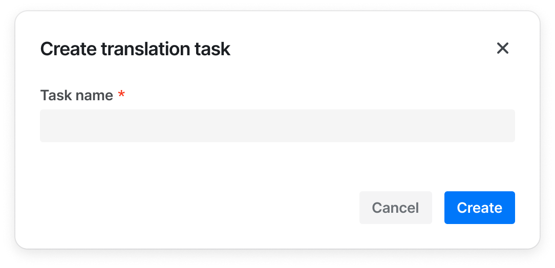
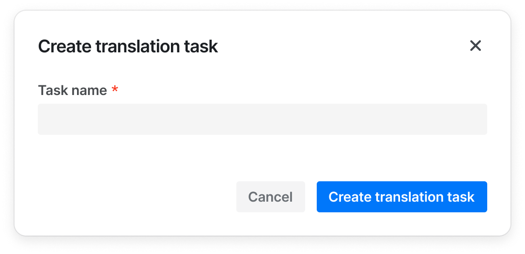
- When the button is combined with other components, the button can only display {verb}, such as "Add", "Create", if the other components (such as Modal and Sidesheet) already provide enough context for the information
  
| ✅ Recommended usage | ❌ Deprecated usage |
| --- | --- |
| <img src='https://lf3-static.bytednsdoc.com/obj/eden-cn/ptlz_zlp/ljhwZthlaukjlkulzlp/content_guide/button-good-2.png' style={{ width: 350 }} />| <img src='https://lf3-static.bytednsdoc.com/obj/eden-cn/ptlz_zlp/ljhwZthlaukjlkulzlp/content_guide/button-bad-2.png' style={{ width: 350 }} /> |

- Always write in Sentence case

| ✅ Recommended usage | ❌ Deprecated usage |
| --- | --- |
| Create project | Create <br/> Create a project|
| Edit profile | Edit |

## Design Tokens
<DesignToken/>

<!-- ## Related Material
```material
5
``` -->
## Related Material
<semi-material-list code="5"></semi-material-list>