---
localeCode: zh-CN
order: 22
category: 输入类
title:  Button 按钮
icon: doc-button
dir: column
brief: 用户使用按钮来触发一个操作或者进行跳转。
---


## 代码演示

### 如何引入

```jsx import
import { Button, SplitButtonGroup } from '@douyinfe/semi-ui';
```

### 按钮类型

按钮支持以下类型：

-   主按钮（"primary"，默认）
-   次要按钮（"secondary"）
-   第三按钮（"tertiary"）
-   警告按钮（"warning"）
-   危险按钮（"danger"）

```jsx live=true dir="column"
import React from 'react';
import { Button } from '@douyinfe/semi-ui';

function ButtonDemo() {
    return (
        <div className="btn-margin-right">
            <Button>主要按钮</Button>
            <Button type="secondary">次要按钮</Button>
            <Button type="tertiary">第三按钮</Button>
            <Button type="warning">警告按钮</Button>
            <Button type="danger">危险按钮</Button>
        </div>
    );
}

```

#### 关于类型字体色值

按钮的字体色值使用的都是 [CSS Variables](https://developer.mozilla.org/zh-CN/docs/Web/CSS/Using_CSS_custom_properties)，分别为：

-   `var(--semi-color-primary)`：主要
-   `var(--semi-color-secondary)`：次要
-   `var(--semi-color-tertiary)`：第三
-   `var(--semi-color-warning)`：警告
-   `var(--semi-color-danger)`：危险

你可以直接使用这些主题色定义你的元素。

```jsx live=true dir="column"
import React from 'react';

function ButtonDemo() {
    const types = [['primary', '主要'], ['secondary', '次要'], ['tertiary', '第三'], ['warning', '警告'], ['danger', '危险']];

    return (
        <article>
            {types.map((type, index) => (
                <strong key={index} style={{ color: `var(--semi-color-${Array.isArray(type) ? type[0] : type})`, marginRight: 10 }}>{Array.isArray(type) ? type[1]: type}</strong>
            ))}
        </article>
    );
}
```

### 按钮主题

目前可用的主题（theme）为：

-   `light`：浅色背景
-   `solid`：深色背景
-   `borderless`：无背景
-   `outline`: 边框模式

默认的主题为 `light`

#### 浅色背景

```jsx live=true dir="column"
import React from 'react';
import { Button } from '@douyinfe/semi-ui';

function ButtonDemo() {
    return (
        <>
            <Button theme='light' type='primary' style={{ marginRight: 8 }}>浅色主要</Button>
            <Button theme='light' type='secondary' style={{ marginRight: 8 }}>浅色次要</Button>
            <Button theme='light' type='tertiary' style={{ marginRight: 8 }}>浅色第三</Button>
            <Button theme='light' type='warning' style={{ marginRight: 8 }}>浅色警告</Button>
            <Button theme='light' type='danger' style={{ marginRight: 8 }}>浅色危险</Button>
        </>
    );
}

```

#### 深色背景

```jsx live=true dir="column"
import React from 'react';
import { Button } from '@douyinfe/semi-ui';

function ButtonDemo() {
    return (
        <>
            <Button theme='solid' type='primary' style={{ marginRight: 8 }}>深色主要</Button>
            <Button theme='solid' type='secondary' style={{ marginRight: 8 }}>深色次要</Button>
            <Button theme='solid' type='tertiary' style={{ marginRight: 8 }}>深色第三</Button>
            <Button theme='solid' type='warning' style={{ marginRight: 8 }}>深色警告</Button>
            <Button theme='solid' type='danger' style={{ marginRight: 8 }}>深色危险</Button>
        </>
    );
}

```

#### 无背景

```jsx live=true dir="column"
import React from 'react';
import { Button } from '@douyinfe/semi-ui';

function ButtonDemo() {
    return (
        <>
            <Button theme='borderless' type='primary' style={{ marginRight: 8 }}>主要</Button>
            <Button theme='borderless' type='secondary' style={{ marginRight: 8 }}>次要</Button>
            <Button theme='borderless' type='tertiary' style={{ marginRight: 8 }}>第三</Button>
            <Button theme='borderless' type='warning' style={{ marginRight: 8 }}>警告</Button>
            <Button theme='borderless' type='danger' style={{ marginRight: 8 }}>危险</Button>
        </>
    );
}

```


#### 边框模式

```jsx live=true dir="column"
import React from 'react';
import { Button } from '@douyinfe/semi-ui';

function ButtonDemo() {
    return (
        <>
            <Button theme='outline' type='primary' style={{ marginRight: 8 }}>主要</Button>
            <Button theme='outline' type='secondary' style={{ marginRight: 8 }}>次要</Button>
            <Button theme='outline' type='tertiary' style={{ marginRight: 8 }}>第三</Button>
            <Button theme='outline' type='warning' style={{ marginRight: 8 }}>警告</Button>
            <Button theme='outline' type='danger' style={{ marginRight: 8 }}>危险</Button>
        </>
    );
}

```

### 尺寸

默认定义了三种尺寸：

-   大："large"
-   默认："default"
-   小："small"

```jsx live=true dir="column"
import React from 'react';
import { Button } from '@douyinfe/semi-ui';

function ButtonDemo() {
    return (
        <div>
            <Button size='large' style={{ marginRight: 8 }}>大尺寸</Button>
            <Button size='default' style={{ marginRight: 8 }}>默认尺寸</Button>
            <Button size='small'>小尺寸</Button>
        </div>
    );
}
```

### 块级按钮

块级按钮具有预先定义好的宽度，它的宽度与按钮里面内容的宽度无关。

```jsx live=true dir="column"
import React from 'react';
import { Button } from '@douyinfe/semi-ui';

function ButtonDemo() {
    return (
        <div>
            <Button block>块级按钮</Button>
        </div>
    );
}
```

### 图标按钮

可定义按钮的图标。

```jsx live=true dir="column"
import React from 'react';
import { Button } from '@douyinfe/semi-ui';
import { IconCamera, IconSidebar, IconChevronDown } from '@douyinfe/semi-icons';

function ButtonDemo() {
    return (
        <div>
            <strong>默认状态：</strong>
            <Button icon={<IconCamera />} aria-label="截屏" />
            <br/><br/>
            <strong>禁用状态：</strong>
            <Button disabled icon={<IconCamera />} aria-label="截屏"/>
            <br/><br/>
            <strong>复合类型：</strong>
            <span className="btn-margin-right">
                <Button type="primary" icon={<IconCamera />} aria-label="截屏"/>
                <Button type="secondary" icon={<IconCamera />} aria-label="截屏" />
                <Button type="warning" icon={<IconCamera />} aria-label="截屏" />
                <Button type="danger" icon={<IconCamera />} aria-label="截屏" />
            </span>
            <br/><br/>
            <strong>更改主题：</strong>
            <Button icon={<IconCamera />} theme="solid" style={{ marginRight: 10 }} aria-label="截屏" />
            <Button icon={<IconCamera />} theme="light" aria-label="截屏" />
            <br/><br/>
            <strong>更改图标位置：</strong>
            <Button icon={<IconSidebar />} theme="solid" style={{ marginRight: 10 }}>收起</Button>
            <Button icon={<IconChevronDown />} theme="solid" iconPosition="right">展开选项</Button>
            <br/><br/>
        </div>
    );
}
```

### 链接按钮

我们推荐使用 Typography 的 link 属性来实现链接型的文字按钮，具体用法详见[Typography](/zh-CN/basic/typography)

```jsx live=true
import React from 'react';
import { Typography } from '@douyinfe/semi-ui';
import { IconLink } from '@douyinfe/semi-icons';

function Demo() {
    const { Text } = Typography;
    return (
        <div>
            <Text link={{ href: 'https://semi.design/' }}>链接文本</Text>
            <br />
            <br />
            <Text link={{ href: 'https://semi.design/' }}>打开网站</Text>
            <br />
            <br />
            <Text link icon={<IconLink />} underline>带下划线的网页链接</Text>
        </div>
    );
}
```

### 禁用状态

```jsx live=true dir="column"
import React from 'react';
import { Button } from '@douyinfe/semi-ui';

function ButtonDemo() {
    return (
        <div>
            <Button disabled>禁用</Button>
            <Button disabled theme="borderless">无背景禁用</Button>
            <Button disabled theme="light">浅色禁用</Button>
            <Button disabled theme="borderless" type="primary">无背景主要禁用</Button>
            <Button disabled theme="solid" type="warning">深色警告禁用</Button>
        </div>
    );
}
```

### 加载状态

按钮支持加载状态，通过设置 loading 参数值为 true 即可，注意：disabled 状态优先级高于 loading 状态。

```jsx live=true dir="column"
import React, { useState } from 'react';
import { Button } from '@douyinfe/semi-ui';
import { IconDelete } from '@douyinfe/semi-icons';

function ButtonDemo() {
    const [saveLoading, setSaveLoading] = useState(false);
    const [delLoading, setDelLoading] = useState(true);
    const [repLoading, setRepLoading] = useState(true);

    const reset = status => {
        status = !!status;
        setSaveLoading(status);
        setDelLoading(status);
        setRepLoading(status);
    };

    return (
        <div>
            <div> 
                <div className="btn-margin-right" style={{ display: 'inline-flex', alignItems: 'center', paddingBottom: 14 }}>
                    <Button onClick={() => reset(false)}>关闭加载态</Button>
                    <Button onClick={() => reset(true)}>开启加载态</Button>
                </div>
            </div>
            <hr/>
            <Button loading={saveLoading} onClick={() => setSaveLoading(true)} style={{ marginRight: 14 }}>保存</Button>
            <Button loading={delLoading} icon={<IconDelete />} type="danger" onClick={() => setDelLoading(true)} style={{ marginRight: 14 }}>删除</Button>
            <div style={{ width: 200, display: 'inline-block' }}>
                <Button loading={repLoading} type="warning" block theme="solid" onClick={() => setRepLoading(true)}>撤销</Button>
            </div>
        </div>
    );
}
```

### AI 风格 - 多彩按钮

设置 `colorful` 即可获得多彩按钮，多彩按钮支持所有的 `theme` ， `type` 仅支持 `primary` 及 `tertiary`。

```jsx live=true dir="column"
import React, { useState } from 'react';
import { Button } from '@douyinfe/semi-ui';
import { IconAIFilledLevel1, IconAIFilledLevel2, IconAIFilledLevel3 } from '@douyinfe/semi-icons';

function ButtonDemo() {
    return (['Colorful', undefined].map(content => (<div 
        key={content}
        style={{ display: 'flex', rowGap: 16, marginTop: 20, marginLeft: 10, flexDirection: 'column' }}
    >
        <div style={{ display: 'flex', columnGap: 16 }}>
            <Button colorful theme="solid" type="primary" icon={<IconAIFilledLevel1 />}>{content}</Button>
            <Button colorful theme="solid" type="primary" loading >{content}</Button>
            <Button colorful theme="solid" type="primary" icon={<IconAIFilledLevel1 />} disabled >{content}</Button>
            <Button colorful theme="solid" type="tertiary" icon={<IconAIFilledLevel3 />}>{content}</Button>
            <Button colorful theme="solid" type="tertiary" loading >{content}</Button>
            <Button colorful theme="solid" type="tertiary" icon={<IconAIFilledLevel3 />} disabled >{content}</Button>
        </div>
        <div style={{ display: 'flex', columnGap: 16 }}>
            <Button colorful theme="light" type="primary" icon={<IconAIFilledLevel3 />}>{content}</Button>
            <Button colorful theme="light" type="primary" loading >{content}</Button>
            <Button colorful theme="light" type="primary" icon={<IconAIFilledLevel3 />} disabled >{content}</Button>
            <Button colorful theme="light" type="tertiary" icon={<IconAIFilledLevel2 />}>{content}</Button>
            <Button colorful theme="light" type="tertiary" loading >{content}</Button>
            <Button colorful theme="light" type="tertiary" icon={<IconAIFilledLevel2 />} disabled >{content}</Button>
        </div>
        <div style={{ display: 'flex', columnGap: 16 }}>
            <Button colorful theme="outline" type="primary" icon={<IconAIFilledLevel1 />}>{content}</Button>
            <Button colorful theme="outline" type="primary" loading >{content}</Button>
            <Button colorful theme="outline" type="primary" icon={<IconAIFilledLevel1 />} disabled >{content}</Button>
            <Button colorful theme="outline" type="tertiary" icon={<IconAIFilledLevel2 />}>{content}</Button>
            <Button colorful theme="outline" type="tertiary" loading >{content}</Button>
            <Button colorful theme="outline" type="tertiary" icon={<IconAIFilledLevel2 />} disabled >{content}</Button>
        </div>
        <div style={{ display: 'flex', columnGap: 16 }}>
            <Button colorful theme="borderless" type="primary" icon={<IconAIFilledLevel3 />}>{content}</Button>
            <Button colorful theme="borderless" type="primary" loading >{content}</Button>
            <Button colorful theme="borderless" type="primary" icon={<IconAIFilledLevel3 />} disabled >{content}</Button>
            <Button colorful theme="borderless" type="tertiary" icon={<IconAIFilledLevel2 />}>{content}</Button>
            <Button colorful theme="borderless" type="tertiary" loading >{content}</Button>
            <Button colorful theme="borderless" type="tertiary" icon={<IconAIFilledLevel2 />} disabled >{content}</Button>
        </div>
    </div>)));
}
```

### 按钮组合

可以将多个按钮放入`ButtonGroup`的容器中，通过设置`size`，`disabled`，`type`可统一设置按钮组合中的按钮尺寸，是否禁用和类型。

#### 组合尺寸

```jsx live=true dir="column"
import React from 'react';
import { ButtonGroup, Button } from '@douyinfe/semi-ui';

function ButtonDemo() {
    const sizes = ['large', 'default', 'small'];

    return (
        <div style={{ display: 'flex' }}>
            {sizes.map(size => (
                <div style={{ marginRight: 10 }} key={size}>
                    <ButtonGroup size={size}>
                        <Button>拷贝</Button>
                        <Button>查询</Button>
                        <Button>剪切</Button>
                    </ButtonGroup>
                </div>
            ))}
        </div>
    );
}
```

#### 组合禁用

```jsx live=true dir="column"
import React from 'react';
import { ButtonGroup, Button } from '@douyinfe/semi-ui';

function ButtonDemo() {
    return (
        <div style={{ display: 'flex' }}>
            <div style={{ marginRight: 10 }}>
                <ButtonGroup disabled>
                    <Button>拷贝</Button>
                    <Button>查询</Button>
                    <Button>剪切</Button>
                </ButtonGroup>
            </div>
        </div>
    );
}
```

#### 组合类型

```jsx live=true dir="column"
import React from 'react';
import { ButtonGroup, Button } from '@douyinfe/semi-ui';

function ButtonDemo() {
    const types = ['primary', 'secondary', 'tertiary', 'warning', 'danger'];

    return (
        <div style={{ display: 'flex' }}>
            {types.map(type => (
                <div style={{ marginRight: 10 }} key={type}>
                    <ButtonGroup type={type} aria-label="操作按钮组">
                        <Button>拷贝</Button>
                        <Button>查询</Button>
                        <Button>剪切</Button>
                    </ButtonGroup>
                </div>
            ))}
        </div>
    );
}
```

### 分裂按钮组合

在`Button`和`Dropdown`结合的场景下，可以使用分裂按钮，分裂按钮添加了按钮之间的间隔，并改变了按钮的边框圆角

#### 基础使用

```jsx live=true dir="column"
import React, { useState } from 'react';
import { SplitButtonGroup, Dropdown, Button } from '@douyinfe/semi-ui';
import { IconTreeTriangleDown } from '@douyinfe/semi-icons';

function SplitButtonDemo(){

    const menu = [
        { node: 'item', name: '编辑项目', onClick: () => console.log('编辑项目点击') },
        { node: 'item', name: '重置项目' },
        { node: 'divider' },
        { node: 'item', name: '复制项目' },
        { node: 'item', name: '从项目创建模版' },
        { node: 'divider' },
        { node: 'item', name: '删除项目', type: 'danger' },
    ];

    const [btnVisible, setBtnVisible] = useState({
        1: false,
        2: false,
        3: false
    });

    const handleVisibleChange = (key, visible)=>{
        newBtnVisible = { ...btnVisible };
        newBtnVisible[key] = visible;
        setBtnVisible(newBtnVisible);
    };

    return (
        <div>
            <SplitButtonGroup style={{ marginRight: 10 }} aria-label="项目操作按钮组">
                <Button theme="solid" type="primary">分裂按钮</Button>
                <Dropdown onVisibleChange={(v)=>handleVisibleChange(1, v)} menu={menu} trigger="click" position="bottomRight">
                    <Button style={btnVisible[1] ? { background: 'var(--semi-color-primary-hover)', padding: '8px 4px' } : { padding: '8px 4px' }} theme="solid" type="primary" icon={<IconTreeTriangleDown />}></Button>
                </Dropdown>
            </SplitButtonGroup>
            <SplitButtonGroup style={{ marginRight: 10 }} aria-label="项目操作按钮组">
                <Button theme="light" type="primary">分裂按钮</Button>
                <Dropdown onVisibleChange={(v)=>handleVisibleChange(2, v)} menu={menu} trigger="click" position="bottomRight">
                    <Button style={btnVisible[2]?{ background: 'var(--semi-color-fill-1)', padding: '8px 4px' }:{ padding: '8px 4px' }} theme="light" type="primary" icon={<IconTreeTriangleDown />}></Button>
                </Dropdown>
            </SplitButtonGroup>
            <SplitButtonGroup aria-label="项目操作按钮组">
                <Button style={btnVisible[3]?{ background: 'var(--semi-color-fill-0)' }:{}} theme="borderless" type="primary">分裂按钮</Button>
                <Dropdown onVisibleChange={(v)=>handleVisibleChange(3, v)} menu={menu} trigger="click" position="bottomRight">
                    <Button style={btnVisible[3]?{ background: 'var(--semi-color-fill-1)', padding: '8px 4px' }:{ padding: '8px 4px' }} theme="borderless" type="primary" icon={<IconTreeTriangleDown />}></Button>
                </Dropdown>
            </SplitButtonGroup>
        </div>
    );
}
```


## API 参考

### Button

| 属性                | 说明                                                                                                          | 类型                            | 默认值    |
| ------------------- |-------------------------------------------------------------------------------------------------------------| ------------------------------- | --------- |
| aria-label          | 按钮的标签                                                                                                       | string                            | -    |
| block               | 将按钮设置为块级按钮                                                                                                  | bool                            | false     |
| className           | 类名                                                                                                          | string                          |           |
| contentClassName | 内容区域 className |  string | 无 |
| colorful | 多彩按钮，自 2.86.0 版本开始支持 |  boolean | false |
| disabled            | 禁用状态                                                                                                        | boolean                         | false     |
| htmlType           | 设置 `button` 原生的 `type` 值，可选值：`button`、`reset`、`submit`                                                      | string                          | "button"  |
| icon                | 图标                                                                                                          | ReactNode               |           |
| iconPosition        | 图标位置，可选值：`left`\|`right`                                                                                    | string                          | `left`    |
| loading             | 加载状态                                                                                                        | boolean                         | false     |
| noHorizontalPadding | 设置水平方向是否去掉内边距，只对设置了 icon 的 Button 有效。可选值：`true`（等效于 \["left", "right"\]），"left"，"right"，\["left", "right"\] | boolean\|string\|Array<string\> | false     |
| size                | 按钮大小，可选值：`large`、`default`、`small`                                                                          | string                          | "default" |
| style               | 自定义样式                                                                                                       | CSSProperties                          |           |
| theme               | 按钮主题，可选值：`solid`（有背景色）、 `borderless`（无背景色）、 `light`（浅背景色）、`outline`(边框模式)                                | string                          | "light"   |
| type                | 类型，可选值：`primary`、`secondary`、`tertiary`、`warning`、 `danger`                                                 | string                          | "primary" |
| onClick             | 单击事件                                                                                                        | function(MouseEvent)                        |           |
| onMouseDown             | 鼠标按下事件                                                                                                      | function(MouseEvent)                        |           |
| onMouseEnter             | 鼠标移入事件                                                                                                      | function(MouseEvent)                        |           |
| onMouseLeave             | 鼠标移出事件                                                                                                      | function(MouseEvent)                        |           |

### ButtonGroup

| 属性     | 说明          | 类型    | 默认值      | 版本 |
| -------- | -------------| ------- | --------- |---- |
| aria-label | 按钮组的标签 | string  | - | |
| className  | 自定义类名   | string  | - | |
| colorful | 多彩按钮，自 2.86.0 版本开始支持 |  boolean | false |
| disabled   | 禁用状态     | boolean | false | |
| size       | 按钮大小，可选值：`large`、`default`、`small` | string  | "default" | |
| style      | 自定义样式   | CSSProperties   | - | 2.20.0 |
| theme      | 按钮主题，可选值：`solid`（有背景色）、 `borderless`（无背景色）、 `light`（浅背景色）、`outline`(边框模式)   | string | "light"   | |
| type     | 类型，可选值：`primary`、`secondary`、`tertiary`、`warning`、 `danger` | string  | "primary" | |

### SplitButtonGroup **V1.12.0新增**
| 属性          | 说明                 | 类型      | 默认值     |
| -----------  | ---------------------| -------- | --------- |
| aria-label   | 分裂按钮组的标签        | string   | - |
| className    | 自定义类名             | string   | - |
| style        | 自定义样式             | CSSProperties   | - |

## Accessibility

### ARIA

- `aria-label` 用于表示按钮的作用，对于图标按钮，我们推荐使用此属性
- `aria-disabled` 与 disabled 属性同步，表示按钮禁用

### 键盘和焦点

- Button 的焦点管理与原生 button 一致，键盘用户可以使用 Tab 及  Shift + Tab 切换焦点
- Button 的触发与原生 button 一致，当按钮聚焦时，可以通过 Enter 或 Space 键激活
- ButtonGroup 中的按钮与单个按钮的焦点管理方式一致，可以通过 Tab 以及 Shift + Tab 进行切换


## 文案规范
- 按钮需要清晰可预测，用户应该能够预测他们点击按钮时会发生什么
- 按钮应该总是以鼓励行动的强动词开头
- 为了给用户提供足够的上下文，在按钮上使用 {动词}+{名词} 内容公式；除了常见的动作，如“Done”、“Close”、“Cancel”或“OK”

| ✅ 推荐用法 | ❌ 不推荐用法 |   
| --- | --- | 
| <div style={{ textAlign: 'center' }}><Empty image={<IllustrationNoAccess style={{ width: 150, height: 150 }} />} darkModeImage={<IllustrationNoAccessDark style={{ width: 150, height: 150 }} />} description={'No permission to view this page'}/><Button theme='solid' type='primary' style={{ marginTop: 12 }}>Apply permission</Button></div>|  <div style={{ textAlign: 'center' }}><Empty image={<IllustrationNoAccess style={{ width: 150, height: 150 }} />} darkModeImage={<IllustrationNoAccessDark style={{ width: 150, height: 150 }} />} description={'No permission to view this page'}/><Button theme='solid' type='primary' style={{ marginTop: 12 }}>Apply</Button></div>  |

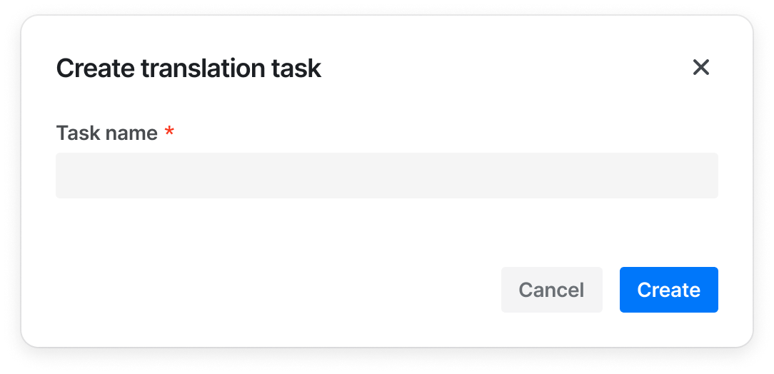
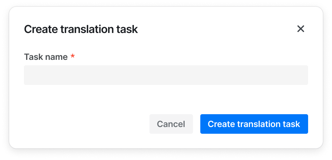
- 当按钮和其他组件一起时候，如果其他组件（比如 Modal 和Sidesheet）已经提供了足够信息的上下文的话，按钮可以只展示 {动词}，如“Add”、“Create”；
  
| ✅ 推荐用法 | ❌ 不推荐用法 |   
| --- | --- | 
| <img src='https://lf3-static.bytednsdoc.com/obj/eden-cn/ptlz_zlp/ljhwZthlaukjlkulzlp/content_guide/button-good-2.png' style={{ width: 350 }} />| <img src='https://lf3-static.bytednsdoc.com/obj/eden-cn/ptlz_zlp/ljhwZthlaukjlkulzlp/content_guide/button-bad-2.png' style={{ width: 350 }} /> |

- 始终按句子大小写（Sentence case）原则书写

| ✅ 推荐用法 | ❌ 不推荐用法 |   
| --- | --- | 
| Create project | Create <br/> Create a project|
| Edit profile | Edit |

## 设计变量
<DesignToken/>

## FAQ
- #### 为什么Button中的icon属性不起作用？  
  请检查你的Button import路径，正确的import路径应该为```import { Button } from '@douyinfe/semi-ui;'```，如果你错误地从 @douyinfe/semi-ui/button/button中import的话，获取到的是不带icon功能的基础Button组件

<!-- ## 相关物料
```material
5
``` -->
## 相关物料
<semi-material-list code="5"></semi-material-list>