Status: Canonical (v1.0)
Last updated: 2025-12-21
Taxonomy placement: D0. Color (Emotional Palette)
Audience: Design Systems, Product Design, Front-End Engineering
CEM uses color as the primary channel for communicating, using a branded palette to express:
Companion specs:
cem-dimension) — spacing scale, density modes, and layout gapscem-coupling) — density affects perceived color intensity and separabilitycem-shape) — rounded shapes soften color impactcem-layering) — tonal shifts for depth perception (recess/lift)cem-stroke) — focus/selection colors; D0 defines hue, D5 defines geometrycem-voice-fonts-typography) — text contrast requirementscem-timing) — color transition timingD0 (Color) defines:
D0 (Color) does not define:
This spec defines consumer-semantic color tokens for CEM:
--cem-color-*) used as implementation substrate.--cem-palette-*) that expresses meaning in user language (comfort, trust, danger, etc.).--cem-action-*) for buttons/steps and other “do something” controls.--cem-zebra-*) used with D5 Stroke to express selection/focus/target without relying on
fill.Non-goals:
Tokens are named for what the user experiences (comfort, danger, trust) and for flow semantics (primary, destructive, selected, pending), rather than for RGB/hex values.
CEM intentionally separates meaning across channels:
--cem-zebra-*) for high-salience but non-fill states (focus/target/selected).This avoids overloading color fill and improves accessibility in compact/dense UIs.
To avoid “palette explosion”, D0 constrains variation intentionally:
xl, l, d, xd), not per-component
shades.color-mix() rather than hand-picked colors.When forced-colors is active, system colors win. CEM must preserve semantics using Canvas, CanvasText,
Highlight, SelectedItem, etc., and avoid losing meaning when shadows/glows are dropped by the UA.
Emotional terms (what the interface wants the user to feel):
| Term | Primary palette token | Typical usage |
|---|---|---|
| comfort | --cem-palette-comfort |
canvas/surfaces, low-salience backgrounds |
| calm | --cem-palette-calm |
subtle affordances, secondary emphasis |
| trust | --cem-palette-trust |
primary emphasis, highlights |
| enthusiasm | --cem-palette-enthusiasm |
alternate emphasis, “positive energy” |
| creativity | --cem-palette-creativity |
exploration, novelty |
| danger | --cem-palette-danger |
errors, destructive affordances |
| conservative | --cem-palette-conservative |
neutral/disabled, “quiet UI” |
Action terms (what an action will do):
| Term | Intent token prefix | Typical usage |
|---|---|---|
| primary | --cem-action-primary-* |
default “go forward” action |
| explicit | --cem-action-explicit-* |
strong call-to-action |
| contextual | --cem-action-contextual-* |
within-context action |
| alternate | --cem-action-alternate-* |
secondary/alternate action |
| destructive | --cem-action-destructive-* |
deletion, irreversible change |
State terms (how condition changes):
| State | Channel | Notes |
|---|---|---|
| disabled/readonly/editable | background + text | subdued progression (see §7.2) |
| hover/active/pending | background + text | formulaic color-mix() progression (see §7.2) |
| focus/selected/target | outline (zebra) | do not rely on fill alone (see §8) |
Branded hues (implementation substrate)
  --cem-color-{hue}-{variant}
        │
        ▼
Emotional palette (semantic contract)
  --cem-palette-{emotion} (+ -x / -text / -text-x)
        │
        ▼
Action intents (consumer-facing API)
  --cem-action-{intent}-{state}-{attribute}
CEM color endpoints are layered:
--cem-color-{hue}-{variant}--cem-palette-{emotion} and --cem-palette-{emotion}-text--cem-action-{intent}-{state}-{attribute}--cem-zebra-color-0..3 + strip sizeRule: consumers should theme primarily by adjusting palette and (optionally) base colors; product code should depend on palette/action/zebra endpoints.
Branded hues are provided in a small, repeatable set of brightness variants:
| Variant | Meaning (relative) | Typical role |
|---|---|---|
xl |
lightest | large surface fills in light schemes; extreme contrast partner in dark |
l |
light | standard surface/intent fill in light schemes |
d |
dark | standard surface/intent fill in dark schemes |
xd |
darkest | extreme contrast partner in light schemes; deep surfaces in dark |
When selecting a safe pairing (especially for text and outlines), prefer opposite ends:
xl/l): pair with d or xd for text/outline.d/xd): pair with l or xl for text/outline.The neutral/grey family is intentionally smaller (typically l + d) and is used primarily via the conservative
palette.
The base family is a small set of named hues with a few variants. These are reference values (from
theme-data.xhtml) and may be overridden by a brand, as long as the semantic palette mappings remain coherent.
| Token | Hue | Variant | Value | Label | Intended use | Tier |
|---|---|---|---|---|---|---|
--cem-color-blue-xl |
blue | xl | #e0e8ff | Lightest blue | Trust palette (light scene surface) | recommended |
--cem-color-blue-l |
blue | l | #d7e3ff | Light blue | Trust palette, attention semantic | recommended |
--cem-color-blue-d |
blue | d | #002f65 | Dark blue | Trust palette (dark theme) | recommended |
--cem-color-blue-xd |
blue | xd | #001b3f | Darkest blue | Trust palette (dark scene surface) | recommended |
--cem-color-brown-xl |
brown | xl | #d7ccc8 | Extra light brown | Conservative palette (light theme) | recommended |
--cem-color-brown-l |
brown | l | #a1887f | Light brown | Conservative emotion, brand-3 | recommended |
--cem-color-brown-d |
brown | d | #4e342e | Dark brown | Conservative palette (dark theme) | recommended |
--cem-color-brown-xd |
brown | xd | #3e2723 | Extra dark brown | Conservative palette (dark theme, extreme) | recommended |
--cem-color-cyan-xl |
cyan | xl | #f1fefe | Extra light cyan | Used for comfort palette (light scenes) | recommended |
--cem-color-cyan-l |
cyan | l | #00fbfb | Light cyan | Calm palette, creativity accent | recommended |
--cem-color-cyan-d |
cyan | d | #006a6a | Dark cyan | Calm palette (dark theme) | recommended |
--cem-color-cyan-xd |
cyan | xd | #001010 | Extra dark cyan | Used for comfort palette (dark scenes) | recommended |
--cem-color-grey-l |
grey | l | #f1f1eb | Light grey | Conservative palette, neutral backgrounds | recommended |
--cem-color-grey-d |
grey | d | #1a1c18 | Dark grey | Conservative palette (dark theme) | recommended |
--cem-color-orange-xl |
orange | xl | #f0f070 | Extra light yellow | Enthusiasm palette (light theme) | recommended |
--cem-color-orange-l |
orange | l | #ffe082 | Light orange | Enthusiasm emotion, brand-2 | recommended |
--cem-color-orange-d |
orange | d | #723600 | Dark orange | Enthusiasm hype (dark theme) | recommended |
--cem-color-orange-xd |
orange | xd | #502400 | Extra dark orange | Enthusiasm palette (dark theme, extreme) | recommended |
--cem-color-purple-xl |
purple | xl | #f3e5f5 | Extra light purple | Creativity palette (light theme) | recommended |
--cem-color-purple-l |
purple | l | #e1bee7 | Light purple | Creativity emotion, brand-1 | recommended |
--cem-color-purple-d |
purple | d | #6a1b9a | Dark purple | Creativity palette (dark theme) | recommended |
--cem-color-purple-xd |
purple | xd | #4a148c | Extra dark purple | Creativity palette (dark theme, extreme) | recommended |
--cem-color-red-xl |
red | xl | #ffb4ab | Extra light red | Danger palette (light theme) | recommended |
--cem-color-red-l |
red | l | #ba1a1a | Light red | Danger emotion, alert semantic | recommended |
--cem-color-red-d |
red | d | #690005 | Dark red | Danger palette (dark theme) | recommended |
--cem-color-red-xd |
red | xd | #410002 | Extra dark red | Danger palette (dark theme, extreme) | recommended |
--cem-color-visitedtext-30-black |
nat | d | color-mix(in srgb, VisitedText 30%, black) | light trust-x | Native palette Trust extreme variant | recommended |
--cem-color-visitedtext-30-white |
nat | l | color-mix(in srgb, VisitedText 30%, white) | dark trust-x | Native palette Trust extreme variant | recommended |
--cem-color-mark-30-black |
nat | d | color-mix(in srgb, Mark 30%, black) | light enthusiasm-x | Native palette Enthusiasm extreme variant | recommended |
--cem-color-mark-30-white |
nat | l | color-mix(in srgb, Mark 30%, white) | dark enthusiasm-x | Native palette Enthusiasm extreme variant | recommended |
--cem-color-canvastext-30-purple |
nat | d | color-mix(in srgb, CanvasText 30%, purple ) | light creativity-x | Native palette Creativity extreme variant | recommended |
--cem-color-canvastext-30-lightpink |
nat | l | color-mix(in srgb, CanvasText 30%, lightpink) | dark creativity-x | Native palette Creativity extreme variant | recommended |
--cem-color-red-30-black |
nat | d | color-mix(in srgb, red 30%, black) | light danger-x | Native palette Danger extreme variant | recommended |
--cem-color-red-30-white |
nat | l | color-mix(in srgb, red 30%, white) | dark danger-x | Native palette Danger extreme variant | recommended |
--cem-color-white |
nat | l | white | dark trust text | Trust and Extreme palette dark mode text | recommended |
Variant semantics:
xl / l: light-scene support (surfaces, containers, accents)d / xd: dark-scene support (surfaces, ink-safe accents)CSS system colors adapt automatically to the user’s
OS color scheme. In native mode, CEM maps palette endpoints directly to these values (see §9).
| Color | Text pair | Description |
|---|---|---|
AccentColor |
AccentColorText |
Background of accented user interface controls |
AccentColorText |
AccentColor |
Text of accented user interface controls |
ActiveText |
Canvas |
Text of active links |
ButtonBorder |
Canvas |
Base border color of controls |
ButtonFace |
CanvasText |
Background color of controls |
ButtonText |
Canvas |
Text color of controls |
Canvas |
CanvasText |
Background of application content or documents |
CanvasText |
Canvas |
Text color in application content or documents |
Field |
CanvasText |
Background of input fields |
FieldText |
Canvas |
Text in input fields |
GrayText |
Canvas |
Text color for disabled items |
Highlight |
HighlightText |
Background of selected items |
HighlightText |
Highlight |
Text color of selected items |
LinkText |
Canvas |
Text of non-active, non-visited links |
Mark |
MarkText |
Background of specially marked text (e.g. <mark>) |
MarkText |
Mark |
Text of specially marked text |
SelectedItem |
SelectedItemText |
Background of selected items (e.g. checkbox) |
SelectedItemText |
SelectedItem |
Text of selected items |
VisitedText |
Canvas |
Text of visited links |
The emotional palette is the primary semantic contract for color.
Reference mappings (from theme-data.xhtml) use light-dark() so a single token resolves appropriately for light vs dark schemes.
| Token | Role | Light | dark | Native Light | Native Dark | Usage | Emotion | Shift | tier |
|---|---|---|---|---|---|---|---|---|---|
--cem-palette-comfort |
Base comfort color | cyan-xl | cyan-xd | Canvas | Main canvas/background | comfort | required | ||
--cem-palette-comfort-x |
Comfort extreme variant | cyan-xd | cyan-xl | CanvasText | Used in color-mix for state variations | comfort | x | recommended | |
--cem-palette-comfort-text |
Comfort text color | cyan-xd | cyan-xl | CanvasText | Primary text on comfort backgrounds | comfort | text | required | |
--cem-palette-comfort-text-x |
Comfort extreme text | cyan-xl | cyan-xd | Canvas | Text on extreme variant backgrounds | comfort | text-x | recommended | |
--cem-palette-calm |
Base calm color | cyan-l | cyan-d | cyan | Foreground elements | calm | recommended | ||
--cem-palette-calm-x |
Calm extreme variant | cyan-d | cyan-l | rgb(0, 120, 120) | Inverted calm color ( darked darkcyan ) | calm | x | recommended | |
--cem-palette-calm-text |
Calm text color | comfort-text | comfort-text | black | Text on calm backgrounds | calm | text | recommended | |
--cem-palette-calm-text-x |
Calm extreme text | comfort-text-x | comfort-text-x | white | Text on extreme calm backgrounds | calm | text-x | recommended | |
--cem-palette-trust |
Base trust color | blue-l | blue-d | color-mix(in srgb, Highlight 70%, black) | Primary actions, highlights | trust | required | ||
--cem-palette-trust-x |
Trust extreme variant | blue-d | blue-l | --cem-color-visitedtext-30-black |
--cem-color-visitedtext-30-white |
Darker/lighter trust variation | trust | x | recommended |
--cem-palette-trust-text |
Trust text color | comfort-text | white | HighlightText | Text on trust backgrounds | trust | text | required | |
--cem-palette-trust-text-x |
Trust extreme text | comfort-text-x | comfort-text-x | Canvas | Canvas | Text on extreme trust backgrounds | trust | text-x | recommended |
--cem-palette-enthusiasm |
Base enthusiasm color | orange-l | orange-d | Mark | Brand-2, alternate actions | enthusiasm | recommended | ||
--cem-palette-enthusiasm-x |
Enthusiasm extreme variant | orange-xd | orange-xl | --cem-color-mark-30-black |
--cem-color-mark-30-white |
Darker/lighter enthusiasm variation | enthusiasm | x | recommended |
--cem-palette-enthusiasm-text |
Enthusiasm text color | comfort-text | white | MarkText | Text on enthusiasm backgrounds | enthusiasm | text | recommended | |
--cem-palette-enthusiasm-text-x |
Enthusiasm extreme text | comfort-text-x | comfort-text-x | Canvas | Text on extreme enthusiasm backgrounds | enthusiasm | text-x | recommended | |
--cem-palette-creativity |
Base creativity color | purple-l | purple-d | ButtonFace | Brand-1, explicit actions | creativity | recommended | ||
--cem-palette-creativity-x |
Creativity extreme variant | purple-d | purple-l | --cem-color-canvastext-30-purple |
--cem-color-canvastext-30-lightpink |
Darker/lighter creativity variation | creativity | x | recommended |
--cem-palette-creativity-text |
Creativity text color | comfort-text | comfort-text | CanvasText | Text on creativity backgrounds | creativity | text | recommended | |
--cem-palette-creativity-text-x |
Creativity extreme text | comfort-text-x | comfort-text-x | Canvas | Text on extreme creativity backgrounds | creativity | text-x | recommended | |
--cem-palette-danger |
Base danger color | red-l | red-d | red-l | red-d | Error messages, destructive actions | danger | required | |
--cem-palette-danger-x |
Danger extreme variant | red-d | red-l | --cem-color-red-30-black |
--cem-color-red-30-white |
Darker/lighter danger variation | danger | x | recommended |
--cem-palette-danger-text |
Danger text color | comfort-text-x | comfort-text | Canvas | CanvasText | Text on danger backgrounds | danger | text | required |
--cem-palette-danger-text-x |
Danger extreme text | orange-xl | orange-xl | Canvas | High contrast text on extreme danger backgrounds | danger | text-x | recommended | |
--cem-palette-conservative |
Base conservative color | grey-l | grey-d | ButtonFace | Brand-3, disabled states | conservative | required | ||
--cem-palette-conservative-x |
Conservative extreme variant | grey-d | grey-l | CanvasText | Darker/lighter conservative variation | conservative | x | recommended | |
--cem-palette-conservative-text |
Conservative text color | comfort-text | comfort-text | CanvasText | Text on conservative backgrounds | conservative | text | required | |
--cem-palette-conservative-text-x |
Conservative extreme text | comfort-text-x | comfort-text-x | Canvas | Text on extreme conservative backgrounds | conservative | text-x | recommended |
CEM defines 5 operational modes for color behavior:
| Mode | Color scheme | Description |
|---|---|---|
native |
system | Rely on system colors (Canvas, CanvasText, etc.) |
light |
light | Branded palette in light scheme |
dark |
dark | Branded palette in dark scheme |
contrast-light |
light | Minimize fill differences; emphasize outlines/markers |
contrast-dark |
dark | Same, in dark scheme |
Normative expectations:
native MUST preserve meaning using system semantic colors (no hard-coded hex assumptions).contrast-* MUST NOT encode state primarily via background darkness; state must remain legible via zebra outline and
markers.Action tokens encode user-flow intent (primary, explicit, destructive, etc.) and interaction/state.
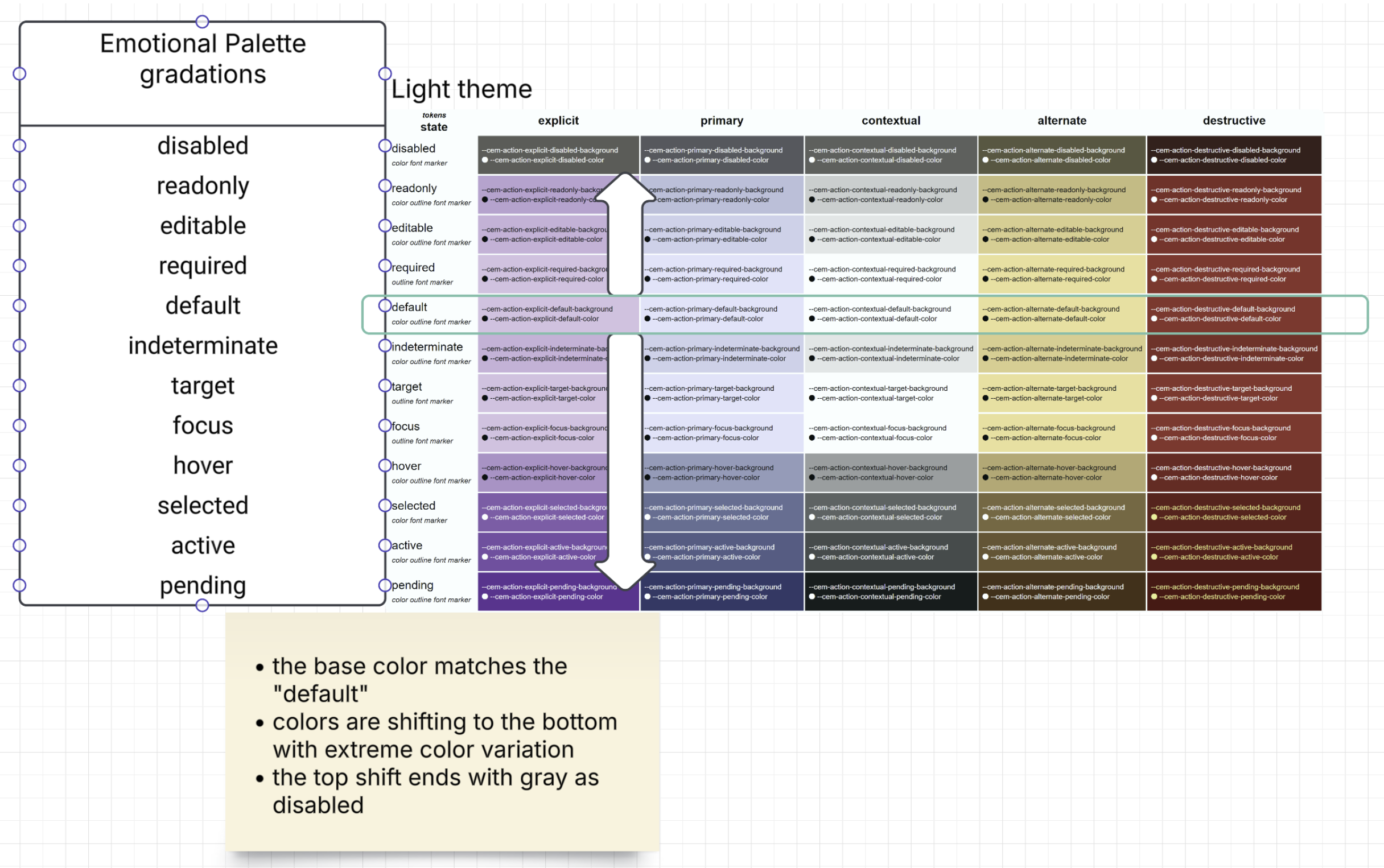
Supplemental title: Light theme — Emotional palette gradations across interaction states (action intents).
Notes (interpretation):
default state row.*-x) for higher salience.disabled, preserving “less available” semantics.| Action intent | Emotional palette | Branded (light) | Branded (dark) | Primary token |
|---|---|---|---|---|
explicit |
creativity |
purple-l (#e1bee7) | purple-d (#6a1b9a) | --cem-action-explicit-default-background |
primary |
trust |
blue-l (#d7e3ff) | blue-d (#002f65) | --cem-action-primary-default-background |
contextual |
comfort |
cyan-xl (#f1fefe) | cyan-xd (#001010) | --cem-action-contextual-default-background |
alternate |
enthusiasm |
orange-l (#ffe082) | orange-d (#723600) | --cem-action-alternate-default-background |
destructive |
danger |
red-l (#ba1a1a) | red-d (#690005) | --cem-action-destructive-default-background |
CEM action states (union of form/action semantics and interaction semantics):
disabledreadonlyeditablerequireddefaultindeterminatetargetfocushoverselectedactivependingState progression is defined as a formulaic movement from “least emphasized” to “most emphasized”, using
color-mix() against the emotion’s extreme variant (--cem-palette-{emotion}-x).
disabled → readonly → editable → default → indeterminate → hover → active → pending
 (30%)      (80%)      (90%)      (base)   (90%)          (70%)   (25%)   (5%)
--cem-palette-conservative-x) to desaturate and quiet the
UI.| State | Background formula (palette-level) | Text token | tier |
|---|---|---|---|
| disabled | color-mix(in srgb, var(--cem-palette-[emotion]) 30%, var(--cem-palette-conservative-x)) |
var(--cem-palette-conservative-text-x) |
required |
| readonly | color-mix(in srgb, var(--cem-palette-[emotion]) 80%, var(--cem-palette-[emotion]-x)) |
var(--cem-palette-[emotion]-text) |
recommended |
| editable | color-mix(in srgb, var(--cem-palette-[emotion]) 90%, var(--cem-palette-[emotion]-x)) |
var(--cem-palette-[emotion]-text) |
recommended |
| default | var(--cem-palette-[emotion]) |
var(--cem-palette-[emotion]-text) |
required |
| indeterminate | color-mix(in srgb, var(--cem-palette-[emotion]) 90%, var(--cem-palette-[emotion]-x)) |
var(--cem-palette-[emotion]-text) |
recommended |
| hover | color-mix(in srgb, var(--cem-palette-[emotion]) 70%, var(--cem-palette-[emotion]-x)) |
var(--cem-palette-[emotion]-text) |
required |
| active | color-mix(in srgb, var(--cem-palette-[emotion]) 25%, var(--cem-palette-[emotion]-x)) |
var(--cem-palette-[emotion]-text-x) |
required |
| pending | color-mix(in srgb, var(--cem-palette-[emotion]) 5%, var(--cem-palette-[emotion]-x)) |
var(--cem-palette-[emotion]-text-x) |
recommended |
Applying this to action intents: substitute [emotion] with the emotional palette mapped by the intent (see §7.1).
The resulting values populate --cem-action-{intent}-{state}-background and --cem-action-{intent}-{state}-text.
focus, selected, and target are primarily expressed through the zebra outline channel (§8). Background tokens
MAY remain at default for these states; do not rely on fill alone.
Action state can affect these channels (the set varies by state):
background (fill)text (ink on fill)outline (via zebra / stroke tokens)marker (required star, etc.)font (weight/face, see Typography spec)To render functional UIs, the following endpoints are REQUIRED per action intent:
--cem-action-{intent}-default-background--cem-action-{intent}-default-text--cem-action-{intent}-hover-background--cem-action-{intent}-hover-text--cem-action-{intent}-active-background--cem-action-{intent}-active-text--cem-action-{intent}-disabled-background--cem-action-{intent}-disabled-textOther states (focus, target, pending, required, indeterminate, readonly, editable) are RECOMMENDED, and
may be implemented through zebra/markers rather than fill.
In contrast-light and contrast-dark, background tokens SHOULD converge on the base surface (
--cem-palette-comfort), with state primarily expressed via:
--cem-zebra-color-*)Deriving state backgrounds from palette (example):
/* Example: primary intent is mapped to trust */
:root {
  --cem-action-primary-default-background: var(--cem-palette-trust);
  --cem-action-primary-default-text:       var(--cem-palette-trust-text);

  --cem-action-primary-hover-background:   color-mix(in srgb, var(--cem-palette-trust) 70%, var(--cem-palette-trust-x));
  --cem-action-primary-hover-text:         var(--cem-palette-trust-text);

  --cem-action-primary-active-background:  color-mix(in srgb, var(--cem-palette-trust) 25%, var(--cem-palette-trust-x));
  --cem-action-primary-active-text:        var(--cem-palette-trust-text-x);
}

/* Focus should be expressed via zebra outlines (D5), not by fill alone */
.button:focus-visible { outline-color: var(--cem-zebra-color-1); }
Framework adapters (illustrative, not normative):
| CEM semantic | MUI (conceptual) | Angular Material (conceptual) |
|---|---|---|
--cem-action-primary-* |
palette.primary.* |
primary |
--cem-action-destructive-* |
palette.error.* |
warn |
--cem-action-alternate-* |
palette.secondary.* (or custom) |
accent (or custom) |
| zebra focus/selected/target | focus ring / outline styles | focus indicator / ripple-outline styles |
| State | Zebra stripe | Recommended meaning |
|---|---|---|
| focus | --cem-zebra-color-1 |
keyboard focus visibility |
| target | --cem-zebra-color-2 |
navigation target / guided attention |
| selected | --cem-zebra-color-3 |
selection / checked / chosen |
See D5 Stroke for zebra geometry (stripe order, offsets, and ring widths).
Zebra is a striped outline (implemented in D5 Stroke) with four semantic strips.
Color endpoints:
| Token | value-type | default-formula | tier | notes |
|---|---|---|---|---|
--cem-zebra-color-0 |
<color> |
var(--cem-palette-comfort) |
required | Base stripe; state selectors override per §8.2 |
--cem-zebra-color-1 |
<color> |
var(--cem-palette-comfort) |
required | Focus stripe; :focus override = CanvasText |
--cem-zebra-color-2 |
<color> |
var(--cem-palette-comfort) |
required | Target stripe; :target override = Mark |
--cem-zebra-color-3 |
<color> |
var(--cem-palette-comfort) |
required | Selected stripe; .selected override = SelectedItem |
--cem-zebra-strip-size |
<length> |
2px |
required | Stripe thickness basis; D5 geometry references this |
Why target occupies the middle ring (color-2): Target is the least-used state — typically once per page. When inactive it collapses to
--cem-palette-comfort, so its ring acts as a neutral visual gap. When active the target color is always hue-distinct from both the focus ring (color-1) and the selection ring (color-3), providing clear three-way separability without competing for attention alongside the two more common states. In light and contrast-light modes a warm orange (orange-l) serves this role; in dark mode a mid-tone purple (creativity) does; in native mode the OSMarkcolor (typically yellow) is used.
Focus, selected, and target MUST always resolve to different hues so that combined states
(e.g., a focused-and-selected item) remain distinguishable. --cem-zebra-color-0 anchors
the ring to the base surface; the remaining stripes are state indicators.
| Theme mode | --cem-zebra-color-0 (base) |
--cem-zebra-color-1 (focus) |
--cem-zebra-color-2 (target) |
--cem-zebra-color-3 (selected) |
|---|---|---|---|---|
native |
Canvas |
CanvasText |
Mark |
SelectedItem |
light |
--cem-palette-comfort |
--cem-palette-trust-x |
--cem-color-orange-l |
--cem-palette-creativity-x |
dark |
--cem-palette-comfort |
--cem-palette-comfort-x |
--cem-palette-creativity |
--cem-palette-calm-x |
contrast-light |
--cem-palette-comfort |
--cem-palette-trust-x |
--cem-color-orange-l |
--cem-palette-creativity-x |
contrast-dark |
--cem-palette-comfort |
--cem-palette-comfort-x |
--cem-palette-enthusiasm-x |
--cem-palette-trust |
Rationale:
native — Canvas anchors the base stripe to the system surface. CanvasText gives high-contrast
focus without colliding with button borders. Mark (yellow) is the OS semantic for highlighted/pointed-at
content and maps naturally to the target role. SelectedItem is the OS semantic for selection (color-3).
If Mark is unavailable on a target platform, fall back to Highlight.light — trust-x (cool blue) for focus. orange-l (warm) for target: hue-distinct from both the
focus ring and the selection ring, and bright enough to read as a light visual separator. creativity-x
(vivid purple) for selected: high salience without colliding with either focus or target hues.dark — comfort-x (inverted surface) for focus: sufficient contrast against the dark surface without
an additional branded color. creativity (purple, mid-tone) for target: warm-to-cool shift from
comfort-x keeps the two states distinct. calm-x (inverted cyan) for selected: a cooler, distinct hue
that reads as “chosen” without competing with focus or target.contrast-light — identical mapping to light. In contrast mode, fills collapse to the surface, so the
zebra rings carry all state meaning; using the same high-contrast hues as light mode preserves legibility
without requiring a separate token set.contrast-dark — comfort-x for focus (same as dark). enthusiasm-x (deep orange/mark-derived) for
target: high salience in a dark scheme. trust (mid-tone blue) for selected: affirming but clearly
distinct from the target stripe.Zebra colors MUST NOT reuse the same tone as action border/box-shadow indicators in the same theme variation.
:root defaults for focus/target/selected MUST use native system colors (CanvasText, Mark, SelectedItem) so that zebra is functional without an explicit theme class.native this is achieved by mapping to system colors.In native mode, palette endpoints SHOULD map to system colors:
--cem-palette-comfort: Canvas--cem-palette-comfort-text: CanvasText--cem-palette-trust: color-mix(in srgb, Highlight 70%, black)--cem-palette-trust-text: HighlightText--cem-zebra-color-0: Canvas--cem-zebra-color-1: CanvasText--cem-zebra-color-2: Mark (fallback: Highlight)--cem-zebra-color-3: SelectedItemHighlight color in Chromium and Firefox do not pass contrast compliance against HighlightText, have to be darkened.When @media (forced-colors: active) is true:
Canvas, CanvasText, Highlight, SelectedItem) over authored colors.box-shadow/glow as a sole state indicator (UAs commonly drop or adjust it).Use this as a quick “did we wire tokens correctly?” checklist.
--cem-action-primary-*--cem-action-explicit-*--cem-action-contextual-*--cem-action-alternate-*--cem-action-destructive-*readonly/editable/requiredselected and indeterminate distinctly:target) use target zebra strip--cem-palette-danger + --cem-palette-danger-text--cem-palette-trust--cem-palette-conservative| Element | Minimum ratio |
|---|---|
| Body text on background | ≥4.5:1 |
| Large text (≥18pt or ≥14pt bold) | ≥3:1 |
| UI components and graphical objects | ≥3:1 |
| Focus indicators | ≥3:1 against adjacent colors |
Minimum QA expectations:
prefers-reduced-motion (see D7).Implementations SHOULD preserve the three-layer model:
--cem-color-*) — implementation substrate (brand-controlled)--cem-palette-*) — semantic contract (theme-adaptive via light-dark())--cem-action-*) — product-facing API (derived state progression via color-mix()):root {
/* Emotional palette (example) */
--cem-palette-trust: light-dark(var(--cem-color-blue-l), var(--cem-color-blue-d));
--cem-palette-trust-x: light-dark(var(--cem-color-blue-d), var(--cem-color-blue-l));
--cem-palette-trust-text: light-dark(var(--cem-color-blue-d), white);
--cem-palette-trust-text-x: light-dark(var(--cem-color-blue-xl), var(--cem-color-blue-xl));
/* Primary intent mapped to trust */
--cem-action-primary-default-background: var(--cem-palette-trust);
--cem-action-primary-default-text: var(--cem-palette-trust-text);
--cem-action-primary-hover-background: color-mix(in srgb, var(--cem-palette-trust) 70%, var(--cem-palette-trust-x));
--cem-action-primary-hover-text: var(--cem-palette-trust-text);
--cem-action-primary-active-background: color-mix(in srgb, var(--cem-palette-trust) 25%, var(--cem-palette-trust-x));
--cem-action-primary-active-text: var(--cem-palette-trust-text-x);
}
@media (forced-colors: active) {
:root {
--cem-palette-comfort: Canvas;
--cem-palette-comfort-text: CanvasText;
--cem-palette-trust: color-mix(in srgb, Highlight 70%, black);
--cem-palette-trust-text: HighlightText;
}
}
| CEM semantic | Material Design 3 (concept) | Angular Material (concept) | MUI (concept) |
|---|---|---|---|
--cem-palette-comfort |
md-sys-color-surface |
--mat-sys-surface |
theme.palette.background.default |
--cem-palette-comfort-text |
md-sys-color-on-surface |
--mat-sys-on-surface |
theme.palette.text.primary |
--cem-palette-trust |
md-sys-color-primary |
--mat-sys-primary |
theme.palette.primary.main |
--cem-palette-danger |
md-sys-color-error |
--mat-sys-error |
theme.palette.error.main |
| zebra focus/selected/target | focus indicator guidance | focus indicator styles | focus ring / outline styles |
In addition to contrast, validate that semantic meaning remains stable across:
forced-colors: activeTreat as breaking (major):
--cem-palette-*, --cem-action-*, or --cem-zebra-* canonical endpoint.primary no longer mapping to trust).active to be less emphasized than hover).Treat as non-breaking (minor/patch):
--cem-color-* while preserving semantics.Emotional palette (minimum set):
--cem-palette-comfort, --cem-palette-comfort-text--cem-palette-trust, --cem-palette-trust-text--cem-palette-danger, --cem-palette-danger-text--cem-palette-conservative, --cem-palette-conservative-textZebra (outline/pattern channel):
--cem-zebra-color-0, --cem-zebra-color-1, --cem-zebra-color-2, --cem-zebra-color-3--cem-zebra-strip-sizeActions (per shipped intent):
For each shipped intent (primary, explicit, contextual, alternate, destructive), the implementation MUST provide at least:
--cem-action-{intent}-default-background, --cem-action-{intent}-default-text--cem-action-{intent}-hover-background, --cem-action-{intent}-hover-text--cem-action-{intent}-active-background, --cem-action-{intent}-active-text--cem-action-{intent}-disabled-background, --cem-action-{intent}-disabled-text--cem-action-{intent}-selected-background, --cem-action-{intent}-selected-text--cem-color-* (brand-controlled; used to derive palette tokens)--cem-palette-*-x, --cem-palette-*-text-x (required if using formulaic color-mix() state progression)--cem-palette-calm, --cem-palette-enthusiasm, --cem-palette-creativity (recommended where the product uses the corresponding semantics)readonly, editable, required, indeterminate, focus, target, pendingToken tier is encoded in the tier column of each source table. The manifest validator derives expected token names
from these tables using the same logic as cem-colors.html.
| Source table h6 id | Tokens covered | Validator derivation |
|---|---|---|
cem-color-hue-variant |
--cem-color-* (35 tokens) |
one token per row |
cem-palette-emotion-shift |
--cem-palette-* (28 tokens) |
one token per row |
cem-zebra-tokens |
--cem-zebra-* (5 tokens) |
one token per row |
cem-action-intent-emotion × cem-action-state-color |
--cem-action-* (80 tokens) |
intent × state × {background, text} |
custom-element-dist discussion #14): https://github.com/EPA-WG/custom-element-dist/discussions/14color-mix(): https://developer.mozilla.org/en-US/docs/Web/CSS/color_value/color-mixlight-dark(): https://developer.mozilla.org/en-US/docs/Web/CSS/color_value/light-darkforced-colors: https://developer.mozilla.org/en-US/docs/Web/CSS/@media/forced-colorsThis spec is the canonical D0 contract for CEM color semantics.