# react-circular-slider
[](https://github.com/fseehawer/react-circular-slider)
[](https://opensource.org/licenses/MIT)
A highly customizable circular slider with **zero dependencies**. Check out the [live demos](https://fseehawer.github.io/react-circular-slider/)!
 ## TypeScript Support
This component now has full **TypeScript** support! Enjoy full IntelliSense and strong type-checking out of the box.
*JavaScript users: No worries – the published output is plain JavaScript and works exactly as before.*
## Installation
```bash
npm install @fseehawer/react-circular-slider
```
## example
```javascript
import React from 'react';
import CircularSlider from '@fseehawer/react-circular-slider';
const App: React.FC = () => (
<>
console.log(value)} />
);
export default App;
```
## Custom Configuration
Customize properties such as the label, colors, data set, and more:
```javascript
import React from 'react';
import CircularSlider from '@fseehawer/react-circular-slider';
const App: React.FC = () => (
<>
console.log(value)}
/>
);
export default App;
```
## Props
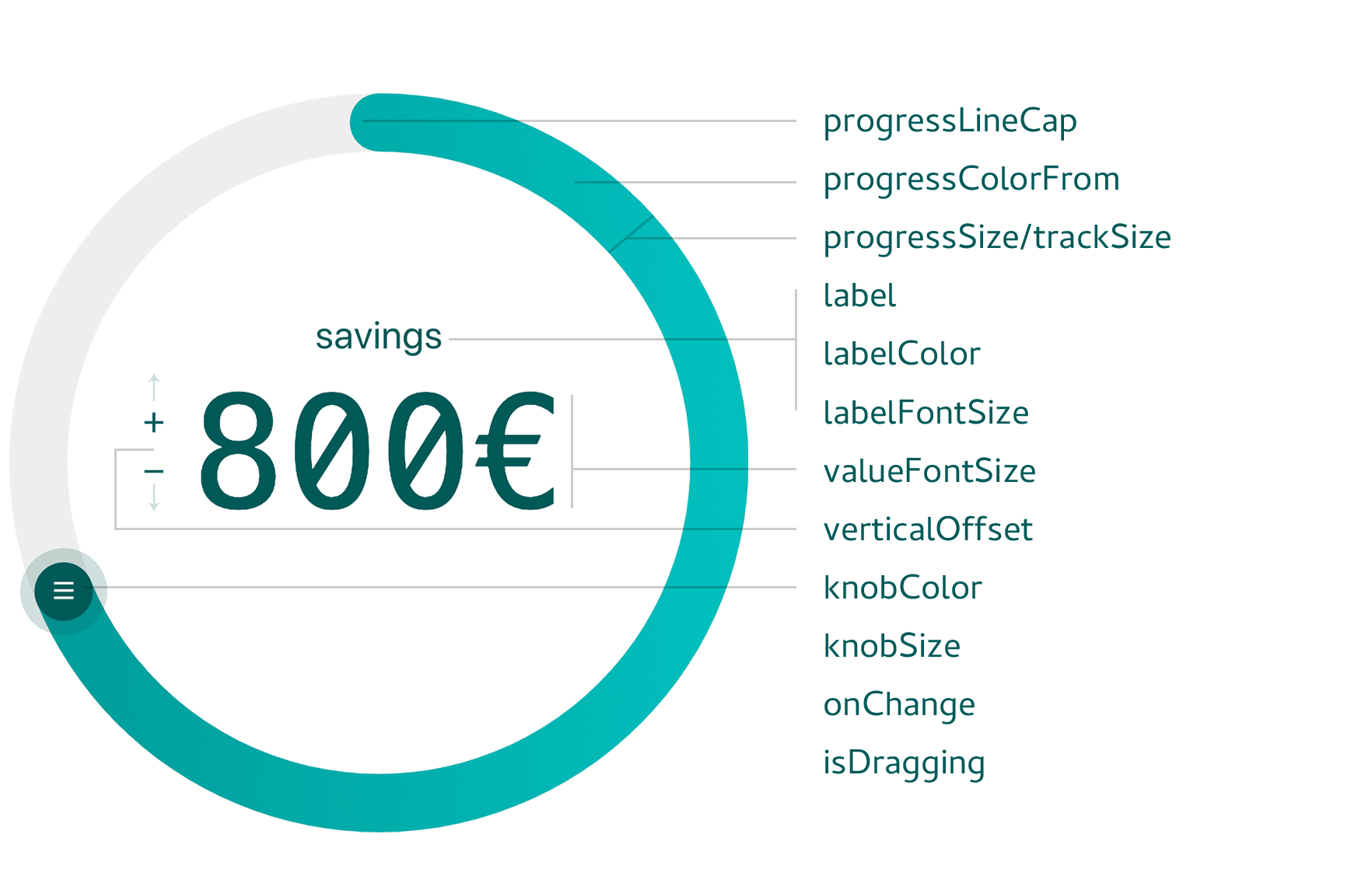
The table below lists all available props along with their TypeScript types, default values, and descriptions.
| Prop | Type | Default | Description |
|---------------------------|---------------------------------------------------------|-------------------------------------------|----------------------------------------------------------------------------------------------------------|
| `width` | `number` | `280` | Width of the slider in pixels. |
| `direction` | `1 \| -1` | `1` | Rotation direction: `1` for clockwise, `-1` for anticlockwise. |
| `min` | `number` | `0` | Minimum value. |
| `max` | `number` | `360` | Maximum value. |
| `initialValue` | `number` | `0` | Initial value for the label. |
| `data` | `(string \| number)[]` | `[]` | Array of values or labels, evenly spread over 360°. |
| `dataIndex` | `number` | `0` | Initial index position in the data array. |
| `knobColor` | `string` | `"#4e63ea"` | Color of the knob. |
| `knobSize` | `number` | `32` | Diameter of the knob in pixels. |
| `hideKnob` | `boolean` | `false` | If `true`, the knob is hidden. |
| `hideKnobRing` | `boolean` | `false` | If `true`, the translucent ring around the knob is hidden. |
| `knobDraggable` | `boolean` | `true` | If `true`, the knob is draggable. |
| `knobPosition` | `string \| number` | `"top"` | Starting position: accepts `"top"`, `"right"`, `"bottom"`, `"left"` or an angle (in degrees). |
| `label` | `string` | `"ANGLE"` | Text label displayed on the slider. |
| `labelColor` | `string` | `"#272b77"` | Color of the label and value text. |
| `labelBottom` | `boolean` | `false` | If `true`, the label is positioned below the slider. |
| `labelFontSize` | `string` | `"1rem"` | Font size of the label. |
| `valueFontSize` | `string` | `"4rem"` | Font size of the displayed value. |
| `appendToValue` | `string` | `""` | Text appended to the value. |
| `prependToValue` | `string` | `""` | Text prepended to the value. |
| `renderLabelValue` | `React.ReactNode` | `null` | Custom JSX for rendering the label and value. |
| `verticalOffset` | `string` | `"2rem"` | Vertical offset for the label/value display. |
| `hideLabelValue` | `boolean` | `false` | If `true`, both the label and value are hidden. |
| `progressColorFrom` | `string` | `"#80C3F3"` | Start color for the progress gradient. |
| `progressColorTo` | `string` | `"#4990E2"` | End color for the progress gradient. |
| `progressSize` | `number` | `8` | Thickness of the progress track. |
| `progressLineCap` | `"round" \| "butt"` | `"round"` | Cap style for the progress track. |
| `trackColor` | `string` | `"#DDDEFB"` | Color of the background track. |
| `trackSize` | `number` | `8` | Thickness of the background track. |
| `trackDraggable` | `boolean` | `false` | If `true`, allows dragging the background track. |
| `onChange` | `(value: string \| number) => void` | `() => {}` | Callback fired when the value changes. |
| `isDragging` | `(dragging: boolean) => void` | `() => {}` | Callback to signal whether the slider is being dragged. |
## Donation
If you find this component useful, please consider a small donation. Even one dollar helps maintain and develop new features!
[You can find the donate button on the bottom of the example page](https://fseehawer.github.io/react-circular-slider/)
## license
[MIT License](https://opensource.org/licenses/MIT)
## TypeScript Support
This component now has full **TypeScript** support! Enjoy full IntelliSense and strong type-checking out of the box.
*JavaScript users: No worries – the published output is plain JavaScript and works exactly as before.*
## Installation
```bash
npm install @fseehawer/react-circular-slider
```
## example
```javascript
import React from 'react';
import CircularSlider from '@fseehawer/react-circular-slider';
const App: React.FC = () => (
<>
console.log(value)} />
);
export default App;
```
## Custom Configuration
Customize properties such as the label, colors, data set, and more:
```javascript
import React from 'react';
import CircularSlider from '@fseehawer/react-circular-slider';
const App: React.FC = () => (
<>
console.log(value)}
/>
);
export default App;
```
## Props
The table below lists all available props along with their TypeScript types, default values, and descriptions.
| Prop | Type | Default | Description |
|---------------------------|---------------------------------------------------------|-------------------------------------------|----------------------------------------------------------------------------------------------------------|
| `width` | `number` | `280` | Width of the slider in pixels. |
| `direction` | `1 \| -1` | `1` | Rotation direction: `1` for clockwise, `-1` for anticlockwise. |
| `min` | `number` | `0` | Minimum value. |
| `max` | `number` | `360` | Maximum value. |
| `initialValue` | `number` | `0` | Initial value for the label. |
| `data` | `(string \| number)[]` | `[]` | Array of values or labels, evenly spread over 360°. |
| `dataIndex` | `number` | `0` | Initial index position in the data array. |
| `knobColor` | `string` | `"#4e63ea"` | Color of the knob. |
| `knobSize` | `number` | `32` | Diameter of the knob in pixels. |
| `hideKnob` | `boolean` | `false` | If `true`, the knob is hidden. |
| `hideKnobRing` | `boolean` | `false` | If `true`, the translucent ring around the knob is hidden. |
| `knobDraggable` | `boolean` | `true` | If `true`, the knob is draggable. |
| `knobPosition` | `string \| number` | `"top"` | Starting position: accepts `"top"`, `"right"`, `"bottom"`, `"left"` or an angle (in degrees). |
| `label` | `string` | `"ANGLE"` | Text label displayed on the slider. |
| `labelColor` | `string` | `"#272b77"` | Color of the label and value text. |
| `labelBottom` | `boolean` | `false` | If `true`, the label is positioned below the slider. |
| `labelFontSize` | `string` | `"1rem"` | Font size of the label. |
| `valueFontSize` | `string` | `"4rem"` | Font size of the displayed value. |
| `appendToValue` | `string` | `""` | Text appended to the value. |
| `prependToValue` | `string` | `""` | Text prepended to the value. |
| `renderLabelValue` | `React.ReactNode` | `null` | Custom JSX for rendering the label and value. |
| `verticalOffset` | `string` | `"2rem"` | Vertical offset for the label/value display. |
| `hideLabelValue` | `boolean` | `false` | If `true`, both the label and value are hidden. |
| `progressColorFrom` | `string` | `"#80C3F3"` | Start color for the progress gradient. |
| `progressColorTo` | `string` | `"#4990E2"` | End color for the progress gradient. |
| `progressSize` | `number` | `8` | Thickness of the progress track. |
| `progressLineCap` | `"round" \| "butt"` | `"round"` | Cap style for the progress track. |
| `trackColor` | `string` | `"#DDDEFB"` | Color of the background track. |
| `trackSize` | `number` | `8` | Thickness of the background track. |
| `trackDraggable` | `boolean` | `false` | If `true`, allows dragging the background track. |
| `onChange` | `(value: string \| number) => void` | `() => {}` | Callback fired when the value changes. |
| `isDragging` | `(dragging: boolean) => void` | `() => {}` | Callback to signal whether the slider is being dragged. |
## Donation
If you find this component useful, please consider a small donation. Even one dollar helps maintain and develop new features!
[You can find the donate button on the bottom of the example page](https://fseehawer.github.io/react-circular-slider/)
## license
[MIT License](https://opensource.org/licenses/MIT)