@huds0n/components
[]()
[](https://github.com/JontiHudson/modules-huds0n-components/issues)
[](https://github.com/JontiHudson/modules-huds0n-components/pulls)
[](/LICENSE)
---
Enhanced components for React Native.Badge, Button, FadeOverlay, FlatList, Icon, Pressable, ScrollView, and View.
## 📝 Table of Contents
- [About](#about)
- [Components](#components)
- [Getting Started](#getting_started)
- [Usage](#usage)
- [Badge](#badge)
- [Button](#button)
- [FadeOverlay](#fade_overlay)
- [FadeOverlayContainer](#fade_overlay_container)
- [FlatList](#flat_list)
- [Icon](#icon)
- [Pressable](#pressable)
- [ScrollView](#scroll_view)
- [View](#view)
- [Authors](#authors)
- [Acknowledgments](#acknowledgement)
## 🧐 About
Enhanced common react native components!
## ✅ List of Components
- **Badge:** _Numbered badge, similar to IOS notification badge._
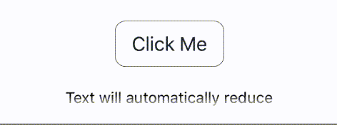
- **Button:** _Highly customizable button, with built-in spinner._
- **FadeOverlay:** _Overlay container that enables fading at component edges._
- **FlatList:** _Enhanced to have built-in pull to refresh, scroll fading, and more._
- **Icon:** _Use either image or vector icon props, and optional badge._
- **Pressable:** _Easily control feedback._
- **ScrollView:** _Automatic scroll to focus when used with [@huds0n/inputs](https://github.com/JontiHudson/modules-huds0n-inputs), dynamically disables scrolling when content less than view._
- **View:** Has onPressThrough method and enables passing layout directly to children.\_
## 🏁 Getting Started
### **Prerequisites**
Requires **React Native** 0.63 or above. If using **Expo** install **@expo/vector-icons** and **expo-linear-gradient**, otherwise install and link **react-native-vector-icons** and **react-native-linear-gradient**.
### **Installing**
```
npm i @huds0n/components
```
## 🧑💻 Usage
### **Badge**
| Prop | Required/(_Default_) | Description | Type |
| -------------- | :------------------: | -------------------------------------------------------------------------------------------------------------- | -------------------------------- |
| color | _#E63B2E_ | Background color | _string_ |
| containerStyle | - | Badge container style | _viewstyle_ |
| maxValue | _9_ | Over this value the badge will just show a plusPrevents large badge values which will be difficult to see | _number_ |
| offset | - | Translates badge to the right offset | _{ x?: number,y?: number }_ |
| size | 14 | Size of badge | _number_ |
| textColor | _#FFFFFF_ | Text color | _string_ |
| textStyle | _#FFFFFF_ | Button text style color | _textStyle_ |
| value | ✔ | Current badge value | _number_ |
### **Button**
_Inherits all [Pressable props](#pressable)._
| Prop | Required/(_Default_) | Description | Type |
| ------------------- | :------------------: | -------------------------------------------------------------------------------------------------------------------------------------------------------------------- | ----------- |
| color | - | Background color | _string_ |
| disabledLabelStyle | - | Label style when disabled | _textStyle_ |
| disabledStyle | - | Disabled container style | _viewstyle_ |
| dismissInputOnPress | true | If true, input is dismissed on button press | _boolean_ |
| label | - | Label textAlso set by passing a string as a child prop | _string_ |
| labelStyle | - | Label style | _textStyle_ |
| pressedStyle | - | Pressed container style | _viewstyle_ |
| pressedLabelStyle | - | Pressed label style | _textStyle_ |
| spinner | false | Show activitity indicatior instead of label | _boolean_ |
| spinnerColor | _#FFFFFF_ | Color of activity indicator | _string_ |
| spinnerStyle | - | Spinner container style | _viewStyle_ |
| style | - | Base container style | _viewstyle_ |
| useIsConnected | - | If true, becomes disabled when there is no networkRequires [@huds0n/network-manager](https://github.com/JontiHudson/modules-huds0n-network-manager) initialized | _boolean_ |
### **FadeOverlay**
| Prop | Required/(_Default_) | Description | Type |
| --------- | :------------------: | ------------------------------- | ------------------------------------------- |
| color | _#FFFFFF_ | Oapaque color color | _string_ |
| height | - | Height of container | _number_ or _string_ |
| intensity | 2 | The rate fade | _integer_ |
| position | _TOP_ | Defines which direction to fade | _'TOP'_, _'BOTTOM'_, _'LEFT'_, or _'RIGHT'_ |
| width | - | Width of container | _number_ or _string_ |
### **FadeOverlayContainer**
| Prop | Required/(_Default_) | Description | Type |
| ------ | :------------------: | ----------- | ------------------------------------------------- |
| top | - | Top fade | _[FadeOverlay Props](#fade_overlay)_ or _boolean_ |
| bottom | - | Bottom fade | _[FadeOverlay Props](#fade_overlay)_ or _boolean_ |
| left | - | Left fade | _[FadeOverlay Props](#fade_overlay)_ or _boolean_ |
| right | - | Right fade | _[FadeOverlay Props](#fade_overlay)_ or _boolean_ |
_This component can be placed within any view, quickly adding fading to any/all sides. If option is true a standard white fade is used_
### **FlatList**
_Like the **ScrollView**, the **FlatList** will automatically disable its scroll if the conents are smaller than the container._
| Prop | Required/(_Default_) | Description | Type |
| ---------------------- | :------------------: | ------------------------------------------------------------------------ | ------------------------------------------------------- |
| activityIndicatorColor | - | Activity indicator color on pull to refresh | _string_ |
| fade | - | Controls edge fading | _[FadeOverlayContainer Props](#fade_overlay_container)_ |
| keyName | - | Extract key from an element's propertyData elements must be objects | key of data element |
| onPullToRefresh | - | Adds **Refresh Control**, runs on pulling down | _() => (void \| Promise\)_ |
### **Icon**
_Inherits all [Pressable props](#pressable) except style._
| Prop | Required/(_Default_) | Description | Type |
| ------------------- | :------------------: | --------------------------------------------- | ------------------------------------------------------------------- |
| badge | _0_ | Adds badge with value | _number_ |
| dismissInputOnPress | _true_ | If true, input is dismissed on icon press | _boolean_ |
| | | |
| backgroundColor | - | Background color | _string_ |
| badgeProps | - | Style badge | [Badge props](#badge) |
| color | - | Icon color | _string_ |
| containerStyle | - | Badge container style | _viewstyle_ |
| size | _20_ | Icon size | _number_ |
| | | |
| Component | - | Icon component | _React.Component_ |
| | | | |
| imageProps | - | Icon image component props, if source is used | _[Image Props](https://reactnative.dev/docs/image)_ |
| source | - | Icon image source | _[Image Source](https://reactnative.dev/docs/image#source)_ |
| | | |
| set | - | VectorIcon set name | _[Set Name](https://oblador.github.io/react-native-vector-icons/)_ |
| name | - | VectorIcon icon name | _[Icon Name](https://oblador.github.io/react-native-vector-icons/)_ |
| | | |
| disableProps | - | Over-ride props when disabled | (any of the above) |
| pressedProps | - | Over-ride props when pressed | (any of the above) |
_**Icon** will preferentially be a vector icon if there is a name and set, then an image icon if there is a source, and finally a component icon._
### **Pressable**
_Inherits all [React Native's Pressable props](https://reactnative.dev/docs/next/pressable) except style._
| Prop | Required/(_Default_) | Description | Type |
| ----------------- | :------------------: | ------------------------------------------------------------------------------------------------------------------------------------- | --------------------------------------------------------------------------------------- |
| android_ripple | false | Adds ripple effect as feedback to android devicesIf true, defaults to darker background color | _[RippleConfig](https://reactnative.dev/docs/next/pressable#rippleconfig)_ or _boolean_ |
| feedback | 'none' | Type of feedback | _'fade'_, _'hightlight'_, or _'none'_ |
| feedbackIntensity | - | The intensity of the fade, highlight, or ripple | _number_ |
| whilePress | - | Take a function that return another functionThe initial function is called on pressThe return function is called on release | _() => () => void_ |
### **ScrollView**
_Like the **FlatList**, the **ScrollView** will automatically disable its scroll if the conents are smaller than the container.Also, if the [@huds0n/inputs](https://github.com/JontiHudson/modules-huds0n-inputs) module is being used, the **ScrollView** will automatically scroll to ensure any focused input is in view._
| Prop | Required/(_Default_) | Description | Type |
| ------------ | :------------------: | ----------------------------------------------------------------------------- | ------------------------------------------------------- |
| inputPadding | _20_ | The amount of padding the **ScrollView** will ensure focused inputs will have | _number_ |
| fade | - | Controls edge fading | _[FadeOverlayContainer Props](#fade_overlay_container)_ |
### **View**
_Inherits all [React Native's View props](https://reactnative.dev/docs/next/view)._
| Prop | Required/(_Default_) | Description | Type |
| -------------- | :------------------: | ------------------------------------------------------------------------------------------------------ | ------------------------------------------------ |
| onPressThrough | - | Called whenever the view captures a touch eventHowever, touch event still passed down to children | _() => any_ |
| children | - | Accepts either children or function that receives layout | _React Node_ or _(layout: Layout) => React Node_ |
_Similar to **Pressable**, **View** can take a function. This function passes in **Layout** which can be directly used. **Layout** is undefined initally as it is calculated on mount. Once calculated, height, width, x, and y are available to use._
```jsx
import { View } from '@huds0n/components';
export function ExampleFunction() {
return (
{(layout) =>
layout && (
This text will grow with View size
)
}
);
}
```
## ✍️ Authors
- [@JontiHudson](https://github.com/JontiHudson) - Idea & Initial work
- [@MartinHudson](https://github.com/martinhudson) - Support & Development
See also the list of [contributors](https://github.com/JontiHudson/modules-huds0n-shared-state-store-rn/contributors) who participated in this project.
## 🎉 Acknowledgements
- Special thanks to my fiance, Arma, who has been so patient with all my extra-curricular work.