
Storybook CSS Custom Properties Addon
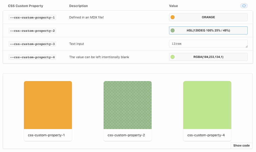
## Installation
```sh
npm i -D @ljcl/storybook-addon-cssprops
```
Enable the addon in [`.storybook/main.js`](https://storybook.js.org/docs/react/configure/overview#configure-your-storybook-project):
```js
module.exports = {
addons: ["@ljcl/storybook-addon-cssprops"],
};
```
To use it inside MDX, or when customising the docs page:
```js
import { CssPropsBlock } from "@ljcl/storybook-addon-cssprops";
```
## Usage
Include your CSS Custom Properties without the initial `--` prefix, the addon will apply and document this automatically.
```jsx
export default {
title: "Simple Component",
parameters: {
cssprops: {
"css-custom-property-1": {
value: "hsl(120deg 100% 25% / 49%)",
description: "Optional description",
},
}
},
} as Meta;
```
## Configuration
The addon can be configured wherever other [parameters](https://storybook.js.org/docs/react/writing-stories/parameters) can be configured (at the Global, Story, or individual story level). It will also attempt to detect between `colour` and `text`, this can be overriden by specifying the `control` property.
```ts
parameters: {
cssprops: {
// Disable the addon by setting disable to true:
disable: false,
// Override the detected default control type:
"override-property-detection-type": {
value: "green",
control: "text",
description: "Maybe you want 'green' for reasons differing to colour"
},
// Override the detected default control type:
"optional-category-or-subcategory": {
value: "red",
category: "Optional",
subcategory: "Very Optional",
description: "This property will be grouped under a category called 'Optional', and then a further subcategory of 'Very Optional'",
},
// Customise preset colours for the colourpicker
presetColors: ['#FFF']
}
}
```
### Adding to DocsPage and MDX
#### DocsPage
Modify the docs page based by [following the storybook docs](https://storybook.js.org/docs/react/writing-docs/docs-page#remixing-docspage-using-doc-blocks). Including `` where you prefer.
## Development
This monorepo uses npm@7 workspaces, run `npm i` at the root.
### TODO
- [ ] Look for the args of a defined component when in MDX
- [ ] Better specificity when injecting styles (with & without iframes)
- [ ] Reset the default values without requiring a page refresh (ArgsTable)