# Noa Jalali DatePicker
A modern, Persian (Jalali) date picker for React applications with full Tailwind CSS support. This date picker provides a sleek and user-friendly interface for selecting dates with extensive customization options.
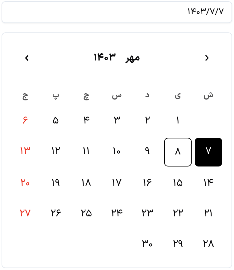
## Demo
## Screenshots
Demo page: [Noa Jalali Datepicker](https://freecyberhawk.github.io/noa_jalali_datepicker/)
## Installation
### npm
```bash
npm install noa-jalali-datepicker
```
### yarn
```bash
yarn add noa-jalali-datepicker
```
## Usage
### Basic Usage
```javascript
import React, { useState } from 'react';
import { DatePicker } from 'noa-jalali-datepicker';
const App: React.FC = () => {
const [selectedDate, setSelectedDate] = useState(null);
return (
setSelectedDate(date)}
className="w-72"
/>
);
};
export default App;
```
### With Tailwind Customization
```javascript
import React, { useState } from 'react';
import { DatePicker } from 'noa-jalali-datepicker';
const App: React.FC = () => {
const [selectedDate, setSelectedDate] = useState(null);
return (
setSelectedDate(date)}
className="w-72"
inputClassName="border-gray-300 focus:border-blue-500 focus:ring-blue-500"
popupClassName="w-72 bg-white dark:bg-gray-800"
selectedDayClassName="bg-blue-500 text-white hover:bg-blue-600"
holidayClassName="text-red-500 dark:text-red-400"
todayClassName="ring-2 ring-blue-500"
size="md"
dir="rtl"
/>
);
};
```
## Features
- **Tailwind CSS Support**: Full integration with Tailwind CSS for extensive styling
- **Light and Dark Themes**: Built-in support for light and dark modes
- **Modern Design**: Flat design with customizable rounded corners
- **User-Friendly**: Intuitive interface for date selection
- **Responsive**: Fully responsive design for all screen sizes
- **RTL Support**: Built-in support for right-to-left languages
## Props
| Prop | Type | Description |
|------------------------|---------------------------------------|---------------------------------------------------------|
| `value` | `string \| null` | Selected date value |
| `onChange` | `(date: string) => void` | Callback when date changes |
| `disabled` | `boolean` | Disable the date picker |
| `placeholderText` | `string` | Placeholder text |
| `size` | `"xs" \| "sm" \| "md" \| "lg" \| "xl"` | Size of the date picker |
| `dir` | `"rtl" \| "ltr"` | Text direction |
| `className` | `string` | Container Tailwind classes |
| `inputClassName` | `string` | Input field Tailwind classes |
| `popupClassName` | `string` | Popup container Tailwind classes |
| `headerClassName` | `string` | Header Tailwind classes |
| `weeksClassName` | `string` | Week row Tailwind classes |
| `weekItemClassName` | `string` | Week day item Tailwind classes |
| `daysClassName` | `string` | Days grid Tailwind classes |
| `dayClassName` | `string` | Day item Tailwind classes |
| `selectedDayClassName` | `string` | Selected day Tailwind classes |
| `holidayClassName` | `string` | Holiday Tailwind classes |
| `todayClassName` | `string` | Today Tailwind classes |
| `monthsGridClassName` | `string` | Months grid Tailwind classes |
| `monthItemClassName` | `string` | Month item Tailwind classes |
| `selectedMonthClassName`| `string` | Selected month Tailwind classes |
| `yearsGridClassName` | `string` | Years grid Tailwind classes |
| `yearItemClassName` | `string` | Year item Tailwind classes |
| `selectedYearClassName`| `string` | Selected year Tailwind classes |
| `arrowClassName` | `string` | Navigation arrow Tailwind classes |
## Default Tailwind Classes
The component comes with sensible defaults that you can override:
```javascript
const defaultClasses = {
container: 'relative',
input: 'w-full px-3 py-2 border rounded-lg shadow-sm focus:outline-none focus:ring-2',
popup: 'absolute mt-1 bg-white rounded-lg shadow-lg z-50',
selectedDay: 'bg-blue-500 text-white hover:bg-blue-600',
holiday: 'text-red-500',
today: 'ring-2 ring-blue-500'
// ... more defaults available
}
```
## Dark Mode Support
The date picker supports Tailwind's dark mode out of the box. Example usage:
```javascript
```
## Authors
- [FreeCyberHawk](https://github.com/freecyberhawk)
- [YousefZare](https://github.com/yousefZare2000)
## License
MIT