# apsl-react-native-button

This is a forked repository of [apsl/react-native-button](https://github.com/apsl/react-native-button), rewritten in TypeScript.

<img src="https://travis-ci.org/APSL/react-native-button.svg?branch=master" />
<img src="https://img.shields.io/badge/coverage-82%25-green.svg" />
<img src="https://img.shields.io/npm/dm/apsl-react-native-button.svg" />

A React Native button component customizable via `style` props.

<p align="center">
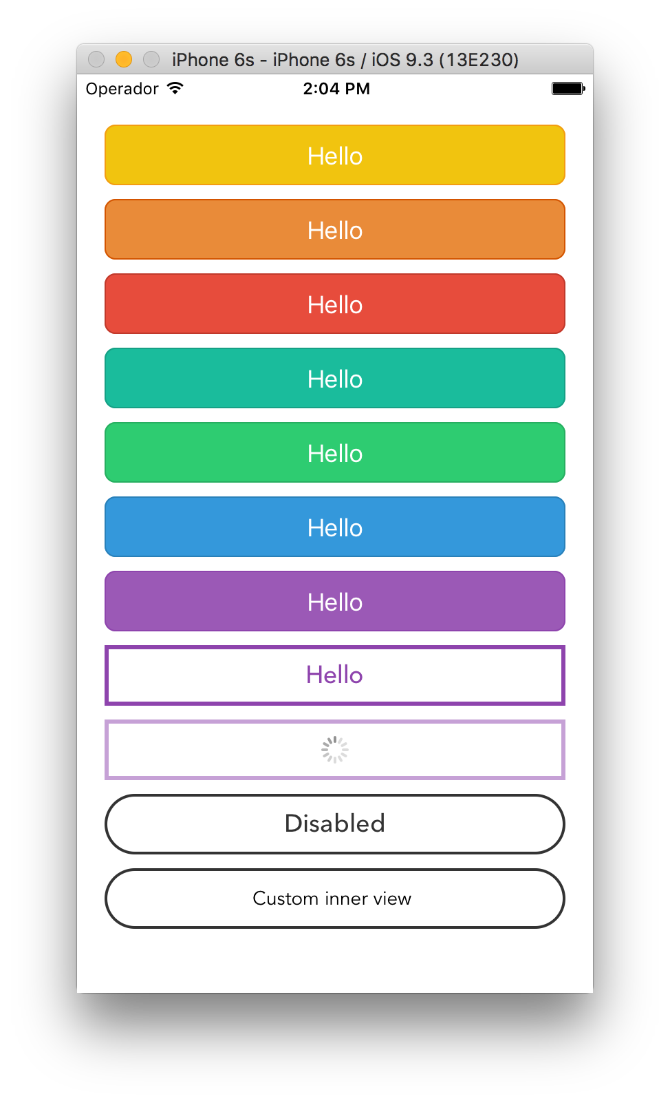
<img src="https://raw.githubusercontent.com/wiki/APSL/react-native-button/button.png" alt="Button component screenshot" width="400">
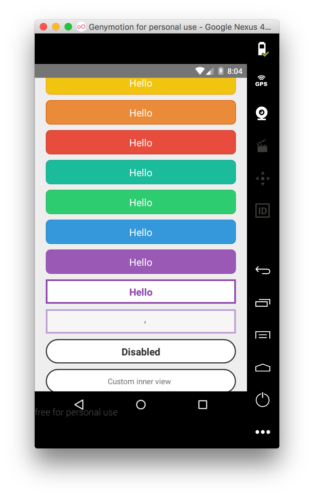
<img src="https://raw.githubusercontent.com/wiki/APSL/react-native-button/and.png" alt="Android Button component screenshot" width="400">
</p>

Renders a `TouchableOpacity` under iOS and a `TouchableNativeFeedback` under Android.

## Install

`apsl-react-native-button>=2.6.0` needs React Native 0.28 or higher.
`apsl-react-native-button>=2.5.0` needs React Native 0.25 or higher.
`apsl-react-native-button<=2.4.2` needs React Native 0.16 or higher.

Install the package:

```bash
$ yarn add @naturalclar/apsl-react-native-button --save
```

Import the `Button` component:

```javascript
import Button from '@naturalclar/apsl-react-native-button';
```

## Usage

Provide `TouchableWithoutFeedback`' props to the component (including `style`),
`textStyle`'s `StyleSheet` to customize the inner text and a children node
to render. You can also provide the `isLoading` prop that will dim the button
and disable it to prevent accidental taps.

```javascript
<Button style={{backgroundColor: 'red'}} textStyle={{fontSize: 18}}>
  Hello!
</Button>
```

You can also provide a `<Button>` element with nested children that are not strings
or `<Text>` elements as long as they are valid React elements or numbers. This helps
if your project is using another library that provides easy icon integration
utilizing the `<i>` tag, for instance, as well as various other cases where you are
creating visually complex buttons. You may omit the `textStyle` property and apply
your own styles to your child elements as you see fit. Multiple children are allowed.

```javascript
<Button style={{backgroundColor: 'blue'}}>
  <View style={styles.nestedViewStyle}>
    <Text style={styles.nestedTextStyle}>Nested views!</Text>
  </View>
</Button>
```

## API

| Prop                     | Type                                           | Description                                                                                                                                                                                                   |
| ------------------------ | ---------------------------------------------- | ------------------------------------------------------------------------------------------------------------------------------------------------------------------------------------------------------------- |
| `onPress`                | `func`                                         | Function to execute when the `onPress` event is triggered.                                                                                                                                                    |
| `onPressIn`              | `func`                                         | Function to execute when the `onPressIn` event is triggered.                                                                                                                                                  |
| `onPressOut`             | `func`                                         | Function to execute when the `onPressOut` event is triggered.                                                                                                                                                 |
| `onLongPress`            | `func`                                         | Function to execute when the `onLongPress` event is triggered.                                                                                                                                                |
| `textStyle`              | `TextStylePropTypes`                           | The StyleSheet to apply to the inner button text.                                                                                                                                                             |
| `disabledStyle`          | `TextStylePropTypes`                           | The StyleSheet to apply when disabled.                                                                                                                                                                        |
| `children`               | `string`, `number`, `React.Element`,or `array` | The child nodes to render inside the button. If child is `string` or `number`, it will be rendered inside of a `<Text>` element with `textStyle` applied if present. Multiple children are allowed (`array`). |
| `isLoading`              | `bool`                                         | Renders an inactive state dimmed button with a spinner if `true`.                                                                                                                                             |
| `isDisabled`             | `bool`                                         | Renders an inactive state dimmed button if `true`.                                                                                                                                                            |
| `activeOpacity`          | `Number`                                       | The button onpressing transparency (Usually with a point value between 0 and 1).                                                                                                                              |
| `activityIndicatorColor` | `string`                                       | Sets the button of the `ActivityIndicatorIOS` or `ProgressBarAndroid` in the loading state.                                                                                                                   |
| `background`             | `TouchableNativeFeedback.propTypes.background` | **Android only**. The background prop of `TouchableNativeFeedback`.                                                                                                                                           |

Check the included example for more options.

## Similar projects

[James Ide](https://github.com/ide/)'s `react-native-button` https://github.com/ide/react-native-button/

## License

MIT.