# react-freshdesk-widget [](https://scrutinizer-ci.com/g/Personare/react-freshdesk-widget/build-status/master)
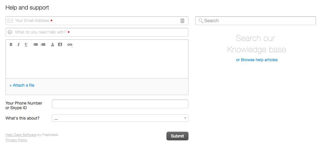
> A component of React for use the Freshdesk Widget
## Demo
[Check it live :)](https://personare.github.io/react-freshdesk-widget)
## Installation
```bash
yarn add @personare/react-freshdesk-widget
```
## Basic Usage
```js
import FreshdeskWidget from '@personare/react-freshdesk-widget';
...
render() {
return (
);
}
...
```
## With custom button
```js
import FreshdeskWidget from '@personare/react-freshdesk-widget';
...
render() {
return (
);
}
...
```
## Props
* [`url`](#urlProperty) - *required*
* [`type`](#typeProperty) - *one of ['pop-up', 'incorporated']*
* [`formTitle`](#formTitleProperty) - *default: Help and support*
* [`formHeight`](#formHeightProperty) - *default: 500px*
* [`submitThanks`](#submitThanksProperty) - *default: Thank you, one of our representatives will respond to you soon! =)*
* [`buttonType`](#buttonTypeProperty) - *only if the type property are equal 'pop-up'*
* [`buttonText`](#buttonTextProperty) - *only if the type property are equal 'pop-up'*
* [`buttonColor`](#buttonColorProperty) - *only if the type property are equal 'pop-up'*
* [`buttonOffset`](#buttonOffsetProperty) - *only if the type property are equal 'pop-up'*
* [`buttonPosition`](#buttonPositionProperty) - *only if the type property are equal 'pop-up'*
* [`buttonBackgroundColor`](#buttonBackgroundColorProperty) - *only if the type property are equal 'pop-up'*
* [`buttonBackgroundImage`](#buttonBackgroundImageProperty) - *only if the type property are equal 'pop-up'*
* [`autofill`](#autofillProperty) - *allows autofilling fields*
#### `url` (required)
An URL of the service of your Freshdesk
For example:
```js
...
render() {
return (
);
}
...
```
#### `type` - one of ['pop-up', 'incorporated']
The type of widget you want to insert the page.
Currently you can perform through two ways:
1. Through a pop-up where the user must click to display the widget.
2. Incorporating direct in your HTML.
*default: incorporated*
For example:
```js
...
render() {
return (
);
}
...
```
#### `formTitle` (optional)
What will be the title of the form.
*default: Help and support*
For example:
```js
...
render() {
return (
);
}
...
```
#### `formHeight`
The height of the form.
*default: 500px*
For example:
```js
...
render() {
return (
);
}
...
```
#### `submitThanks`
The message that appears after the user send feedback.
*default: Thank you, one of our representatives will respond to you soon! =)*
For example:
```js
...
render() {
return (
);
}
...
```
#### `buttonType` - one of ['text', 'image']
The type of button when use pop-up.
*default: text*
Note: When do you use an image type is necessary to pass `buttonBackgroundImage` property.
For example:
```js
...
render() {
return (
);
}
...
```
#### `buttonText` - (optional)
The text of button.
*default: Support*
For example:
```js
...
render() {
return (
);
}
...
```
#### `buttonColor` - (optional)
The font color of button text.
*default: white*
For example:
```js
...
render() {
return (
);
}
...
```
#### `buttonBackgroundColor` - (optional)
The background-color of button.
*default: #015453*
For example:
```js
...
render() {
return (
);
}
...
```
#### `buttonPosition` - one of ['left', 'right', 'top', 'bottom']
The position of button in the window.
*default: top*
For example:
```js
...
render() {
return (
);
}
...
```
#### `buttonOffset` - (optional)
The offset of button.
*default: 235px*
For example:
```js
...
render() {
return (
);
}
...
```
#### `buttonBackgroundImage` - (optional)
When you use the `buttonType` with image, need to specify the URL and this property is for this.
*default: 235px*
For example:
```js
...
render() {
return (
);
}
...
```
#### `autofill` - (optional)
If you want to fill any of the fields in with data from your application you
can do that here. This doesn't work for custom fields.
For example:
```js
...
render() {
return (
);
}
...
```
## Development
To start developing in the project run:
```bash
yarn serve
```
Then ready at `http://localhost:9001`.
## Tests
Just run:
```bash
yarn test
```
*This scaffolding will be generated by* [@Personare/react-component-generator](https://github.com/Personare/react-component-generator)