[](https://badge.fury.io/js/%40react-theming%2Fstorybook-addon)
[](https://react-theming.github.io/storybook-addon)
# Storybook Addon @ React Theming
Storybook addon for Styled Components, Emotion, Material-UI and any other theming solution. Allows to develop themed components in isolation.
```shell
npm i --save-dev @react-theming/storybook-addon
```
[Demo](https://react-theming.github.io/storybook-addon)
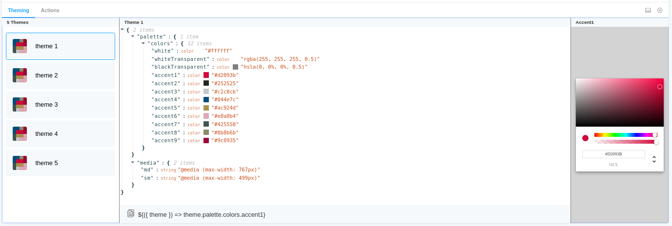
## Features :dizzy:
- Universal - can be used with any styling library
- Switching between themes from addon panel.
- Change a color and see how it affects to your components
- Easily copy-paste paths of nesting theme props into your code
- Auto changes background
- Supports dark Storybook theme
- Keep selected theme on stories updates
## Usage
specify addon in `.storybook/main.js`
```js
// .storybook/main.js
module.exports = {
stories: ['../src/**/*.stories.js'],
addons: ['@react-theming/storybook-addon'],
};
```
or in `.storybook/addons.js` for older versions of Storybook
```js
import '@react-theming/storybook-addon/register';
```
Then you'll need to add a decorator with a ThemeProvider of your library. This project is not related to any particular styling solutions, instead, you can use **any of theme providers** you're using in your project.
```js
import ThemeProvider from 'library-of-your-choice';
import { withThemes } from '@react-theming/storybook-addon';
import { theme } from '../src/theme';
// create decorator
const themingDecorator = withThemes(ThemeProvider, [theme]);
```
ThemeProvider should accept a theme via `theme` props. This is usually the case for the most common styling libraries like Styled Components, Emotion, Material-UI.
In case of non standard ThemeProvider you can pass `providerFn` function in options:
```js
const providerFn = ({ theme, children }) => {
return {children};
};
const themingDecorator = withThemes(null, [theme], { providerFn });
```
## Use your output of the selected value
```js
// .storybook/preview.js
import { ThemeProvider } from 'styled-components';
import { addDecorator } from '@storybook/react';
import { withThemes } from '@react-theming/storybook-addon';
import { theme } from '../src/theme';
```
### Example getCustomFieldSnippet
```js
const selectedValue = {
name: "accent5",
namespace: ["palette", "colors"],
type: "color",
value: "#ac924d"
}
const getCustomFieldSnippet = selectedValue => {
const { namespace, name } = selectedValue;
const path = namespace.join('.');
const fullPath = `${path}.${name}`;
const themeProp = `\${({ theme }) => theme.${fullPath}}`;
return themeProp;
};
// The snippet Func function takes the SelectedValue parameter and returns a string
addDecorator(withThemes(ThemeProvider, [theme], { getCustomFieldSnippet }));
```
### Example getCustomValueSnippet
By default, the addon outputs colors in HEX format, if you need some kind of add-in, then pass the colorSnippet parameter.
```js
const getCustomValueSnippet = ({value, name, type}) => {
// Here is your code
return value
};
// The colorSnipept function accepts an object consisting of { value : HEX, name: string, type: color}
addDecorator(withThemes(ThemeProvider, [theme], { getCustomValueSnippet }));
```
BACKGROUND COLOR
This addon has ability to auto change background color when it detect a dark theme. By default it checks if the theme name contains 'dark'.
You can customize this behavior by passing `onThemeSwitch` function:
```js
export const onThemeSwitch = context => {
const { theme } = context;
const background = theme.name === 'Dark theme' ? '#2c2f33' : 'white';
const parameters = {
backgrounds: {
default: background,
},
// Pass backgrounds: null to disable background switching at all
};
return {
parameters,
};
};
const themingDecorator = withThemes(null, [theme], { onThemeSwitch });
```
This way you can have own checks of what the theme is selected and pass what ever color you need.
!important: The addon change background color on each theme selecting. In some scenarios you might want to disable this behavior e.g. if you already using addon-backgrounds. You can disable background switching by passing `backgrounds: null` in parameters.
Below the use cases for most popular styling libraries:
## Using with Emotion
```js
// .storybook/preview.js
import { ThemeProvider } from '@emotion/react';
import { addDecorator } from '@storybook/react';
import { withThemes } from '@react-theming/storybook-addon';
import { theme } from '../src/theme';
// pass ThemeProvider and array of your themes to decorator
addDecorator(withThemes(ThemeProvider, [theme]));
```
## 💅 Using with Styled Components
```js
// .storybook/preview.js
import { ThemeProvider } from 'styled-components';
import { addDecorator } from '@storybook/react';
import { withThemes } from '@react-theming/storybook-addon';
import { theme } from '../src/theme';
// pass ThemeProvider and array of your themes to decorator
addDecorator(withThemes(ThemeProvider, [theme]));
```
## Using with Material-UI
```js
// theme.js
import { red } from '@material-ui/core/colors';
// A custom theme for this app
const theme = {
palette: {
primary: {
main: '#556cd6',
},
secondary: {
main: '#19857b',
},
error: {
main: red.A400,
},
background: {
default: '#fff',
},
},
};
export default theme;
```
```js
// .storybook/preview.js
import { ThemeProvider } from '@material-ui/core';
import { createMuiTheme } from '@material-ui/core/styles';
import { addDecorator } from '@storybook/react';
import { withThemes } from '@react-theming/storybook-addon';
import theme from '../src/theme';
const providerFn = ({ theme, children }) => {
const muTheme = createMuiTheme(theme);
return {children};
};
// pass ThemeProvider and array of your themes to decorator
addDecorator(withThemes(null, [theme], { providerFn }));
```
```js
// index.js
import React from 'react';
import ReactDOM from 'react-dom';
import { ThemeProvider } from '@material-ui/core/styles';
import { createMuiTheme } from '@material-ui/core/styles';
import App from './App';
import theme from './theme';
ReactDOM.render(
,
document.querySelector('#root'),
);
```
There is an example app with CRA, Material-UI and Storybook Addon [Demo](https://react-theming.github.io/theming-material-ui/) [Source](https://github.com/react-theming/theming-material-ui)
## Credits