# dammi falastini project 🇵🇸❤️
A lightweight, expressive React component library of corner banners and pop-ups for sites to express their solidarity with Palestine.

> This isn't the Palestinian flag. Palestine isn't a country for it to have a flag. Palestine is a condition. Every Arab is a Palestinian. Every poor man who carries a gun is a Palestinian. Palestine is the condition of us all.
>
> - Elias Khoury 🇱🇧 (Little Mountain)
## overview
`dammi-falastini` is a customizable React component library designed to help developers easily add visual indicators to express support for Palestine. Built with accessibility and performance in mind, this library includes animated, responsive, and _themable_ components that can be dropped into any React site.
Whether you're building a blog, portfolio, product site, or platform, these components offer a simple way to take a visible stance with minimal code.
### why this project?
Visibility matters, especially in the face of injustice. As a Lebanese engineer, the Palestinian cause is deeply personal as it's impacted all aspects of my life. It's embedded in our emotions, our history, and our culture. Like most in Lebanon, I grew up with an awareness of the struggle for Palestinian liberation that was undeniable, as the echoes of war, displacement, and resistance are an integral part of the Lebanese collective memory.
This library is a very small act of solidarity to help make visible what is often erased, silenced, or forgotten. By building tools that allow people to publicly, creatively, and proudly express support for the brotherly Palestinian people, I hope to encourage others to contribute to a broader culture of empathy, humanity, and resistance, abandoning silence for an unwavering commitment to justice.
Use whatever skills you have to stand with the oppressed until we're all standing. Please fork, adapt, and remix with the utmost love and without an ounce of fear.
> We have on this earth what makes life worth living.
>
> - Mahmoud Darwish 🇵🇸 (On This Land)
## tech stack
- ⚛️ React with TypeScript
- ⚡️ Powered by Vite
- 📖 Developed with Storybook
- 🧪 VRT with Chromatic
- 💫 Animations with Framer Motion
### peer deps
- `react`
- `react-dom`
- `motion`
## installation
```bash
npm install @repomadness/dammi-falastini
# or for yarn
yarn add @repomadness/dammi-falastini
```
## usage
This package contains:
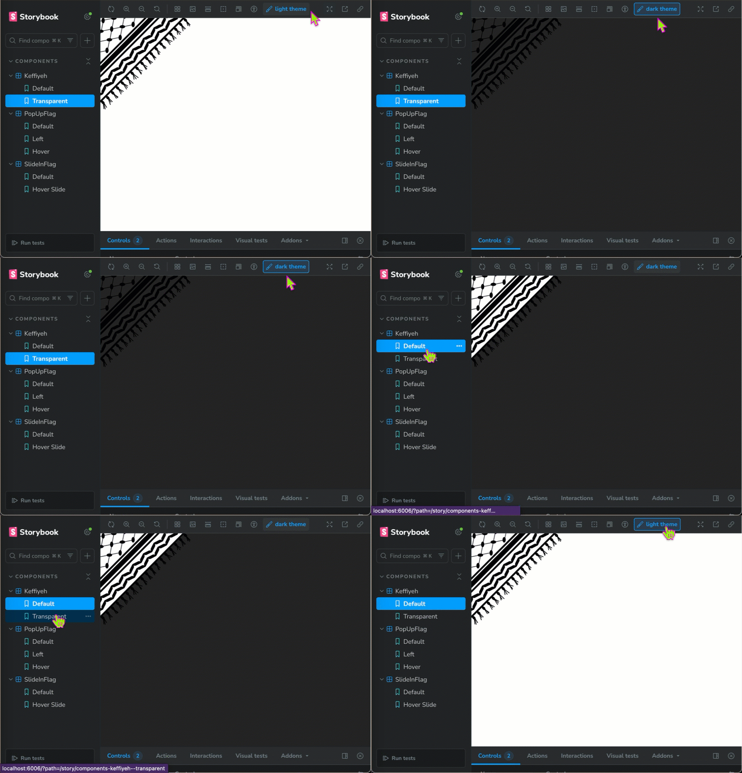
- `` - a corner banner/page peel component available with both a white (default) and transparent background
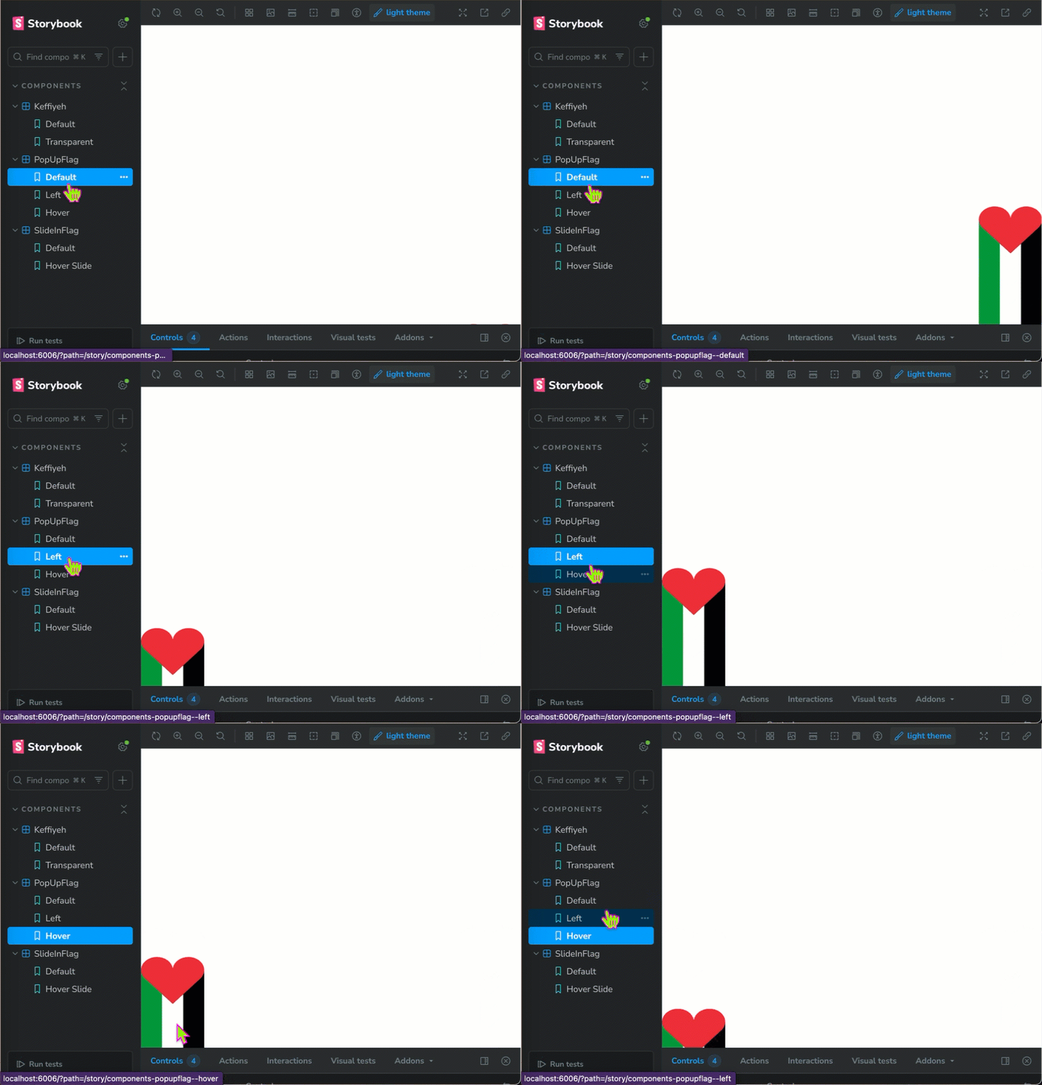
- `` - a corner banner that pops up at the bottom of a page, with automatic or hover animation options available
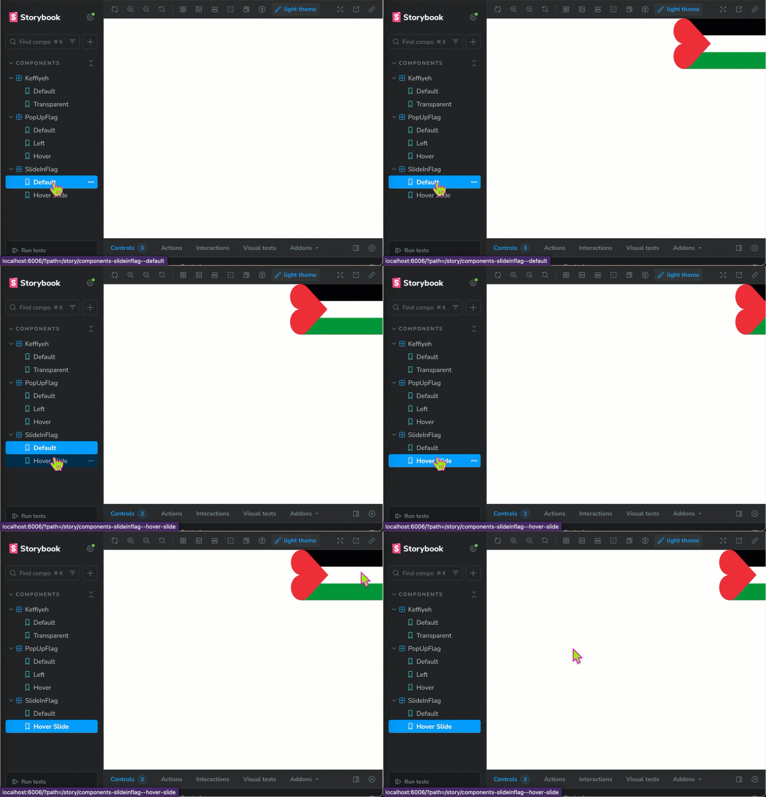
- `` - a corner banner that pops up in the top-right of a page, with automatic or hover animation options available
### Keffiyeh
```ts
import { Keffiyeh } from "@repomadness/dammi-falastini";
;
```
#### options
- `transparent` - the `Keffiyeh` component defaults to a white background, but has a built-in prop to set the background transparent
- `scale` - the component was built with a responsive design, though you can adjust the overall size using the `scale` option (ex. `scale={0.9}` to scale down)
- `designColor` - the primary color of the keffiyeh pattern defaults to black, but can be adjusted to match your theme
- `backgroundColor` - the default background color is white, but can be adjusted to match your theme
### PopUpFlag
```ts
import { PopUpFlag } from "@repomadness/dammi-falastini";
;
```
#### options
- `scale` - the component was built with a responsive design, though you can adjust the overall size using the `scale` option (ex. `scale={0.9}` to scale down)
- `position` - the position defaults to `right`, but can be updated to `left`
- `animationType` - defaults to `slideIn`, but can be changed to `hoverSlide`
- `initialDelay` - defaults to `0`, use to delay animation
### SlideInFlag
```ts
import { SlideInFlag } from "@repomadness/dammi-falastini";
;
```
#### options
- `scale` - the component was built with a responsive design, though you can adjust the overall size using the `scale` option (ex. `scale={0.9}` to scale down)
- `animationType` - defaults to `slideIn`, but can be changed to `hoverSlide`
- `initialDelay` - defaults to `0`, use to delay animation
## contributions
PRs are welcome. If you have ideas for new components or improvements to existing ones, please open an issue or PR.
```bash
git clone https://github.com/repomadness/dammi-falastini.git
cd dammi-falastini
npm install
npm run storybook
```
### releasing a new version
This project uses a manual release process via git tags and GitHub Actions. When a new tag is pushed, the `release.yml` workflow will automatically run in order to publish the package to npm. Releases are triggered on semantic version tags.
1. Bump the package version
To bump the version in `package.json`, use `npm version`:
```bash
npm version # [patch | minor | major]
# Examples
npm version patch # 1.0.0 -> 1.0.1
npm version minor # 1.0.1 -> 1.1.0
npm version major # 1.1.0 -> 2.0.0
```
This will do the following:
- update `package.json`/`package-lock.json`
- create a git tag (ex. `v1.2.0`)
2. Push changes
Push the changes and the tag:
```bash
git push origin main --follow-tags
```
This will push both the commit with the new version, as well as the associated git tag.
3. Allow GHA to publish
Once the tag is published, GHA will run the `release.yml` workflow. This will build the package and publish it to npm.
4. Verify release
Check the Actions tab to see if the `release` job was successful. Confirm the new version is live on npm.
## license
MIT © repomadness
Silence is a choice - use freely, stand firmly.