> This repository is for demonstration purposes of how it can be implemented in Angular and is not maintaned. Please fork and maintain your own version of this repository.

# ngx-accordion

Simple accordion control for your angular applications using bootstrap. Does not depend of jquery.
If you don't want to use it without bootstrap - simply create proper css classes. Please star a project if you liked it,
or create an issue if you have problems with it.
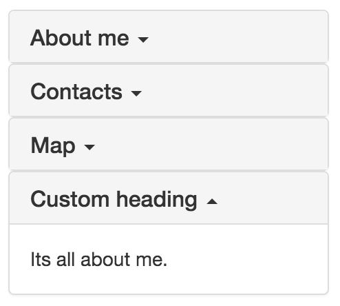

![angular 2 accordion](https://raw.githubusercontent.com/pleerock/ngx-accordion/master/resources/accordion-example.png)

## Installation

1. Install npm module:
    
    `npm install ngx-accordion --save`

2. If you are using system.js you may want to add this into `map` and `package` config:

    ```json
    {
        "map": {
            "ngx-accordion": "node_modules/ngx-accordion"
        },
        "packages": {
            "ngx-accordion": { "main": "index.js", "defaultExtension": "js" }
        }
    }
    ```

## Usage

Import `AccordionModule` in your app and start using component:

```typescript
<accordion [showArrows]="true" [closeOthers]="false" [expandAll]="true">
    <accordion-group heading="Accordion heading">
        <accordion-heading>
            Or <b>custom</b> <accordion-toggle>heading with clickable zone.</accordion-toggle>
        </accordion-heading>
        Accordion group contents.
    </accordion-group>
    ...
</accordion>
```

* `<accordion>`:

    Contains accordion groups.

    * `[showArrows]="true|false"` Indicates if arrows should be shown or not. Default is **false**
    * `[closeOthers]="true|false"` Indicates if other opened groups should be automatically closed when you open a new group. Default is **true**
    * `[expandAll]="true|false"` Indicates if all panels should be expanded by default. Default is false. If expandAll is set to true, then the closeOthers option has no effect, since all panels are opened.
* `<accordion-group>`:

    Used inside `<accordion>` and represents a single collapsible panel.

    * `heading="Group heading"` Simple text group heading
    * `[disabled]="true|false"` Indicates if this group is disabled or not (expandable or not)
    * `(onOpen)="doSomethingOnOpen()"` Calls function when this accordion-group is opened
    * `(onClose)="doSomethingOnClose()"` Calls function when this accordion-group is closed
    * `(onToggle)="doSomethingOnToggle(isOpened)"` Calls function when this accordion-group is toggled
    * `<accordion-heading>` Content zone where you can put custom headings

* `<accordion-toggle>`:

    Used inside `<accordion-group>` to provide a *custom clickable zone* for the accordion heading.
    This is usable when you have clickable controls in your header (for example checkbox) and you don't want
    accordion to be opened/closed on click of this controls.

## Sample

```typescript
import {Component} from "@angular/core";
import {AccordionModule} from "ngx-accordion";

@Component({
    selector: "app",
    template: `
<div class="container">

    <!-- regular accordion -->
    <accordion>
        <accordion-group heading="About me">
            Its all about me.
        </accordion-group>
        <accordion-group heading="Contacts">
            This is content of the contacts
        </accordion-group>
        <accordion-group heading="Map">
            Content of the Map
        </accordion-group>
        <accordion-group>
            <accordion-heading>
                Custom heading
            </accordion-heading>
            Its all about me.
        </accordion-group>
    </accordion>

    <!-- regular accordion with first opened group -->
    <accordion>
        <accordion-group heading="About me" [isOpened]="true">
            Its all about me.
        </accordion-group>
        <accordion-group heading="Contacts">
            This is content of the contacts
        </accordion-group>
        <accordion-group heading="Map">
            Content of the Map
        </accordion-group>
        <accordion-group>
            <accordion-heading>
                <b>Custom</b> <i style="color: deeppink">heading</i>
            </accordion-heading>
            Its all about me.
        </accordion-group>
    </accordion>

    <!-- accordion with arrows -->
    <accordion [showArrows]="true">
        <accordion-group heading="About me">
            Its all about me.
        </accordion-group>
        <accordion-group heading="Contacts">
            This is content of the contacts
        </accordion-group>
        <accordion-group heading="Map">
            Content of the Map
        </accordion-group>
        <accordion-group>
            <accordion-heading>
                Custom heading
            </accordion-heading>
            Its all about me.
        </accordion-group>
    </accordion>

    <!-- accordion where you can close multiple groups -->
    <accordion [closeOthers]="false">
        <accordion-group heading="About me">
            Its all about me.
        </accordion-group>
        <accordion-group heading="Contacts">
            This is content of the contacts
        </accordion-group>
        <accordion-group heading="Map">
            Content of the Map
        </accordion-group>
        <accordion-group>
            <accordion-heading>
                Custom heading
            </accordion-heading>
            Its all about me.
        </accordion-group>
    </accordion>

    <!-- accordion where all items are expanded by default -->
    <accordion [expandAll]="true">
        <accordion-group heading="About me">
            Its all about me.
        </accordion-group>
        <accordion-group heading="Contacts">
            This is content of the contacts
        </accordion-group>
        <accordion-group heading="Map">
            Content of the Map
        </accordion-group>
        <accordion-group>
            <accordion-heading>
                Custom heading
            </accordion-heading>
            Its all about me.
        </accordion-group>
    </accordion>

    <!-- accordion with custom "clickable zone" -->
    <accordion>
        <accordion-group heading="About me">
            Its all about me.
        </accordion-group>
        <accordion-group heading="Contacts">
            This is content of the contacts
        </accordion-group>
        <accordion-group heading="Map">
            Content of the Map
        </accordion-group>
        <accordion-group>
            <accordion-heading>
                <input type="checkbox"> <accordion-toggle>Custom clickable heading</accordion-toggle>
            </accordion-heading>
            Its all about me.
        </accordion-group>
    </accordion>

</div>
`
})
export class App {

}

@NgModule({
    imports: [
        // ...
        AccordionModule
    ],
    declarations: [
        App
    ],
    bootstrap: [
        App
    ]
})
export class AppModule {

}
```

Take a look on samples in [./sample](https://github.com/pleerock/ngx-accordion/tree/master/sample) for more examples of
usages.

## Release notes

**0.0.13**
* added "disabled" option to accordion group

**0.0.12**
* angular last version support
* fixed issue when accordion is used in ngFor
* added onOpen, onClose, onToggle event emitters to accordion group

**0.0.9**
* angular rc.6 support

**0.0.8**
* angular rc.5 support

**0.0.7**
* angular rc.2 support. Use older versions if you still using rc1.
