# rc-calendar
---

React Calendar

[![NPM version][npm-image]][npm-url]
[![build status][travis-image]][travis-url]
[![Test coverage][codecov-image]][codecov-url]
[![gemnasium deps][gemnasium-image]][gemnasium-url]
[![npm download][download-image]][download-url]
[![Code Quality: Javascript][lgtm-badge]][lgtm-badge-url]
[![Total alerts][lgtm-alerts]][lgtm-alerts-url]

[npm-image]: http://img.shields.io/npm/v/rc-calendar.svg?style=flat-square
[npm-url]: http://npmjs.org/package/rc-calendar
[travis-image]: https://img.shields.io/travis/react-component/calendar.svg?style=flat-square
[travis-url]: https://travis-ci.org/react-component/calendar
[codecov-image]: https://img.shields.io/codecov/c/github/react-component/calendar/master.svg?style=flat-square
[codecov-url]: https://codecov.io/gh/react-component/calendar/branch/master
[gemnasium-image]: http://img.shields.io/gemnasium/react-component/calendar.svg?style=flat-square
[gemnasium-url]: https://gemnasium.com/react-component/calendar
[node-image]: https://img.shields.io/badge/node.js-%3E=_0.10-green.svg?style=flat-square
[node-url]: http://nodejs.org/download/
[download-image]: https://img.shields.io/npm/dm/rc-calendar.svg?style=flat-square
[download-url]: https://npmjs.org/package/rc-calendar
[lgtm-badge]: https://img.shields.io/lgtm/grade/javascript/g/react-component/calendar.svg?logo=lgtm&logoWidth=18
[lgtm-badge-url]: https://lgtm.com/projects/g/react-component/calendar/context:javascript
[lgtm-alerts]: https://img.shields.io/lgtm/alerts/g/react-component/calendar.svg?logo=lgtm&logoWidth=18
[lgtm-alerts-url]: https://lgtm.com/projects/g/react-component/calendar/alerts

## Screenshots

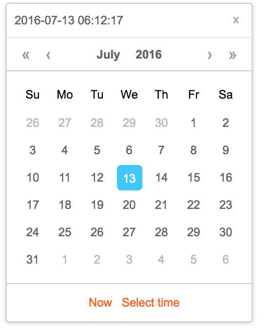
<img src="https://img.alicdn.com/tps/TB1mYC8KVXXXXaHXXXXXXXXXXXX-566-678.png" width="288"/>

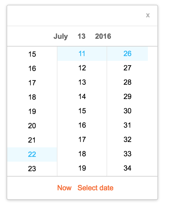
<img src="https://img.alicdn.com/tps/TB1KW1HKVXXXXa9aXXXXXXXXXXX-578-694.png" width="288"/>

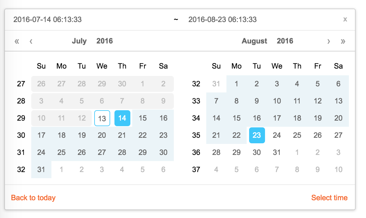
<img src="https://img.alicdn.com/tps/TB1QYqPKVXXXXasXVXXXXXXXXXX-1196-712.png" width="288"/>

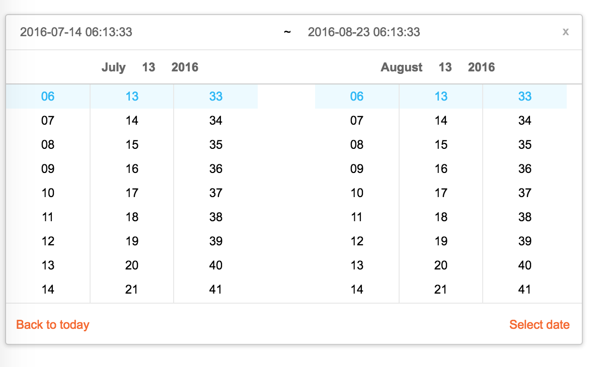
<img src="https://img.alicdn.com/tps/TB1nAGDKVXXXXXvapXXXXXXXXXX-1206-730.png" width="500"/>

## Feature

* support ie9,ie9+,chrome,firefox,safari
* support date, month, year, decade select panel
* support week number
* support en_US and zh_CN locale(UI), use moment.utcOffset to set timezone
* support aria and keyboard accessibility

### Keyboard

* Previous month (PageUp)
* Next month (PageDown)
* tab into hour input: Last hour(Up), Next hour(Down)
* tab into hour input: Last minute(Up), Next minute(Down)
* tab into hour input: Last second(Up), Next second(Down)
* Last year (Control + left)
* Next year (Control + right)

## install

[![rc-calendar](https://nodei.co/npm/rc-calendar.png)](https://npmjs.org/package/rc-calendar)

## Usage

```js
import Calendar from 'rc-calendar';
import React from 'react';
import ReactDOM from 'react-dom';
ReactDOM.render(<Calendar />, container);
```

## Development

```
npm install
npm start
```

## Example

http://localhost:8002/examples/

online example:

http://react-component.github.io/calendar/examples/index.html

## API

### rc-calendar props

<table class="table table-bordered table-striped">
    <thead>
    <tr>
        <th style="width: 100px;">name</th>
        <th style="width: 50px;">type</th>
        <th style="width: 50px;">default</th>
        <th>description</th>
    </tr>
    </thead>
    <tbody>
        <tr>
          <td>prefixCls</td>
          <td>String</td>
          <td></td>
          <td>prefixCls of this component</td>
        </tr>
        <tr>
          <td>className</td>
          <td>String</td>
          <td></td>
          <td>additional css class of root dom node</td>
        </tr>
        <tr>
          <td>style</td>
          <td>Object</td>
          <td></td>
          <td>additional style of root dom node</td>
        </tr>
        <tr>
          <td>dateRender</td>
          <td>(current, value) => React.Node</td>
          <td></td>
          <td>date cell</td>
        </tr>
        <tr>
          <td>renderSidebar</td>
          <td>() => React.Node</td>
          <td></td>
          <td>side bar</td>
        </tr>
        <tr>
          <td>renderFooter</td>
          <td>(mode) => React.Node</td>
          <td></td>
          <td>extra footer</td>
        </tr>
        <tr>
          <td>value</td>
          <td>moment</td>
          <td></td>
          <td>current value like input's value</td>
        </tr>
        <tr>
          <td>defaultValue</td>
          <td>moment</td>
          <td></td>
          <td>defaultValue like input's defaultValue</td>
        </tr>
        <tr>
          <td>locale</td>
          <td>Object</td>
          <td>import from 'rc-calendar/lib/locale/en_US'</td>
          <td>calendar locale</td>
        </tr>
        <tr>
          <td>format</td>
          <td>String | String[]</td>
          <td>depends on whether you set timePicker and your locale</td>
          <td>use to format/parse date(without time) value to/from input.  
          When an array is provided, all values are used for parsing and first value for display.</td>
        </tr>
        <tr>
          <td>disabledDate</td>
          <td>Function(current:moment):Boolean</td>
          <td></td>
          <td>whether to disable select of current date</td>
        </tr>
        <tr>
          <td>disabledTime</td>
          <td>Function(current:moment):Object</td>
          <td></td>
          <td>a function which return a object with member of disabledHours/disabledMinutes/disabledSeconds according to rc-time-picker</td>
        </tr>
        <tr>
          <td>showDateInput</td>
          <td>Boolean</td>
          <td>true</td>
          <td>whether to show input on top of calendar panel</td>
        </tr>
        <tr>
          <td>showWeekNumber</td>
          <td>Boolean</td>
          <td>false</td>
          <td>whether to show week number of year</td>
        </tr>
        <tr>
          <td>showToday</td>
          <td>Boolean</td>
          <td>true</td>
          <td>whether to show today button</td>
        </tr>
        <tr>
          <td>showOk</td>
          <td>Boolean</td>
          <td>auto</td>
          <td>whether has ok button in footer</td>
        </tr>
        <tr>
          <td>showHourAndMinute</td>
          <td>Boolean</td>
          <td>auto</td>
          <td>whether has hour-minute chooser in the right panel(for dtable date column)</td>
        </tr>
        <tr>
          <td>timePicker</td>
          <td>React Element</td>
          <td></td>
          <td>rc-timer-picker/lib/module/panel element</td>
        </tr>
        <tr>
          <td>onSelect</td>
          <td>Function(date: moment)</td>
          <td></td>
          <td>called when a date is selected from calendar</td>
        </tr>
        <tr>
          <td>onClear</td>
          <td>Function()</td>
          <td></td>
          <td>called when a date is cleared from calendar</td>
        </tr>
        <tr>
          <td>onChange</td>
          <td>Function(date: moment)</td>
          <td></td>
          <td>called when a date is changed inside calendar (next year/next month/keyboard)</td>
        </tr>
        <tr>
          <td>onOk</td>
          <td>Function(date: moment)</td>
          <td></td>
          <td>called when ok button is pressed, only if it's visible</td>
        </tr>
        <tr>
          <td>onClickRightPanelTime</td>
          <td>Function()</td>
          <td></td>
          <td>called when right panel hour and minute is clicked, only prop showHourAndMinute is true</td>
        </tr>
        <tr>
          <td>dateInputPlaceholder</td>
          <td>String</td>
          <td></td>
          <td>date input's placeholder</td>
        </tr>
        <tr>
          <td>mode</td>
          <td>enum('time', 'date', 'month', 'year', 'decade')</td>
          <td>'date'</td>
          <td>control which kind of panel should be shown</td>
        </tr>
        <tr>
          <td>onPanelChange</td>
          <td>Function(date: moment, mode)</td>
          <td></td>
          <td>called when panel changed</td>
        </tr>
        <tr>
          <td>clearIcon</td>
          <td>ReactNode</td>
          <td></td>
          <td>specific the clear icon.</td>
        </tr>
         <tr>
          <td>inputMode</td>
          <td>string</td>
          <td>text</td>
          <td>Change the keyboard in mobile device</td>
        </tr>
    </tbody>
</table>


### rc-calendar/lib/RangeCalendar props

<table class="table table-bordered table-striped">
    <thead>
    <tr>
        <th style="width: 100px;">name</th>
        <th style="width: 50px;">type</th>
        <th style="width: 50px;">default</th>
        <th>description</th>
    </tr>
    </thead>
    <tbody>
        <tr>
          <td>prefixCls</td>
          <td>String</td>
          <td></td>
          <td>prefixCls of this component</td>
        </tr>
        <tr>
          <td>className</td>
          <td>String</td>
          <td></td>
          <td>additional css class of root dom node</td>
        </tr>
        <tr>
          <td>style</td>
          <td>Object</td>
          <td></td>
          <td>additional style of root dom node</td>
        </tr>
        <tr>
          <td>renderSidebar</td>
          <td>() => React.Node</td>
          <td></td>
          <td>side bar</td>
        </tr>
        <tr>
          <td>renderFooter</td>
          <td>() => React.Node</td>
          <td></td>
          <td>extra footer</td>
        </tr>
        <tr>
          <td>selectedValue</td>
          <td>moment[]</td>
          <td></td>
          <td>current selected value range. with two elements.</td>
        </tr>
        <tr>
          <td>defaultSelectedValue</td>
          <td>moment[]</td>
          <td></td>
          <td>default selected value range</td>
        </tr>
        <tr>
          <td>locale</td>
          <td>Object</td>
          <td>import from 'rc-calendar/lib/locale/en_US'</td>
          <td>calendar locale</td>
        </tr>
        <tr>
          <td>format</td>
          <td>String</td>
          <td>depends on whether you set timePicker and your locale</td>
          <td>use to format/parse date(without time) value to/from input</td>
        </tr>
        <tr>
          <td>disabledDate</td>
          <td>Function(current:moment):Boolean</td>
          <td></td>
          <td>whether to disable select of current date</td>
        </tr>
        <tr>
          <td>showWeekNumber</td>
          <td>Boolean</td>
          <td>false</td>
          <td>whether to show week number of year</td>
        </tr>
        <tr>
          <td>showToday</td>
          <td>Boolean</td>
          <td>true</td>
          <td>whether to show today button</td>
        </tr>
        <tr>
          <td>showOk</td>
          <td>Boolean</td>
          <td>auto</td>
          <td>whether has ok button in footer</td>
        </tr>
        <tr>
          <td>showClear</td>
          <td>Boolean</td>
          <td>false</td>
          <td>whether has clear button in header</td>
        </tr>
        <tr>
          <td>timePicker</td>
          <td>React Element</td>
          <td></td>
          <td>rc-timer-picker/lib/module/panel element</td>
        </tr>
        <tr>
          <td>onSelect</td>
          <td>Function(date: moment[])</td>
          <td></td>
          <td>called when a date range is selected from calendar</td>
        </tr>
        <tr>
          <td>onInputSelect</td>
          <td>Function(date: moment[])</td>
          <td></td>
          <td>called when a valid date entered in input</td>
        </tr>
        <tr>
          <td>onClear</td>
          <td>Function()</td>
          <td></td>
          <td>called when a date range is cleared from calendar</td>
        </tr>
        <tr>
          <td>onChange</td>
          <td>Function(date: moment[])</td>
          <td></td>
          <td>called when a date range is changed inside calendar (next year/next month/keyboard)</td>
        </tr>
        <tr>
          <td>onOk</td>
          <td>Function(date: moment)</td>
          <td></td>
          <td>called when ok button is pressed, only if it's visible</td>
        </tr>
        <tr>
          <td>dateInputPlaceholder</td>
          <td>String[]</td>
          <td></td>
          <td>range date input's placeholders</td>
        </tr>
        <tr>
          <td>disabledTime</td>
          <td>Function(current: moment[], type:'start'|'end'):Object</td>
          <td></td>
          <td>a function which return a object with member of disabledHours/disabledMinutes/disabledSeconds according to rc-time-picker</td>
        </tr>
        <tr>
          <td>showDateInput</td>
          <td>Boolean</td>
          <td>true</td>
          <td>whether to show date inputs on top of calendar panels</td>
        </tr>
        <tr>
          <td>type</td>
          <td>enum('both','start', 'end')</td>
          <td>both</td>
          <td>whether fix start or end selected value. check start-end-range example</td>
        </tr>
        <tr>
          <td>mode</td>
          <td>enum('date', 'month', 'year', 'decade')[]</td>
          <td>['date', 'date']</td>
          <td>control which kind of panels should be shown</td>
        </tr>
        <tr>
          <td>onPanelChange</td>
          <td>Function(date: moment[], mode)</td>
          <td></td>
          <td>called when panels changed</td>
        </tr>
        <tr>
          <td>hoverValue</td>
          <td>moment[]</td>
          <td></td>
          <td>control hover value</td>
        </tr>
        <tr>
          <td>onHoverChange</td>
          <td>Function(hoverValue: moment[])</td>
          <td></td>
          <td>called when hover value change</td>
        </tr>
        <tr>
          <td>clearIcon</td>
          <td>ReactNode</td>
          <td></td>
          <td>specific the clear icon.</td>
        </tr>
    </tbody>
</table>

### rc-calendar/lib/MonthCalendar props

<table class="table table-bordered table-striped">
    <thead>
    <tr>
        <th style="width: 100px;">name</th>
        <th style="width: 50px;">type</th>
        <th style="width: 50px;">default</th>
        <th>description</th>
    </tr>
    </thead>
    <tbody>
        <tr>
          <td>prefixCls</td>
          <td>String</td>
          <td></td>
          <td>prefixCls of this component</td>
        </tr>
        <tr>
          <td>className</td>
          <td>String</td>
          <td></td>
          <td>additional css class of root dom node</td>
        </tr>
        <tr>
          <td>style</td>
          <td>Object</td>
          <td></td>
          <td>additional style of root dom node</td>
        </tr>
        <tr>
          <td>value</td>
          <td>moment</td>
          <td></td>
          <td>current value like input's value</td>
        </tr>
        <tr>
          <td>defaultValue</td>
          <td>moment</td>
          <td></td>
          <td>defaultValue like input's defaultValue</td>
        </tr>
        <tr>
          <td>locale</td>
          <td>Object</td>
          <td>import from 'rc-calendar/lib/locale/en_US'</td>
          <td>calendar locale</td>
        </tr>
        <tr>
          <td>disabledDate</td>
          <td>Function(current:moment):Boolean</td>
          <td></td>
          <td>whether to disable select of current month</td>
        </tr>
        <tr>
          <td>onSelect</td>
          <td>Function(date: moment)</td>
          <td></td>
          <td>called when a date is selected from calendar</td>
        </tr>
        <tr>
          <td>monthCellRender</td>
          <td>function</td>
          <td></td>
          <td>Custom month cell render method</td>
        </tr>
        <tr>
          <td>monthCellContentRender</td>
          <td>function</td>
          <td></td>
          <td>Custom month cell content render method,the content will be appended to the cell.</td>
        </tr>
        <tr>
        <tr>
          <td>onChange</td>
          <td>Function(date: moment)</td>
          <td></td>
          <td>called when a date is changed inside calendar (next year/next month/keyboard)</td>
        </tr>
        <tr>
          <td>renderFooter</td>
          <td>() => React.Node</td>
          <td></td>
          <td>extra footer</td>
        </tr>
    </tbody>
</table>

### rc-calendar/lib/Picker props

<table class="table table-bordered table-striped">
    <thead>
    <tr>
        <th style="width: 100px;">name</th>
        <th style="width: 50px;">type</th>
        <th style="width: 50px;">default</th>
        <th>description</th>
    </tr>
    </thead>
    <tbody>
        <tr>
          <td>prefixCls</td>
          <td>String</td>
          <td></td>
          <td>prefixCls of this component</td>
        </tr>
        <tr>
          <td>calendar</td>
          <td>Calendar React Element</td>
          <td></td>
          <td></td>
        </tr>
        <tr>
          <td>disabled</td>
          <td>Boolean</td>
          <td></td>
          <td>whether picker is disabled</td>
        </tr>
        <tr>
          <td>placement</td>
          <td>String|Object</td>
          <td></td>
          <td>one of ['left','right','top','bottom', 'topLeft', 'topRight', 'bottomLeft', 'bottomRight']</td>
        </tr>
        <tr>
          <td>align</td>
          <td>Object: alignConfig of [dom-align](https://github.com/yiminghe/dom-align)</td>
          <td></td>
          <td>value will be merged into placement's align config.</td>
        </tr>
        <tr>
          <td>animation</td>
          <td>String</td>
          <td></td>
          <td>index.css support 'slide-up'</td>
        </tr>
        <tr>
          <td>transitionName</td>
          <td>String</td>
          <td></td>
          <td>css class for animation</td>
        </tr>
        <tr>
          <td>value</td>
          <td>moment|moment[]</td>
          <td></td>
          <td>current value like input's value</td>
        </tr>
        <tr>
          <td>defaultValue</td>
          <td>moment|moment[]</td>
          <td></td>
          <td>defaultValue like input's defaultValue</td>
        </tr>
        <tr>
          <td>onChange</td>
          <td>Function</td>
          <td></td>
          <td>called when select a different value</td>
        </tr>
        <tr>
          <td>onOpenChange</td>
          <td>(open:boolean) => void</td>
          <td></td>
          <td>called when open/close picker</td>
        </tr>
        <tr>
          <td>open</td>
          <td>Boolean</td>
          <td></td>
          <td>current open state of picker. controlled prop</td>
        </tr>
        <tr>
          <td>getCalendarContainer</td>
          <td>() => HTMLElement</td>
          <td>() => {return document.body;}</td>
          <td>dom node where calendar to be rendered into</td>
        </tr>
        <tr>
          <td>dropdownClassName</td>
          <td>string</td>
          <td></td>
          <td>additional className applied to dropdown</td>
        </tr>
    </tbody>
</table>

### rc-calendar/lib/FullCalendar props

<table class="table table-bordered table-striped">
    <thead>
    <tr>
        <th style="width: 100px;">name</th>
        <th style="width: 50px;">type</th>
        <th style="width: 50px;">default</th>
        <th>description</th>
    </tr>
    </thead>
    <tbody>
        <tr>
          <td>prefixCls</td>
          <td>String</td>
          <td></td>
          <td>prefixCls of this component</td>
        </tr>
        <tr>
          <td>Select</td>
          <td>React Component Class</td>
          <td></td>
          <td>rc-select Component Class</td>
        </tr>
        <tr>
          <td>value</td>
          <td>moment</td>
          <td></td>
          <td>current value like input's value</td>
        </tr>
        <tr>
          <td>defaultValue</td>
          <td>moment</td>
          <td></td>
          <td>defaultValue like input's defaultValue</td>
        </tr>
        <tr>
          <td>defaultType</td>
          <td>string</td>
          <td>date</td>
          <td>default panel type: date/month</td>
        </tr>
        <tr>
          <td>type</td>
          <td>string</td>
          <td></td>
          <td>panel type: date/month</td>
        </tr>
        <tr>
          <td>onTypeChange</td>
          <td>function(type)</td>
          <td></td>
          <td>called when panel type change</td>
        </tr>
        <tr>
          <td>fullscreen</td>
          <td>bool</td>
          <td>false</td>
          <td></td>
        </tr>
        <tr>
          <td>monthCellRender</td>
          <td>function</td>
          <td></td>
          <td>Custom month cell render method</td>
        </tr>
        <tr>
          <td>dateCellRender</td>
          <td>function</td>
          <td></td>
          <td>Custom date cell render method</td>
        </tr>
        <tr>
          <td>monthCellContentRender</td>
          <td>function</td>
          <td></td>
          <td>Custom month cell content render method,the content will be appended to the cell.</td>
        </tr>
        <tr>
          <td>dateCellContentRender</td>
          <td>function</td>
          <td></td>
          <td>Custom date cell content render method,the content will be appended to the cell.</td>
        </tr>        <tr>
          <td>onSelect</td>
          <td>Function(date: moment)</td>
          <td></td>
          <td>called when a date is selected from calendar</td>
        </tr>
    </tbody>
</table>

## Test Case

```
npm test
```

## Coverage

```
npm run coverage
```

open coverage/ dir

## License

rc-calendar is released under the MIT license.

# node version
>= 18.20.4
