# React Native Datetime Picker
![Supports Android and iOS][support-badge]
This is a library forked from https://github.com/nysamnang/react-native-24h-timepicker/issues
the intention was to support buddhist year and modified min max date time.
I'll try my best to update this documentation.
### Screenshot
| Date Picker |
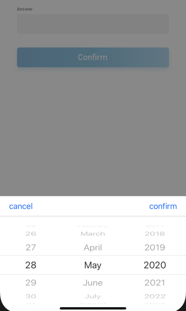
|
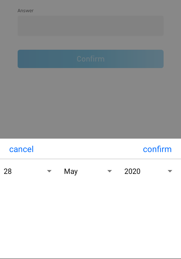
|
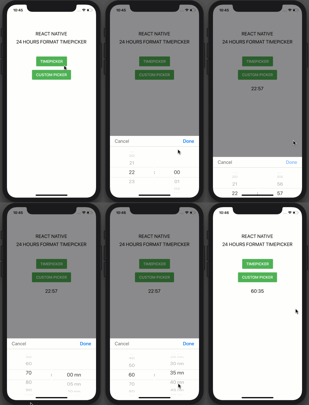
## Installation
```
npm i @sorakrisc/react-native-datetimepicker --save
npm i @react-native-picker/picker
```
### or
```
yarn add @sorakrisc/react-native-datetimepicker
yarn add @react-native-picker/picker
```
## Usage
### Date Picker
```jsx
import {TimePicker, DatePicker, toBuddhistYear} from "react-native-24h-timepicker";
{
this.DatePicker = ref;
}}
placeholder={'placeholder'}
date={date}
format={'DD/MM/YYYY'}
inputComponent={}
minDate={moment().subtract(100, 'years')}
maxDate={moment().add(100, 'years')}
confirmBtnText={'confirm'}
cancelBtnText={'cancel'}
onConfirm={(date) => this.setDate(date)}
// calendarType={'buddhist'}
// monthList={[
// 'มกราคม',
// 'กุมภาพันธ์',
// 'มีนาคม',
// 'เมษายน',
// 'พฤษภาคม',
// 'มิถุนายน',
// 'กรกฎาคม',
// 'สิงหาคม',
// 'กันยายน',
// 'ตุลาคม',
// 'พศจิกายน',
// 'ธันวาคม'
// ]}
/>
```
### Time Picker
```jsx
import React, { Component } from "react";
import { StyleSheet, View, TouchableOpacity, Text } from "react-native";
import TimePicker from "react-native-24h-timepicker";
class Example extends Component {
constructor() {
super();
this.state = {
time: ""
};
}
onCancel() {
this.TimePicker.close();
}
onConfirm(hour, minute) {
this.setState({ time: `${hour}:${minute}` });
this.TimePicker.close();
}
render() {
return (
REACT NATIVE
24 HOURS FORMAT TIMEPICKER
this.TimePicker.open()}
style={styles.button}
>
TIMEPICKER
{this.state.time}
{
this.TimePicker = ref;
}}
onCancel={() => this.onCancel()}
onConfirm={(hour, minute) => this.onConfirm(hour, minute)}
/>
);
}
}
const styles = StyleSheet.create({
container: {
flex: 1,
alignItems: "center",
backgroundColor: "#fff",
paddingTop: 100
},
text: {
fontSize: 20,
marginTop: 10
},
button: {
backgroundColor: "#4EB151",
paddingVertical: 11,
paddingHorizontal: 17,
borderRadius: 3,
marginVertical: 50
},
buttonText: {
color: "#FFFFFF",
fontSize: 16,
fontWeight: "600"
}
});
export default Example;
```
##### Props
| Prop | Type | Description | Default |
| -------------- | -------- | ---------------------------------------------- | ------- |
| maxHour | number | Maximum of hour | 23 |
| maxMinute | number | Maximum of minute | 59 |
| hourInterval | number | The interval at which hours can be selected. | 1 |
| minuteInterval | number | The interval at which minutes can be selected. | 1 |
| hourUnit | string | Add extra text to hour | "" |
| minuteUnit | string | Add extra text to minute | "" |
| selectedHour | string | Default hour | "0" |
| selectedMinute | string | Default minute | "00" |
| itemStyle | object | Item text style | {} |
| textCancel | string | Cancel button text | Cancel |
| textConfirm | string | Confirm button text | Confirm |
| onCancel | function | Event on Cancel button | |
| onConfirm | function | Event on Confirm button | |
##### Methods
| Method Name | Description |
| ----------- | ---------------- |
| open | Open TimePicker |
| close | Close TimePicker |
##### Note
Always set `ref` to `TimePicker` and call each method by using `this.TimePicker.methodName()` like example above.
## License
This project is licensed under the MIT License - see the [LICENSE.md](https://github.com/NYSamnang/react-native-24h-timepicker/blob/master/LICENSE) file for details
## Author
[Sorakris Chaladlamsakul](https://github.com/sorakrisc).
Originally from [NY Samnang](https://github.com/NYSamnang).
[support-badge]: https://img.shields.io/badge/platforms-android%20|%20ios-lightgrey.svg?style=flat-square