# Further Elements for React
ReactJS binding for [Further Elements](https://www.npmjs.com/package/@talkfurther/elements)
To install:
```
npm install @talkfurther/react
```
## Available Elements
### Teaser
Integrates into the page layout to and is a starting point for website visitors to interact with Further VSAs.

```javascript
import { Teaser } from "@talkfurther/react";
...
```
#### Properties
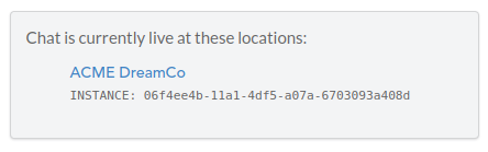
- `vsaInstance` - your chat instance UUID. Can be found in the [Further Dashboard](https://dashboard.talkfurther.com/chats), after selecting a chat
- `title` - The main title text shown within the Teaser element
- `subtitle` - The subtitle text shown within the Teaser element
- `options` - List of button properties, including:
- `label` - Button label
- `sublabel` (optional) - Button sub-label. If empty and `showRecentTourInquiries` is set to `true`, based on the `isTourButton` property, `sublabel` will be set to display the recent tour inquiries count as "Join ${interestedCount} other recent inquiries"
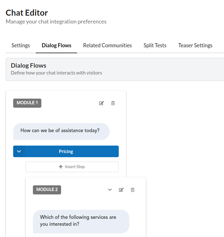
- `action` - Module number of the chat module that should open upon clicking the option button. Can be found in the [Further Dashboard](https://dashboard.talkfurther.com/chats), after selecting a chat and navigating to the Dialog Flows tab
- `icon` - Name of the icon (currently, only `"calendar"` is available)
- `primary` (optional) - Boolean indicating whether the button background should be using the primary brand color
- `isTourButton` (optional) - Boolean indicating whether the button is a tour button.
- If set to `true`, `sublabel` will be set to display the recent tour inquiries count as "Join ${interestedCount} other recent inquiries".
- If set to `false`, the `sublabel` will be displayed as provided in the `sublabel` property
- If not set, but `label` contains any of the predefined "Schedule a Tour" keywords (see the actual keywords at the end of the README document), it's considered as same as `isTourButton=true`
- `showRecentTourInquiries` (optional) defaults to `true` - Boolean indicating whether to show recent tour inquiries count in the Teaser "Schedule a Tour" button. Default is `true`.
- `theme` - UI customization variables"
- `fontFamily`: (`helvetica neue`) - Base font family
- `fontSize`: (`16px`) - Base font size
- `color`: (`#121212`) - Base text color
- `fontWeight`: (`normal`) - Base font weight
- `lineHeight`: (`normal`) - Base line height
- `brandColor`: (`#14386e`) - Primary brand color
- `teaserBackground`: (`#ffffff`) - Container background color
- `teaserBorder`: (`none`) - Container border (CSS shorthand)
- `teaserBorderRadius`: (`10px`) - Container border radius
- `teaserMinWidth`: (`300px`) - Minimum width of the container element
- `teaserMinHeight`: (`60px`) - Minimum height of the container element
- `teaserMaxWidth`: (`1800px`) - Maximum width of the container element
- `teaserMaxHeight`: (`100%`) - Maximum height of the container element
- `teaserBoxShadow`: (`0 15px 40px 0 rgba(51, 51, 51, 0.15)`) - Container box shadow (CSS shorthand)
- `teaserPadding`: (`16px 30px`) - Container padding (CSS shorthand)
- `teaserMargin`: (`0 auto`) - Container margin (CSS shorthand)
- `teaserSegmentsGap`: (`16px`) - Flex gap between teaser segments
- `buttonHeight`: (`60px`) - Option button height
- `buttonColor`: (`#ffffff`) - Text color on primary buttons
- `buttonShadow`: (`0 2px 6px 0 rgba(0, 0, 0, 0.12)`) - Box shadow around option buttons (CSS shorthand)
- `buttonLabelFontSize`: (`initial`) - Font size override for buttons (main label)
- `buttonSublabelFontSize`: (`initial`) - Font size override for buttons (sub-label)
- `buttonsBorderRadius`: (`6px`) - Border radius for option buttons
- `headerTitleDisplay`: (`block`) - CSS display property for the main title element
- `headerTitleFontFamily`: (`initial`) - Font family override for the main title
- `headerTitleFontSize`: (`26px`) - Font size override for the main title
- `headerTitleColor`: (`initial`) - Text color override for the main title
- `headerTitleFontWeight`: (`initial`) - Font weight override for the main title
- `headerTitleLineHeight`: (`normal`) - Line height override for the main title
- `headerSubtitleDisplay`: (`block`) - CSS display property for the subtitle element
- `headerSubtitleFontFamily`: (`initial`) - Font family override for the subtitle
- `headerSubtitleFontSize`: (`initial`) - Font size override for the subtitle
- `headerSubtitleColor`: (`initial`) - Text color override for the subtitle
- `headerSubtitleFontWeight`: (`initial`) - Font weight override for the subtitle
- `headerSubtitleLineHeight`: (`initial`) - Line height override for the subtitle
- `customCss` - CSS (string), which gets inserted into the teaser Shadow DOM as a `