react-circular-progress-bar
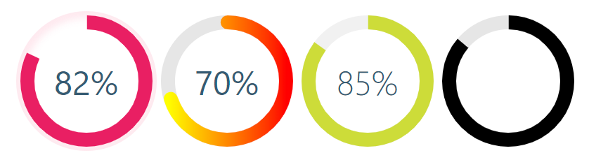
React library to help developers to draw animated, cross-browser, highly customizable progress circles using SVG. IntersectionObserver support, the animation starts when the individual chart appears in the view.


## Demo
See the demo - [example](https://tomickigrzegorz.github.io/react-circular-progress-bar/)
## Install
```bash
yarn add @tomickigrzegorz/react-circular-progress-bar
# or
npm install @tomickigrzegorz/react-circular-progress-bar
```
## Usage
```jsx
import { CircularProgressBar } from "@tomickigrzegorz/react-circular-progress-bar";
```
```jsx
// available control variables
const props = {
percent: 60, // is require
colorSlice: "#00a1ff",
colorCircle: "#00a1ff",
fontColor: "#365b74",
fontSize: "1.6rem",
fontWeight: 400,
size: 200,
stroke: 10,
strokeBottom: 5,
speed: 60,
cut: 0,
rotation: -90,
fill: "#00897B",
unit: "%",
textPosition: "0.35em",
animationOff: false,
strokeDasharray: "10,1",
inverse: false,
round: false,
number: false,
linearGradient: ["#ffff00", "brown"],
styles: {
borderRadius: "50%",
boxShadow: "inset 0 0 25px 10px #a2caff"
}
};
;
```
### Update percent
> If you want to update component you have to add `id` to each of them
```jsx
const config = {
id: 0, // important
percent: 50,
colorSlice: "#E91E63"
};
function App() {
const [update, setUpdate] = useState(config);
useEffect(() => {
const interval = setInterval(() => {
setUpdate({
...config,
id: 0, // we indicate which component we want to change
percent: Math.floor(Math.random() * 100 + 1)
colorSlice: "#000",
fontColor: "#F50057",
fontSize: "1.2rem",
fontWeight: 700
});
}, 3000);
return () => clearInterval(interval);
}, []);
const newObject = { ...config, ...update };
return (
);
}
```
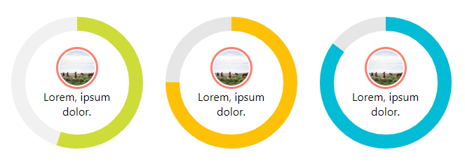
### Add photos and text
```jsx
const config = {
percent: 55,
colorSlice: "#E91E63",
colorCircle: "#f1f1f1",
fontWeight: 100,
number: false // turn off the percentage animation first
};

Lorem, ipsum dolor.
;
```
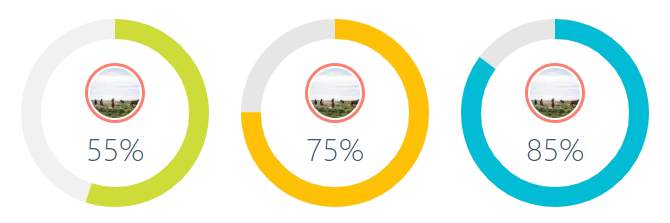
### Add photos and percent animation
```jsx
const config = {
percent: 55,
colorSlice: "#CDDC39",
colorCircle: "#f1f1f1",
fontWeight: 100,
fontSize: "1rem",
textPosition: "1.5em" // needed element to move the percentage animation lower
};
;
```
### How to turn off `%` or style them?
Turning off the percentage and leaving the number alone is very simple.
Each percent (%) has a class of `circular-unit-x` of course you must add for each circle` id`. If you don't do this, the class will always be `circular-unit-0`. Just add `.circular-unit-x { display: none }` to our styles. Digit animation remains but percent sign [%] disappears.
You can also style this elements to create your own styles, example below:
```css
.circular-unit-15 {
fill: #f50057;
font-size: 0.8rem;
font-weight: 700;
}
```
Instead of adding styles to a component, you can add them in the configuration stage.
```jsx
const examples = [
{
percent: 75,
styles: {
borderRadius: "50%",
boxShadow: "inset 0 0 25px 10px #a2caff"
}
}
];
{examples.map((props, index) => {
return ;
})}
```
See an example [Minimal Width Shadow](https://tomickigrzegorz.github.io/react-circular-progress-bar/?path=/story/circular-progress-bar--minimal-width-shadow)
## Configuration of the plugin
| props | type | default | require | description |
| --------------- | :-----: | :---------: | :-----: | ----- |
| percent | number | | ✔ | Represents the progress bar and animation of the animation progress expressed by a number e.g. 65% |
| id | number | | | If you want to update a component, you need to add an `id` to each of them. Also when you want to display several components with different gradients - `linearGradient` |
| speed | number | | | Frame rate animation [fps]. Let's say you want the animation to be 60fps, just add the parameter `speed: 60` |
| animationOff | boolean | `false` | | Turn off the progress animation |
| animationSmooth | string | `` | | The [transition](https://developer.mozilla.org/en-US/docs/Web/CSS/transition) property allows you to create animations (a smooth transition effect), e.g. `500ms ease-out` |
| colorSlice | string | `'#00a1ff'` | | Progress layer color and background ["#ffff00","brown" \*](#colors-names) |
| colorCircle | string | `'#00a1ff'` | | Bottom circle color Font ["#ffff00","brown" \*](#colors-names) |
| stroke | number | `10` | | Stroke width, chart thickness |
| strokeBottom | number | `10` | | If "strokBottom" is set, it is used to generate a background circle size |
| round | boolean | `false` | | Path rounding |
| inverse | boolean | `false` | | Counterclockwise animation |
| rotation | number | `-90` | | Chart rotation |
| number | boolean | `true` | | Add props number and set to false to hide the number with percent |
| size | number | `200` | | Size progress bar width and height in px |
| cut | number | `0` | | Angle of the circle sector |
| unit | string | `%` | | Different unit instead of percentage (%) inside the circle |
| fill | string | `none` | | Inner circle background color |
| strokeDasharray | string | `` | | It works only on the lowest circle and only on whole circles - [stroke-dasharray](https://developer.mozilla.org/en-US/docs/Web/SVG/Attribute/) |
| textPosition | string | `0.35em` | | The position of the SVG TEXT element vertically |
| fontSize | string | `1.6rem` | | Font size. The font can be shown in units rem, em, px ... |
| fontWeight | number | `400` | | 400, 600, ... |
| fontColor | string | `'#365b74'` | | Font color ["#ffff00","brown" \*](#colors-names) |
| linearGradient | array | | | Array of colors "lineargradient": ["#ffff00","brown" \*](#colors-names) |
| styles | object | | | Possibility to add styles to parent div see example [Minimal Width Shadow](https://tomickigrzegorz.github.io/react-circular-progress-bar/?path=/story/circular-progress-bar--minimal-width-shadow) |
## Colors names
[\* See colors names](https://htmlcolorcodes.com/color-names/)
## Browser support
react-circular-progress-bar supports all major browsers including IE 11 and above