Progress 进度条
---
> **Progress 进度条组件在未来的版本参数已变更,请注意使用**
表明某个任务的当前进度。
**------------------------------------------------------------------------------新文档------------------------------------------------------------------------------**
### 基础示例
```jsx mdx:preview&background=#bebebe29
import React from 'react';
import { SafeAreaView } from 'react-native';
import { Progress } from '@uiw/react-native';
function Demo() {
return (
)
}
export default Demo
```
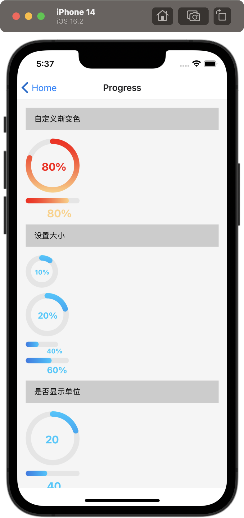
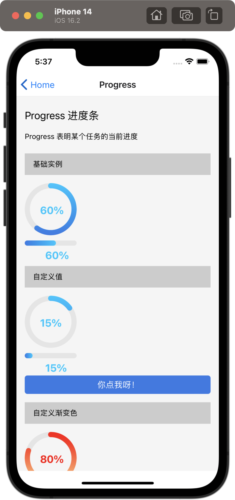 ### 自定义颜色
```jsx mdx:preview&background=#bebebe29
import React from 'react';
import { SafeAreaView } from 'react-native';
import { Progress } from '@uiw/react-native';
function Demo() {
return (
)
}
export default Demo
```
### 自定义颜色
```jsx mdx:preview&background=#bebebe29
import React from 'react';
import { SafeAreaView } from 'react-native';
import { Progress } from '@uiw/react-native';
function Demo() {
return (
)
}
export default Demo
```
 ### 自定义百分比,展示进度
```jsx mdx:preview&background=#bebebe29
import React from 'react';
import { SafeAreaView } from 'react-native';
import { Progress } from '@uiw/react-native';
function Demo() {
return (
)
}
export default Demo
```
### 自定义百分比,展示进度
```jsx mdx:preview&background=#bebebe29
import React from 'react';
import { SafeAreaView } from 'react-native';
import { Progress } from '@uiw/react-native';
function Demo() {
return (
)
}
export default Demo
```
 ### Props
| 参数 | 说明 | 类型 | 默认值 |
|------|------|-----|------|
| `type` | 设置进度圈还是进度条,`'line' or 'circle'` | string | 'circle' |
| `width` |设置进度圈大小,进度条长度 | number | 100 |
| `color` | 设置进度圈,进度条颜色 `string or [string, string]`| String | `['#3578e5', '#00c6ff']` |
| `bgColor` | 设置背景颜色 | String | `'#e5e5e5'` |
| `strokeWidth` | 设置进度圈外环宽度,进度条的高 | number | 10 |
| `value` | 设置百分比的值 | number| 0 |
| `showLabel` | 是否显示值文本 | boolean| true |
| `label` | 自定义标签 | number | 10 |
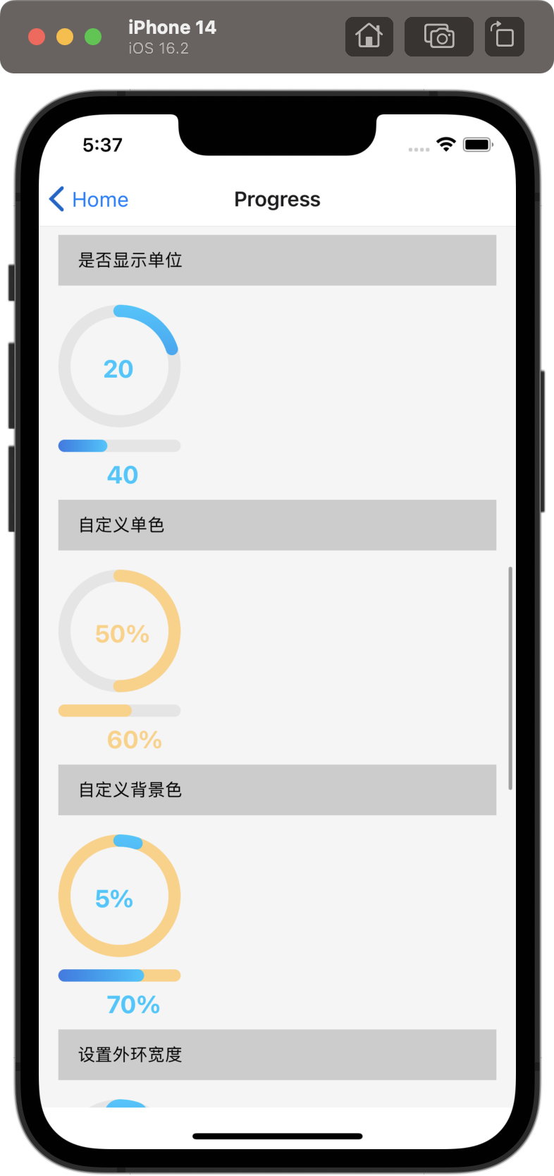
| `showUnit` | 是否显示单位 | boolean | true |
| `top` | 自定义文本位置 | String | `'50%'` |
| `left` | 自定义文本位置 | String | `'11%'` |
**------------------------------------------------------------------------------老文档------------------------------------------------------------------------------**
### 基础示例
```jsx mdx:preview&background=#bebebe29
import React from 'react';
import { SafeAreaView } from 'react-native';
import { Progress } from '@uiw/react-native';
import { motorcycle } from './svg';
function Demo() {
return (
)
}
export default Demo
```
### 自定义颜色
```jsx mdx:preview&background=#bebebe29
import React from 'react';
import { SafeAreaView } from 'react-native';
import { Progress } from '@uiw/react-native';
function Demo() {
return (
)
}
export default Demo
```
### 自定义百分比,展示进度
```jsx mdx:preview&background=#bebebe29
import React from 'react';
import { SafeAreaView } from 'react-native';
import { Progress } from '@uiw/react-native';
function Demo() {
return (
)
}
export default Demo
```
### Props
| 参数 | 说明 | 类型 | 默认值 |
|------|------|-----|------|
| `progress` | 进度百分比(可选) | Number | 0 |
| `progressColor` | 颜色(可选) | String | none |
| `position` | 位置,fixed 将浮出固定在最顶层(可选) | String | none |
| `iconShow` | 是否展示图标 | boolean | false |
| `xml` | 图标源 | String | 默认图标 |
| `size` | 图标尺寸 | number| 25 |
| `progressShow` | 是否展示进度提示字 | boolean| true |
### Props
| 参数 | 说明 | 类型 | 默认值 |
|------|------|-----|------|
| `type` | 设置进度圈还是进度条,`'line' or 'circle'` | string | 'circle' |
| `width` |设置进度圈大小,进度条长度 | number | 100 |
| `color` | 设置进度圈,进度条颜色 `string or [string, string]`| String | `['#3578e5', '#00c6ff']` |
| `bgColor` | 设置背景颜色 | String | `'#e5e5e5'` |
| `strokeWidth` | 设置进度圈外环宽度,进度条的高 | number | 10 |
| `value` | 设置百分比的值 | number| 0 |
| `showLabel` | 是否显示值文本 | boolean| true |
| `label` | 自定义标签 | number | 10 |
| `showUnit` | 是否显示单位 | boolean | true |
| `top` | 自定义文本位置 | String | `'50%'` |
| `left` | 自定义文本位置 | String | `'11%'` |
**------------------------------------------------------------------------------老文档------------------------------------------------------------------------------**
### 基础示例
```jsx mdx:preview&background=#bebebe29
import React from 'react';
import { SafeAreaView } from 'react-native';
import { Progress } from '@uiw/react-native';
import { motorcycle } from './svg';
function Demo() {
return (
)
}
export default Demo
```
### 自定义颜色
```jsx mdx:preview&background=#bebebe29
import React from 'react';
import { SafeAreaView } from 'react-native';
import { Progress } from '@uiw/react-native';
function Demo() {
return (
)
}
export default Demo
```
### 自定义百分比,展示进度
```jsx mdx:preview&background=#bebebe29
import React from 'react';
import { SafeAreaView } from 'react-native';
import { Progress } from '@uiw/react-native';
function Demo() {
return (
)
}
export default Demo
```
### Props
| 参数 | 说明 | 类型 | 默认值 |
|------|------|-----|------|
| `progress` | 进度百分比(可选) | Number | 0 |
| `progressColor` | 颜色(可选) | String | none |
| `position` | 位置,fixed 将浮出固定在最顶层(可选) | String | none |
| `iconShow` | 是否展示图标 | boolean | false |
| `xml` | 图标源 | String | 默认图标 |
| `size` | 图标尺寸 | number| 25 |
| `progressShow` | 是否展示进度提示字 | boolean| true |