# The AdaptivUI Styled Components Library 🎨
AdaptivUI is a design system built with accessability as the highest priority.
## Getting Started
### Installing
To install AdaptivUI to your project simply run `yarn add adaptiv-ui` || `npm i adaptiv-ui` and your ready to hook it up!
### CSS overhaul and AppWrapper
AdaptivUI comes with a css file you can import that includes a nice subtle style overhaul and a normalize. Just add `import "adaptiv-ui/css/main.css";` to the top of your root index.js!
AppWrapper is a powerful component that lets you set the background and fonts of your application.
Example:
```javascript
// src/App.js
export default function App() {
return (
);
}
```
### Style Props and Maps
AdaptivUI comes with some unique style props and maps that make laying out and editing you page very easily.
Style props need to be given a value and the associated
These are the props you will probably use most often. I'll break them down into catagories.
#### Flex-box
**Props:**
| CSS Property Name | Prop Name | Default value |
| ----------------- | --------- | ------------- |
| flex-direction | direction | row |
| justify-content | justify | flex-start |
| align-items | align | normal |
| align-content | content | stretch |
Example:
```javascript
...
```
**Style Maps:**
| CSS Property Name | Style Prop | Property Value |
| ----------------- | ---------- | -------------- |
| flex-direction | col | column |
| flex-direction | revrow | row-reverse |
| flex-direction | revcol | column-reverse |
| justify-content | jc_end | center |
| justify-content | jc_center | space-between |
| justify-content | jc_between | space-around |
| justify-content | jc_around | space-evenly |
| justify-content | jc_evenly | flex-start |
| align-items | ai_center | center |
| align-items | ai_start | flex-start |
| align-items | ai_end | flex-end |
| align-items | ai_stretch | stretch |
| align-content | ac_center | center |
| align-content | ac_start | flex-start |
| align-content | ac_end | flex-end |
| align-content | ac_between | space-between |
| align-content | ac_around | space-around |
| align-content | ac_evenly | space-evenly |
| flex-direction | drape | column |
| align-items | drape | center |
Example:
```javascript
// col changes flex-direction to column
// ai_center changes align items to center
...
// drape changes flex-direction to column and align-items to center
...
```
### Sizing and color props
**Props:**
| CSS Property Name | Prop Name | Default value |
| ------------------- | --------- | ------------- |
| height | h | auto |
| width | w | auto |
| width && height | sqr | auto |
| border-radius | radius | 0.3rem |
| border | border | none |
| margin | m | 0 |
| padding | p | 0 |
| background | bg | none |
| color | color | auto |
| opacity | opacity | none |
| min-height | min_h | none |
| max-width | max_w | none |
| min-width | min_w | none |
| max-height | max_h | none |
| box-sizing | box_size | border-box |
| box-shadow | shadow | none |
| overflow | overflow | hidden |
| font-family | font | Open Sans |
| font-size | f_size | 1.6rem |
| clip-path | clip | none |
| background-size | bg_size | auto |
| background-attach | bg_size | scroll |
| background-position | bg_size | center |
> The square prop changes width and height at the same time!
**Style Maps:**
| CSS Property Name | Style Prop | Property Value |
| ----------------- | -------------- | ----------------------------- |
| width | stretch | 100% |
| margin | xsm | 1rem |
| margin | sm | 2rem |
| margin | mm | 3rem |
| margin | lm | 4rem |
| margin | xlm | 5rem |
| padding | xsp | 1rem |
| padding | sp | 2rem |
| padding | mp | 3rem |
| padding | lp | 4rem |
| padding | xlp | 5rem |
| font-size | xsf | 0.6rem |
| font-size | sf | 1rem |
| font-size | mf | 1.4rem |
| font-size | lf | 2rem |
| font-size | xlf | 3rem |
| box-shadow | shade | 0 0.3rem 1rem \${theme.gray7} |
| box-shadow | backlight | 0 0.3rem 1rem \${theme.gray0} |
| box-sizing | cbox | content-box |
| box-sizing | init | initial |
| box-sizing | inherit | inherit |
| overflow | visible | visible |
| overflow | scroll | scroll |
| overflow | auto | auto |
| text-align | ta_right | right |
| text-align | ta_left | left |
| text-align | ta_center | center |
| text-align | ta_justify | justify |
| text-align | ta_all | justify-all |
| text-align | ta_start | start |
| text-align | ta_end | end |
| background-size | size_len | length |
| background-size | size_cover | cover |
| background-size | size_contain | contain |
| background-size | size_initial | initial |
| background-size | size_inherit | inherit |
| background-size | size_auto | auto |
| background-attach | attach_fix | fix |
| background-attach | attach_local | local |
| background-attach | attach_inherit | inherit |
| background-attach | attach_initial | initial |
| background-attach | attach_scroll | scroll |
## New Semantic Components!
Now featuring new semantic components! Main, Section and Aside. They work much like Flex but with flex direction default to column and align items default to center. Main difference is that they break down into their sematic counterparts instead of div's.
### AppWrapper:
AppWrapper is a div that is meant to wrap your app page, where you hold your routes. It's purpose is to easily change the font and background of the whole application.
### Wrapper:
This should wrap every parent component. It set's min height to 100% view height, and max width is set to 100% view width. This makes flexing items around your page a dream. Default flex-direction is set to column instead of row and align-items is set to.
### Text:
A text component that lets you set size, font and font weight easily.
Example:
```javascript
// Bold text, font size 2rem, text align center, font Georgia
Some text here...
```
### Box:
Box is a div with lots of useful props. Images inside the box are set to `width: 100%; height: auto;` so they will size responsively. Just adjust the with of the Box to size the image.
Example:
```javascript
/* Placing the image in a Box with a width of 5rem
will responsively size it to a width of 50px */
```
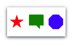
Box's also have a prop for background, so you can set a background color, a width and a height and you have a colored box. One thing that makes Box & FlexBox unique is that you can set shape props on them! So just by adding the prop `star` you turn the div into a star. See list of style maps below for full list of shape props you can choose from. You can even create your own by using the clip-path prop, clip!
Example:
```javascript
```
Will look like...
> I also find that Box's make good spacers, between elements!
```javascript
// This puts a 20px spacer between Header, Body and Footer components
```
### Modal
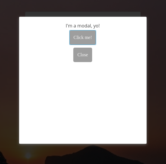
In order to pull off a modal you're going to need 2 components: Modal and useModal. In order to make Modal work your going to need to pass it an "isActive" prop and a "toggle" prop. You can get both of these props off of useModal hook:
```javascript
import { useModal } from "adaptiv-ui";
const [isActive, toggle] = useModal();
```
Then you can plug them into Modal and you're good to go!
Example:
```javascript
import React from "react";
import { useModal, Modal, Flex, Button, Text } from "adaptiv-ui";
export default function Component() {
const [isActive, toggle] = useModal();
return (
<>
I'm a modal, yo!
);
}
```
### Tool Tip
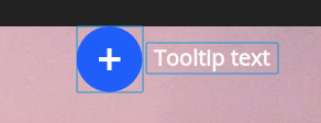
TooTip component has all the same props as Flex, but it has a special feature! After adding your element, you can place a div under it with a className of "tooltip". Whatever you put inside this "tooltip" div will be invisible until you hover over or focus on the element you nested inside your ToolTip component. In addition to the Flex props, there are a couple of extra props that ToolTip has so that you can edit your "tooltip" element and position.
tt_w: edits the **width** of the tooltip
tt_h: edits the **height** of the tooltip
tt_color: edits the **color** of the tooltip
tt_bg: edits the **background color** of the tooltip
tt_top: edits the **top position** of the tooltip
tt_right: edits the **right position** of the tooltip
tt_bottom: edits the **bottom position** of the tooltip
tt_left: edits the **left position** of the tooltip
tt_radius: edits the **radius** of the tooltip
tt_zIndex: edits the **z index** of the tooltip
Example:
```javascript
// using tt props to edit tool tip position and size
{/* These two Box's make up the content that we want to add a tooltip too */}
{/* Our "tooltip" div is the container for what we want to show in our
tooltip on focus or hover. */}
Tooltip text
```
### Container
Container is a component that's main purpose is to provide a background image. It also can set colors as the background but the css for images is set for responsiveness. If you need things to lay on top of a background image this is the component to use. Just wrap the content in Container and set bg_src prop to the location/URL of your image. It also has flex enabled and all sizing props. By default justify content is column and align items is center. You can change these individually to you own desire. You can also use the `across` props to set them to flex-start / normal respectively.
Example:
```javascript
{/* Add invert prop to make text white instead of black */}
Stuff...
Stuff...
Stuff...
```
### Button:
It's a beautiful button! It has some color props to quickly and easily change the color scheme of the button.
List of color props:
- primitive (default)
- primary
- secondary
### Linkton:
Looks exactly like a button, but is a Link from @reach/router.
List of color props:
- primitive (default)
- primary
- secondary
Example:
```javascript
Go home
```
### Form:
It's a form with flex-box (direction: column, align: center by default) and some basic additional props.
### Input:
A better looking input to use.
### Importing adaptiv-ui css and styled components 🚀
It's highly recommended to pull in adaptiv-ui's global style overhauls, just `import "adaptiv-ui/css/main.css"` in your root index.js file. Feel free to check out the code to see what is under the hood! 🔥
All styled components get exported from `adaptiv-ui`. So all you need to do is deconstruct the component(s) you want from "adaptiv-ui".
#### Example:
`./src/components/MyComponent`
```javascript
import React from "react";
import { Wrapper, Flex, Button } from "adaptiv-ui";
export default function MyComponent() {
return (
Card Header
Card text.
);
}
```
## Theme Color Variables 🖌
If you want to use the color variables in just throw in theme to your AdaptivUI import: `import { theme } from "adaptiv-ui"`
Example:
```javascript
import React from "react";
import { Wrapper, Flex, Button, theme } from "adaptiv-ui";
export default function MyComponent() {
return (