# Angular Moment Picker
[](https://gitter.im/indrimuska/angular-moment-picker?utm_source=badge&utm_medium=badge&utm_campaign=pr-badge&utm_content=badge)
[](https://travis-ci.org/indrimuska/angular-moment-picker)
[](https://npmjs.org/package/angular-moment-picker)
[](https://npmjs.org/package/angular-moment-picker)
[](LICENSE)
[](https://cdnjs.com/libraries/angular-moment-picker)
Check out the homepage at [http://indrimuska.github.io/angular-moment-picker/](http://indrimuska.github.io/angular-moment-picker/).
*Angular Moment Picker* is a native AngularJS directive for date and time picker that uses *Moment.js* and **does not require jQuery**.
## Installation
Get Angular Moment Picker from [**npm**](https://www.npmjs.com/), [**bower**](http://bower.io/) or [**git**](https://git-scm.com/):
```
npm install angular-moment-picker
bower install moment-picker
git clone https://github.com/indrimuska/angular-moment-picker.git
```
Include style and script in your page:
```html
```
Add *moment-picker* dependency to your module:
```js
var myApp = angular.module('myApp', ['moment-picker']);
```
Provide the attribute to your element:
```html
{{ myDate }}
```
## Demo
Check out the demo page at [http://indrimuska.github.io/angular-moment-picker/](http://indrimuska.github.io/angular-moment-picker/).
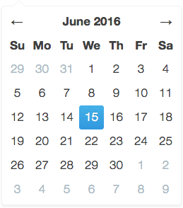
## The views
***Decade view*** | ***Year view*** | ***Month view***
:---:|:---:|:---:
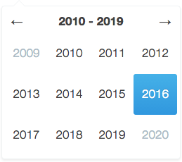 | 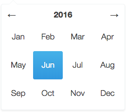 | 
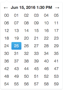
***Day view*** | ***Hour view*** | ***Minute view***
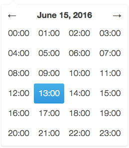 | 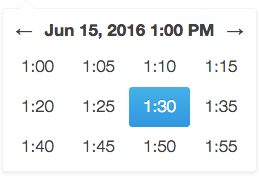 | 
### Additional themes
Angular Moment Picker provides the following additional themes. Each theme has a dedicate stylesheet to be included in the application the overrides the default style.
- **Material UI** - [Plunker](https://embed.plnkr.co/P48UnN)
```html
```
A preview of the each theme is available [here](dist/themes/).
## Options
To configure Angular Moment Picker you have to add to your element or your input the attribute relative to the options you want to set.
```html
Mon anniversaire est le {{ ctrl.birthday }}
```
```html
```
Property | Default | Description | Sample
---|---|---|---
moment-picker | | Two-way bindable property as **formatted datetime string**. | [Plunker](https://embed.plnkr.co/nPGbO3KkmmPqf7mfN2PC/)
ng-model | | Two-way bindable property as **Moment.js object**. | [Plunker](https://embed.plnkr.co/hs10SM)
locale | `"en"` | Locale code. 1 | [Plunker](https://embed.plnkr.co/z3KSxy)
format | `"L LTS"` | Format of the output value and min/max date. 1 | [Plunker](https://embed.plnkr.co/rWtdhO)
min-view | `"decade"` | Minimum navigable view. | [Plunker](https://embed.plnkr.co/wAGqtl)
max-view | `"minute"` | Maximum navigable view. | [Plunker](https://embed.plnkr.co/GYRv7J)
start-view | `"year"` | Initial view when the picker is open. | [Plunker](https://embed.plnkr.co/wFXcGL)
min-date | | Two-way bindable property representing the minimum selectable date (as String in the same format of the value, or as a Moment.js object). | [Plunker](https://embed.plnkr.co/L9dOc4)
max-date | | Two-way bindable property representing the maximum selectable date (as String in the same format of the value, or as a Moment.js object). | [Plunker](https://embed.plnkr.co/OvvfAQ)
start-date | | Two-way bindable property representing the initial date to be shown in picker (as String in the same format of the value, or as a Moment.js object). | [Plunker](https://embed.plnkr.co/rjFk9d)
disable | `false` | Disables the picker if truly. | [Plunker](https://embed.plnkr.co/Zeaxd3)
position | | Sets a fixed position for the picker. Available values are `"top left"`, `"top right"`, `"bottom left"`, `"bottom right"`. | [Plunker](https://embed.plnkr.co/v9AZFu)
inline | `false` | Views the picker inline. | [Plunker](https://embed.plnkr.co/5PhKOc)
validate | `true` | Forces picker value between the range `minDate` and `maxDate`. | [Plunker](https://embed.plnkr.co/hFTyMV)
autoclose | `true` | Closes the picker after selecting a date. | [Plunker](https://embed.plnkr.co/z7M6WK)
set-on-select | `false` | Updates picker model after selecting a date in each view. | [Plunker](https://embed.plnkr.co/hJRNcT)
is-open | | Open/closes the picker when set to `true` or `false`. | [Plunker](https://embed.plnkr.co/7T4sbs)
today | `false` | Highlights the current day. | [Plunker](https://embed.plnkr.co/YYbV4C)
keyboard | `false` | Allows using the keyboard to navigate the picker. | [Plunker](https://embed.plnkr.co/OdUhHx)
show-header | `true` | Shows the header in the view. | [Plunker](https://embed.plnkr.co/PCL4mh)
additions | `{ top: undefined, bottom: undefined }` | Template url for custom contents above and below each picker views (inside the dialog). | [Plunker](https://embed.plnkr.co/CXOH5U)
## Methods
Append your method to your element and define its behavior in the controller.
```html
Next exhibition is on {{ ctrl.exhibition }}.
```
```javascript
ctrl.isSelectable = function (date, type) {
// disable all Sundays in the Month View
return type != 'day' || date.format('dddd') != 'Sunday';
};
```
Method | Parameters | Description | Sample
---|---|---|---
selectable | `date`, `type` | Return `true` if the given date can be selected in the current view. **Please note** that this method is called for every date in the view, every time a view is rendered, so be careful, it may affect performances. | [Plunker](https://embed.plnkr.co/6wxtMn)
## Events
As for methods, to bind an event you only need to attach the right property to your picker.
```html
The meeting starts at {{ ctrl.meeting }}.
```
```javascript
ctrl.onChange = function (newValue, oldValue) {
$log.log('Meeting changed from ' + oldValue + ' to ' + newValue);
};
```
Event | Parameters | Description | Sample
---|---|---|---
change | `newValue`, `oldValue` | Function fired upon change in picker value. | [Plunker](https://embed.plnkr.co/IIhjjv)
## momentPickerProvider
Angular Moment Picker comes out with its own provider, in order to define your own configuration for all the pickers in your app.
```javascript
angular
.module('myApp', ['moment-picker'])
.config(['momentPickerProvider', function (momentPickerProvider) {
momentPickerProvider.options({
/* ... */
});
}]);
```
Property | Default | Description
---|---|---
locale | `"en"` | Locale code. 1
format | `"L LTS"` | Format of the output value and min/max date. 1
min-view | `"decade"` | Minimum navigable view.
max-view | `"minute"` | Maximum navigable view.
start-view | `"year"` | Initial view after picker opening.
position | | Sets a fixed position for the picker. Available values are `"top left"`, `"top right"`, `"bottom left"`, `"bottom right"`.
inline | `false` | Views the picker inline.
validate | `true` | Forces picker value between the range `minDate` and `maxDate`.
autoclose | `true` | Closes the picker after selecting a date.
set-on-select | `false` | Updates picker model after selecting a date in each view.
today | `false` | Highlights the current day.
keyboard | `false` | Allows using the keyboard to navigate the picker.
show-header | `true` | Shows the header in the view.
left-arrow | `"←"` | Left arrow string (HTML allowed).
right-arrow | `"→"` | Right arrow string (HTML allowed).
additions | `{ top: undefined, bottom: undefined }` | Template url for custom contents above and below each picker views (inside the dialog).
years-format | `"YYYY"` | Years format in `decade` view.
months-format | `"MMM"` | Months format in `year` view.
days-format | `"D"` | Days format in `month` view.
hours-format | `"HH:[00]"` | Hours format in `day` view.
hours-start | `0` | First rendered hour in `day` view (24h format).
hours-end | `23` | Last rendered hour in `day` view (24h format).
minutes-format | 2 | Minutes format in `hour` view.
minutes-step | `5` | Step between each visible minute in `hour` view.
minutes-start | `0` | First rendered minute in `hour` view.
minutes-end | `59` | Last rendered minute in `hour` view.
seconds-format | `"ss"` | Seconds format in `minute` view.
seconds-step | `1` | Step between each visible second in `minute` view.
seconds-start | `0` | First rendered second in `minute` view.
seconds-end | `59` | Last rendered second in `minute` view.
## Notes
1. Locale codes and format tokens are available at http://momentjs.com/.
2. Locale format `LT` without meridiem part (AM/PM, am/pm).
## Builder
Try the online [Angular Moment Picker Builder](http://indrimuska.github.io/angular-moment-picker/#builder):
[http://indrimuska.github.io/angular-moment-picker/#builder](http://indrimuska.github.io/angular-moment-picker/#builder).
## Dev scripts
- `npm run build`: compile sources and generate built files in `dist` folder.
- `npm run minify`: generate built files and minified ones.
- `npm run release`: increase package version and compile the project.
- `npm run test`: run all tests in the `tests` folder.
## License
Copyright (c) 2015 Indri Muska. Licensed under the MIT license.