# [angular](https://angularjs.org/)-ui-switch
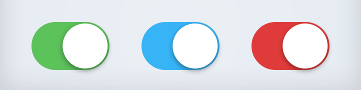
This is a simple iOS 7 style switch directive for AngularJS. You can use this module as you would use the default HTML checkbox input element. This is a super lightweight module and you can completely change the design using just CSS.
Supported by all modern browsers: Chrome, Firefox, Opera, Safari, IE8+
Inspired by [switchery](https://github.com/abpetkov/switchery) - in angular way.
## Installation
Download the package from `github`. The package is also available over `npm install angular-ui-switch` or `bower install angular-ui-switch`.
Include `javascript` and `css` files into your page.
```html
...
...
```
Declare a dependency on the module.
```js
angular.module('myModule', ['uiSwitch']);
```
Insert the switch in your html template.
```html
```
Add optional on/off text
```html
```
Disabled state
```html
```
## Design
You can completely change the design. All the magic is hidden inside two CSS classes.
```css
.switch {
/* frame */
}
.switch small {
/* button */
}
.switch.checked {
/* frame when enabled */
}
.switch.checked small {
/* button when enabled */
}
```
## Publishing
1. Update version in `package.json` and `bower.json`.
2. Run `make compile` to minify files.
3. Run `make publish` to publish.