# 🎮 ASafariM NavLinks Interactive Demo
This is a comprehensive demo application showcasing all the features of the `asafarim-navlinks` package. The demo provides real-world examples of navigation implementation including multi-level dropdowns that open on hover, custom styling, and various navigation patterns.
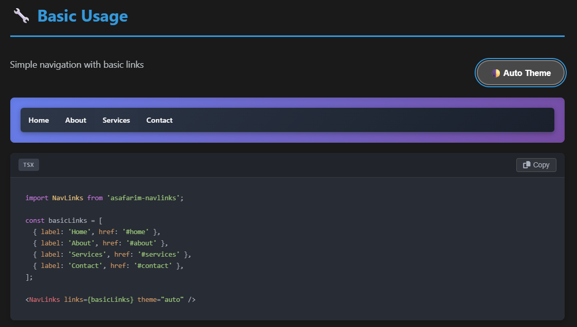
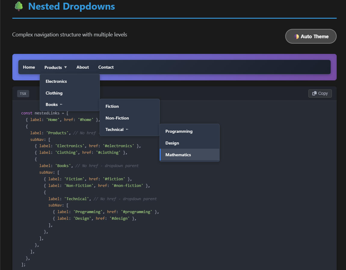
*Experience unlimited multi-level dropdown menus in action*

*Four different alignment options for flexible dropdown positioning*
## ✨ Features Demonstrated
- ✅ **Basic Navigation**: Simple, clean navigation links
- ✅ **Unlimited Multi-level Dropdowns**: Deep nesting with proper hover behavior
- ✅ **Four Alignment Options**: Left, right, top, and bottom dropdown positioning
- ✅ **Icon Support**: Font Awesome icons on left/right sides of menu items
- ✅ **Emoji Support**: Using emojis as visual indicators for modern UI
- ✅ **SVG/Logo Integration**: Custom SVG icons and logos for brand identity
- ✅ **Custom Styling**: Extensive CSS classes and inline style customization
- ✅ **Responsive Design**: Automatic mobile detection with animated hamburger menu
- ✅ **Mobile Features**: Touch-friendly navigation with hamburger-to-cross animation
## 🚀 Running the Demo
### Quick Start
The easiest way to run the demo is using the package script:
```bash
# From the root directory of the package
pnpm run demo
```
This will build the package and start the demo application.
### Manual Setup
1. **Install dependencies**:
```bash
cd demo
pnpm install
```
2. **Build the main package** (if not already built):
```bash
cd ..
pnpm run build
```
3. **Start the demo**:
```bash
cd demo
pnpm run dev
```
4. Open your browser at the URL shown in the terminal (typically [http://localhost:5173](http://localhost:5173)) to view the demo.
### Build for Production
```bash
# From the demo directory
pnpm run build
```
The built demo will be in the `dist` directory and can be served with any static file server.
## 🔍 Demo Structure
The demo is organized into several sections, each showcasing different aspects of the component:
### Main Demo Sections
- **Basic Navigation**: Clean, simple navigation links without any dropdowns
- **Dropdown Navigation**: Multi-level nested navigation menus showing hover behavior
- **Icons & Emojis**: Examples with Font Awesome icons and emoji indicators
- **Advanced Demos**: Complex examples showing deep nesting and mixed content
- **Alignment Options**: Four different positioning options (left, right, top, bottom)
- **Custom Styling**: Navigation with different visual styles and themes
- **Professional Examples**: Real-world navigation structures and documentation layouts
### Advanced Features Showcase
- **Deep Nesting**: Navigation with 5+ levels of nested dropdowns
- **Mixed Content**: Dropdowns with icons, emojis, and text in various combinations
- **All Alignment Options**: Left, right, top, and bottom dropdown positioning
- **Interactive Elements**: Demonstration of hover states and animations
- **Responsive Behavior**: How the navigation adapts to different screen sizes
### Implementation Examples
Each demo section includes:
- Live interactive example
- Visual preview of the feature
- Source code snippet showing implementation details
- Explanation of the props and options used
## 📋 Demo Navigation Structure
The demo showcases a sophisticated navigation structure with multiple levels:
```typescript
const mainNavigation: NavLinkType[] = [
// Brand logo with SVG
{
label: 'ASafariM',
href: '/',
svgLogoIcon: {
src: '/assets/logoT.svg',
alt: 'ASafariM Logo',
width: 35,
height: 35,
caption: 'ASafariM',
}
},
// Products menu with nested dropdowns
{
label: 'Products',
href: '/products',
iconLeft: 'fas fa-cube',
subNav: [
{
label: 'Web Development',
href: '/web-dev',
emoji: '🌐',
subNav: [
{ label: 'React Apps', href: '/react-apps', iconLeft: 'fab fa-react' },
{ label: 'Vue Apps', href: '/vue-apps', iconLeft: 'fab fa-vuejs' },
// More nested items...
]
},
// More menu items...
]
},
// Advanced demos section with deep nesting
{
label: 'Advanced Demos',
href: '#',
iconLeft: 'fas fa-flask',
subNav: [
{
label: 'Deep Nesting',
href: '#deep-nesting',
subNav: [
{
label: 'Level 3',
href: '#level-3',
subNav: [
{
label: 'Level 4',
href: '#level-4',
subNav: [
{ label: 'Level 5', href: '#level-5' },
// Can go deeper...
]
}
]
}
]
}
]
}
]
```
## 🔧 Key Implementation Details
### Multi-level Dropdown Behavior
The demo highlights how dropdowns only appear on hover:
```tsx
// All dropdowns are hidden by default and only appear on hover
// CSS in NavbarLinks.module.css handles the hover behavior
```
### Four Alignment Options
The demo demonstrates all four alignment options for dropdown positioning:
- **Left Aligned**: Nested dropdowns slide out to the left of their parent items
- **Right Aligned**: Nested dropdowns slide out to the right of their parent items
- **Top Aligned**: All dropdowns appear above their parent items instead of below
- **Bottom Aligned**: All dropdowns appear below their parent items (default behavior)
### Custom Styling Applied
The demo shows how to apply custom styling:
```tsx
// Example with custom styling for professional appearance
```
## 🎯 Learning from the Demo
This demo is designed to help you:
1. **Understand the API**: See all props and options in action, including all four alignment options
2. **Learn patterns**: How to structure complex navigation hierarchies with proper nesting
3. **Explore styling**: Ways to customize the appearance to match your brand and design system
4. **Master alignment**: How to use left, right, top, and bottom alignment for optimal dropdown positioning
5. **Troubleshoot issues**: Compare your implementation with working examples and see best practices
## 💻 Development
If you want to modify the demo:
1. Make changes to the source code in the `src` directory
2. Run the development server with `pnpm run dev`
3. Test your changes in the browser
### Project Structure
```
demo/
├── public/ # Static assets
│ └── assets/ # Images, logos, etc.
├── src/ # Source code
│ ├── App.tsx # Main application component with all examples
│ └── index.css # Demo-specific styling
├── index.html # HTML entry point
├── package.json # Dependencies and scripts
└── vite.config.ts # Vite configuration
```
## 🙋♂️ Feedback & Support
We'd love to hear your feedback on the demo and the package!
- **Issues**: Report bugs or request features [on GitHub](https://github.com/AliSafari-IT/asafarim-navlinks/issues)
- **Questions**: Reach out with questions about implementation
- **Suggestions**: Let us know how we can improve the demo
## 📄 License
This demo is part of the asafarim-navlinks package, licensed under the MIT License.
---
Brought to you by Ali Safari - [@AliSafari-IT](https://github.com/AliSafari-IT)
### Alignment Options Demonstrated
The demo showcases all four alignment options with clear visual examples:
```typescript
// Left Aligned (Default) - nested dropdowns slide to the left
// Right Aligned - nested dropdowns slide to the right
// Top Aligned - dropdowns appear above parent items
// Bottom Aligned (Default) - dropdowns appear below parent items
```