# async-modal-react

[Documentation - livemehere-dev-packs](https://livemehere.github.io/livemehere-dev-packs/docs/category/async-modal-react)
This is a simple solution to create a modal in React using hooks and async/await.
> Really simple, only what you have to do is wrap your root component with `ModalProvider` and use `useModal` hook.
## Demo
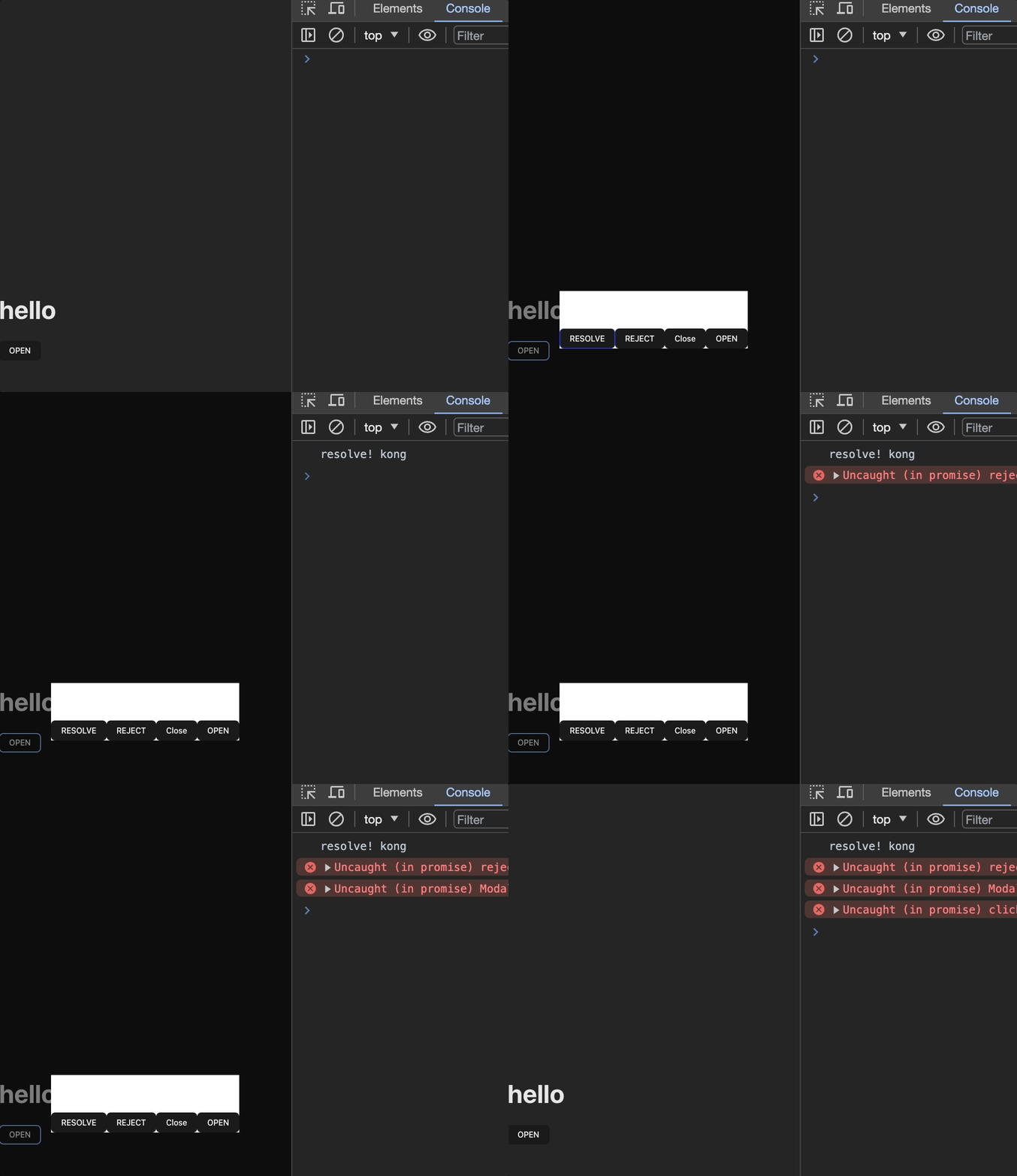
## Short Description
- You can open modal by using promise function.
- You can open multiple modals at the same time.
- You can close all modals at the same time.
- You can close modal by clicking outside of modal.
- You can customize reject reason and resolve value.
- Typescript support.
- No dependencies except React.
## Install
```bash
npm install async-modal-react@3 # react <=18
npm install async-modal-react@latest # react >=19
```
## Usage
### Wrap your Root Component with ModalProvider
- `closeOnOutsideClick` props is for close modal when click outside of modal(default: true).
- `disableBodyScrollWhenOpen` props is for disable body scroll when modal is opened(default: true).
- `closeOnRouteChange` props is for close all modals when route is changed(default: true).
- `errorOnClose` props is for throw error when modal is closed by clicking outside of modal or route change(default: false).
```jsx
import { ModalProvider } from "async-modal-react";
ReactDOM.createRoot(document.getElementById("root")).render(
,
);
```
### Create Your Modal Component
- Component that used for modal receive 3 props: `close`, `resolve`, `reject`.
- `resolve` function will return value when using `open` function.
- `close` and `reject` function will reject when using `open` function.
- `reject` reason and `resolve` value can customize by yourself.
> ❗`close` estimated as `reject`
```jsx
const ExampleModal = ({ close, resolve, reject }) => {
return (
ExampleModal
);
};
export default ExampleModal;
```
### Use Modal with Hooks
- `useModal` hook return `open` and `closeAll` function.
```jsx
import ExampleModal from "./components/ExampleModal";
import { useModal } from "async-modal-react";
function App() {
const { open, closeAll } = useModal();
const openModal = async () => {
try {
// resolve
const result = await open(ExampleModal);
console.log(result);
} catch (e) {
// reject, close
console.log(e);
}
};
return (
);
};
export default ExampleModal;
```
### Hooks
- resolve type can be set by generic type.
- second generic type is for modal props. (most case is not necessary)
- `open` function return `Promise`.
- options are higher priority than `ModalProvider` props. You can set individually.
```tsx
const result = await open(
ExampleModal, // Modal Component
{}, // ExampleModal props
{ // Individual options
onClickOutsideClose: true,
disableScroll: true,
enableInsideScroll: true, // use this when global disableScroll is true but you want to enable scroll in this modal.
errorOnClose: true,
},
);
```
## Customizing
### Modal root element
```jsx
{children}
```
customize `#modal-root` element with global css.
```css
#modal-root {
background: blue !important;
}
```
### Multiple modals style
By Default modal root element display children with `flex` and `justifyContent: center`, `alignItems: center`. So if there are more than two modal is opened, they will be displayed in just like a flex.
if you want to stack layout, your modal component should have `position: absolute` style.
```jsx
// ...
return (
ExampleModal
);
```
#### If Modal Component not have `position: absolute` look like.

#### If Modal Component have `position: absolute` look like.
- Two modals are stacked
