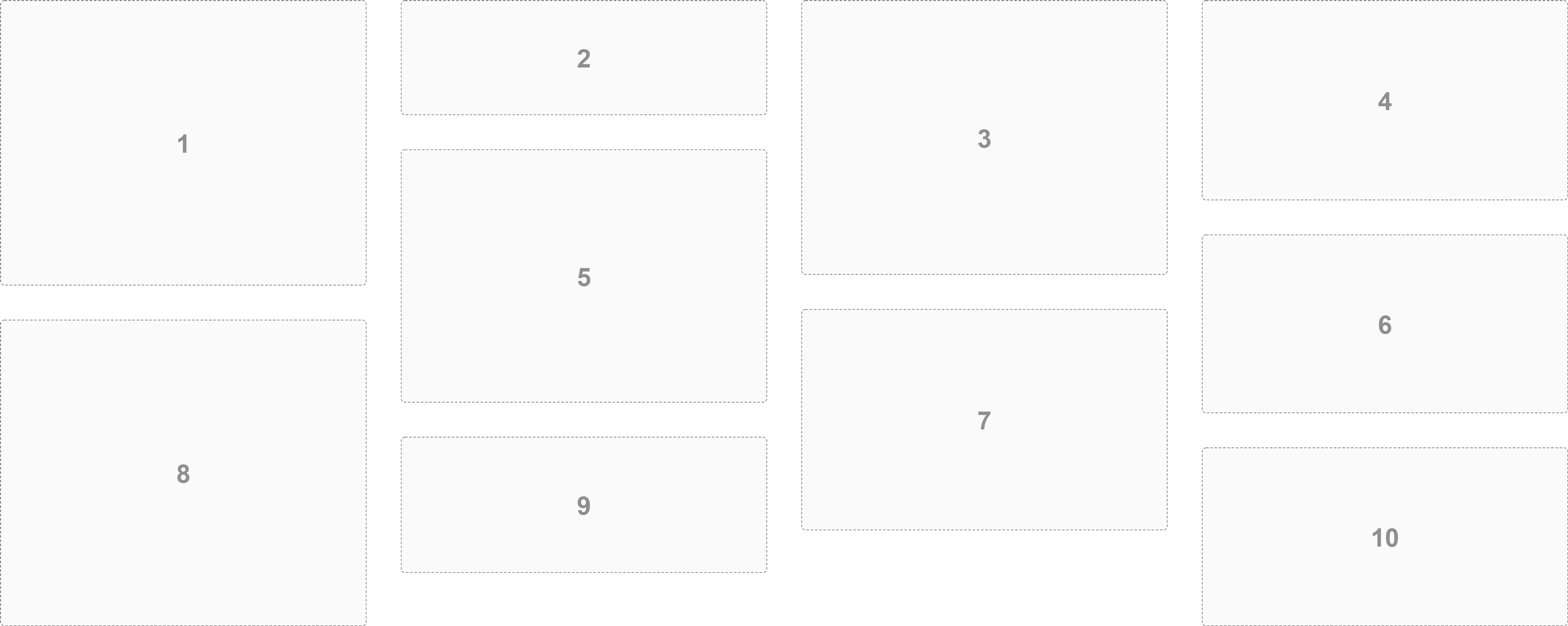
Box 1
Lorem ipsum dolor sit amet, consectetur adipiscing elit.
Box 2
Lorem ipsum dolor sit amet, consectetur adipiscing elit, sed do eiusmod tempor incididunt ut laboret.
Box 3
Box 4
Lorem ipsum dolor sit amet.
Box 5
Lorem ipsum dolor sit amet, consectetur adipiscing elit, sed do eiusmod tempor.
```
## Parameters
3 parameters can be passed to the `Brique` class.
```ts
new Brique(gridElement, options, observeGridResize);
```
### gridElement`: HTMLElement`
Target HTML element which is the container for grid items.
### options`: BriqueOptions` (Optional)
| Property | Type | Required | Description |
| --- | --- | --- | --- |
| columns | number | true | Number of columns |
| columnGap | string | false | Spacing between columns |
| rowGap | string | false | Spacing between row |
#### Example
``` ts
const refGrid = document.getElementById('grid');
const options = {
columns: 4,
rowGap: '24px',
columnGap: '16px',
};
new Brique(refGrid, options);
```
### observeGridResize`: boolean` (Optional)
The default value for this parameter is `true`.
If the value is `true`, the grid items will be updated when the viewport is resized.
If the value is `false`, the grid will **never** be updated when the viewport is resized.
## Properties
### Default options
Static property which returns the options defined by default in the `Brique` class.
```ts
Brique.DEFAULT_OPTIONS;
```
### itemElements`: HTMLElement[]`
Reference array of HTML elements of all grid items.
## Methods
### update()
Update the rendering of the entire grid on demand.
``` ts
briqueGrid.update();
```
### updateItems()
Update the rendering of the grid items on demand.
``` ts
briqueGrid.updateItems();
```
### updateOnResize()
Update the dimension of grid items when the grid element is resized.
``` ts
const refGrid = document.getElementById('grid');
const briqueGrid = new Brique(refGrid);
briqueGrid.updateOnResize();
```
### stopUpdateOnResize()
Stop update the dimension of grid items when the grid element is resized.
``` ts
briqueGrid.stopUpdateOnResize();
```
### getOptions()`: BriqueOptions`
Return current options object.
``` ts
briqueGrid.getOptions(); // output: { columns: 3, rowGap: '32px', columnGap: '32px'}
```
### setOptions(`options`)
Change all properties of options object.
``` ts
briqueGrid.setOptions({
columns: 5
});
```
### updateOptions(`updatedOptions`)
Updates only changed properties.
``` ts
briqueGrid.updateOptions({
columns: 5
});
```
Can be used to create a [responsive grid](#responsive-grid).
### destroy()
Removes all events listened to on the HTML elements handled by the `Brique` class.
The `destroy()` method must be called when the grid is removed from HTML.
## Responsive grid
Update options object on media queries change.
``` ts
const refGrid = document.getElementById('grid');
const mediaQueryMobile = window.matchMedia('(max-width: 767px)');
const getColumnsNumber = () => mediaQueryMobile.matches ? 2 : 3;
const briqueGrid = new Brique(refGrid, {
columns: getColumnsNumber(),
columnGap: '32px',
rowGap: '32px',
});
mediaQueryMobile.addEventListener('change', () => {
briqueGrid.updateOptions({
columns: getColumnsNumber(),
});
});
```
 ## Getting Started
1. [Install](#install)
2. [Instantiate](#instantiate)
3. [HTML markup example](#HTML-markup-example)
4. [Parameters](#parameters)
5. [Properties](#properties)
6. [Methods](#methods)
7. [Responsive grid](#responsive-grid)
## Install
```
$ npm i brique --save
```
## Instantiate
### TypeScript
``` ts
import { Brique } from './node_modules/brique/lib';
const refGrid = document.getElementById('grid');
new Brique(refGrid);
```
### JavaScript ES6
HTML `script` tag requires the `type="module"` attribute.
``` html
```
Create the grid in the JavaScript file (`scripts/main.js`) and import the `esm` version of the library (`index.esm.js`).
``` js
import { Brique } from './node_modules/brique/lib/index.esm.js';
const refGrid = document.getElementById('grid');
new Brique(refGrid);
```
## HTML markup example
``` html
## Getting Started
1. [Install](#install)
2. [Instantiate](#instantiate)
3. [HTML markup example](#HTML-markup-example)
4. [Parameters](#parameters)
5. [Properties](#properties)
6. [Methods](#methods)
7. [Responsive grid](#responsive-grid)
## Install
```
$ npm i brique --save
```
## Instantiate
### TypeScript
``` ts
import { Brique } from './node_modules/brique/lib';
const refGrid = document.getElementById('grid');
new Brique(refGrid);
```
### JavaScript ES6
HTML `script` tag requires the `type="module"` attribute.
``` html
```
Create the grid in the JavaScript file (`scripts/main.js`) and import the `esm` version of the library (`index.esm.js`).
``` js
import { Brique } from './node_modules/brique/lib/index.esm.js';
const refGrid = document.getElementById('grid');
new Brique(refGrid);
```
## HTML markup example
``` html