ngx-skeleton-loader
Version:
Make beautiful, animated loading skeletons that automatically adapt to your Angular apps
223 lines (160 loc) • 8.53 kB
Markdown
# NGX Skeleton loader
[](https://npmjs.org/ngx-skeleton-loader)
[](https://david-dm.org/willmendesneto/ngx-skeleton-loader)
[](https://stackblitz.com/edit/ngx-skeleton-loader-sample)
[](https://npmjs.org/ngx-skeleton-loader)
[](https://npmjs.org/ngx-skeleton-loader)
[](https://circleci.com/gh/willmendesneto/ngx-skeleton-loader)
[](https://coveralls.io/r/willmendesneto/ngx-skeleton-loader?branch=master)
[](https://bundlephobia.com/result?p=ngx-skeleton-loader)
[](/LICENSE)
## Why skeletons?
> If you want to get more details about that, please read ["NGX-Skeleton-Loader — States, Animations, Performance, and Accessibility for your Angular App"](https://medium.com/@willmendesneto/ngx-skeleton-loader-states-animations-performance-and-accessibility-for-your-angular-app-ad0fd86da7a5) blog post at Medium
The idea of this component is make the process transparent and easier. So the main point is integrate this component with other tooling process, such as:
- Server-side rendering;
- Progressive rendering;
- Any other that you like :)
It's totally transparent for you and you can integrate easier in your application, improving your user experience 🎉
- [Demo](#demo)
- [Install](#install)
- [Setup](#setup)
- [Development](#development)
- [Contribute](#contribute)
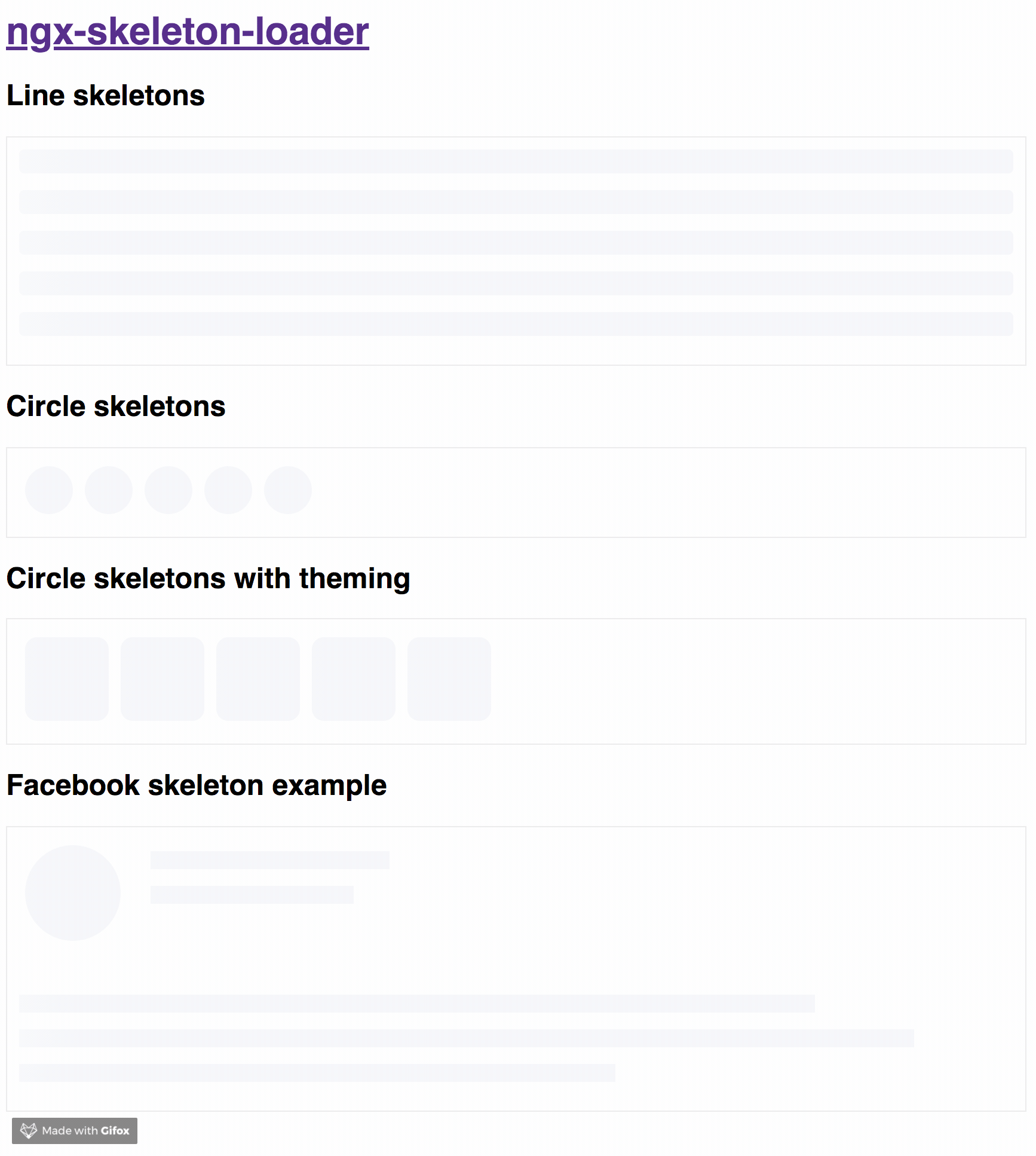
## Demo
Try out our demos on Stackblitz!
- [Usage: animations, appearance, and themes](https://ngx-skeleton-loader-sample.stackblitz.io)
- [User Card Component Loading simulation using NGX Skeleton Loader](https://ngx-skeleton-loader-user-card-component-sample.stackblitz.io)
## Install
You can get it on NPM installing `ngx-skeleton-loader` module as a project dependency.
```shell
npm install ngx-skeleton-loader --save
```
## Setup
You'll need to add `NgxSkeletonLoaderModule` to your application module. So that, the `<ngx-skeleton-loader>` components will be accessible in your application.
```typescript
...
import { NgxSkeletonLoaderModule } from 'ngx-skeleton-loader';
...
@NgModule({
declarations: [
YourAppComponent
],
imports: [
...
NgxSkeletonLoaderModule,
...
],
providers: [],
bootstrap: [YourAppComponent]
})
export class YourAppComponent {}
```
After that, you can use the `ngx-skeleton-loader` components in your templates, passing the configuration data into the component itself.
- `ngx-skeleton-loader`: Handle the skeleton animation and the skeleton styles of your app;
```html
<div class="item">
<ngx-skeleton-loader count="5" appearance="circle"></ngx-skeleton-loader>
</div>
```
## Animations
You can also define which CSS animation you want to use - even not use any, if it's the case - in your skeleton loader by passing the options in your component via `[animation]` attribute.
### Options
- `false`: it will disable the animation;
- `progress` - _default_: it will use it `progress` as animation;
- `progress-dark`: it will use it `progress-dark` as animation. Recommended if your color schema is darken;
- `pulse`: it will use `pulse` as animation;
> `progress` is the default animation, used as the single one previously. If you don't pass the animation attribute, it defaults to `progress`.
```html
<!--
If you need to change all the background wrapper
you need to apply the style changes on the
`ngx-skeleton-loader` component wrapper
-->
<div class="item">
<!-- Disables the animation -->
<ngx-skeleton-loader animation="false"></ngx-skeleton-loader>
<!-- Uses `progress` as animation -->
<ngx-skeleton-loader animation="progress"></ngx-skeleton-loader>
<ngx-skeleton-loader></ngx-skeleton-loader>
<!-- Uses `pulse` as animation -->
<ngx-skeleton-loader animation="pulse"></ngx-skeleton-loader>
</div>
```
> You can check the code details in the [Stackblitz Live Demo Link](https://stackblitz.com/edit/ngx-skeleton-loader-sample?file=app%2Fapp.component.html)
## Theming
You can also define different styles for the skeleton loader by passing an object with the css styles - in dashed case - into the component via `[theme]` attribute.
```html
<!--
If you need to change all the background wrapper
you need to apply the style changes on the
`ngx-skeleton-loader` component wrapper
-->
<div style="background: #FF0001; padding: 10px;">
<ngx-skeleton-loader
count="5"
[theme]="{
'border-radius': '5px',
height: '50px',
'background-color': '#992929',
border: '1px solid white'
}"
></ngx-skeleton-loader>
</div>
```
### ⚠️ This is here only as a documentation, but it's not encouraged to be used. Please consider use it with caution ⚠️
Also, you can use CSS to add theme styles into your component. However, there are some implications:
- You're using `:host` in your stylesheet, which means **you are aware of any possible problem `:host` can create for your app at that level since it's based on [`:host` DOM style scoping](https://developer.mozilla.org/en-US/docs/Web/CSS/:host)**
- You're adding stylesheet based on `<ngx-skeleton-loader>` internal classes. It means that **class naming changes on module's side will be breaking changes for your application as well**.
As an example, your Component file is like this
```typescript
import { Component } from "@angular/core";
@Component({
selector: "my-ngx-skeleton-loader-with-theming",
templateUrl: "./my-ngx-skeleton-loader-with-theming.component.html",
styleUrls: ["./my-ngx-skeleton-loader-with-theming.component.css"],
})
export class MyNGXSkeletonLoaderWithThemingComponent {
/* ... code goes here*/
}
```
And your componennt HTML code is
```html
<!--
file: my-ngx-skeleton-loader-with-theming.component.html
As an example, it's not using themes via [theme] attributes.
-->
<ngx-skeleton-loader
count="5"
animation="pulse"
></ngx-skeleton-loader>
```
You can apply theme changes in our stylesheet. At the end it will be
```css
/* file: `my-ngx-skeleton-loader-with-theming.component.css`
*
* You can find more details about `:host` at
* Angular Component Style Docs https://angular.io/guide/component-styles#host
*/
:host >>> ngx-skeleton-loader .loader {
border-radius: 5px;
height: 50px;
background-color: #992929;
border: 1px solid white;
}
```
> You should change the styles on the skeleton wrapper element in case you need to change the background color. You can check the code details in the [Stackblitz Live Demo Link](https://stackblitz.com/edit/ngx-skeleton-loader-sample?file=app%2Fapp.component.html) or check it out a content load simulation [in this Stackblitz Live Demo Link](https://stackblitz.com/edit/ngx-skeleton-loader-user-card-component-sample?file=app%2Fapp.component.html)
## Development
### Run demo locally
1. This project uses [Angular CLI](https://cli.angular.io/) as base. That means you just need to run `npm start` and access the link `http://localhost:4200` in your browser
### Run tests
1. Run `npm test` for run tests. In case you want to test using watch, please use `npm run tdd`
### Publish
this project is using `np` package to publish, which makes things straightforward. EX: `np <patch|minor|major> --contents=dist/ngx-skeleton-loader`
> For more details, [please check np package on npmjs.com](https://www.npmjs.com/package/np)
## Contribute
For any type of contribution, please follow the instructions in [CONTRIBUTING.md](https://github.com/willmendesneto/ngx-skeleton-loader/blob/master/CONTRIBUTING.md) and read [CODE_OF_CONDUCT.md](https://github.com/willmendesneto/ngx-skeleton-loader/blob/master/CODE_OF_CONDUCT.md) files.
## Author
**Wilson Mendes (willmendesneto)**
- <https://twitter.com/willmendesneto>
- <http://github.com/willmendesneto>