| 1 | # rc-tabs
|
| 2 |
|
| 3 | ---
|
| 4 |
|
| 5 | React Tabs component.
|
| 6 |
|
| 7 | [![NPM version][npm-image]][npm-url] [](https://github.com/umijs/dumi) [![build status][github-actions-image]][github-actions-url] [![Test coverage][codecov-image]][codecov-url] [![npm download][download-image]][download-url] [![bundle size][bundlephobia-image]][bundlephobia-url]
|
| 8 |
|
| 9 | [npm-image]: http://img.shields.io/npm/v/rc-tabs.svg?style=flat-square
|
| 10 | [npm-url]: http://npmjs.org/package/rc-tabs
|
| 11 | [github-actions-image]: https://github.com/react-component/tabs/workflows/CI/badge.svg
|
| 12 | [github-actions-url]: https://github.com/react-component/tabs/actions
|
| 13 | [codecov-image]: https://img.shields.io/codecov/c/github/react-component/tabs/master.svg?style=flat-square
|
| 14 | [codecov-url]: https://codecov.io/gh/react-component/tabs/branch/master
|
| 15 | [download-image]: https://img.shields.io/npm/dm/rc-tabs.svg?style=flat-square
|
| 16 | [download-url]: https://npmjs.org/package/rc-tabs
|
| 17 | [bundlephobia-url]: https://bundlephobia.com/result?p=rc-tabs
|
| 18 | [bundlephobia-image]: https://badgen.net/bundlephobia/minzip/rc-tabs
|
| 19 |
|
| 20 |
|
| 21 | ## Screenshot
|
| 22 |
|
| 23 | <img src='https://zos.alipayobjects.com/rmsportal/JwLASrsOYJuFRIt.png' width='408'>
|
| 24 |
|
| 25 | ## Example
|
| 26 |
|
| 27 | http://localhost:8000/examples
|
| 28 |
|
| 29 | online example: https://tabs.react-component.now.sh/
|
| 30 |
|
| 31 | ## install
|
| 32 |
|
| 33 | [](https://npmjs.org/package/rc-tabs)
|
| 34 |
|
| 35 | ## Feature
|
| 36 |
|
| 37 | ### Keyboard
|
| 38 |
|
| 39 | - left and up: tabs to previous tab
|
| 40 | - right and down: tabs to next tab
|
| 41 |
|
| 42 | ## Usage
|
| 43 |
|
| 44 | ```js
|
| 45 | import Tabs, { TabPane } from 'rc-tabs';
|
| 46 |
|
| 47 | var callback = function(key) {};
|
| 48 |
|
| 49 | React.render(
|
| 50 | <Tabs defaultActiveKey="2" onChange={callback}>
|
| 51 | <TabPane tab="tab 1" key="1">
|
| 52 | first
|
| 53 | </TabPane>
|
| 54 | <TabPane tab="tab 2" key="2">
|
| 55 | second
|
| 56 | </TabPane>
|
| 57 | <TabPane tab="tab 3" key="3">
|
| 58 | third
|
| 59 | </TabPane>
|
| 60 | </Tabs>,
|
| 61 | document.getElementById('t2'),
|
| 62 | );
|
| 63 | ```
|
| 64 |
|
| 65 | ## API
|
| 66 |
|
| 67 | ### Tabs
|
| 68 |
|
| 69 | | name | type | default | description |
|
| 70 | | --- | --- | --- | --- |
|
| 71 | | activeKey | string | - | current active tabPanel's key |
|
| 72 | | animated | boolean \| { inkBar: boolean, tabPane: boolean } | `{ inkBar: true, tabPane: false }` | config animation |
|
| 73 | | defaultActiveKey | string | - | initial active tabPanel's key if activeKey is absent |
|
| 74 | | destroyInactiveTabPane | boolean | false | whether destroy inactive TabPane when change tab |
|
| 75 | | direction | `'ltr' | 'rlt'` | `'ltr'` | Layout direction of tabs component |
|
| 76 | | editable | { onEdit(type: 'add' | 'remove', info: { key, event }), showAdd: boolean, removeIcon: ReactNode, addIcon: ReactNode } | - | config tab editable |
|
| 77 | | locale | { dropdownAriaLabel: string, removeAriaLabel: string, addAriaLabel: string } | - | Accessibility locale help text |
|
| 78 | | moreIcon | ReactNode | - | collapse icon |
|
| 79 | | tabBarGutter | number | 0 | config tab bar gutter |
|
| 80 | | tabBarPosition | `'left' | 'right' | 'top' | 'bottom'` | `'top'` | tab nav 's position |
|
| 81 | | tabBarStyle | style | - | tab nav style |
|
| 82 | | tabBarExtraContent | ReactNode \| `{ left: ReactNode, right: ReactNode }` | - | config extra content |
|
| 83 | | renderTabBar | (props, TabBarComponent) => ReactElement | - | How to render tab bar |
|
| 84 | | prefixCls | string | `'rc-tabs'` | prefix class name, use to custom style |
|
| 85 | | onChange | (key) => void | - | called when tabPanel is changed |
|
| 86 | | onTabClick | (key) => void | - | called when tab click |
|
| 87 | | onTabScroll | ({ direction }) => void | - | called when tab scroll |
|
| 88 |
|
| 89 | ### TabPane
|
| 90 |
|
| 91 | | name | type | default | description |
|
| 92 | | --- | --- | --- | --- |
|
| 93 | | key | string | - | corresponding to activeKey, should be unique |
|
| 94 | | forceRender | boolean | false | forced render of content in tabs, not lazy render after clicking on tabs |
|
| 95 | | tab | ReactNode | - | current tab's title corresponding to current tabPane |
|
| 96 | | closeIcon | ReactNode | - | Config close icon |
|
| 97 |
|
| 98 | ## Development
|
| 99 |
|
| 100 | ```
|
| 101 | npm install
|
| 102 | npm start
|
| 103 | ```
|
| 104 |
|
| 105 | ## Test Case
|
| 106 |
|
| 107 | ```
|
| 108 | npm test
|
| 109 | npm run chrome-test
|
| 110 | ```
|
| 111 |
|
| 112 | ## Coverage
|
| 113 |
|
| 114 | ```
|
| 115 | npm run coverage
|
| 116 | ```
|
| 117 |
|
| 118 | open coverage/ dir
|
| 119 |
|
| 120 | ## License
|
| 121 |
|
| 122 | rc-tabs is released under the MIT license.
|
| 123 |
|
| 124 | ## FAQ
|
| 125 |
|
| 126 | ### Resposive Tabs
|
| 127 |
|
| 128 | There are 3 cases when handling resposive tabs:
|
| 129 | 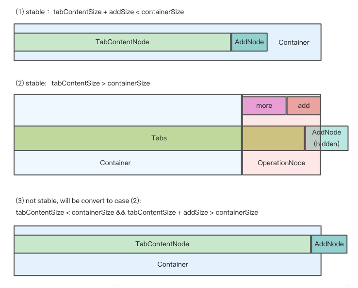
|
| 130 |
|
| 131 | We get hidden tabs through [useVisibleRange.ts](https://github.com/react-component/tabs/blob/master/src/hooks/useVisibleRange.ts).
|
| 132 | If enconter the third case, in order to make tabs responsive, some tabs should be hidden.
|
| 133 | So we minus `addSize` when calculating `basicSize` manully, even though there's no addNode in container.
|
| 134 | In this way, case 3 turns to case 2, tabs become stable again.
|