| 1 | # react-blessed
|
| 2 |
|
| 3 | A [React](https://facebook.github.io/react/) custom renderer for the [blessed](https://github.com/chjj/blessed) library.
|
| 4 |
|
| 5 | This renderer should currently be considered as experimental and is subject to change since it works on a beta version of React (`0.14.0-beta3`).
|
| 6 |
|
| 7 | 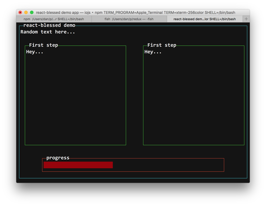
|
| 8 |
|
| 9 | ## Summary
|
| 10 |
|
| 11 | * [Installation](#installation)
|
| 12 | * [Demo](#demo)
|
| 13 | * [Usage](#usage)
|
| 14 | * [Rendering a simple application](#rendering-a-simple-application)
|
| 15 | * [Nodes & text nodes](#nodes--text-nodes)
|
| 16 | * [Refs](#refs)
|
| 17 | * [Events](#events)
|
| 18 | * [Classes](#classes)
|
| 19 | * [Roadmap](#roadmap)
|
| 20 | * [Contribution](#contribution)
|
| 21 | * [License](#license)
|
| 22 |
|
| 23 | ## Installation
|
| 24 |
|
| 25 | You can install `react-blessed` through npm:
|
| 26 |
|
| 27 | ```bash
|
| 28 | # Be sure to install react>=0.14.0 & blessed>=0.1.15 before
|
| 29 | npm install react@0.14.0-beta3 blessed
|
| 30 | npm install react-blessed
|
| 31 | ```
|
| 32 |
|
| 33 | ## Demo
|
| 34 |
|
| 35 | For a quick demo of what you could achieve with such a renderer you can clone this repository and check some of the examples:
|
| 36 |
|
| 37 | ```bash
|
| 38 | git clone https://github.com/Yomguithereal/react-blessed
|
| 39 | cd react-blessed
|
| 40 | npm install
|
| 41 |
|
| 42 | # Some examples (code is in `examples/`)
|
| 43 | npm run demo
|
| 44 | npm run dashboard
|
| 45 | npm run animation
|
| 46 | ```
|
| 47 |
|
| 48 | ## Usage
|
| 49 |
|
| 50 | ### Rendering a basic application
|
| 51 |
|
| 52 | ```jsx
|
| 53 | import React, {Component} from 'react';
|
| 54 | import {render} from 'react-blessed';
|
| 55 |
|
| 56 | // Rendering a simple centered box
|
| 57 | class App extends Component {
|
| 58 | render() {
|
| 59 | return <box top="center"
|
| 60 | left="center"
|
| 61 | width="50%"
|
| 62 | height="50%"
|
| 63 | border={{type: 'line'}}
|
| 64 | style={{border: {fg: 'blue'}}}>
|
| 65 | Hello World!
|
| 66 | </box>;
|
| 67 | }
|
| 68 | }
|
| 69 |
|
| 70 | // Creating our screen
|
| 71 | const screen = render(<App />, {
|
| 72 | autoPadding: true,
|
| 73 | smartCSR: true,
|
| 74 | title: 'react-blessed hello world'
|
| 75 | });
|
| 76 |
|
| 77 | // Adding a way to quit the program
|
| 78 | screen.key(['escape', 'q', 'C-c'], function(ch, key) {
|
| 79 | return process.exit(0);
|
| 80 | });
|
| 81 | ```
|
| 82 |
|
| 83 | ### Nodes & text nodes
|
| 84 |
|
| 85 | Any of the blessed [widgets](https://github.com/chjj/blessed#widgets) can be renderered through `react-blessed` by using a lowercased tag title.
|
| 86 |
|
| 87 | Text nodes, on the other hand, will be renderer by applying the `setContent` method with the given text on the parent node.
|
| 88 |
|
| 89 | ### Refs
|
| 90 |
|
| 91 | As with React's DOM renderer, `react-blessed` lets you handle the original blessed nodes, if you ever need them, through refs.
|
| 92 |
|
| 93 | ```jsx
|
| 94 | class CustomList extends Component {
|
| 95 | componentDidMount() {
|
| 96 |
|
| 97 | // Focus on the first box
|
| 98 | this.refs.first.focus();
|
| 99 | }
|
| 100 |
|
| 101 | render() {
|
| 102 | return (
|
| 103 | <element>
|
| 104 | <box ref="first">
|
| 105 | First box.
|
| 106 | </box>
|
| 107 | <box ref="second">
|
| 108 | Second box.
|
| 109 | </box>
|
| 110 | </element>
|
| 111 | );
|
| 112 | }
|
| 113 | }
|
| 114 | ```
|
| 115 |
|
| 116 | ### Events
|
| 117 |
|
| 118 | Any blessed node event can be caught through a `on`-prefixed listener:
|
| 119 |
|
| 120 | ```jsx
|
| 121 | class Completion extends Component {
|
| 122 | constructor(props) {
|
| 123 | super(props);
|
| 124 |
|
| 125 | this.state = {progress: 0, color: 'blue'};
|
| 126 |
|
| 127 | const interval = setInterval(() => {
|
| 128 | if (this.state.progress >= 100)
|
| 129 | return clearInterval(interval);
|
| 130 |
|
| 131 | this.setState({progress: this.state.progress + 1});
|
| 132 | }, 50);
|
| 133 | }
|
| 134 |
|
| 135 | render() {
|
| 136 | const {progress} = this.state,
|
| 137 | label = `Progress - ${progress}%`;
|
| 138 |
|
| 139 | // See the `onComplete` prop
|
| 140 | return <progressbar label={label}
|
| 141 | onComplete={() => this.setState({color: 'green'})}
|
| 142 | filled={progress}
|
| 143 | style={{bar: {bg: this.state.color}}} />;
|
| 144 | }
|
| 145 | }
|
| 146 | ```
|
| 147 |
|
| 148 | ### Classes
|
| 149 |
|
| 150 | For convenience, `react-blessed` lets you handle classes looking like what [react-native](https://facebook.github.io/react-native/docs/style.html#content) proposes.
|
| 151 |
|
| 152 | Just pass object or an array of objects as the class of your components likewise:
|
| 153 |
|
| 154 | ```jsx
|
| 155 | // Let's say we want all our elements to have a fancy blue border
|
| 156 | const stylesheet = {
|
| 157 | bordered: {
|
| 158 | border: {
|
| 159 | type: 'line'
|
| 160 | },
|
| 161 | style: {
|
| 162 | border: {
|
| 163 | fg: 'blue'
|
| 164 | }
|
| 165 | }
|
| 166 | }
|
| 167 | };
|
| 168 |
|
| 169 | class App extends Component {
|
| 170 | render() {
|
| 171 | return (
|
| 172 | <element>
|
| 173 | <box class={stylesheet.bordered}>
|
| 174 | First box.
|
| 175 | </box>
|
| 176 | <box class={stylesheet.bordered}>
|
| 177 | Second box.
|
| 178 | </box>
|
| 179 | </element>
|
| 180 | );
|
| 181 | }
|
| 182 | }
|
| 183 | ```
|
| 184 |
|
| 185 | You can of course combine classes (note that the given array of classes will be compacted):
|
| 186 | ```jsx
|
| 187 | // Let's say we want all our elements to have a fancy blue border
|
| 188 | const stylesheet = {
|
| 189 | bordered: {
|
| 190 | border: {
|
| 191 | type: 'line'
|
| 192 | },
|
| 193 | style: {
|
| 194 | border: {
|
| 195 | fg: 'blue'
|
| 196 | }
|
| 197 | }
|
| 198 | },
|
| 199 | magentaBackground: {
|
| 200 | style: {
|
| 201 | bg: 'magenta'
|
| 202 | }
|
| 203 | }
|
| 204 | };
|
| 205 |
|
| 206 | class App extends Component {
|
| 207 | render() {
|
| 208 |
|
| 209 | // If this flag is false, then the class won't apply to the second box
|
| 210 | const backgroundForSecondBox = this.props.backgroundForSecondBox;
|
| 211 |
|
| 212 | return (
|
| 213 | <element>
|
| 214 | <box class={[stylesheet.bordered, stylesheet.magentaBackground]}>
|
| 215 | First box.
|
| 216 | </box>
|
| 217 | <box class={[
|
| 218 | stylesheet.bordered,
|
| 219 | backgroundForSecondBox && stylesheet.magentaBackground
|
| 220 | ]}>
|
| 221 | Second box.
|
| 222 | </box>
|
| 223 | </element>
|
| 224 | );
|
| 225 | }
|
| 226 | }
|
| 227 | ```
|
| 228 |
|
| 229 | ## Roadmap
|
| 230 |
|
| 231 | * Full support (meaning every tags and options should be handled by the renderer).
|
| 232 | * `react-blessed-contrib` to add some sugar over the [blessed-contrib](https://github.com/yaronn/blessed-contrib) library (probably through full-fledged components).
|
| 233 |
|
| 234 | ## Contribution
|
| 235 |
|
| 236 | Contributions are obviously welcome.
|
| 237 |
|
| 238 | Be sure to add unit tests if relevant and pass them all before submitting your pull request.
|
| 239 |
|
| 240 | ```bash
|
| 241 | # Installing the dev environment
|
| 242 | git clone git@github.com:Yomguithereal/react-blessed.git
|
| 243 | cd react-blessed
|
| 244 | npm install
|
| 245 |
|
| 246 | # Running the tests
|
| 247 | npm test
|
| 248 | ```
|
| 249 |
|
| 250 | ## License
|
| 251 |
|
| 252 | MIT
|