react-native-whc-banner
Version:
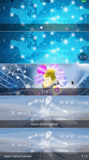
A react native module to banner auto play loop component, it works on iOS and Android.
144 lines (109 loc) • 5.68 kB
Markdown
# [react-native-whc-banner](https://github.com/netyouli/react-native-whc-banner/)
一款简单易用的 Banner 组件,支持 Android&iOS。
[ ](https://github.com/netyouli/react-native-whc-banner/releases)
[ ](https://github.com/netyouli/react-native-whc-banner/pulls)
[ ](https://www.npmjs.com/package/react-native-whc-banner)
[](https://raw.githubusercontent.com/netyouli/react-native-whc-banner/master/LICENSE)
[ ](https://github.com/netyouli/react-native-whc-banner/)
## 目录
- [安装](#安装)
- [Demo](#demo)
- [如何使用?](#如何使用?)
- [API](#api)
- [贡献](#contribution)
## 安装
* 1.在终端运行 `npm i react-native-whc-banner --save`
* 2.在要使用`Banner`的js文件中添加`import Banner, {IndicaterAlign, IndicaterType} from 'react-native-whc-banner'`
## Demo
* [Example](https://github.com/netyouli/react-native-whc-banner/tree/master/example)
## 如何使用?
>第一步:
在你的js文件中导入 `react-native-whc-banner`:
`import Banner, {IndicaterAlign, IndicaterType} from 'react-native-whc-banner'`
>第二步:
将下面代码插入到`render()`方法中:
```jsx
render() {
return (
<Banner style = {styles.banner}>
<View><Image style = {styles.img} source = {images[0]}/></View>
<View><Image style = {styles.img} source = {images[1]}/></View>
<View><Image style = {styles.img} source = {images[2]}/></View>
</Banner>
);
}
```
### 用例
```jsx
render() {
return (
<Banner style = {styles.banner}
indicaterType = {IndicaterType.circle}>
<View><Image style = {styles.img} source = {images[0]}/></View>
<View><Image style = {styles.img} source = {images[1]}/></View>
<View><Image style = {styles.img} source = {images[2]}/></View>
</Banner>
);
}
```
### 自定义 Banner
```jsx
render() {
return (
<Banner style = {styles.banner}
indicaterStyle = {styles.indicater}
dotStyle = {styles.dot}
currentDotStyle = {styles.currentDot}
circleStyle = {styles.circle}
numberStyle = {styles.number}
titleStyle = {styles.title}
titles = {['react-native banner', 'ios native banner', 'android native banner']}
autoPlay = {true}
autoLoop = {true}
indicaterType = {IndicaterType.dot}
indicaterAlign = {IndicaterAlign.center}
duration = {5000}
>
<View><Image style = {styles.img} source = {images[0]}/></View>
<View><Image style = {styles.img} source = {images[1]}/></View>
<View><Image style = {styles.img} source = {images[2]}/></View>
</Banner>
);
}
```
## API
IndicaterType(指示器类型) | 描述
----------------- | -----------
IndicaterType.none | 不创建指示器
IndicaterType.circle | 创建圆形指示器
IndicaterType.number | 创建数字指示器
IndicaterType.title | 创建文字指示器
IndicaterType.number_title | 创建数字和文字指示器
IndicaterType.dot | 创建点指示器
IndicaterAlign(指示器元素对齐类型) | 描述
----------------- | -----------
IndicaterAlign.left | 左对齐
IndicaterAlign.center | 居中对齐
IndicaterAlign.right | 又对齐
属性 | 类型 | 可选 | 默认值 | 描述
----------------- | -------- | -------- | ----------- | -----------
style | ViewPropTypes.style |true | {} | 自定义banner样式
indicaterStyle | ViewPropTypes.style | true | {} | 自定义banner指示器样式
dotStyle | ViewPropTypes.style | true | {} | 自定义指示器为点的样式
currentDotStyle | ViewPropTypes.style | true | {} | 自定义指示器为点的当前(选中)样式
circleStyle | ViewPropTypes.style | true | {} | 自定义指示器为圆形的样式
numberStyle | Text.propTypes.style | true | {} | 自定义指示器为数字的样式
titleStyle | Text.propTypes.style | true | {} | 自定义指示器为文字的样式
titles | PropTypes.array | true | [] | 当指示器为文字时指定要显示的文字标题
autoPlay | PropTypes.bool | true | true | banner是否可以自动轮播
autoLoop | PropTypes.bool | true | true | banner是否可以无限循环
indicaterType | IndicaterType | true | IndicaterType.dot | 自定义指示器类型
indicaterAlign | IndicaterAlign | true | IndicaterAlign.center | 自定义指示器元素对齐类型
duration | PropTypes.number | true | 5000 | 自定义banner自动轮播时间周期
## 贡献
欢迎大家提Issues。如果能为Issues配一个异常或报错的截图,能帮助我快速的定位问题和解决问题。
另外欢迎大家Pull requests,为项目贡献的智慧。
---
**MIT Licensed**
大家可以自由复制和转载。