| 1 | # react-typeahead
|
| 2 |
|
| 3 | > A typeahead/autocomplete component for React
|
| 4 |
|
| 5 | react-typeahead is a javascript library that provides a react-based
|
| 6 | typeahead, or autocomplete text entry, as well as a "typeahead tokenizer",
|
| 7 | a typeahead that allows you to select multiple results.
|
| 8 |
|
| 9 | ## Usage
|
| 10 |
|
| 11 | For a typeahead input:
|
| 12 |
|
| 13 | ```javascript
|
| 14 | var Typeahead = require('react-typeahead').Typeahead;
|
| 15 | React.render(
|
| 16 | <Typeahead
|
| 17 | options={['John', 'Paul', 'George', 'Ringo']}
|
| 18 | maxVisible={2}
|
| 19 | />
|
| 20 | );
|
| 21 | ```
|
| 22 |
|
| 23 | For a tokenizer typeahead input:
|
| 24 |
|
| 25 | ```javascript
|
| 26 | var Tokenizer = require('react-typeahead').Tokenizer;
|
| 27 | React.render(
|
| 28 | <Tokenizer
|
| 29 | options={['John', 'Paul', 'George', 'Ringo']}
|
| 30 | onTokenAdd={function(token) {
|
| 31 | console.log('token added: ', token);
|
| 32 | }}
|
| 33 | />
|
| 34 | );
|
| 35 | ```
|
| 36 |
|
| 37 | ## Examples
|
| 38 |
|
| 39 | * [Basic Typeahead with Topcoat][1]
|
| 40 | * [Typeahead Tokenizer with Topcoat][2]
|
| 41 | * [Typeahead Tokenizer with simple styling][3]
|
| 42 |
|
| 43 | 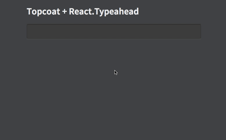
|
| 44 |
|
| 45 | [1]: http://wookiehangover.github.com/react-typeahead/examples/typeahead-topcoat.html
|
| 46 | [2]: http://wookiehangover.github.com/react-typeahead/examples/tokenizer-topcoat.html
|
| 47 | [3]: http://wookiehangover.github.com/react-typeahead/examples/TypeaheadTokenizer-simple.html
|
| 48 | [4]: http://blog.npmjs.org/post/85484771375/how-to-install-npm
|
| 49 |
|
| 50 | ## API
|
| 51 |
|
| 52 | ### Typeahead(props)
|
| 53 |
|
| 54 | Type: React Component
|
| 55 |
|
| 56 | Basic typeahead input and results list.
|
| 57 |
|
| 58 | #### props.options
|
| 59 |
|
| 60 | Type: `Array`
|
| 61 | Default: []
|
| 62 |
|
| 63 | An array supplied to the filtering function. Can be a list of strings or a list of arbitrary objects. In the latter case, `filterOption` and `displayOption` should be provided.
|
| 64 |
|
| 65 | #### props.defaultValue
|
| 66 |
|
| 67 | Type: `String`
|
| 68 |
|
| 69 | A default value used when the component has no value. If it matches any options a option list will show.
|
| 70 |
|
| 71 | #### props.value
|
| 72 |
|
| 73 | Type: `String`
|
| 74 |
|
| 75 | Specify a value for the text input.
|
| 76 |
|
| 77 | #### props.maxVisible
|
| 78 |
|
| 79 | Type: `Number`
|
| 80 |
|
| 81 | Limit the number of options rendered in the results list.
|
| 82 |
|
| 83 | #### props.customClasses
|
| 84 |
|
| 85 | Type: `Object`
|
| 86 | Allowed Keys: `input`, `results`, `listItem`, `listAnchor`, `hover`
|
| 87 |
|
| 88 | An object containing custom class names for child elements. Useful for
|
| 89 | integrating with 3rd party UI kits.
|
| 90 |
|
| 91 | #### props.placeholder
|
| 92 |
|
| 93 | Type: `String`
|
| 94 |
|
| 95 | Placeholder text for the typeahead input.
|
| 96 |
|
| 97 | #### props.textarea
|
| 98 |
|
| 99 | Type: `Boolean`
|
| 100 |
|
| 101 | Set to `true` to use a `<textarea>` element rather than an `<input>` element
|
| 102 |
|
| 103 | #### props.inputProps
|
| 104 |
|
| 105 | Type: `Object`
|
| 106 |
|
| 107 | Props to pass directly to the `<input>` element.
|
| 108 |
|
| 109 | #### props.onKeyDown
|
| 110 |
|
| 111 | Type: `Function`
|
| 112 |
|
| 113 | Event handler for the `keyDown` event on the typeahead input.
|
| 114 |
|
| 115 | #### props.onKeyUp
|
| 116 |
|
| 117 | Type: `Function`
|
| 118 |
|
| 119 | Event handler for the `keyUp` event on the typeahead input.
|
| 120 |
|
| 121 | #### props.onBlur
|
| 122 |
|
| 123 | Type: `Function`
|
| 124 |
|
| 125 | Event handler for the `blur` event on the typeahead input.
|
| 126 |
|
| 127 | #### props.onFocus
|
| 128 |
|
| 129 | Type: `Function`
|
| 130 |
|
| 131 | Event handler for the `focus` event on the typeahead input.
|
| 132 |
|
| 133 | #### props.onOptionSelected
|
| 134 |
|
| 135 | Type: `Function`
|
| 136 |
|
| 137 | Event handler triggered whenever a user picks an option.
|
| 138 |
|
| 139 | #### props.filterOption
|
| 140 |
|
| 141 | Type: `String` or `Function`
|
| 142 |
|
| 143 | A function to filter the provided `options` based on the current input value. For each option, receives `(inputValue, option)`. If not supplied, defaults to [fuzzy string matching](https://github.com/mattyork/fuzzy).
|
| 144 |
|
| 145 | If provided as a string, it will interpret it as a field name and fuzzy filter on that field of each option object.
|
| 146 |
|
| 147 | #### props.displayOption
|
| 148 |
|
| 149 | Type: `String` or `Function`
|
| 150 |
|
| 151 | A function to map an option onto a string for display in the list. Receives `(option, index)` where index is relative to the results list, not all the options. Must return a string.
|
| 152 |
|
| 153 | If provided as a string, it will interpret it as a field name and use that field from each option object.
|
| 154 |
|
| 155 | #### props.formInputOption
|
| 156 |
|
| 157 | Type: `String` or `Function`
|
| 158 |
|
| 159 | A function to map an option onto a string to include in HTML forms (see `props.name`). Receives `(option)` as arguments. Must return a string.
|
| 160 |
|
| 161 | If specified as a string, it will interpret it as a field name and use that field from each option object.
|
| 162 |
|
| 163 | If not specified, it will fall back onto the semantics described in `props.displayOption`.
|
| 164 |
|
| 165 | This option is ignored if you don't specify the `name` prop. It is required if you both specify the `name` prop and are using non-string options. It is optional otherwise.
|
| 166 |
|
| 167 | #### props.defaultClassNames
|
| 168 |
|
| 169 | Type: `boolean`
|
| 170 | Default: true
|
| 171 |
|
| 172 | If false, the default classNames are removed from the typeahead.
|
| 173 |
|
| 174 | #### props.customListComponent
|
| 175 |
|
| 176 | Type: `React Component`
|
| 177 |
|
| 178 | A React Component that renders the list of typeahead results. This replaces the default list of results.
|
| 179 |
|
| 180 | This component receives the following props :
|
| 181 |
|
| 182 | ##### Passed through
|
| 183 |
|
| 184 | - `props.displayOptions`
|
| 185 | - `props.customClasses`
|
| 186 | - `props.onOptionSelected`
|
| 187 |
|
| 188 | ##### Created or modified
|
| 189 | - `props.options`
|
| 190 | - This is the Typeahead's `props.options` filtered and limited to `Typeahead.props.maxVisible`.
|
| 191 | - `props.selectedIndex`
|
| 192 | - The index of the highlighted option for rendering
|
| 193 |
|
| 194 |
|
| 195 | ### Typeahead ([Exposed Component Functions][reactecf])
|
| 196 |
|
| 197 | #### typeahead.focus
|
| 198 |
|
| 199 | Focuses the typeahead input.
|
| 200 |
|
| 201 | ---
|
| 202 |
|
| 203 | ### Tokenizer(props)
|
| 204 |
|
| 205 | Type: React Component
|
| 206 |
|
| 207 | Typeahead component that allows for multiple options to be selected.
|
| 208 |
|
| 209 | #### props.options
|
| 210 |
|
| 211 | Type: `Array`
|
| 212 | Default: []
|
| 213 |
|
| 214 | An array supplied to the filter function.
|
| 215 |
|
| 216 | #### props.maxVisible
|
| 217 |
|
| 218 | Type: `Number`
|
| 219 |
|
| 220 | Limit the number of options rendered in the results list.
|
| 221 |
|
| 222 | #### props.name
|
| 223 |
|
| 224 | Type: `String`
|
| 225 |
|
| 226 | The name for HTML forms to be used for submitting the tokens' values array.
|
| 227 |
|
| 228 | #### props.customClasses
|
| 229 |
|
| 230 | Type: `Object`
|
| 231 | Allowed Keys: `input`, `results`, `listItem`, `listAnchor`, `typeahead`
|
| 232 |
|
| 233 | An object containing custom class names for child elements. Useful for
|
| 234 | integrating with 3rd party UI kits.
|
| 235 |
|
| 236 | #### props.placeholder
|
| 237 |
|
| 238 | Type: `String`
|
| 239 |
|
| 240 | Placeholder text for the typeahead input.
|
| 241 |
|
| 242 | #### props.inputProps
|
| 243 |
|
| 244 | Type: `Object`
|
| 245 |
|
| 246 | Props to pass directly to the `<input>` element.
|
| 247 |
|
| 248 | #### props.onKeyDown
|
| 249 |
|
| 250 | Type: `Function`
|
| 251 |
|
| 252 | Event handler for the `keyDown` event on the typeahead input.
|
| 253 |
|
| 254 | #### props.onKeyUp
|
| 255 |
|
| 256 | Type: `Function`
|
| 257 |
|
| 258 | Event handler for the `keyUp` event on the typeahead input.
|
| 259 |
|
| 260 | #### props.onBlur
|
| 261 |
|
| 262 | Type: `Function`
|
| 263 |
|
| 264 | Event handler for the `blur` event on the typeahead input.
|
| 265 |
|
| 266 | #### props.onFocus
|
| 267 |
|
| 268 | Type: `Function`
|
| 269 |
|
| 270 | Event handler for the `focus` event on the typeahead input.
|
| 271 |
|
| 272 | #### props.defaultSelected
|
| 273 |
|
| 274 | Type: `Array`
|
| 275 |
|
| 276 | A set of values of tokens to be loaded on first render.
|
| 277 |
|
| 278 | #### props.onTokenRemove
|
| 279 |
|
| 280 | Type: `Function`
|
| 281 | Params: `(removedToken)`
|
| 282 |
|
| 283 | Event handler triggered whenever a token is removed.
|
| 284 |
|
| 285 | #### props.onTokenAdd
|
| 286 |
|
| 287 | Type: `Function`
|
| 288 | Params: `(addedToken)`
|
| 289 |
|
| 290 | Event handler triggered whenever a token is removed.
|
| 291 |
|
| 292 | #### props.displayOption
|
| 293 |
|
| 294 | Type: `String` or `Function`
|
| 295 |
|
| 296 | A function to map an option onto a string for display in the list. Receives `(option, index)` where index is relative to the results list, not all the options. Must return a string.
|
| 297 |
|
| 298 | If provided as a string, it will interpret it as a field name and use that field from each option object.
|
| 299 |
|
| 300 | #### props.filterOption
|
| 301 |
|
| 302 | Type: `Function`
|
| 303 |
|
| 304 | A function to filter the provided `options` based on the current input value. For each option, receives `(inputValue, option)`. If not supplied, defaults to [fuzzy string matching](https://github.com/mattyork/fuzzy).
|
| 305 |
|
| 306 | #### props.defaultClassNames
|
| 307 |
|
| 308 | Type: `boolean`
|
| 309 | Default: true
|
| 310 |
|
| 311 | If false, the default classNames are removed from the tokenizer and the typeahead.
|
| 312 |
|
| 313 | ### Tokenizer ([Exposed Component Functions][reactecf])
|
| 314 |
|
| 315 | #### tokenizer.focus
|
| 316 |
|
| 317 | Focuses the tokenizer input.
|
| 318 |
|
| 319 | #### tokenizer.getSelectedTokens
|
| 320 |
|
| 321 | Type: `Function`
|
| 322 |
|
| 323 | A function to return the currently selected tokens.
|
| 324 |
|
| 325 | ## Developing
|
| 326 |
|
| 327 | ### Setting Up
|
| 328 |
|
| 329 | You will need `npm` to develop on react-typeahead. [Installing npm][4].
|
| 330 |
|
| 331 | Once that's done, to get started, run `npm install` in your checkout directory.
|
| 332 | This will install all the local development dependences, such as `gulp` and `mocha`
|
| 333 |
|
| 334 | ### Testing
|
| 335 |
|
| 336 | react-typeahead uses mocha for unit tests and gulp for running them. Large changes should
|
| 337 | include unittests.
|
| 338 |
|
| 339 | After updating or creating new tests, run `npm run-script build-test` to regenerate the
|
| 340 | test package.
|
| 341 |
|
| 342 | Once that's done, running the tests is easy with `gulp`:
|
| 343 |
|
| 344 | ```
|
| 345 | > gulp test
|
| 346 | [00:17:25] Using gulpfile ~/src/react-typeahead/gulpfile.js
|
| 347 | [00:17:25] Starting 'test'...
|
| 348 |
|
| 349 |
|
| 350 | ․․․․․․․․․․․․․․․
|
| 351 |
|
| 352 | 15 passing (43ms)
|
| 353 |
|
| 354 | [00:17:25] Finished 'test' after 448 ms
|
| 355 | [00:17:25] Starting 'default'...
|
| 356 | [00:17:25] Finished 'default' after 6.23 μs
|
| 357 | ```
|
| 358 |
|
| 359 | ### Contributing
|
| 360 |
|
| 361 | Basically, fork the repository and send a pull request. It can be difficult to review these, so
|
| 362 | here are some general rules to follow for getting your PR accepted more quickly:
|
| 363 |
|
| 364 | - All new properties and exposed component function should be documented in the README.md
|
| 365 | - Break your changes into smaller, easy to understand commits.
|
| 366 | - Send separate PRs for each commit when possible.
|
| 367 | - Feel free to rebase, merge, and rewrite commits to make them more readible.
|
| 368 | - Add comments explaining anything that's not painfully obvious.
|
| 369 | - Add unittests for your change if possible.
|
| 370 |
|
| 371 | [reactecf]: https://facebook.github.io/react/tips/expose-component-functions.html
|