| 1 | # rsuite-table
|
| 2 |
|
| 3 | A React table component.
|
| 4 |
|
| 5 | [![npm][npm-badge]][npm]
|
| 6 |
|
| 7 | [![Travis][build-badge]][build] [![Coverage Status][coverage-badge]][coverage]
|
| 8 |
|
| 9 | ## Features
|
| 10 |
|
| 11 | - Support virtualized.
|
| 12 | - Support fixed header, fixed column.
|
| 13 | - Support custom adjustment column width.
|
| 14 | - Support for custom cell content.
|
| 15 | - Support for displaying a tree form.
|
| 16 | - Support for sorting.
|
| 17 | - Support for expandable child nodes
|
| 18 | - Support for RTL
|
| 19 |
|
| 20 | ## Preview
|
| 21 |
|
| 22 | - Fixed Column
|
| 23 |
|
| 24 | 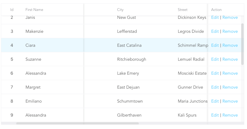
|
| 25 |
|
| 26 | - Custom Cell
|
| 27 |
|
| 28 | 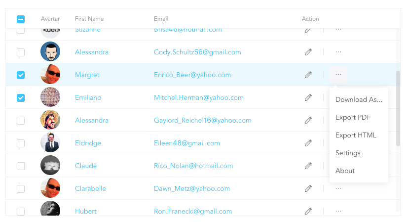
|
| 29 |
|
| 30 | - Tree Table
|
| 31 |
|
| 32 | 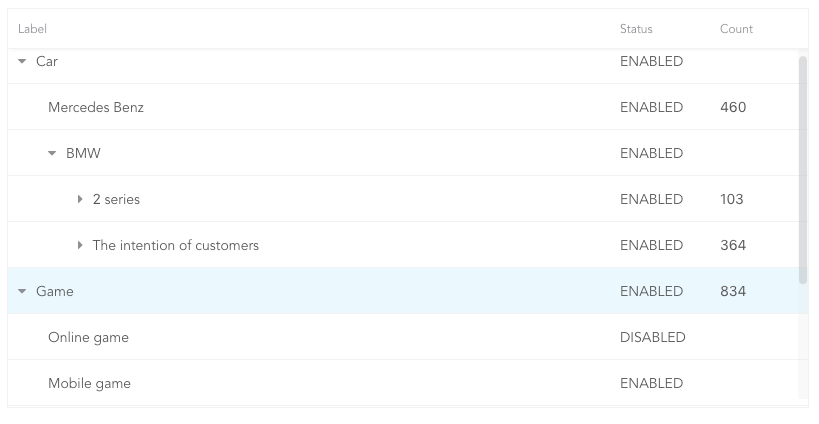
|
| 33 |
|
| 34 | - Expandable
|
| 35 |
|
| 36 | 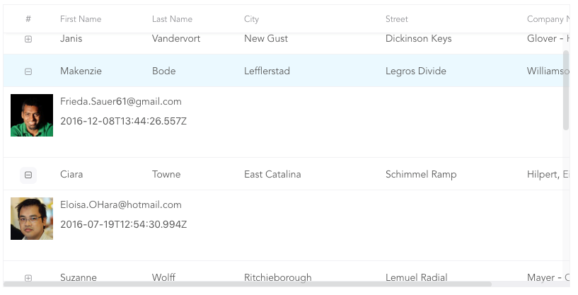
|
| 37 |
|
| 38 | [More Examples](https://rsuitejs.com/en/components/table)
|
| 39 |
|
| 40 | ## Install
|
| 41 |
|
| 42 | ```sh
|
| 43 | npm i rsuite-table --save
|
| 44 | ```
|
| 45 |
|
| 46 | ### Usage
|
| 47 |
|
| 48 | ```tsx
|
| 49 | import { Table, Column, HeaderCell, Cell } from 'rsuite-table';
|
| 50 | import 'rsuite-table/lib/less/index.less'; // or 'rsuite-table/dist/css/rsuite-table.css'
|
| 51 |
|
| 52 | const dataList = [
|
| 53 | { id: 1, name: 'a', email: 'a@email.com', avartar: '...' },
|
| 54 | { id: 2, name: 'b', email: 'b@email.com', avartar: '...' },
|
| 55 | { id: 3, name: 'c', email: 'c@email.com', avartar: '...' }
|
| 56 | ];
|
| 57 |
|
| 58 | const ImageCell = ({ rowData, dataKey, ...rest }) => (
|
| 59 | <Cell {...rest}>
|
| 60 | <img src={rowData[dataKey]} width="50" />
|
| 61 | </Cell>
|
| 62 | );
|
| 63 |
|
| 64 | const App = () => (
|
| 65 | <Table data={dataList}>
|
| 66 | <Column width={100} sortable fixed resizable>
|
| 67 | <HeaderCell>ID</HeaderCell>
|
| 68 | <Cell dataKey="id" />
|
| 69 | </Column>
|
| 70 |
|
| 71 | <Column width={100} sortable resizable>
|
| 72 | <HeaderCell>Name</HeaderCell>
|
| 73 | <Cell dataKey="name" />
|
| 74 | </Column>
|
| 75 |
|
| 76 | <Column width={100} sortable resizable>
|
| 77 | <HeaderCell>Email</HeaderCell>
|
| 78 | <Cell>
|
| 79 | {(rowData, rowIndex) => {
|
| 80 | return <a href={`mailto:${rowData.email}`}>{rowData.email}</a>;
|
| 81 | }}
|
| 82 | </Cell>
|
| 83 | </Column>
|
| 84 |
|
| 85 | <Column width={100} resizable>
|
| 86 | <HeaderCell>Avartar</HeaderCell>
|
| 87 | <ImageCell dataKey="avartar" />
|
| 88 | </Column>
|
| 89 | </Table>
|
| 90 | );
|
| 91 | ```
|
| 92 |
|
| 93 | ## API
|
| 94 |
|
| 95 | ### `<Table>`
|
| 96 |
|
| 97 | | Property | Type `(Default)` | Description |
|
| 98 | | ------------------------ | --------------------------------------------------------------------------------- | --------------------------------------------------------------------------------------------- |
|
| 99 | | affixHeader | boolean,number | Affix the table header to the specified position on the page |
|
| 100 | | affixHorizontalScrollbar | boolean,number | Affix the table horizontal scrollbar to the specified position on the page |
|
| 101 | | autoHeight | boolean | Automatic height |
|
| 102 | | bodyRef | (ref: HTMLElement) => void | A ref attached to the table body element |
|
| 103 | | bordered | boolean | Show border |
|
| 104 | | cellBordered | boolean | Show cell border |
|
| 105 | | data \* | object[] | Table data |
|
| 106 | | defaultExpandAllRows | boolean | Expand all nodes By default |
|
| 107 | | defaultExpandedRowKeys | string[] | Specify the default expanded row by `rowkey` |
|
| 108 | | defaultSortType | enum: 'desc', 'asc' | Sort type |
|
| 109 | | expandedRowKeys | string[] | Specify the default expanded row by `rowkey` (Controlled) |
|
| 110 | | headerHeight | number`(40)` | Table Header Height |
|
| 111 | | height | number`(200)` | Table height |
|
| 112 | | hover | boolean `(true)` | The row of the table has a mouseover effect |
|
| 113 | | isTree | boolean | Show as Tree table |
|
| 114 | | loading | boolean | Show loading |
|
| 115 | | locale | object: { emptyMessage: `('No data')`, loading: `('Loading...')` } | Messages for empty data and loading states |
|
| 116 | | minHeight | number `(0)` | Minimum height |
|
| 117 | | onDataUpdated | (nextData: object[], scrollTo: (coord: { x: number; y: number }) => void) => void | Callback after table data update. |
|
| 118 | | onExpandChange | (expanded:boolean,rowData:object)=>void | Tree table, the callback function in the expanded node |
|
| 119 | | onRowClick | (rowData:object, event: SyntheticEvent)=>void | Click the callback function after the row and return to `rowDate` |
|
| 120 | | onRowContextMenu | (rowData:object, event: SyntheticEvent)=>void | Invoke the callback function on contextMenu and pass the `rowData` |
|
| 121 | | onScroll | (scrollX:object, scrollY:object)=>void | Callback function for scroll bar scrolling |
|
| 122 | | onSortColumn | (dataKey:string, sortType:string)=>void | Click the callback function of the sort sequence to return the value `sortColumn`, `sortType` |
|
| 123 | | renderEmpty | (info: React.ReactNode) => React.ReactNode | Customized data is empty display content |
|
| 124 | | renderLoading | (loading: React.ReactNode) => React.ReactNode | Customize the display content in the data load |
|
| 125 | | renderRowExpanded | (rowDate?: Object) => React.ReactNode | Customize what you can do to expand a zone |
|
| 126 | | renderTreeToggle | (icon:node,rowData:object,expanded:boolean)=> node | Tree table, the callback function in the expanded node |
|
| 127 | | rowClassName | string , (rowData:object)=>string | Add an optional extra class name to row |
|
| 128 | | rowExpandedHeight | number `(100)` | Set the height of an expandable area |
|
| 129 | | rowHeight | number`(46)`, (rowData: object) => number | Row height |
|
| 130 | | rowKey | string `('key')` | Each row corresponds to the unique `key` in `data` |
|
| 131 | | rtl | boolean | Right to left |
|
| 132 | | shouldUpdateScroll | boolean`(true)` | Whether to update the scroll bar after data update |
|
| 133 | | showHeader | boolean `(true)` | Display header |
|
| 134 | | sortColumn | string | Sort column name ˝ |
|
| 135 | | sortType | enum: 'desc', 'asc' | Sort type (Controlled) |
|
| 136 | | virtualized | boolean | Effectively render large tabular data |
|
| 137 | | width | number | Table width |
|
| 138 |
|
| 139 | ### `<Column>`
|
| 140 |
|
| 141 | | Property | Type `(Default)` | Description |
|
| 142 | | ------------- | ------------------------------------------------ | ----------------------------------------------------------------------------------------------------------- |
|
| 143 | | align | enum: 'left','center','right' | Alignment |
|
| 144 | | colSpan | number | Merges column cells to merge when the `dataKey` value for the merged column is `null` or `undefined`. |
|
| 145 | | fixed | boolean, 'left', 'right' | Fixed column |
|
| 146 | | flexGrow | number | Set the column width automatically adjusts, when set `flexGrow` cannot set `resizable` and `width` property |
|
| 147 | | minWidth | number`(200)` | When you use `flexGrow`, you can set a minimum width by `minwidth` |
|
| 148 | | onResize | (columnWidth?: number, dataKey?: string) => void | Callback after column width change |
|
| 149 | | resizable | boolean | Customizable Resize Column width |
|
| 150 | | sortable | boolean | Sortable |
|
| 151 | | treeCol | boolean | A column of a tree. |
|
| 152 | | verticalAlign | enum: 'top', 'middle', 'bottom' | Vertical alignment |
|
| 153 | | width | number | Column width |
|
| 154 |
|
| 155 | > `sortable` is used to define whether the column is sortable, but depending on what `key` sort needs to set a `dataKey` in `Cell`.
|
| 156 | > The sort here is the service-side sort, so you need to handle the logic in the ' Onsortcolumn ' callback function of `<Table>`, and the callback function returns `sortColumn`, `sortType` values.
|
| 157 |
|
| 158 | ### `<ColumnGroup>`
|
| 159 |
|
| 160 | | Property | Type `(Default)` | Description |
|
| 161 | | ------------- | ------------------------------- | ------------------ |
|
| 162 | | align | enum: 'left','center','right' | Alignment |
|
| 163 | | fixed | boolean, 'left', 'right' | Fixed column |
|
| 164 | | verticalAlign | enum: 'top', 'middle', 'bottom' | Vertical alignment |
|
| 165 | | header | React.ReactNode | Group header |
|
| 166 |
|
| 167 | ### `<Cell>`
|
| 168 |
|
| 169 | | Property | Type `(Default)` | Description |
|
| 170 | | -------- | ---------------- | -------------------------------------------- |
|
| 171 | | dataKey | string | Data binding `key`, but also a sort of `key` |
|
| 172 | | rowData | object | Row data |
|
| 173 | | rowIndex | number | Row number |
|
| 174 |
|
| 175 | #### There are three ways to use `<Cell>`, as follows:
|
| 176 |
|
| 177 | - 1.Associate the fields in the data with `dataKey`.
|
| 178 |
|
| 179 | ```tsx
|
| 180 | <Column width="{100}" align="center">
|
| 181 | <HeaderCell>Name</HeaderCell>
|
| 182 | <Cell dataKey="name" />
|
| 183 | </Column>
|
| 184 | ```
|
| 185 |
|
| 186 | - 2.Customize a `<Cell>`.
|
| 187 |
|
| 188 | ```tsx
|
| 189 | const NameCell = ({ rowData, ...props }) => (
|
| 190 | <Cell {...props}>
|
| 191 | <a href={`mailto:${rowData.email}`}>{rowData.name}<a>
|
| 192 | </Cell>
|
| 193 | );
|
| 194 |
|
| 195 | <Column width={100} align="center">
|
| 196 | <HeaderCell>Name</HeaderCell>
|
| 197 | <NameCell />
|
| 198 | </Column>
|
| 199 | ```
|
| 200 |
|
| 201 | - 3.Customize functions directly within the `<Cell>`.
|
| 202 |
|
| 203 | ```tsx
|
| 204 | <Column width={100} align="center">
|
| 205 | <HeaderCell>Name</HeaderCell>
|
| 206 | <Cell>
|
| 207 | {(rowData, rowIndex) => {
|
| 208 | return <a href={`mailto:${rowData.email}`}>{rowData.name}</a>;
|
| 209 | }}
|
| 210 | </Cell>
|
| 211 | </Column>
|
| 212 | ```
|
| 213 |
|
| 214 | (For nested data read this: https://github.com/rsuite/rsuite-table/issues/158)
|
| 215 |
|
| 216 | ## Methods
|
| 217 |
|
| 218 | - scrollTop(top:number = 0)
|
| 219 | - scrollLeft(left:number = 0)
|
| 220 |
|
| 221 | [npm-badge]: https://img.shields.io/npm/v/rsuite-table.svg?style=flat-square
|
| 222 | [npm]: https://www.npmjs.com/package/rsuite-table
|
| 223 | [build-badge]: https://img.shields.io/travis/rsuite/rsuite-table.svg?style=flat-square
|
| 224 | [build]: https://travis-ci.org/rsuite/rsuite-table
|
| 225 | [coverage-badge]: https://img.shields.io/coveralls/rsuite/rsuite-table.svg?style=flat-square
|
| 226 | [coverage]: https://coveralls.io/github/rsuite/rsuite-table
|