spectacle
Version:
ReactJS Powered Presentation Framework
433 lines (310 loc) • 15.8 kB
Markdown
# Spectacle
[](https://gitter.im/FormidableLabs/spectacle?utm_source=badge&utm_medium=badge&utm_campaign=pr-badge&utm_content=badge)
ReactJS based Presentation Library
[Spectacle Boilerplate](https://github.com/FormidableLabs/spectacle-boilerplate/)
## Contents
<!-- MarkdownTOC depth=4 autolink=true bracket=round autoanchor=true -->
- [Getting Started](#getting-started)
- [Development](#development)
- [Build & Deployment](#build--deployment)
- [Presenting](#presenting)
- [Controls](#controls)
- [Fullscreen](#fullscreen)
- [PDF Export](#pdf-export)
- [Basic Concepts](#basic-concepts)
- [Main file](#main-file)
- [Themes](#themes)
- [createTheme(colors, fonts)](#createthemecolors-fonts)
- [Tag API](#tag-api)
- [Main Tags](#main-tags)
- [Spectacle](#spectacle)
- [Deck](#deck)
- [Slide (Base)](#slide-base)
- [Layout Tags](#layout-tags)
- [Layout](#layout)
- [Fit](#fit)
- [Fill](#fill)
- [Markdown Tag](#markdown-tag)
- [Markdown](#markdown)
- [Element Tags](#element-tags)
- [Appear](#appear)
- [BlockQuote, Quote and Cite (Base)](#blockquote-quote-and-cite-base)
- [CodePane (Base)](#codepane-base)
- [Code (Base)](#code-base)
- [Heading (Base)](#heading-base)
- [Image (Base)](#image-base)
- [Link (Base)](#link-base)
- [List & ListItem (Base)](#list--listitem-base)
- [S (Base)](#s-base)
- [Table, TableRow, TableHeaderItem and TableItem (Base)](#table-tablerow-tableheaderitem-and-tableitem-base)
- [Text (Base)](#text-base)
- [Base Props](#base-props)
- [Third Party Extensions](#third-party)
<!-- /MarkdownTOC -->
<a name="getting-started"></a>
## Getting Started
The best way to get started is by using the [Spectacle Boilerplate](https://github.com/FormidableLabs/spectacle-boilerplate).
Alternatively, you can `npm install spectacle` and write your own build configurations.
But really, it is SO much easier to just use the boilerplate. Trust me.
<a name="development"></a>
## Development
After downloading the boilerplate, your first order of business is to open terminal and run `npm install`
Next run `rm -R .git` to remove the existing version control.
Then, to start up the local server, run `npm start`
Open a browser and hit [http://localhost:3000](http://localhost:3000), and we are ready to roll
<a name="build--deployment"></a>
## Build & Deployment
Building the dist version of the project is as easy as running `npm run build`
If you want to deploy the slideshow to surge, run `npm run deploy`
<a name="presenting"></a>
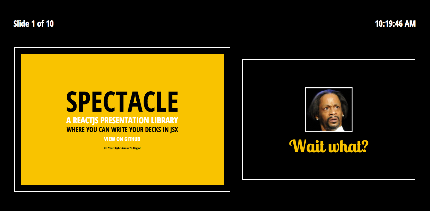
## Presenting
Spectacle comes with a built in presenter mode. It shows you a slide lookahead, current time and your current slide:
To present:
- Run `npm start`
- Open two browser windows on two different screens
- On your screen visit [http://localhost:3000/?presenter](http://localhost:3000/?presenter)
- On the presentation screen visit [http://localhost:3000/](http://localhost:3000/)
- Give an amazingly stylish presentation
_Note: Any windows/tabs in the same browser that are running Spectacle will sync to one another, even if you don't want to use presentation mode_
Check it out:

You can toggle the presenter or overview mode by pressing respectively `alt+p` and `alt+o`.
<a name="controls"></a>
## Controls
|Key Combination|Function|
|---|---|
|Right Arrow|Next Slide|
|Left Arrow|Previous Slide|
|Space|Next Slide|
|Shift+Space|Previous Slide|
|Alt/Option + O|Toggle Overview Mode|
|Alt/Option + P|Toggle Presenter Mode|
<a name="fullscreen"></a>
## Fullscreen
Fullscreen can be toggled via browser options, or by **hovering over the bottom right corner of your window until the fullscreen icon appears and clicking it**.
<a name="pdf-export"></a>
## PDF Export
Exporting a totally sweet looking PDF from your totally sweet looking Spectacle presentation is absurdly easy.
- Run `npm start`
- Append your URL with `?export` ([http://localhost:3000/?export](http://localhost:3000/?export))
- Bring up the print dialog `(ctrl or cmd + p)`
- Check "Background Graphics" to on if you are about that life
- Change destination to "Save as PDF", as shown below:

If you want to print your slides, and want a printer friendly version, simply repeat the above process but instead print from [http://localhost:3000/?export&print](http://localhost:3000/?export&print)
<a name="basic-concepts"></a>
## Basic Concepts
<a name="main-file"></a>
### Main file
Your presentation files & assets will live in the `presentation` folder.
The main `.js` file you write your deck in is `/presentation/index.js`
Check it out [here](https://github.com/FormidableLabs/spectacle-boilerplate/blob/master/presentation/index.js) in the boilerplate.
```jsx
// index.js
import React, { Component } from 'react';
import {
Appear, BlockQuote, Cite, CodePane, Code, Deck, Fill, Fit,
Heading, Image, Layout, ListItem, List, Quote, Spectacle, Slide, Text
} from 'spectacle';
export default class extends Component {
render() {
return (
<Spectacle>
<Deck>
<Slide>
<Text>Hello</Text>
</Slide>
</Deck>
</Spectacle>
);
}
}
```
Here is where you can use the library's tags to compose your presentation. While you can use any JSX syntax here, building your presentation with the supplied tags allows for theming to work properly.
The bare minimum you need to start is a `Spectacle` element, a`Deck` element and a `Slide` element. Each `Slide` element represents a slide inside of your slideshow.
<a name="themes"></a>
### Themes
In Spectacle, themes are functions that return style objects for `screen` & `print`.
You can import the default theme from:
```jsx
import createTheme from "spectacle/lib/themes/default";
```
Or create your own based upon the source.
`index.js` is what you would edit in order to create a custom theme of your own, using ReactJS style inline style objects.
You will want to edit `index.html` to include any web fonts or additional CSS that your theme requires.
<a name="createthemecolors-fonts"></a>
#### createTheme(colors, fonts)
Spectacle's functional theme system allows you to pass in color and font variables that you can use on your elements. See the example below:
```jsx
const theme = createTheme({
primary: "red"
}, {
primary: "Helvetica"
});
```
The returned theme object can then be passed to the `Spectacle` tag via the `theme` prop, and will override the default styles.
<a name="tag-api"></a>
## Tag API
In Spectacle, presentations are composed of a set of base tags. We can separate these into three categories: Main tags, Layout tags & Element tags.
<a name="main-tags"></a>
### Main Tags
<a name="spectacle"></a>
#### Spectacle
The Spectacle tag is the root level tag for your presentation. It handles routing, flux and generally presenting your Deck & Slides. It supports the following props:
|Name|PropType|Description|
|---|---|---|
|history|React.PropTypes.object|Accepts custom configuration for [history](https://github.com/ReactTraining/history)
|theme|React.PropTypes.object|Accepts a theme object for styling your presentation|
<a name="deck"></a>
#### Deck
The deck tag wraps your slides. It supports the following props:
|Name|PropType|Description|
|---|---|---|
|transition|React.PropTypes.array|Accepts `slide`, `zoom`, `fade` or `spin`, and can be combined. Sets global slide transitions. **Note: If you use the 'scale' transition, fitted text won't work in Safari.**|
|transitionDuration| React.PropTypes.number| Accepts integer value in milliseconds for global transition duration.
|progress| React.PropTypes.string|Accepts `pacman`, `bar`, `number` or `none`.
|controls| React.PropTypes.bool| Show control arrows when not in fullscreen
<a name="slide-base"></a>
#### Slide (Base)
The slide tag represents each slide in the presentation. Giving a slide tag an `id` attribute will replace its number based navigation hash with the `id` provided. It supports the following props, in addition to any of the props outlined in the Base class props listing:
|Name|PropType|Description|
|---|---|---|
|align| React.PropTypes.string | Accepts a space delimited value for positioning interior content. The first value can be `flex-start` (left), `center` (middle), or `flex-end` (bottom). The second value can be `flex-start` (top) , `center` (middle), or `flex-end` (bottom). You would provide this prop like `align="center center"`, which is its default.
|transition|React.PropTypes.array|Accepts `slide`, `zoom`, `fade` or `spin`, and can be combined. Sets the slide transition. **Note: If you use the 'scale' transition, fitted text won't work in Safari.**|
|transitionDuration| React.PropTypes.number| Accepts integer value in milliseconds for slide transition duration.
|notes| React.PropTypes.string| Text which will appear in the presenter mode. Can be HTML.
|id| React.PropTypes.string | Used to create a string based hash.
<a name="layout-tags"></a>
### Layout Tags
Layout tags are used for layout using Flexbox within your slide. They are `Layout`, `Fit` & `Fill`.
<a name="layout"></a>
#### Layout
The layout tag is used to wrap `Fit` and `Fill` tags to provide a row.
<a name="fit"></a>
#### Fit
The fit tag only takes up as much space as its bounds provide.
<a name="fill"></a>
#### Fill
The fill tag takes up all the space available to it. For example, if you have a `Fill` tag next to a `Fit` tag, the `Fill` tag will take up the rest of the space. Adjacent `Fill` tags split the difference and form an equidistant grid.
<a name="markdown-tag"></a>
### Markdown Tag
<a name="markdown"></a>
#### Markdown
The Markdown tag is used to add inline markdown to your slide. You can provide markdown source via the `source` prop, or as children. You can also provide a custom [mdast configuration](https://github.com/wooorm/mdast) via the `mdastConfig` prop.
Markdown generated tags aren't prop configurable, and instead render with your theme defaults.
|Name|PropType|Description|
|---|---|---|
|source|React.PropTypes.string| Markdown source |
|mdastConfig| React.PropTypes.object | Mdast configuration object |
<a name="element-tags"></a>
### Element Tags
The element tags are the bread and butter of your slide content. Most of these tags derive their props from the Base class, but the ones that have special options will have them listed:
<a name="appear"></a>
#### Appear
This tag does not extend from Base. It's special. Wrapping elements in the appear tag makes them appear/disappear in order in response to navigation.
<a name="blockquote-quote-and-cite-base"></a>
#### BlockQuote, Quote and Cite (Base)
These tags create a styled blockquote. Use them as follows:
```jsx
<BlockQuote>
<Quote>Ken Wheeler is amazing</Quote>
<Cite>Everyone</Cite>
</BlockQuote>
```
<a name="codepane-base"></a>
#### CodePane (Base)
This tag displays a styled, highlighted code preview. I prefer putting my code samples in external `.example` files and requiring them using `raw-loader` as shown in the demo. Here are the props:
|Name|PropType|Description|
|---|---|---|
|lang|React.PropTypes.string| Prism compatible language name. i.e: 'javascript' |
|source| React.PropTypes.string| String of code to be shown |
You can change your syntax highlighting theme by swapping the prism.js CSS file in `index.html`
<a name="code-base"></a>
#### Code (Base)
A simple tag for wrapping inline text that you want lightly styled in a monospace font.
<a name="heading-base"></a>
#### Heading (Base)
Heading tags are special in that, when you specify a `size` prop, they generate the appropriate heading tag, and extend themselves with a style that is defined in the theme file for that heading. Line height can be adjusted via a numeric `lineHeight` prop.
|Name|PropType|Description|
|---|---|---|
|fit|React.PropTypes.boolean| When set to true, fits text to the slide's width. **Note: If you use the 'scale' transition, this won't work in Safari.** |
|lineHeight|React.PropTypes.number| Sets the line height of your text.|
<a name="image-base"></a>
#### Image (Base)
|Name|PropType|Description|
|---|---|---|
|display|React.PropTypes.string| Set the display style property of the image |
|height|React.PropTypes.string or React.PropTypes.number| Supply a height to the image |
|src|React.PropTypes.string| Image src |
|width|React.PropTypes.string or React.PropTypes.number| Supply a width to the image |
<a name="link-base"></a>
#### Link (Base)
The link tag is used to render `<a>` tags. It accepts an `href` prop:
|Name|PropType|Description|
|---|---|---|
|href|React.PropTypes.string| String of url for `href` attribute |
|target|React.PropTypes.string| Set the `target` attribute |
<a name="list--listitem-base"></a>
#### List & ListItem (Base)
These tags create lists. Use them as follows:
```jsx
<List>
<ListItem>Item 1</ListItem>
<ListItem>Item 2</ListItem>
<ListItem>Item 3</ListItem>
<ListItem>Item 4</ListItem>
</List>
```
<a name="s-base"></a>
#### S (Base)
The `S` tag is used to add inline styling to a piece of text, such as underline or strikethrough.
|Name|PropType|Description|
|---|---|---|
|type|React.PropTypes.string| Accepts `strikethrough`, `underline`, `bold` or `italic`|
<a name="table-tablerow-tableheaderitem-and-tableitem-base"></a>
#### Table, TableRow, TableHeaderItem and TableItem (Base)
The `Table` tag is used to add table to your slide. It is used with `TableRow`, `TableHeaderItem` and `TableItem`. Use them as follows:
```jsx
<Table>
<TableRow>
<TableHeaderItem></TableHeaderItem>
<TableHeaderItem>2011</TableHeaderItem>
</TableRow>
<TableRow>
<TableItem>None</TableItem>
<TableItem>61.8%</TableItem>
</TableRow>
<TableRow>
<TableItem>jQuery</TableItem>
<TableItem>28.3%</TableItem>
</TableRow>
</Table>
```
<a name="text-base"></a>
#### Text (Base)
The `Text` tag is used to add text to your slide. Line height can be adjusted via a numeric `lineHeight` prop.
|Name|PropType|Description|
|---|---|---|
|fit|React.PropTypes.boolean| When set to true, fits text to the slide's width. **Note: If you use the 'scale' transition, this won't work in Safari.** |
|lineHeight|React.PropTypes.number| Sets the line height of your text.|
<a name="base-props"></a>
### Base Props
Every component above that has `(Base)` after it has been extended from a common class that includes the following props:
| Name | PropType | Description |
| ---- | -------- | ----------- |
| italic | React.PropTypes.boolean | Set `fontStyle` to `italic` |
| bold | React.PropTypes.boolean | Set `fontWeight` to `bold ` |
| caps | React.PropTypes.boolean | Set `textTransform` to `uppercase ` |
| margin | React.PropTypes.number or string | Set `margin` value|
| padding | React.PropTypes.number or string | Set `padding` value|
| textColor | React.PropTypes.string | Set `color` value|
| textSize | React.PropTypes.string | Set `fontSize` value|
| textAlign | React.PropTypes.string | Set `textAlign` value|
| textFont | React.PropTypes.string | Set `textFont` value|
| bgColor | React.PropTypes.string | Set `backgroundColor` value|
| bgImage | React.PropTypes.string | Set `backgroundImage` value|
| bgDarken | React.PropTypes.number | Float value from 0.0 to 1.0 specifying how much to darken the bgImage image|
<a name="third-party"></a>
## Third Party Extensions
- [Spectacle Code Slide](https://github.com/thejameskyle/spectacle-code-slide) - Step through lines of code using this awesome slide extension by @thejameskyle