# Select Component
## Overview
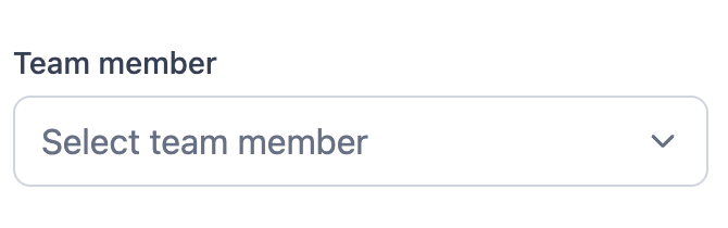
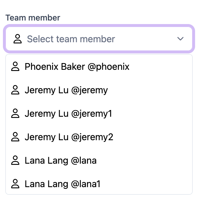
The `Select` component is a versatile dropdown component for React applications. It supports various features such as search, chip list selection, and custom icons.
[Live Demo](https://react-select-omega.vercel.app/)
## Installation
To use the `Select` component, ensure you have the necessary dependencies installed:
```bash
npm install react react-dom react-icons
```
## Usage
### Basic Usage
```typescript
import Select from "./components/select";
import { DUMMY_OPTIONS } from "./data/dummy";
const handleSelectChange = (value: string) => {
console.log("Selected value: ", value);
};
;
```
### With Icons
```typescript
import { FaRegUser } from "react-icons/fa6";
}
onChange={handleSelectChange}
/>;
```
### Searchable Select
```typescript
import { CiSearch } from "react-icons/ci";
}
onChange={handleSelectChange}
/>;
```
### Chip List Select
```typescript
```
## Props
### SelectProps
| Prop | Type | Default | Description |
| -------------- | ------------------------------------------------ | ----------------------- | --------------------------------------------- |
| `options` | `Option[]` | `[]` | Array of options to display in the dropdown. |
| `placeholder` | `string` | `"Select an option"` | Placeholder text when no option is selected. |
| `helperText` | `string` | `undefined` | Helper text displayed below the dropdown. |
| `label` | `string` | `undefined` | Label text displayed above the dropdown. |
| `icon` | `React.ReactNode` | `undefined` | Icon displayed inside the dropdown. |
| `showItemIcon` | `boolean` | `false` | Whether to show icons for each item. |
| `onChange` | `(value: string) => void` | `undefined` | Callback function when an option is selected. |
| `selectedIcon` | `React.ReactNode` | `undefined` | Icon displayed for selected option. |
| `variant` | `SelectVariant` | `SelectVariant.DEFAULT` | Variant of the select component. |
| `disabled` | `boolean` | `false` | Whether the select component is disabled. |
| `defaultValue` | `string` | `undefined` | Default value of the select component. |
| `fieldNames` | `{ label: string; value: string; img?: string }` | `undefined` | Custom field names for the options. |
| `filterSort` | `(optionA: Option, optionB: Option) => number` | `undefined` | Custom filter and sort function for options. |
### Option
| Prop | Type | Description |
| ------- | -------- | ---------------------------------- |
| `value` | `string` | The value of the option. |
| `label` | `string` | The label of the option. |
| `img` | `string` | Optional image URL for the option. |
### SelectVariant
| Variant | Description |
| ----------- | -------------------------------------------------- |
| `DEFAULT` | Default variant with basic dropdown functionality. |
| `SEARCH` | Searchable dropdown variant. |
| `CHIP_LIST` | Chip list variant allowing multiple selections. |
## License
This project is licensed under the MIT License.