# HoverMorph
### React Adaptive Circledot-Cursor 🎯
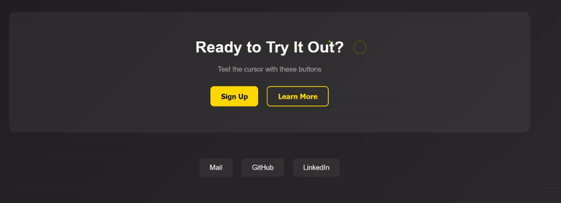
A sleek, responsive, and customizable cursor component for React applications. This library provides an animated cursor that adapts to different interactive elements, creating an engaging user experience.
## ✨ Features
- 🎨 Smooth cursor animations
- 🔄 Adapts to different element shapes
- 🎯 Interactive hover effects
- 📱 Responsive design
- ⚡ Lightweight and performant
- 🛠️ Easy to customize
## 🚀 Installation
```bash
npm install circledot-cursor
# or
yarn add circledot-cursor
```
## 📖 Usage
1. Import the component:
```jsx
import CustomCursor from "circledot-cursor";
```
2. Add it to your app:
```jsx
function App() {
return (
<>
{/* Your app content */}
);
}
```
3. Add the class `social-button` to any circular elements you want the cursor to adapt to:
```jsx
```
## 🎨 Customization
You can customize the cursor by overriding the CSS variables:
```css
:root {
--cursor-dot-size: 5px;
--cursor-dot-color: yellow;
--cursor-circle-size: 30px;
--cursor-circle-border: 2px solid rgb(90, 90, 1);
}
```
## 📝 Props
| Prop | Type | Default | Description |
| ----------- | ------ | ---------------- | -------------------------- |
| dotSize | number | 5 | Size of the cursor dot |
| circleSize | number | 30 | Size of the cursor circle |
| dotColor | string | 'yellow' | Color of the cursor dot |
| borderColor | string | 'rgb(90, 90, 1)' | Color of the circle border |
## 🌟 Examples
### Basic Usage
```jsx
import CustomCursor from "react-adaptive-cursor";
function App() {
return (