# collapsable-panel
Material-ui Collapsable with clickable header.
### Install
```bash
npm install collapsable-panel
yarn add collapsable-panel
```
### Usage
Here's an example of basic usage:
```tsx
import React, { useState } from 'react'
import PaperLabeled from 'collapsable-panel'
function MyApp() {
return (
);
}
```
## User guide
### PaperLabeled
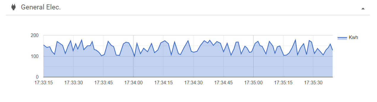
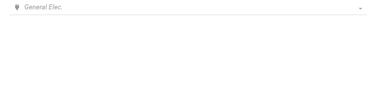
Displays a material-ui Collapsable with a title and a icon
#### props
| Prop name | Type | Description | Default value |
| ------------- | ------------- | ------------- | ------------- |
| title | string o ReactElement | Title that will be shown in the top | '' |
| iconComponent | React.JSXElementConstructor | Icon in the top left | |
| children | ReactElement | Conmtent of the info | |
| hideable | boolean | Sets the pannel as hideable | false |
| hiddenInit | boolean | The panel is constructed hidden or not | false |
| classes | Obj of clases | Classes in the inner components | undefined |
#### CSS props
| Prop name | Type | Description | Default value |
| ------------- | ------------- | ------------- | ------------- |
| root | string | Class of the main continer | '' |
| title | string | Class of the title | '' |
| contentContainer | string | Class of the container of the children | '' |