A lightweight, fully customizable country selector component for Angular, with flag support, keyboard accessibility, dynamic filtering, and zero dependencies.
💡 Built with modern Angular (standalone components) — works with all Angular versions and styles (SCSS, CSS, Tailwind, etc.)
onlyCountries and excludeCountries filtersstartsWith behavior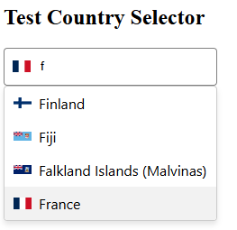
npm install cs-country-selector
// inside ___.module.ts
//import CountrySelectorComponent and add it to your imports

import { CountrySelectorComponent  } from 'cs-country-selector';
imports:[CountrySelectorComponent]
//inside ___.component.ts

import { Country } from 'cs-country-selector';

selectedCountry: Country | null = null;

onCountryChange(country: Country | null) {
  console.log('Selected:', country);
}
//inside ___.component.html

<cs-country-selector
  [(ngModel)]="selectedCountry"
  [placeholder]="'Choose your country...'"
  [includeFlags]="true"
  [onlyCountries]="['US', 'FR', 'DE']"
  [excludeCountries]="['KP']"
  [containerClass]="'custom-container'"
  [inputClass]="'custom-input'"
  [dropdownClass]="'custom-dropdown'"
  [itemClass]="'custom-item'"
  [activeItemClass]="'highlighted'"
  [flagClass]="'flag-icon'"
  [selectedFlagClass]="'flag-icon-selected'"
  (countrySelected)="onCountryChange($event)"
></cs-country-selector>
interface Country {
  code: string;     // e.g. "FR"
  name: string;     // e.g. "France"
  flagUrl: string;  // e.g. "https://.../fr.svg"
}
The cs-country-selector is built to be styled your way — without forcing a design system or theme. You can pass your own classes or override CSS variables.
Use these [Input()] bindings to add your own classes while retaining the internal ones:
| Input | Target Element | Default Class |
|---|---|---|
| containerClass | <div> root wrapper | country-selector-container |
| inputClass | <input> search field | country-input |
| dropdownClass | Dropdown container | country-dropdown |
| itemClass | Each country <li> | country-item |
| activeItemClass | Active country (hover/arrow) | active |
| flagClass | All flags | country-flag |
| selectedFlagClass | Flag inside input field | selected-country-flag |
You can override any style using global CSS or component-level styles.
.custom-input {
  border-radius: 8px;
  background-color: #f0f0f0;
  padding: 10px;
  font-size: 14px;
}
Scrollbar design is fully themeable via CSS variables — no need to override deeply nested elements.
--cs-scrollbar-thumb-color--cs-scrollbar-thumb-hover-color--cs-scrollbar-width--cs-scrollbar-radiuscs-country-selector {
--scrollbar-thumb-color: #00bcd4;
--scrollbar-thumb-hover-color: #0097a7;
--scrollbar-width: 10px;
--scrollbar-radius: 10px;
}
onlyCountries: string[]Displays only the countries listed (by ISO alpha-2 code):
<cs-country-selector [onlyCountries]="['FR', 'DE']" />
excludeCountries: string[]Hides the countries listed:
<cs-country-selector [excludeCountries]="['KP']" />
You can combine both as needed.
MIT © Houssem Hosni
Found a bug? Want to suggest a feature? Open a PR or issue on GitHub — contributions welcome!