# diva-mobile-numeric-input
a cross platform stylish numeric input for react native
Visual Demo
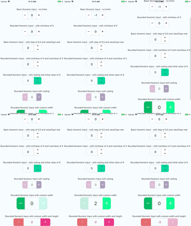
## Working example
you can check out the very simple react native example app
just click [here](https://github.com/onurkantar/diva-mobile-numeric-input/tree/master/Example) and follow the instructions
enjoy!
## Installation
### Latest version
v1.0.1
#### if you have react-native-vector-icons installed in your project
```bash
yarn add diva-mobile-numeric-input
```
or with npm
```bash
npm install diva-mobile-numeric-input --save
```
#### if you don't have react-native-vector-icons installed in your project
```bash
yarn add diva-mobile-numeric-input react-native-vector-icons
react-native link
```
or with npm
```bash
npm install diva-mobile-numeric-input react-native-vector-icons --save
react-native link
```
if you're experiencing issues with `react-native link` which is used to install react-native-vector-icons
please refer to [react-native-vector-icons](https://github.com/oblador/react-native-vector-icons) to see manual installation steps
[link to npm page](https://www.npmjs.com/package/diva-mobile-numeric-input)
## Responsive default size
this component uses the [react-native-pixel-perfect](https://www.npmjs.com/package/react-native-pixel-perfect)
and the defualt style is using base resolution for iphone7, in case you want to use the default design but, using a different base resolution, I added a function called updateBaseResolution(width,height) to use it you need to access it via a ref to the component.
since the component is dependant on react-native-pixel-perfect, when installing this package you install also react-native-pixel-perfect if it's not already installed.
so you can create your own responsive size function and use it to set your custom style.
## Usage
### import Component
```javascript
import NumericInput from "diva-mobile-numeric-input";
```
### Basic Usage
```javascript
console.log(value)} />
```
**or basic up-down**
```javascript
console.log(value)} />
```
### Keep State Value
```javascript
this.setState({ value })}
/>
```
### Advanced Usage
```javascript
this.setState({ value })}
onLimitReached={(isMax, msg) => console.log(isMax, msg)}
totalWidth={240}
totalHeight={50}
iconSize={25}
step={1.5}
valueType="real"
rounded
textColor="#B0228C"
iconStyle={{ color: "white" }}
rightButtonBackgroundColor="#EA3788"
leftButtonBackgroundColor="#E56B70"
/>
```
## Props
| Name | Type | Default |
| -------------------------------- | ----------------------------- | :------------------------------: |
| **value** | `number` | none |
| **timeBetweenPress** | `number` | none |
| **minValue** | `number` | none |
| **maxValue** | `number` | none |
| **step** | `number` | 1 |
| **valueType** | `'integer'` or `'real'` | `'integer'` |
| **initValue** | `number` | null if not used will start at 0 |
| **iconSize** | `number` | calcSize(30) |
| **borderColor** | `string` | `'#d4d4d4'` |
| **iconStyle** | `object` | none |
| **totalWidth** | `number` | calcSize(220) |
| **separatorWidth** | `number` | 1 |
| **type** | `'plus-minus'` or `'up-down'` | `'plus-minus'` |
| **rounded** | `boolean` | false |
| **textColor** | `string` | `'black'` |
| **containerStyle** | `object` | none |
| **inputStyle** | `object` | none |
| **upDownButtonsBackgroundColor** | `string` | `'white'` |
| **rightButtonBackgroundColor** | `string` | `'white'` |
| **leftButtonBackgroundColor** | `string` | `'white'` |
| **totalHeight** | `number` | none |
| **onChange** | `function` | none - required prop |
| **onLimitReached** | `function` | none (empty function) |
| **editable** | `boolean` | true |
| **validateOnBlur** | `boolean` | true |
| **reachMaxIncIconStyle** | `object` | none |
| **reachMaxDecIconStyle** | `object` | none |
| **reachMinIncIconStyle** | `object` | none |
| **reachMinDecIconStyle** | `object` | none |
| **extraTextInputProps** | `object` | none |
### notes about props
- **value prop** - this component uses it's own state to hold value if value is not given as a prop
- **timeBetweenPress prop** - this prop is used when a delay should be added between increment and decrement presses (in milliseconds)
- **style props** - this component has a default style and the styles props are to override the default style or add more fields
- **totalWidth prop** - this prop is for the entire component width, and all other sizes are derived from it , unless given other size props
- **initValue prop** - if using value prop, this is not needed and the initial value can be given by the value prop
- **validateOnBlur** - added on version 1.3.2, if set to false the text input will validate while typing, not recommended, so just keep it true unless there is a good reason not to use the default functionallity
- **reachMaxIncIconStyle** - added on version 1.4.0, used to set style to the increment button icon in case maxValue is reached - **optional**
- **reachMaxDecIconStyle** - added on version 1.4.0, used to set style to the decrement button icon in case maxValue is reached - **optional**
- **reachMinIncIconStyle** - added on version 1.4.0, used to set style to the increment button icon in case minValue is reached - **optional**
- **reachMinDecIconStyle** - added on version 1.4.0, used to set style to the decrement button icon in case minValue is reached - **optional**
- **onLimitReached** - added on version 1.7.0, used to handle event of min/max reached, **this function receives 2 arguments: (isMas:Boolean, msg:String)** like in the advanced example above - **optional**
- **extraTextInputProps** - added on version 1.8.0, used to add props used for the original TextInput component that are not used/supported in this component explicitly - **optional**
## Versioning
We use [SemVer](http://semver.org/) for versioning. For the versions available, see the [tags on this repository](https://github.com/onurkantar/diva-mobile-numeric-input/tags).
## License
This project is licensed under the MIT License