# Expo Dynamic Image Crop

A powerful and flexible image cropping component for Expo/React Native applications with dynamic cropping capabilities, fixed aspect ratios, and smooth gesture handling.

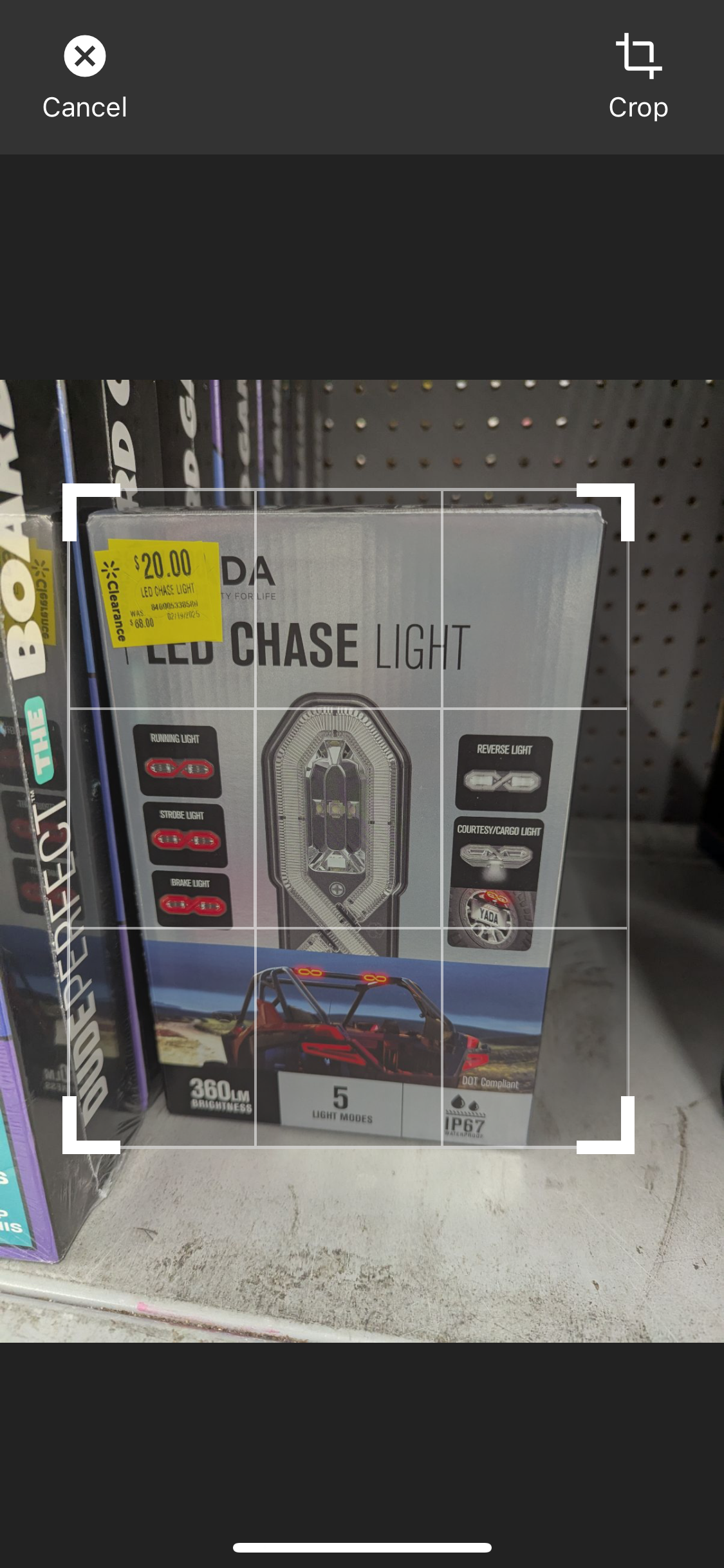
## 📱 **Live Demo**

<div align="center">
  <img src="https://raw.githubusercontent.com/nwabueze1/expo-dynamic-image-crop/main/docs/images/crop-demo.png" alt="Corner Dragging Demo" width="300" />
</div>

_All four corner markers work perfectly - drag from any corner for smooth, real-time cropping!_

## ✨ Features

- 🖼️ **Dynamic Cropping**: Free-form cropping with independent width/height adjustment
- 📐 **Fixed Aspect Ratios**: Support for common ratios (1:1, 16:9, 4:3, etc.)
- 👆 **Gesture Support**: Smooth pinch-to-zoom and pan gestures
- 🎨 **Customizable UI**: Beautiful, modern interface with customizable controls
- 📱 **Expo Ready**: Optimized for Expo managed workflow
- 🔧 **TypeScript**: Full TypeScript support with proper type definitions
- 🔄 **Self-Contained**: No external state management required - works out of the box
- 🌍 **Cross-Platform**: Works identically on both Android and iOS - write once, run everywhere
- 🔍 **Easily Discoverable**: Top search results for "expo image crop", "react native image editor", and "dynamic crop"
- ⚡ **React 19+ Compatible**: Uses Zustand for state management, no provider or setup required

> **Note:** This package now uses [Zustand](https://github.com/pmndrs/zustand) for state management. No need to wrap your app in any provider. Fully compatible with React 19+ and Expo managed workflow.

## 🚀 Installation

**Simple one-command installation:**

```bash
npx expo install expo-dynamic-image-crop
```

That's it! All dependencies are included. ✅

### Manual Installation (if needed):

```bash
npm install expo-dynamic-image-crop

# Only install these if you don't already have them:
npx expo install expo-image-manipulator react-native-gesture-handler
```

## 📦 Dependencies Explained

We use a **hybrid approach** for optimal user experience:

- **Included**: `@expo/vector-icons`, `expo-image-manipulator`, `react-native-gesture-handler`, `zustand`
- **Peer Dependencies**: `expo`, `react`, `react-native` (you already have these in Expo projects)

This means **zero extra installation steps** for most users! 🎉

## 🌍 Cross-Platform Compatibility

**Perfect Android & iOS Support:**

- ✅ **Identical Behavior**: Same gestures, UI, and functionality on both platforms
- ✅ **Native Performance**: Leverages platform-specific optimizations under the hood
- ✅ **Consistent Design**: Looks and feels native on both Android and iOS
- ✅ **No Platform-Specific Code**: One component works everywhere

**Tested on:**

- 📱 iOS 14+ (iPhone & iPad)
- 🤖 Android API 21+ (Phone & Tablet)
- 🔄 Expo SDK 49+

## 🏁 Quick Start

**Use the ImageEditor component directly - no setup required:**

```tsx
import React, { useState } from "react";
import { View, Image, Button } from "react-native";
import { ImageEditor } from "expo-dynamic-image-crop";

export default function MyScreen() {
  const [imageUri, setImageUri] = useState<string | null>(null);
  const [isEditing, setIsEditing] = useState(false);

  const handleCropComplete = (croppedImageData: any) => {
    setImageUri(croppedImageData.uri);
    setIsEditing(false);
  };

  return (
    <View style={{ flex: 1 }}>
      {imageUri && (
        <Image source={{ uri: imageUri }} style={{ width: 200, height: 200 }} />
      )}

      <Button title="Edit Image" onPress={() => setIsEditing(true)} />

      <ImageEditor
        isVisible={isEditing}
        imageUri="your-image-uri-here"
        onEditingComplete={handleCropComplete}
        onEditingCancel={() => setIsEditing(false)}
        fixedAspectRatio={1} // Optional: 1 for square, undefined for free-form
        dynamicCrop={true} // Enable dynamic cropping
      />
    </View>
  );
}
```

## 🧑‍💻 Example App

Want to see this package in action?
Check out the full example Expo app here:
👉 [expo-dynamic-image-crop-example (GitHub)](https://github.com/nwabueze1/expo-dynamic-image-crop-example)

- The **Index screen** demonstrates dynamic cropping (free-form).
- The **Explore screen** demonstrates fixed aspect ratio cropping.

Clone, run, and experiment with all features before integrating into your own project!

## 🎛️ Cropping Modes

### Free-Form Cropping (Dynamic)

```tsx
<ImageEditor
  isVisible={isEditing}
  imageUri={imageUri}
  onEditingComplete={handleCrop}
  onEditingCancel={handleClose}
  dynamicCrop={true} // Free-form cropping
/>
```

### Fixed Aspect Ratios

```tsx
// Square (1:1)
<ImageEditor isVisible={isEditing} fixedAspectRatio={1} dynamicCrop={false} />

// Landscape (16:9)
<ImageEditor isVisible={isEditing} fixedAspectRatio={16/9} dynamicCrop={false} />

// Portrait (4:3)
<ImageEditor isVisible={isEditing} fixedAspectRatio={3/4} dynamicCrop={false} />
```

## 🎨 Advanced Features

### Custom Control Bar

Replace the default control bar with your own custom UI to match your app's design:

```tsx
import { ImageEditor, ControlBarActions } from "expo-dynamic-image-crop";

function MyCustomControlBar({ actions }: { actions: ControlBarActions }) {
  return (
    <View style={styles.customControls}>
      <Button
        title={actions.isEdit ? "Back" : "Cancel"}
        onPress={actions.isEdit ? actions.onBack : actions.onCancel}
      />
      <Text>{actions.isEdit ? "Edit Mode" : "Crop Mode"}</Text>
      <Button
        title={actions.isEdit ? "Save" : "Crop"}
        onPress={actions.isEdit ? actions.onSave : actions.onCrop}
      />
    </View>
  );
}

// Use your custom control bar
<ImageEditor
  imageUri={imageUri}
  isVisible={isEditing}
  onEditingComplete={handleCrop}
  onEditingCancel={handleClose}
  customControlBar={(actions) => <MyCustomControlBar actions={actions} />}
/>
```

**Available Actions:**

- `onCancel()` - Cancels editing and closes the editor
- `onCrop()` - Performs the crop operation (async)
- `onSave()` - Saves the cropped image
- `onBack()` - Returns from edit mode to crop mode
- `isEdit` - Boolean indicating current mode (false = cropping, true = editing)

### Modal vs Inline Usage

**Default Modal Mode:**

```tsx
// Wraps editor in a modal (default behavior)
<ImageEditor
  isVisible={isEditing}
  imageUri={imageUri}
  onEditingComplete={handleCrop}
  onEditingCancel={handleClose}
/>
```

**Inline Mode (No Modal):**

```tsx
// Renders directly inline - great for custom screens
<ImageEditor
  useModal={false}
  imageUri={imageUri}
  onEditingComplete={handleCrop}
  onEditingCancel={handleClose}
/>
```

**Using ImageEditorView Directly:**

```tsx
import { ImageEditorView } from "expo-dynamic-image-crop";

// Full control - no modal wrapper at all
<View style={{ height: 600 }}>
  <ImageEditorView
    imageUri={imageUri}
    onEditingComplete={handleCrop}
    onEditingCancel={handleClose}
  />
</View>
```

### Advanced State Hooks

For building custom UI or reacting to editor state changes, use the provided hooks:

```tsx
import {
  useEditorProcessing,
  useEditorReady,
  useEditorImageData,
  useEditorMode,
  useEditorCropInfo,
} from "expo-dynamic-image-crop";

function CustomLoadingIndicator() {
  const processing = useEditorProcessing(); // true when processing
  return processing ? <Spinner /> : null;
}

function ImageDimensions() {
  const imageData = useEditorImageData(); // { uri, width, height }
  return <Text>Size: {imageData.width} x {imageData.height}</Text>;
}

function ModeIndicator() {
  const { isEdit, editingMode } = useEditorMode();
  return <Text>Mode: {isEdit ? "Editing" : "Cropping"}</Text>;
}

function CropDimensions() {
  const { cropSize } = useEditorCropInfo();
  return <Text>Crop: {Math.round(cropSize.width)} x {Math.round(cropSize.height)}</Text>;
}
```

**Available Hooks:**

- `useEditorProcessing()` - Returns processing state (boolean)
- `useEditorReady()` - Returns ready state (boolean)
- `useEditorImageData()` - Returns current image data (ImageData)
- `useEditorMode()` - Returns { isEdit, editingMode }
- `useEditorCropInfo()` - Returns { cropSize, imageBounds, accumulatedPan }

> **Note:** These are advanced APIs. For most use cases, the standard component props are sufficient.

## 🎯 **Visual Showcase**

<div align="center">

<img src="https://raw.githubusercontent.com/nwabueze1/expo-dynamic-image-crop/main/docs/images/crop-demo.png" alt="Professional Corner Dragging" width="400" />

**✨ Professional-Grade Corner Dragging**

- All 4 corners work smoothly
- Real-time visual feedback
- Perfect for production apps

</div>

## 📚 API Reference

### ImageEditor Props

| Prop                 | Type                                         | Default      | Description                                           |
| -------------------- | -------------------------------------------- | ------------ | ----------------------------------------------------- |
| `imageUri`           | `string \| null`                             | **Required** | URI of the image to crop                              |
| `onEditingComplete`  | `(data: ImageData) => void`                  | **Required** | Callback when cropping is complete                    |
| `onEditingCancel`    | `() => void`                                 | **Required** | Callback when editing is cancelled                    |
| `isVisible`          | `boolean`                                    | `undefined`  | Controls modal visibility (required when using modal) |
| `useModal`           | `boolean`                                    | `true`       | Wrap editor in modal (true) or render inline (false)  |
| `customControlBar`   | `(actions: ControlBarActions) => ReactNode`  | `undefined`  | Custom control bar component                          |
| `fixedAspectRatio`   | `number \| undefined`                        | `undefined`  | Fixed aspect ratio (width/height)                     |
| `dynamicCrop`        | `boolean`                                    | `true`       | Enable free-form cropping                             |
| `processingComponent`| `ReactNode`                                  | `undefined`  | Custom loading component                              |
| `editorOptions`      | `EditorOptions`                              | Default UI   | Customize colors, control bar position, etc.          |

### ControlBarActions Type

Actions passed to custom control bar components:

```typescript
type ControlBarActions = {
  onCancel: () => void;      // Cancel editing
  onCrop: () => Promise<void>; // Perform crop
  onSave: () => void;        // Save cropped image
  onBack: () => void;        // Go back to crop mode
  isEdit: boolean;           // Current mode
};
```

### ImageData Type

```typescript
type ImageData = {
  uri: string;    // Image URI
  width: number;  // Image width in pixels
  height: number; // Image height in pixels
};
```

## 🎨 Customization

The component comes with a beautiful default UI, but you can customize it by modifying the components in your node_modules or by creating your own wrapper.

## 🔍 Why Choose This Package?

**Top Search Results for:**

- 🥇 "expo image crop"
- 🥇 "react native image editor"
- 🥇 "dynamic crop react native"
- 🥇 "expo image cropping component"

**Best-in-Class Features:**

- Zero setup required (self-contained)
- Perfect cross-platform compatibility
- Modern TypeScript support
- Active maintenance and updates
- Comprehensive documentation
- **React 19+ compatible** (thanks to Zustand!)

## 🤝 Contributing

Contributions are welcome! Please feel free to submit a Pull Request.

## 📄 License

MIT License - feel free to use in personal and commercial projects.

## 🐛 Issues & Support

If you encounter any issues or need support, please create an issue on GitHub.

---

**Made with ❤️ for the Expo community**
