# Flexbin
Flexible and gapless image gallery layout like Google Images and 500px.com. Based on [article](https://github.com/xieranmaya/blog/issues/6) of [xieranmaya](https://github.com/xieranmaya)
- Pure CSS, no need for JavaScript or server side calculation
- Responsive, nice look on both desktop and mobile devices
- Gapless, all spaces between images are the same
- Little cropping, no deformation
- SaSS support
- Chrome 31+, Firefox 36+, Safari 10+

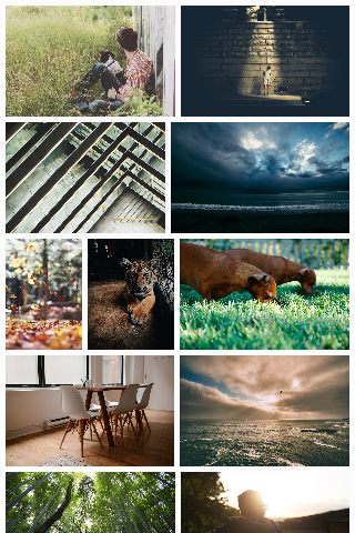
**Demo**:
## Get Started
### Download
1. Download this git repo as zip or tar.gz file.
2. NPM `npm install flexbin`
3. Bower (TODO)
### Import
Use `flexbin.css` in your HTML:
```html
```
or import `flexbin.scss` in your SaSS project:
```scss
@import "path/to/flexbin.scss";
```
### Markup
HTML markup is very simple:
```html
...
```
If you want extra space surround Flexbin gallery, use "flexbin-margin" class:
```html
...
```
### Customize with SaSS
If you use SaSS, you can customize Flexbin further:
```scss
// Desktop, large screen devices
$flexbin-row-height: 200px; // height of image rows
$flexbin-space: 10px; // space between images
// Tablet, medium screen devices
$flexbin-tablet-max: 800px;
$flexbin-row-height-tablet: 150px;
$flexbin-space-tablet: 8px;
// Phone, small screen devices
$flexbin-phone-max: 400px;
$flexbin-row-height-phone: 100px;
$flexbin-space-phone: 4px;
@import "path/to/flexbin.scss";
.my-flexbin {
@include flexbin(100px, 8px);
}
.my-flexbin-large {
@include flexbin(400px, 20px);
@media (max-width: 768px) {
@include flexbin(200px, 10px);
}
}
```
## TODO
- Publish on Bower, Composer, Gem, etc.
- Fallback mode for IE, Edge and other old browsers
## Copyright & License
Copyright 2017 [Guo Yunhe](mailto:guoyunhebrave@gmail.com) & xieranmaya. Code released under GNU General Public License version 3 or later. See [LICENSE](LICENSE).


 ...
...