# folding-side-menu
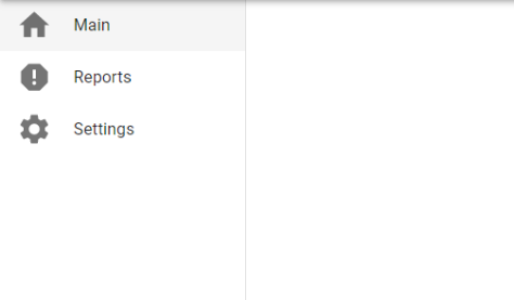
Side menu that expand on mouse over.
### Install
```bash
npm install folding-side-menu
yarn add folding-side-menu
```
### Usage
Here's an example of basic usage:
```tsx
import React from 'react'
import PaperLabeled from 'folding-side-menu'
function MyApp() {
const menuItems: MenuItem[] = [
{
text: 'Main',
path: '/Settings',
icon: ,
},
{
text: 'Reports',
path: '/Settings',
icon: ,
},
{
text: 'Settings',
path: '/Settings',
icon: ,
},
]
return (
);
}
```
Example of ussage integrated wit react-router-doom
```tsx
import React from 'react'
import PaperLabeled from 'folding-side-menu'
import { Link } from 'react-router-dom'
function MyApp() {
const menuItems: MenuItem[] = [
{
text: 'Main',
icon: ,
rootingElement: ({ children }: {children: React.ReactElement}) => (
{children}
),
},
{
text: 'Reports',
icon: ,
rootingElement: ({ children }: {children: React.ReactElement}) => (
{children}
),
},
{
text: 'Settings',
icon: ,
rootingElement: ({ children }: {children: React.ReactElement}) => (
{children}
),
},
]
return (
);
}
```

## User guide
### PaperLabeled
Displays a side menu that collapse and expand when mouse over
#### props
| Prop name | Type | Description | Default value |
| ------------- | ------------- | ------------- | ------------- |
| menuItems | MenuItem[] | List of items in the menu | [] |
| openMenuCSS | CSSProperties | CSS props of the menu when is open. | undefined |
| closeMenuCSS | CSSProperties | CSS props of the menu when is closed. | undefined |
| menuItemCSS | CSSProperties | CSS props of the menu items. | undefined |
| topMarginItems | number? | margin-top of the list of items. | undefined |
```tsx
type MenuItem = {
text: string,
path?: string,
icon?: React.ReactElement,
rootingElement?: ({ children }: {children: React.ReactElement}) => React.ReactElement
}
```