Your device is currently using:
Nested Grid Examples
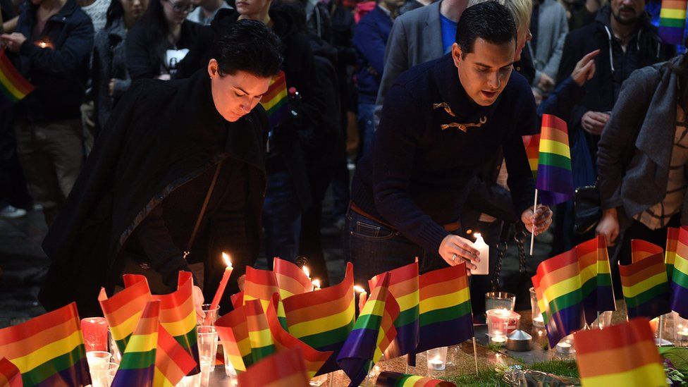
Orlando gunman 'had grudge in his heart'
The father of the gunman who killed 50 people in an Orlando gay club says his son had a "grudge in his heart".
- From the section US & Canada
Sizes
100% (Whole)
50% (Halves)
33.333% (Thirds)
25% (Quarters)
20% (Fifths)
12.5% (Eighths)
Example grid combinations
Quarter / Three Quarters
Applied at extra small (240px) devices and above.
Half / Quarter / Two Eighths
Applied at small (400px) devices and above.
Two Thirds / Third
Applied at medium (600px) devices and above.
Half / Three Sixths
Applied at large (900px) devices and above.
Equal Height
Applied with the class: gel-layout--equal. This option only works for browsers which support flexbox
Horizontal Alignment
Left
Centre
Applied with the class: gel-layout--center
Right
Applied with the class: gel-layout--right
Top Alignment
Middle Alignment
Applied with the class: gel-layout--middle
Bottom Alignment
Applied with the class: gel-layout--bottom
Reversed
1
2
3
4
Applied with the class: gel-layout--rev
Flush
1
2
3
4
Applied with the class: gel-layout--flush
Fit
1
2
3
4
1
2
Applied with the class: gel-layout--fit. This option only works for browsers which support flexbox