<h1 align="center">
<img src="https://raw.githubusercontent.com/lvlrSajjad/ignite-boilerplate-andross-typescript/master/gifs/ignite-typescript-logo.png" alt="IgniTypescript" width="400">
<br>
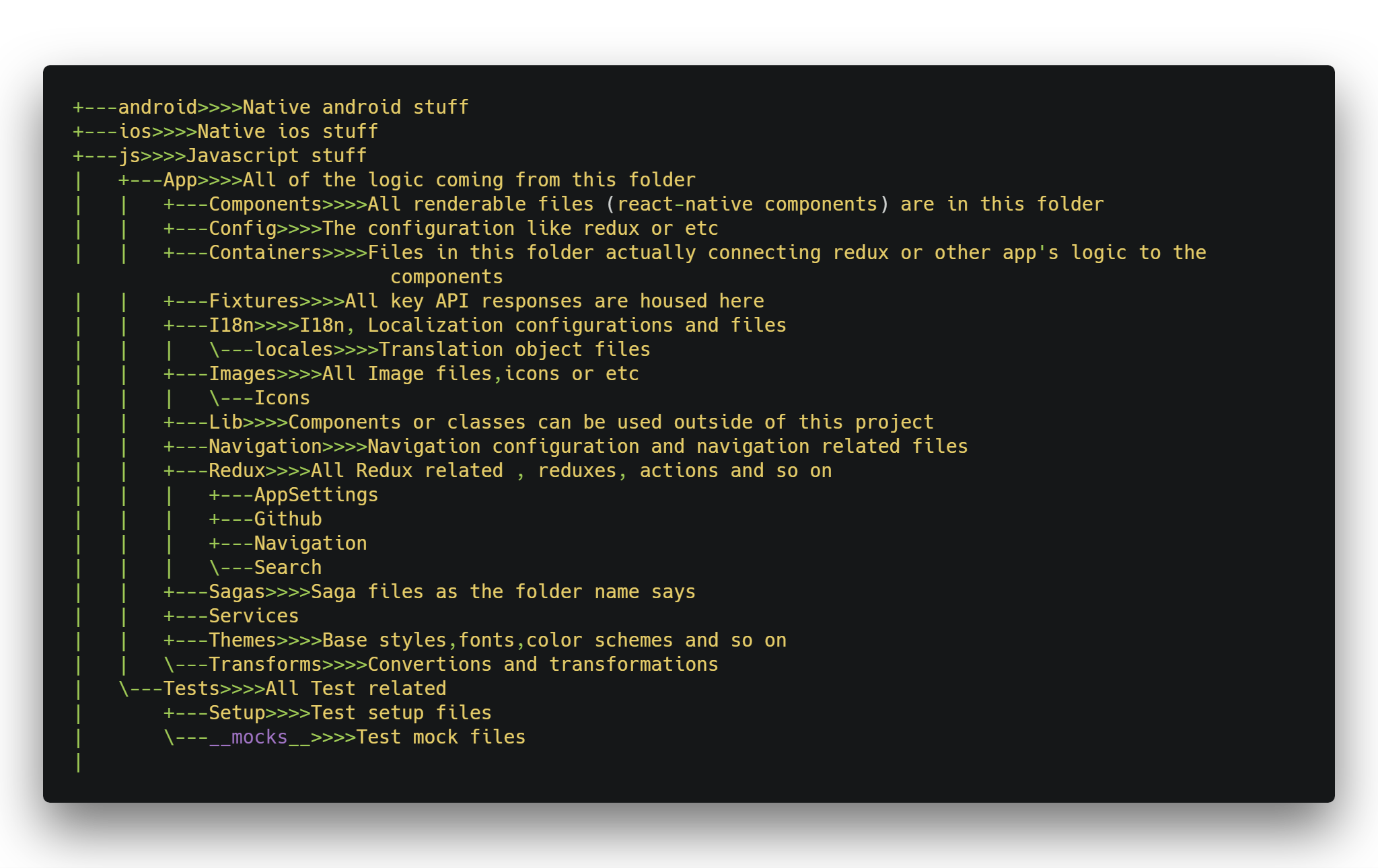
 ignite boilerplate andross typescript
 </br>
</h1>

[![js-standard-style](https://img.shields.io/badge/code%20style-standard-brightgreen.svg?style=flat)](http://standardjs.com/)

<h2 align="center">Table of contents</h2>

<!--ts-->
   * [About](#about)
      * [Folder Structure](#file_folder-folder-structure) 
   * [Ignite Cli](#ignite-cli)
   * [Usage](#usage)
   * [Component Generation](#component-generation)
      * [Generate Rtl Support Component](#generate-rtl-support-component)
      * [Generate Normal Component](#generate-normal-component)
   * [Screen Generation](#screen-generation)
      * [Generate a Simple Screen](#generate-a-simple-screen)
      * [Generate Login Screens](#generate-login-screens)
         * [Normal Login Screen](#normal-login-screen)
         * [Sms Login Screen](#sms-login-screen)
      * [Generate Templated Screens](#generate-templated-screens)
         * [Bottom Tabbed Screen](#bottom-tabbed-screen)
         * [Top Tabbed Screen](#top-tabbed-screen)  
         * [Drawer Navigation Screen](#drawer-navigation-screen)    
         * [Simple Collapsible Toolbar Screen](#simple-collapsible-toolbar-screen) 
         * [Backdrop Screen](#backdrop-screen)  
         * [Collapsible Screen With Drawer Navigation](#collapsible-screen-with-drawer-navigation) 
   * [App Templates](#app-templates)
      * [Social Media Template](#social-media-template)
   * [Using App Settings Redux](#using-app-settings-redux)
      * [Switchable color scheme](#switchable-color-scheme)
      * [Switchable locale](#switchable-locale)
   * [Tips](#tests)
      * [Persisted States](#persisted-states-redux-persist)    
      * [How to navigate screens via redux](#how-to-navigate-screens-via-redux)    
   * [Material Ui Collection](#material-ui-collection)
      * [Material Colors](#material-colors)    
      * [Material Container](#material-container)
      * [Material Collapsible Toolbar Container](#material-collapsible-toolbar-container)
      * [Material Backdrop](#material-backdrop)  
      * [Material Vertical Linear](#material-vertical-linear)
      * [Material Horizontal Linear](#material-horizontal-linear)
      * [Material Card](#material-card)
      * [Material Toolbar](#material-toolbar)
      * [Material Bottom Tabbar](#material-bottom-tabbar)
      * [Material Text Input](#material-text-input)   
      * [Material Progress](#material-progress) 
      * [Material Buttons](#material-buttons) 
      * [Material FAB](#material-fab)
      * [Material Checkbox](#material-checkbox)   
      * [Material Switch](#material-switch)
      * [Material Radio Group](#material-radio-group)
   * [Ignite Mapbox](#ignite-mapbox)   
<!--te-->

<h2 align="center">About</h2>

This Boiler Plate is just my Customized version of ignite Andross 

Changes :
* Installed and configured with typeScript
* Moved all js related folders to js folder (App,Tests)
* Using jest for tests
* Updated react native to (0.57.5)
* Updated react navigation to (3.0.0)
* Added better rtl support
* Added switchable colorScheme support
* Add better multi language support and add language to app settings redux
* Using realm in redux-persist for storing data instead asyncStorage
* Using pure Container Component design pattern in all of templates and even default template 
* Added selectable templates on boilerplate installation and generating screens with those templates after installation
* WIP // Internal set of material components
* HighLighted dependencies that installed :

<img  src="https://raw.githubusercontent.com/lvlrSajjad/ignite-boilerplate-andross-typescript/master/gifs/deps.png" width="100%">

    
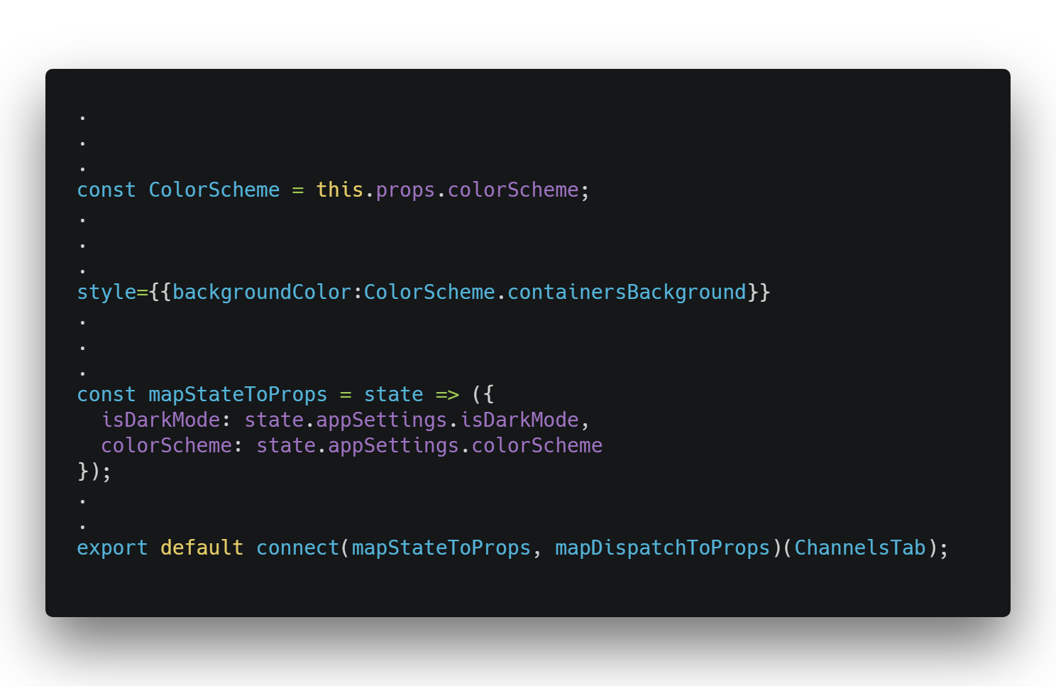
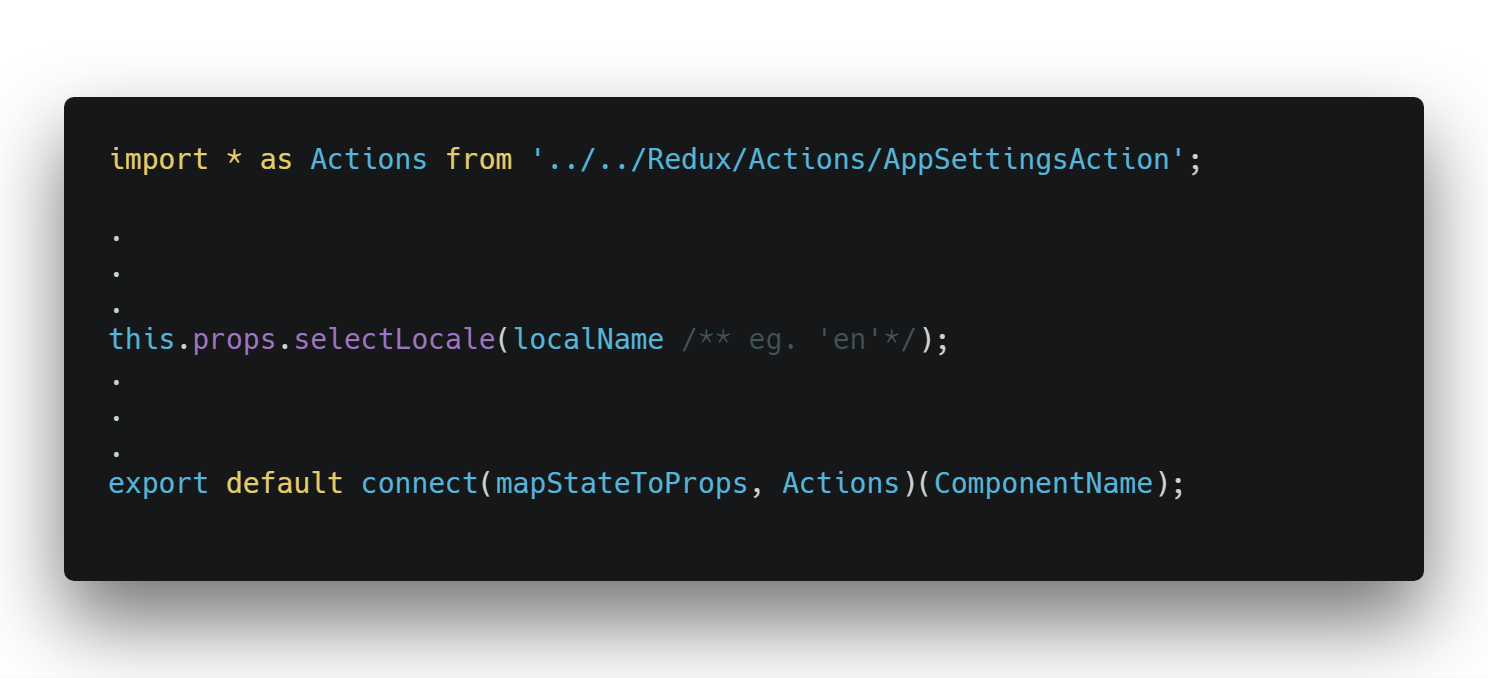
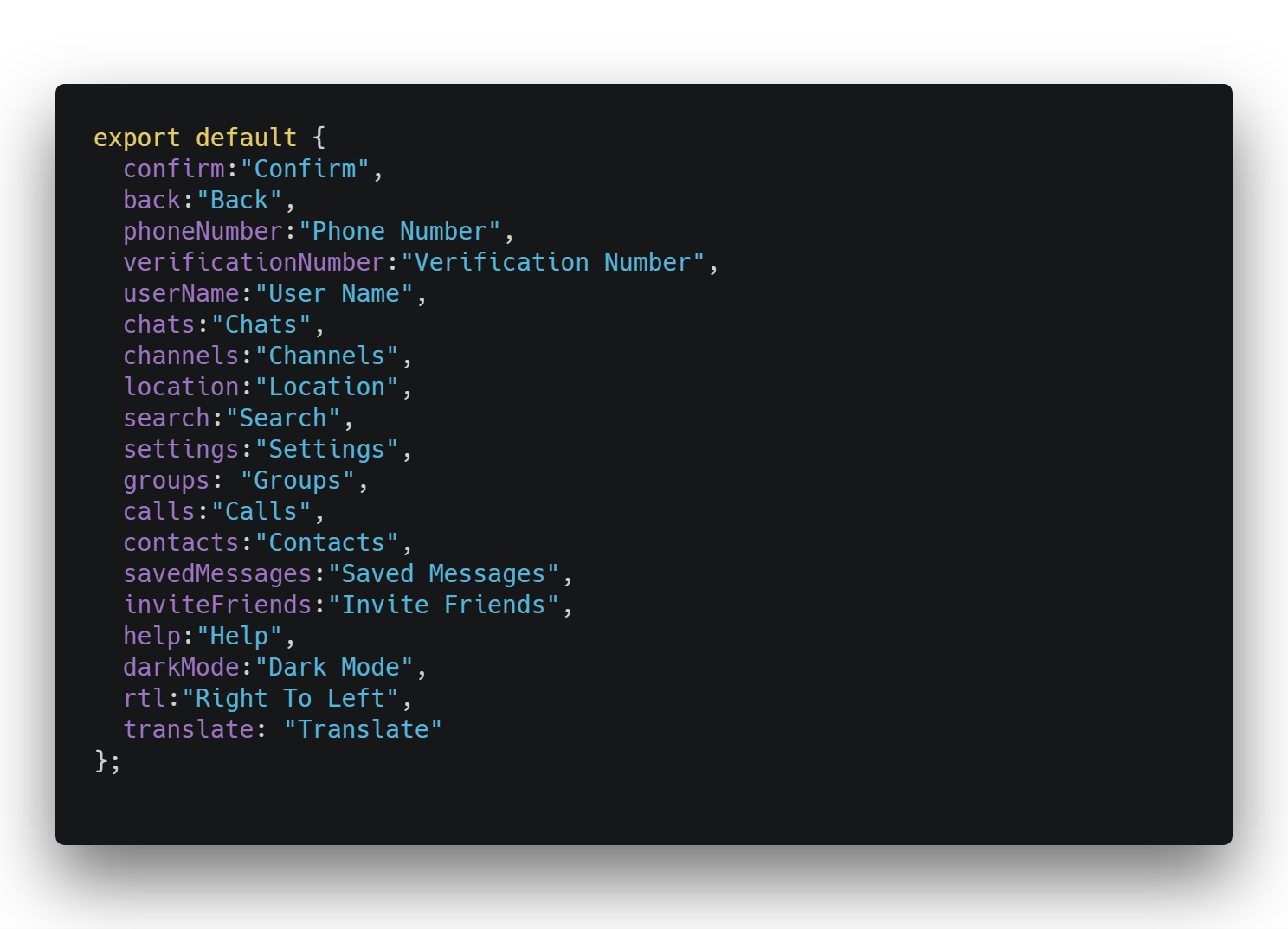
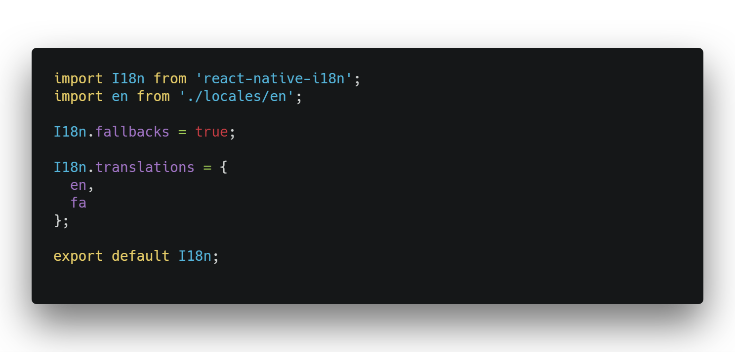
    You can see more on package .json
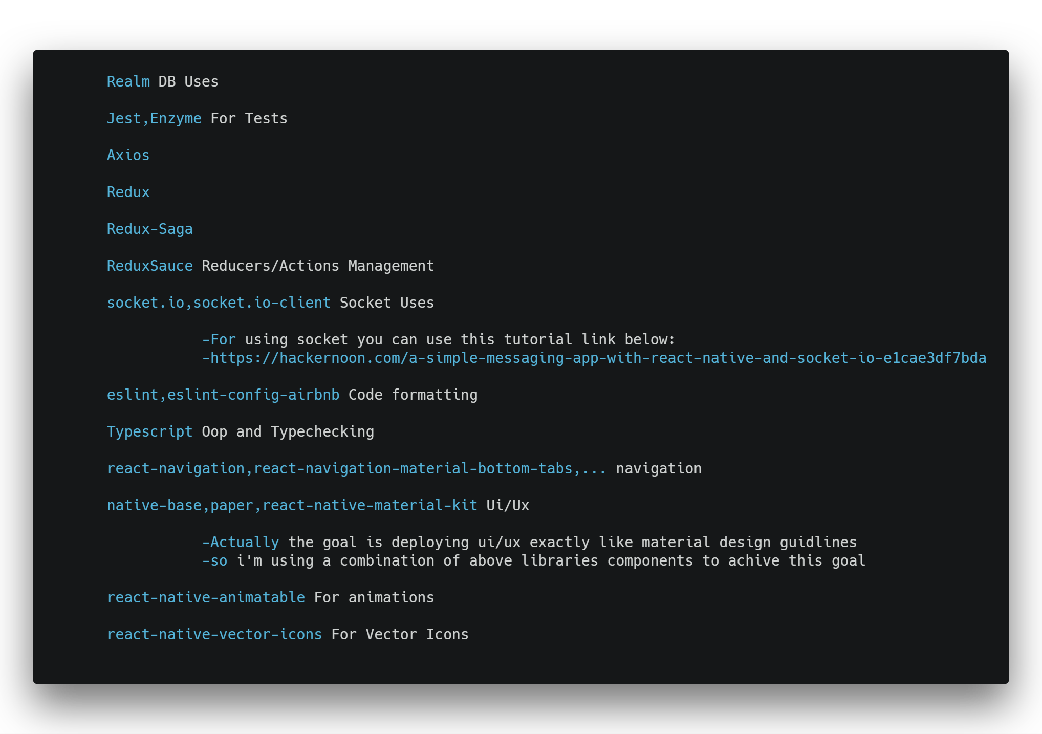
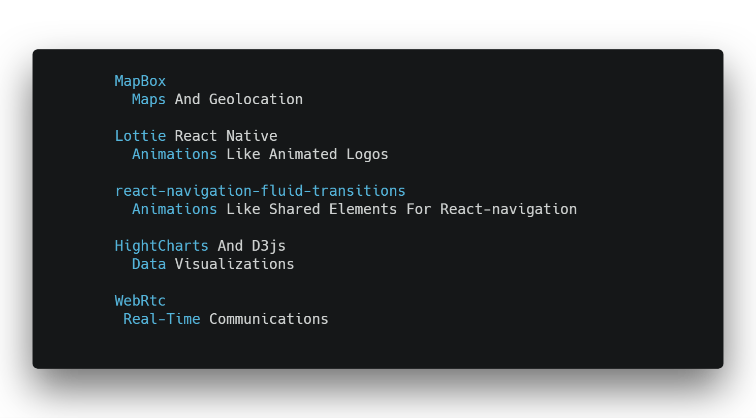
 * Recommended Dependencies :
 
 <p align="center">
<img  src="https://raw.githubusercontent.com/lvlrSajjad/ignite-boilerplate-andross-typescript/master/gifs/recommended.png" width="80%">
</p>

### :file_folder: Folder Structure

It's actually similar to andross folder structure 
 
this folder structure based on container/component design pattern

<p align="center">
<img  src="https://raw.githubusercontent.com/lvlrSajjad/ignite-boilerplate-andross-typescript/master/gifs/folder.png" width="100%">
</p>

So the Components won't have much work with data and getting/setting data is trough containers

Actually containers are in .ts format so they won't and must not render jsx they only do the job with redux and data stuff and passing them to the related component

A container code looks like :

```typescript jsx
import { connect } from "react-redux";
import {RootContainerComponent} from '../Components/RootContainer'
import StartupActions from "../Redux/StartupRedux";

// wraps dispatch to create nicer functions to call within our component
const mapDispatchToProps = dispatch => ({
  startup: () => dispatch(StartupActions.startup())
});

export default connect(null, mapDispatchToProps)(RootContainerComponent);

```

A component code looks like :

```typescript jsx
import * as React from 'react'
import { Component } from 'react';
import { View, StatusBar } from "react-native";
import ReduxNavigation from "../../Navigation/ReduxNavigation";
import ReduxPersist from "../../Config/ReduxPersist";

// Styles
import styles from "./Styles/RootContainerStyles";

interface RootContainerProps {
  startup(): void,
}

export default class RootContainer extends Component<RootContainerProps> {
  constructor(props){
    super(props);
  }
  componentDidMount() {
    if (!ReduxPersist.active) {
      this.props.startup();
    }
  }

  render() {
    return (
      <View style={styles.applicationView}>
        <StatusBar barStyle="light-content" />
        <ReduxNavigation />
      </View>
    );
  }
}

```

<h2 align="center">Ignite Cli</h2>
  
  First you must install ignite cli as gobal with this command
  ```
npm install -g ignite-cli
```
  For More Cli Instructions Please refer to below sections and ignite boilerplate page :
  https://github.com/infinitered/ignite

<h2 align="center">Usage</h2>

  You can create your app using this boilerplate with this commands
  
 ```
 ignite new YourAppName -b ignite-boilerplate-andross-typescript
```
During the installation,
You can choose your login screen style or no login screen:

<p align="center">

<img  src="https://raw.githubusercontent.com/lvlrSajjad/ignite-boilerplate-andross-typescript/master/gifs/login.png" width="80%">

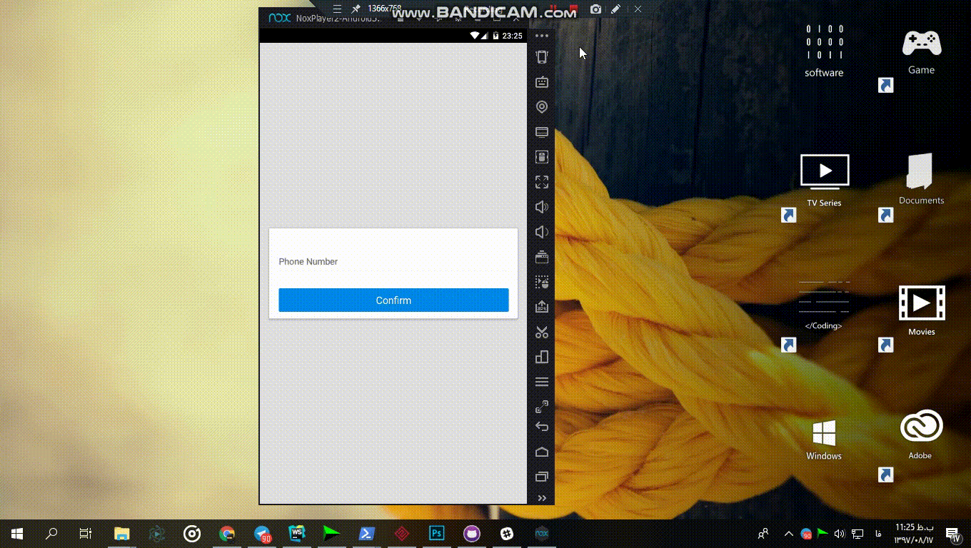
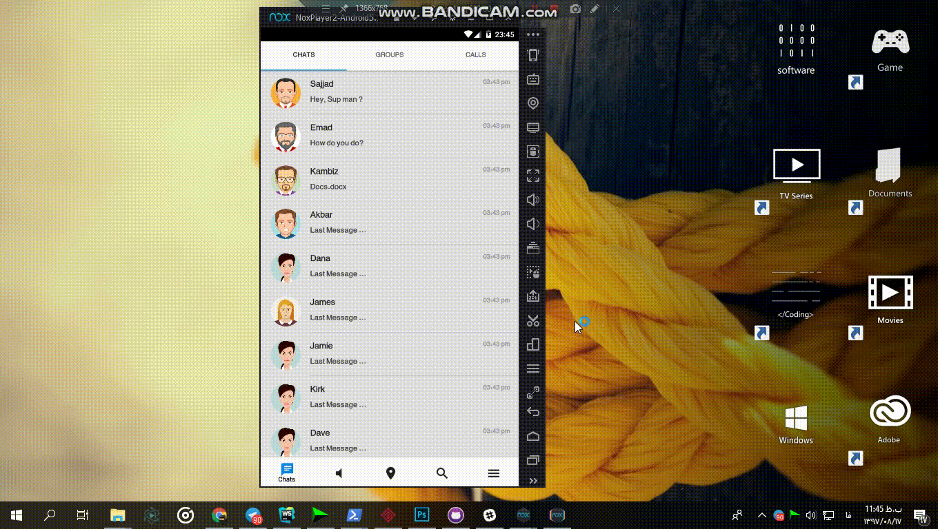
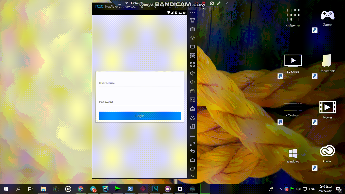
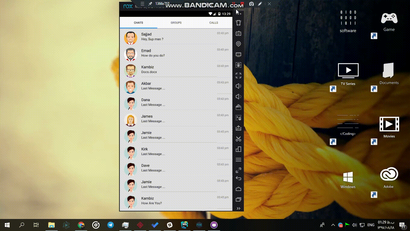
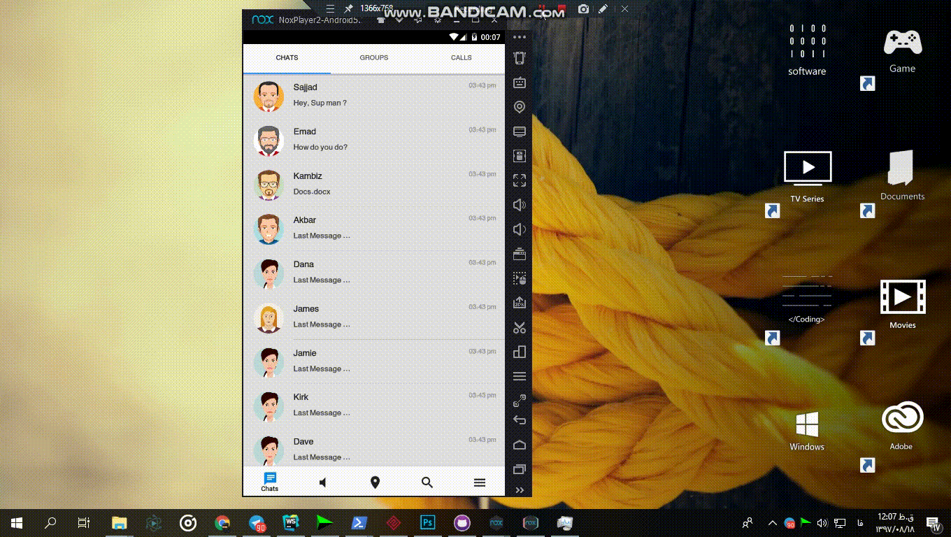
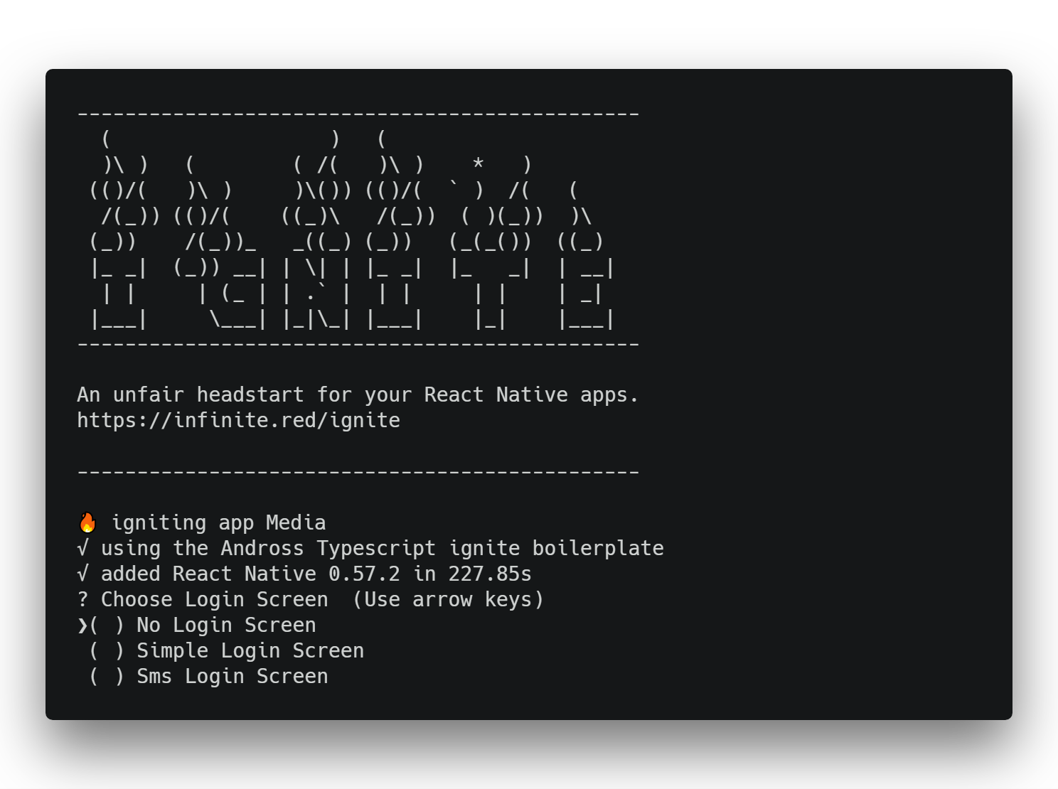
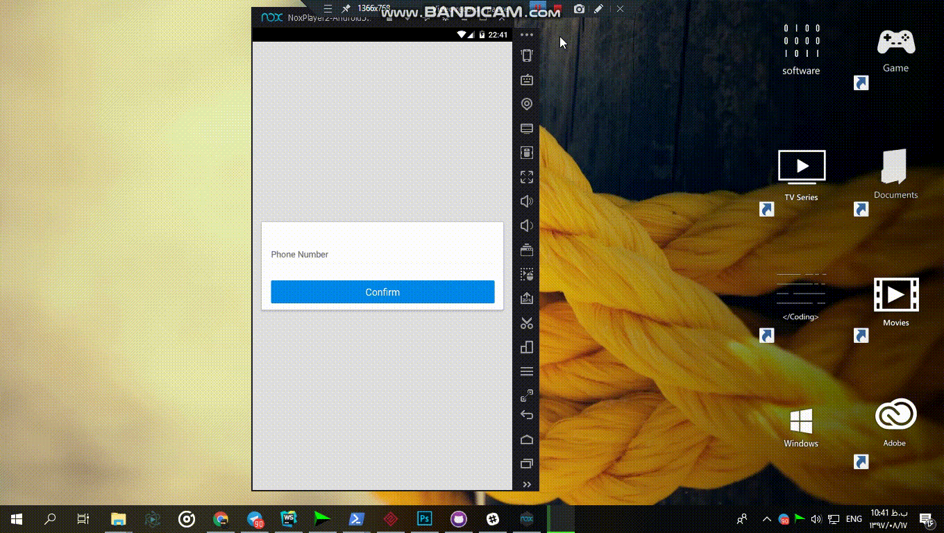
if you choose a login screen, redux,components,login screen will be generated then you can change them.

You can see what will be these login screens look like in  
<a href="https://github.com/lvlrSajjad/ignite-boilerplate-andross-typescript#arrow_down_small-generate-login-screens">Here</a>

</p>


You can choose your main screen style or just a simple screen:
<p align="center">

<img  src="https://raw.githubusercontent.com/lvlrSajjad/ignite-boilerplate-andross-typescript/master/gifs/main.png" width="80%">

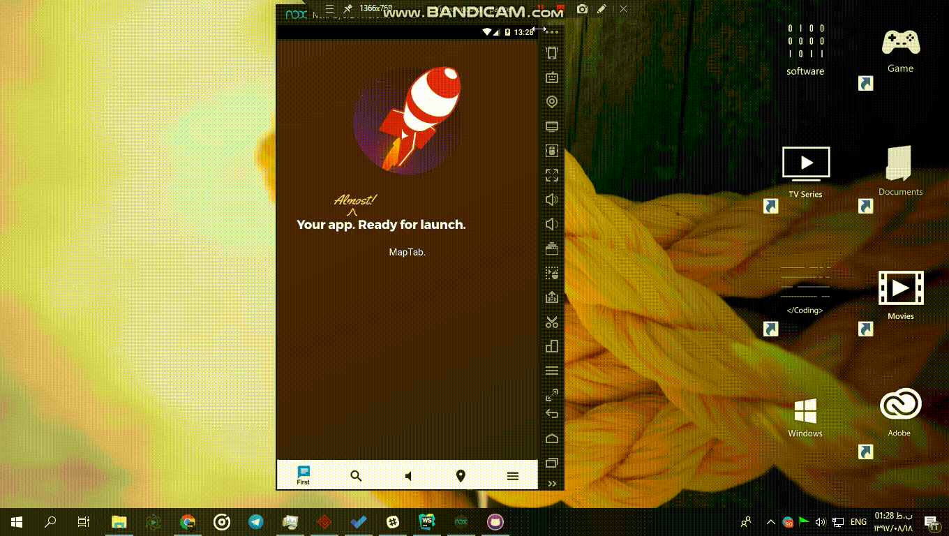
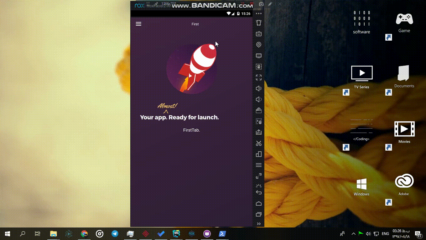
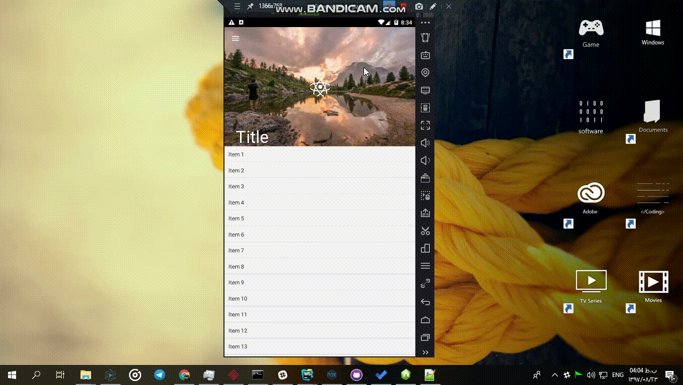
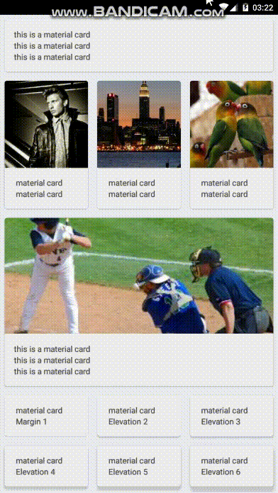
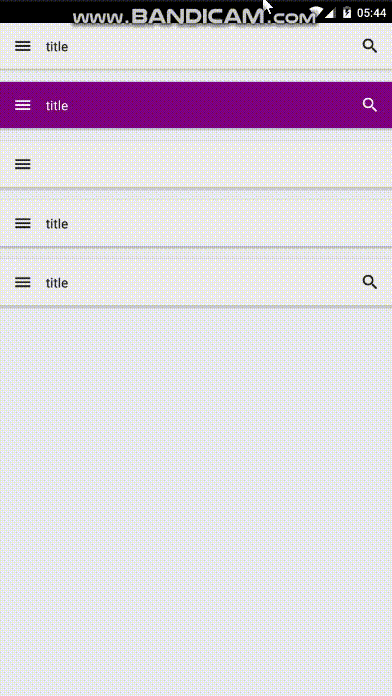
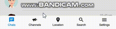
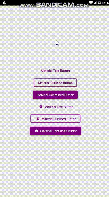
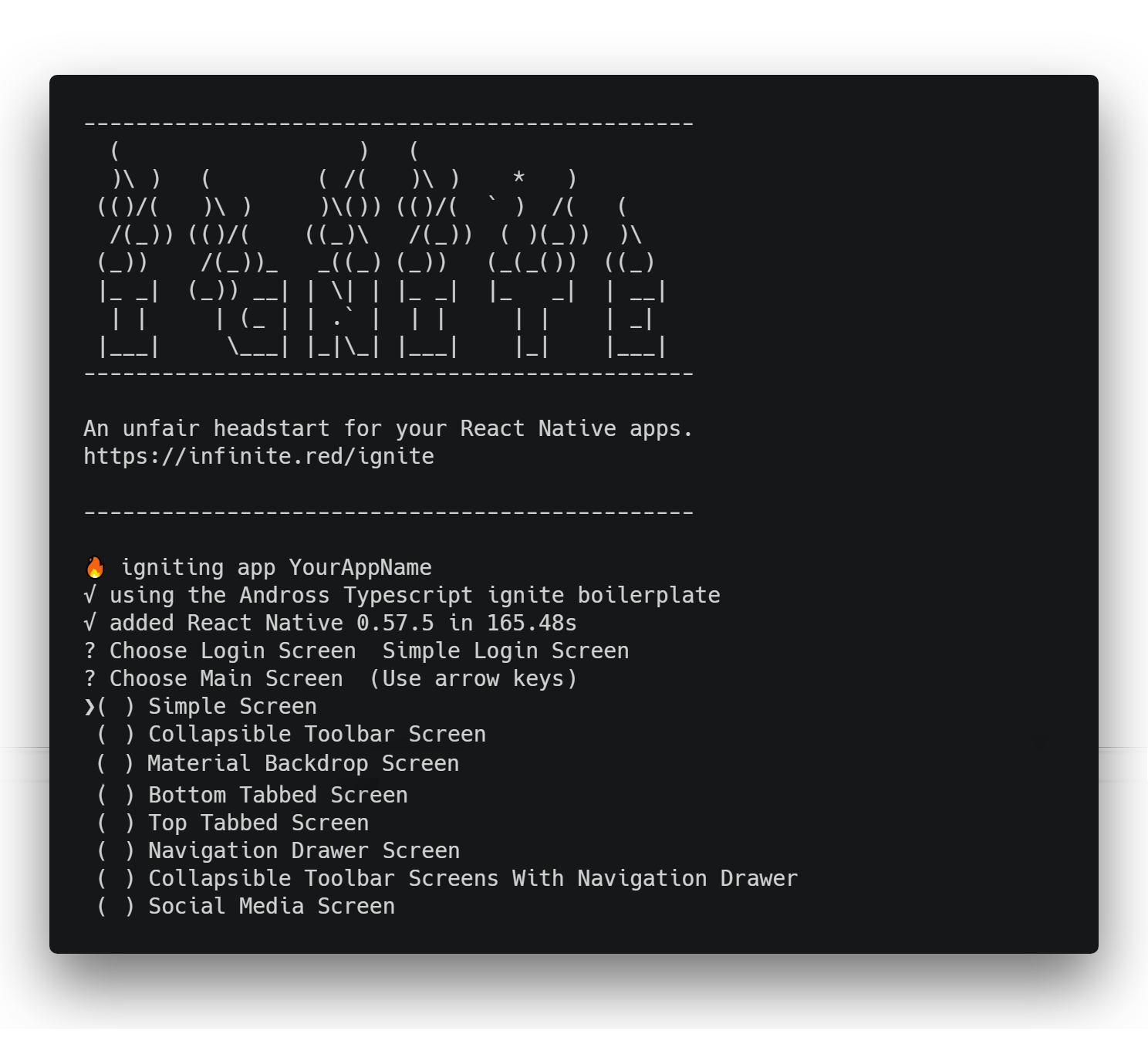
You can see a gif and read about templates in below links: 
<p align="center">
<a href="#social-media-template">Social Media</a><br>
<a href="#bottom-tabbed-screen">Bottom Tab Bar</a><br>
<a href="#top-tabbed-screen">Top Tab Bar</a><br>
<a href="#drawer-navigation-screen">Navigation Drawer</a><br>
<a href="#simple-collapsible-toolbar-screen">
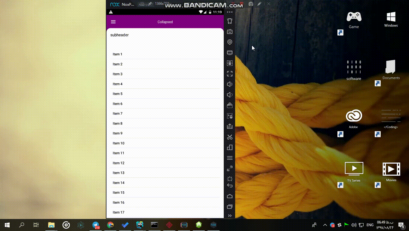
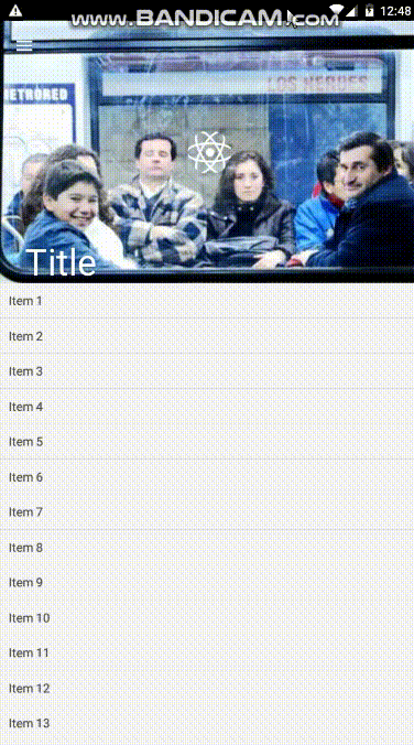
Simple Collapsible Screen Template</a><br>
<a href="#backdrop-screen">Backdrop Screen</a><br>
<a href="#collapsible-screen-with-drawer-navigation">
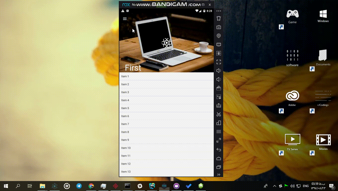
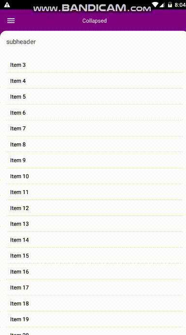
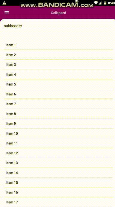
Collapsible Screen With Drawer Navigation Template</a>
</p>
</p>

You can work with combination of this options for example if you choose sms login and social media after installation your app will be like this:
<p align="center">
<img  src="https://raw.githubusercontent.com/lvlrSajjad/ignite-boilerplate-andross-typescript/master/gifs/combined.gif" width="100%">
</p>

after installation run below commands:
```
   cd YourAppName
   react-native run-ios or react-native run-android
   ```
   
<h2 align="center">Component Generation</h2>

### Generate Rtl Support Component

<p align="center">
<img src="https://raw.githubusercontent.com/lvlrSajjad/ignite-boilerplate-andross-typescript/master/gifs/rtl.gif" width="100%">
</p>

If you want to your app support ltr/rtl layouts separately
you can just use this command inside the app folder (just replace pizza with your app name): 
```
ignite g component pizza --rtlsupport
```
it will produce this file/folders inside your Components folder :

<p align="center">
<img  src="https://raw.githubusercontent.com/lvlrSajjad/ignite-boilerplate-andross-typescript/master/gifs/rtl.png" width="80%">
</p>

Just use it as :
```typescript jsx
import Pizza from './path/to/Pizza'
```
The generated index.tsx will be like below:
 
 <p align="center">
 <img  src="https://raw.githubusercontent.com/lvlrSajjad/ignite-boilerplate-andross-typescript/master/gifs/rtl-component-index.png" width="80%">
 </p>

### Generate Normal Component

If you don't want Rtl/Ltr Switchable component us just create the component with this command:
```
ignite g component pizza
```
it will produce this file/folders inside your Components folder :

<p align="center">
<img  src="https://raw.githubusercontent.com/lvlrSajjad/ignite-boilerplate-andross-typescript/master/gifs/component.png" width="80%">
</p>

Just use it as :
```typescript jsx
import Pizza from './path/to/Pizza'
```
The generated index.tsx will be like below:

 <p align="center">
 <img  src="https://raw.githubusercontent.com/lvlrSajjad/ignite-boilerplate-andross-typescript/master/gifs/normal-component-index.png" width="80%">
 </p>
    
<h2 align="center">Screen Generation</h2>
 
### Generate a Simple Screen
You can generate normal screens in containers folder then add them to the navigation by this command
   ```
    ignite g container ScreenName
   ```
   Then choosing `Simple` from answers list

### Generate Login Screens

You can also generate a material designed Login screen with some related components and reduxs by this command:

#### Normal Login Screen

   <p align="center">
   <img src="https://raw.githubusercontent.com/lvlrSajjad/ignite-boilerplate-andross-typescript/master/gifs/login.gif" width="100%">
   </p>
   
```
    ignite g container LoginScreen
   ```
   Then choosing `Simple Login` from answers list
   Or
   Choosing Simple login screen at project initialization
   
#### Sms Login Screen

<p align="center">
 <img src="https://raw.githubusercontent.com/lvlrSajjad/ignite-boilerplate-andross-typescript/master/gifs/smslogin.gif" width="100%">
</p>
 
```
      ignite g container SmsLoginScreen
``` 
   Then choosing `Sms Login` from answers list
   Or
   Choosing Sms login screen at project initialization


   then just add 
   ```typescript jsx
  login: require('./Login/LoginRedux').reducer

```
in the end of 
```typescript jsx
reducers: Reducer<ApplicationState> = combineReducers 
```
array in
```
App/Redux/index.tsx
```
If you want set the login screen as launch screen edit 
```
App/Navigation/AppNavigation.tsx
```
this way :
```typescript jsx
...
initialRouteName: "LoginScreen",
...
```
### Generate Templated Screens

Templated screens will provide container structures for some time saving based on common uses  

#### Bottom Tabbed Screen
This template provides some components and screens with navigation for having a bottom tabbed container with 5 tabs in the first page of your app.
you can change tabs names and contents after installation.
You can use this template by choosing it on boilerplate installation.
this is a preview of Bottom Tabbed Template : 

<p align="center">
<img src="https://raw.githubusercontent.com/lvlrSajjad/ignite-boilerplate-andross-typescript/master/gifs/bottomtabbed.gif" width="100%">
</p>

You can generate a screen with this template using below command :

```
 ignite g container YourScreenName
```
Then choosing `With Bottom Tabbed Navigation` from answers list
this command will produce a screen file with tab files and will add this screen to AppNavigation file

You can edit file names and contents of files inside YourScreenNameTabs folder, just be sure if you edited the file names you also edit the imports inside YourScreenName.tsx file.
You can also edit navigation icon names inside YourScreenName.tsx


#### Top Tabbed Screen
This template provides some components and screens with navigation for having a top tabbed container with 3 tabs with list content in the first page of your app.
you can change tabs names and contents after installation.
You can use this template by choosing it on boilerplate installation.
this is a preview of Top Tabbed Template : 

<p align="center">
<img src="https://raw.githubusercontent.com/lvlrSajjad/ignite-boilerplate-andross-typescript/master/gifs/toptabbed.gif" width="100%">
</p>

You can generate a screen with this template using below command :

```
 ignite g container YourScreenName
```
Then choosing `With Top Tabbed Navigation` from answers list

this command will produce a screen file with tab files and will add this screen to AppNavigation file

You can edit file names and contents of files inside YourScreenNameTabs folder, just be sure if you edited the file names you also edit the imports inside YourScreenName.tsx file.
You can also edit navigation icon names inside YourScreenName.tsx


#### Drawer Navigation Screen
This template provides some components and screens with navigation for having a navigation drawer container with 5 pages.
you can change tabs names and contents after installation.
You can use this template by choosing it on boilerplate installation.
this is a preview of Navigation Drawer Template : 

<p align="center">
<img src="https://raw.githubusercontent.com/lvlrSajjad/ignite-boilerplate-andross-typescript/master/gifs/drawer.gif" width="100%">
</p>

You can generate a screen with this template using below command :

```
 ignite g container YourScreenName
```
Then choosing `With Drawer Navigation` from answers list

You can edit file names and contents of files inside YourScreenNameTabs folder, just be sure if you edited the file names you also edit the imports inside YourScreenName.tsx file.
You can also edit navigation icon names inside YourScreenName.tsx

this command will produce a screen file with tab files and will add this screen to AppNavigation file

#### Simple Collapsible Toolbar Screen
this template provides a simple screen with a collapsible toolbar as below gif

<p align="center">
<img src="https://raw.githubusercontent.com/lvlrSajjad/ignite-boilerplate-andross-typescript/master/gifs/simplecollapsible.gif" width="100%">
</p>

You can generate a screen with this template using below command :

```
 ignite g container YourScreenName
```
Then choosing `Collapsible Toolbar` from answers list

for customization or etc , i've used <a href="https://github.com/lvlrSajjad/ignite-boilerplate-andross-typescript#material-collapsible-toolbar-container">MaterialCollapsibleToolbarContainer</a> in this screen so you can get more info from mentioned link

#### Backdrop Screen

this template provides a back screen as below gif and two sub-components in YourComponentNameContent folder one for backdrop one for content that you will see in the front screen
I used <a href='#material-backdrop'>Material Backdrop</a> component for this

<p align="center">
<img src="https://raw.githubusercontent.com/lvlrSajjad/ignite-boilerplate-andross-typescript/master/gifs/backdrop.gif" width="100%">
</p>

You can generate a screen with this template using below command :

```
 ignite g container YourScreenName
```
Then choosing `Backdrop` from answers list

#### Collapsible Screen With Drawer Navigation
this template provides a navigation drawer screen with 5 tabs , four of them have collapsible toolbars as below gif

<p align="center">
<img src="https://raw.githubusercontent.com/lvlrSajjad/ignite-boilerplate-andross-typescript/master/gifs/collapsibledrawer.gif" width="100%">
</p>

You can generate a screen with this template using below command :

```
 ignite g container YourScreenName
```
Then choosing `Collapsible Toolbar With Drawer Navigation` from answers list

You can edit file names and contents of files inside YourScreenNameTabs folder, just be sure if you edited the file names you also edit the imports inside YourScreenName.tsx file.
You can also edit navigation icon names inside YourScreenName.tsx

this command will produce a screen file with tab files and will add this screen to AppNavigation file

for customization or etc , i've used <a href="https://github.com/lvlrSajjad/ignite-boilerplate-andross-typescript#material-collapsible-toolbar-container">MaterialCollapsibleToolbarContainer</a> in this screen so you can get more info from mentioned link

<h2 align="center">App Templates</h2>

These templates can't be generated after installation these are about a half-complete app (maybe complete app in future) so you can use them as example or if your app is just like them you can use them for time saving and just apply a few changes for customization.

### Social Media Template
This template provides some components and screens with navigation for starting a chat app project. it's also an example of how to start working with this boiler plate.
Inside the template i used farid safi's Gifted Chat for chat screen.
You can use this template by choosing it on boilerplate installation.
this is a preview of Social Media Template : 

<p align="center">
<img src="https://raw.githubusercontent.com/lvlrSajjad/ignite-boilerplate-andross-typescript/master/gifs/socialmedia.gif" width="100%">
</p>

<h2 align="center">Using App Settings Redux</h2>

### Switchable color scheme 
<p align="center">
   
<img src="https://raw.githubusercontent.com/lvlrSajjad/ignite-boilerplate-andross-typescript/master/gifs/darkmode.gif" width="100%">
</p>
actually below reducer And action playing important roles for settings like direction(rtl/ltr) 
or colorScheme and any settings like these :

```
App/Redux/AppSettingsRedux
```
```
App/Redux/Actions/AppSettinsAction
```

for example for colorScheme we have colorScheme state in this reducer which contans below structure :

 <p align="center">
 <img  src="https://raw.githubusercontent.com/lvlrSajjad/ignite-boilerplate-andross-typescript/master/gifs/color-structure.png" width="80%">
 </p>
 
you can also view or change it's structure and values in below file :

`App/Themes/Colors`

this scheme have two states for now dark and light themes

this is how we can change state of this scheme in a redux connected component :

 <p align="center">
 <img  src="https://raw.githubusercontent.com/lvlrSajjad/ignite-boilerplate-andross-typescript/master/gifs/color-scheme-usage.png" width="80%">
 </p>

you can see below file for more detail :

`App/Containers/MainTabs/SettingsTab.tsx`

then you can use it as :

 <p align="center">
 <img  src="https://raw.githubusercontent.com/lvlrSajjad/ignite-boilerplate-andross-typescript/master/gifs/color-scheme-usage2.png" width="80%">
 </p>
 
you can see similiar usage in example files inside Container folder or another folders ...

you can also test this in the settings tab

### Switchable locale
<p align="center">

<img src="https://raw.githubusercontent.com/lvlrSajjad/ignite-boilerplate-andross-typescript/master/gifs/locale.gif" width="100%">
</p>

you can change/select locale in a redux connected component this way:

 <p align="center">
 <img  src="https://raw.githubusercontent.com/lvlrSajjad/ignite-boilerplate-andross-typescript/master/gifs/i18nchange.png" width="80%">
 </p>

you can create you locales in `App/I18n/locales folder` like :

 <p align="center">
 <img  src="https://raw.githubusercontent.com/lvlrSajjad/ignite-boilerplate-andross-typescript/master/gifs/i18n.png" width="80%">
 </p>

then in `App/I18n` folder I18n.ts file :

 <p align="center">
 <img  src="https://raw.githubusercontent.com/lvlrSajjad/ignite-boilerplate-andross-typescript/master/gifs/i18nts.png" width="80%">
 </p>

End usage:

 <p align="center">
 <img  src="https://raw.githubusercontent.com/lvlrSajjad/ignite-boilerplate-andross-typescript/master/gifs/i18nusage.png" width="80%">
 </p>
 
 <h2 align="center">Tips</h2>

### Persisted States (Redux-Persist)
<p align="center">

<img src="https://raw.githubusercontent.com/lvlrSajjad/ignite-boilerplate-andross-typescript/master/gifs/persist.gif" width="100%">
</p>

for using redux-persist to persist your settings or any states you can go to this path

`App/Config/ReduxPersist.tsx`

then add your reducer name to this array :

`whitelist: ["reducer Name",...],`

then go to your reducer and add this code :

`case REHYDRATE:
      return {...state,...action.payload.yourReducerName};`
            
then changes on your reducer will be persisted 


### How to navigate screens via redux 

Be sure about screen added to the AppNavigation.tsx

Then Your App/Redux/NavigationRedux/NavigationRedux.tsx Should be look like this

```typescript jsx
import AppNavigation from "../../Navigation/AppNavigation";
import { NavigationActions } from 'react-navigation'; //add

export const reducer = (state, action) => {
  let newState;

  switch (action.type) {
        case 'YourScreen'://add
             newState = AppNavigation.router.getStateForAction(//add
             NavigationActions.navigate({//add
               routeName: 'YourScreen',//add
                params:{isDarkMode:action.payload}//add
             }),//add
                state//add
            );//add
        break;//add
    default :
      newState = AppNavigation.router.getStateForAction(action, state);
      break;
  }
  return newState || state;
};

```

Then in a redux connected component you can navigate like this

```typescript jsx
 <SomeButton
        onPress={()=>{
         this.props.YourScreen(this.props.isDarkMode)
        }}
      />
.
.
.
const mapStateToProps = state => ({
  isDarkMode: state.appSettings.isDarkMode,
  nav: state.nav,
  colorScheme: state.appSettings.colorScheme
});

const mapDispatchToProps = dispatch => ({
   YourScreen: (darkMode) => {
     dispatch({ type: 'YourScreen' , payload : darkMode});
   },
});

export default withNavigation(connect(mapStateToProps, mapDispatchToProps)(ReduxConnectedComponent));

```
 <h2 align="center">Material Ui Collection</h2>
  Here you can see a Created by me and some hand picked collection of material components from various ui libraries.
  The goal is making ui development easy and seamless (Ui/ux itself with material design rules and Coding Experience)
  For now, components are in a limited number but i'm working on increasing their number to fulfill all ui/ux needed components

### Material Colors 
 <p align="center">
 <img src="https://raw.githubusercontent.com/lvlrSajjad/ignite-boilerplate-andross-typescript/master/gifs/colors.png" width="50%">
 </p>

  I just converted <a href="https://www.materialui.co/colors"> www.materialui.co/colors </a> colors to an object for easier use of these colors
   
#### Usage :
   ```typescript jsx
       import {MaterialColors} from 'react-native-typescript-material-ui-collection';
        MaterialColors.colorName.CcolorTone
        eg:
        MaterialColors.deepPurple.C400 //returns: #7E57C2 as string
   ```

### Material Container 
   
 <p align="center">
 <img src="https://raw.githubusercontent.com/lvlrSajjad/ignite-boilerplate-andross-typescript/master/gifs/container.png" width="30%">
 </p>
 
  This component is a full width/height view for container view you can use it for more ui/ux code readability
  
 #### Usage :
  
   ```typescript jsx
       import {MaterialContainer} from 'react-native-typescript-material-ui-collection';
        <MaterialContainer
          isRoot // if you set this prop true , your component will have no padding and you can render a toolbar view at top of it the default padding is 16
          toolbar={() => <MaterialToolbar
                              leftIcon='menu'
                              iconsColor='white'
                              color='purple'
                              content={() => <MaterialToolbarContent color='white' haveTypeMode={true} text='title'/>}
                          />}> // this view will render at top of the view if you set isRoot true
            <MaterialContainer
             // for using inside a root have 16 dp padding inside
            >
            </MaterialContainer>
        </MaterialContainer>
   ```        
#### Props

```typescript jsx
          isRoot: boolean // if you set this prop true , your component will have no padding and you can render a toolbar view at top of it the default padding is 16
          toolbar:React.ReactNode // this view will render at top of the view if you set isRoot true
```   
      
### Material Collapsible Toolbar Container
 <p align="center">
 <img src="https://raw.githubusercontent.com/lvlrSajjad/ignite-boilerplate-andross-typescript/master/gifs/collapsibletoolbarcontainer.gif" width="30%">
 </p>
 
This is a pure js material collapsible toolbar container
#### Usage :

The exact code of above gif

```typescript jsx
import * as React from 'react'
import {Component} from 'react';
import {Image, Text, View} from 'react-native'
import {MaterialCollapsibleToolbarContainer} from 'react-native-typescript-material-ui-collection'

export default class LaunchScreen extends Component {
  componentWillMount() {
  }

  renderContent = () => (
    <View>
      {new Array(40).fill().map((_, i) => (
        <View
          key={i}
          style={{
            backgroundColor: '#F5F5F5',
            padding: 10,
            borderBottomWidth: 1,
            borderBottomColor: '#E5E5E5'
          }}
        >
          <Text>{`Item ${i + 1}`}</Text>
        </View>
      ))}
    </View>
  );

  renderCollapsedToolbarContent = () => <Image
    source={{uri: 'https://facebook.github.io/react-native/img/header_logo.png'}}

    style={{
      width: 50,
      height: 50,
      borderRadius: 25,
      overflow: 'hidden'
    }}/>;

  render() {
    return (
      <MaterialCollapsibleToolbarContainer
        renderContent={this.renderContent}
        imageSource='https://lorempixel.com/400/300/'
        collapsedNavBarBackgroundColor='#009688'
        translucentStatusBar
        showsVerticalScrollIndicator={false}
        textColor='white'
        renderCollapsedToolbarContent={this.renderCollapsedToolbarContent}
        leftButtonIcon='menu'
        onLeftIconPress={() => console.log('onlefticonpress')}
        title="Title"
        // toolBarHeight={300}
      />
    );
  }
}
``` 

#### Props :

```typescript jsx
  collapsedNavBarBackgroundColor?: string,
  imageSource?: string,
  onContentScroll?(): void,
  renderContent?(): React.ReactNode,
  renderCollapsedToolbarContent?():React.ReactNode, // this component will be rendered on the toolbar 
  toolBarHeight?: number,
  translucentStatusBar?: boolean,
  textColor?: string,
  leftButtonIcon?: string,
  onLeftIconPress?(): void,
  rightButtonIcon?: string,
  onRightIconPress?(): void
```

### Material Backdrop
 <p align="center">
 <img src="https://raw.githubusercontent.com/lvlrSajjad/ignite-boilerplate-andross-typescript/master/gifs/backdropimage.gif" width="30%">
 <img src="https://raw.githubusercontent.com/lvlrSajjad/ignite-boilerplate-andross-typescript/master/gifs/backdroplist.gif" width="30%">
 </p>

I tried to create this component using material.io guidelines in this <a href="https://material.io/design/components/backdrop.html">link</a>

#### Usage :
  ```typescript jsx
    import * as React from 'react'
    import {Component} from 'react';
    import {connect} from 'react-redux'
    import {MaterialBackdrop} from "react-native-typescript-material-ui-collection";
    import {Image, Text, View} from "react-native";
    
    class ScreenName extends Component {
      constructor(props) {
        super(props);
        this.state = {isExpanded: false}
      }
    
      render() {
        return (
          <MaterialBackdrop
            revealComponent={()=>this.renderRevealComponent()}
            leftButtonIcon='menu'
            expandedTitle='Expanded'
            collapsedTitle='Collapsed'
            content={()=>this.renderContent('black')}
            textColor='white'
            subHeaderText='subheader'
            backdropBackgroundColor='purple'
            contentBackgroundColor='white'
            subheaderTextColor='#212121'
          />
        )
      }
      renderRevealComponent=()=><View>
          <Image
            style={{margin: 34, alignSelf: 'center', width: 84, height: 84, borderRadius: 42}}
            source={{uri: 'https://encrypted-tbn0.gstatic.com/images?q=tbn:ANd9GcTwu7s_Ic3YioDVl9AmoJGsKbBuCKFVp2cD3KCPzdYlBLOcGmeV'}}
          />
        </View>
      renderContent=(color)=><View>
        {new Array(40).fill().map((_, i) => (
          <View
            key={i}
            style={{
              padding: 10,
              borderBottomWidth: 1,
              borderBottomColor: '#00000011'
            }}
          >
            <Text style={{color:color}}>{`Item ${i + 1}`}</Text>
          </View>
        ))}
      </View>
    
    }
   ``` 
      
#### Props :

```typescript jsx
  revealComponent?(): React.ReactNode,
  backdropBackgroundColor?: string,
  leftButtonIcon?: string, // an icon name from https://materialdesignicons.com (this component using react-native-vector icons inside)
  expandedTitle?: string,
  collapsedTitle?: string,
  content?(): React.ReactNode,
  textColor?: string,
  subHeaderText?: string,
  horizontalContent?: boolean,
  onSubheaderClick?(): void,
  onLeftButtonClick?(): void,
  onRightButtonClick?(): void,
  contentBackgroundColor?: string,
  subheaderTextColor?: string,
  onExpand?(): void,
  onCollapse?(): void,
  rightButtonIcon?: string // an icon name from https://materialdesignicons.com (this component using react-native-vector icons inside)
                            // if you give it an icon name icon will be rendered top right of backdrop and you can use it as you want
```

### Material Vertical Linear 

 <p align="center">
 <img src="https://raw.githubusercontent.com/lvlrSajjad/ignite-boilerplate-andross-typescript/master/gifs/material-vertical.png" width="50%">
 </p>
 
this component is a view with default column direction it can be used for better readability of jsx ui code 

#### Usage :

  ```typescript jsx
     import {MaterialHorizontalLinear} from 'react-native-typescript-material-ui-collection';
      <MaterialHorizontalLinear>
      </MaterialHorizontalLinear>
   ```
 ### Material Horizontal Linear 
 
 <p align="center">
 <img src="https://raw.githubusercontent.com/lvlrSajjad/ignite-boilerplate-andross-typescript/master/gifs/material-horizontal.png" width="50%">
 </p>
  
  this component is a view with default row direction it can be used for better readability of jsx ui code 
  
 #### Usage :
 
   ```typescript jsx
      import {MaterialVerticalLinear} from 'react-native-typescript-material-ui-collection';
       <MaterialVerticalLinear>
       </MaterialVerticalLinear>
   ```    
   
 ### Material Card 
 
 <p align="center">
 <img src="https://raw.githubusercontent.com/lvlrSajjad/ignite-boilerplate-andross-typescript/master/gifs/card.gif" width="30%">
 </p>
  
  A card component created using material.io guidelines , Also CardContent Component is inside this is actually a view with 16dp padding
  
 #### Usage :
 
 Above gif's code (just important things)
 
 ```typescript jsx
    //import
    import {MaterialCard, MaterialCardContent} from 'react-native-typescript-material-ui-collection';
 ```    
 
```typescript jsx
   //with image header
   <MaterialCard style={{flex:1}}  header={()=><Image style={{height:150}} source={{uri:'https://lorempixel.com/200/300/fashion'}}/>}>
     <MaterialCardContent >
     <Text> material card</Text>
     <Text> material card</Text>
     </MaterialCardContent>
   </MaterialCard>
```    
```typescript jsx
   //setting elevation
   <MaterialCard  style={{flex:1}} elevation={3}>
      <MaterialCardContent >
        <Text> material card</Text>
        <Text> Elevation 3</Text>
      </MaterialCardContent>
   </MaterialCard>
```    
   
```typescript jsx
    //minimal usage
    <MaterialCardContent>
       <Text>this is a material card</Text>
       <Text>this is a material card</Text>
       <Text>this is a material card</Text>
    </MaterialCardContent>
```    
    
```typescript jsx
     //with background image
     <MaterialCard  style={{flex:1,height:200}} backgroundImageSource={{uri:'https://lorempixel.com/300/200/sports'}}>
         <MaterialCardContent >
             <Text style={{textShadowColor:'black',textShadowRadius:2,color:'white'}}> material card</Text>
             <Text style={{textShadowColor:'black',textShadowRadius:2,color:'white'}}> Elevation 7</Text>
         </MaterialCardContent>
     </MaterialCard>
```    
#### Props
```typescript jsx
  elevation?: number,
  margin?:number,
  header?(): React.ReactNode,
  style?:ViewStyle,
  backgroundImageSource?: ImageSourcePropType,
  backgroundColor?:string

```  
#### Default Props
```typescript jsx
    elevation:2,
    margin:8,
    backgroundColor:'#eeeeee'
```          

### Material Toolbar

 <p align="center">
 <img src="https://raw.githubusercontent.com/lvlrSajjad/ignite-boilerplate-andross-typescript/master/gifs/material-toolbar.gif" width="30%">
 </p>
 
 A toolbar designed based on material.io guidelines <br>
 And <br>
 MaterialToolbarContent you can use it for some content on your toolbar , you can also use your custom component <br>
 
 Can be used by [Material Container](#material-container)
 
 #### Usage
 
 Import :
 
 ```typescript jsx
import {MaterialToolbar, MaterialToolbarContent} from 'react-native-typescript-material-ui-collection';
```

Use:

```typescript jsx
 <MaterialToolbar
    leftIcon='menu'
    content={()=><MaterialToolbarContent haveTypeMode={true} text='title'/>}
 />
```

```typescript jsx
<MaterialToolbar
  leftIcon='menu'
  iconsColor='white'
  color='purple'
  content={()=><MaterialToolbarContent color='white' haveTypeMode={true} text='title'/>}
/>
```
 
```typescript jsx
 // Minimal
<MaterialToolbar
   leftIcon='menu'
/>
```

```typescript jsx
<MaterialToolbar
  leftIcon='menu'
  content={()=><MaterialToolbarContent haveTypeMode={false} text='title'/>}
/>
``` 
#### Props

```typescript jsx
MaterialToolbarProps {
  color?: string,
  onLeftIconPress?():void,
  onRightIconPress?():void,
  content?():ReactNode
  iconsColor?:string,
  leftIcon?:string, // one of https://materialdesignicons.com/ icons
  rightIcon?:string // one of https://materialdesignicons.com/ icons
}
MaterialToolbarContentProps {
  color?: string,
  font?: string,
  text?: string,
  haveTypeMode?: boolean,
  typeModeIcon?:string, // one of https://materialdesignicons.com/ icons
  onChangeText?(text:string),
  onTypeModePress?(): void,
}
```

#### Default Props

```typescript jsx
//Material Toolbar Content

    color: '#212121',
    typeModeIcon:'magnify', 
    onTypeModePress: () => {
    },
    onChangeText:()=>{}
  

//Material Toolbar

    color: '#eeeeee',
    onLeftIconPress:()=>{},
    onRightIconPress:()=>{},
    iconsColor:'#212121'
  
```   


### Material Bottom Tabbar

<p align="center">
 <img src="https://raw.githubusercontent.com/lvlrSajjad/ignite-boilerplate-andross-typescript/master/gifs/bottom-tab.gif" width="30%">
 <img src="https://raw.githubusercontent.com/lvlrSajjad/ignite-boilerplate-andross-typescript/master/gifs/bottom-tab1.gif" width="30%">
 <img src="https://raw.githubusercontent.com/lvlrSajjad/ignite-boilerplate-andross-typescript/master/gifs/bottom-tab2.gif" width="30%">
</p>

A material tab bar designed and created based on material.io instructions, tested and developed on react-navigation version 3.0.0

#### Usage

```typescript jsx
import {createBottomTabNavigator,createAppContainer} from 'react-navigation';
import MaterialBottomTabbar from '../../Components/MaterialBottomTabbar';
// A bunch of other imports

const commonNavigationOptions = ({navigation}) => ({
  header: null,
  title: navigation.state.routeName,
});

const ChatsRouteOptions = {
  screen: Tab1,
  navigationOptions: commonNavigationOptions,
};
const SearchRouteOptions = {
  screen: Tab2,
  navigationOptions: commonNavigationOptions,
};
const ChannelsRouteOptions = {
  screen: Tab3,
  navigationOptions: commonNavigationOptions,
};
 const LocationRouteOptions = {
   screen: Tab4,
   navigationOptions: commonNavigationOptions,
 };
const SettingsRouteOptions = {
  screen: Tab5,
  navigationOptions: commonNavigationOptions,
};
// different routes for all, active and completed todos
export default (props) => React.createElement(
  createAppContainer(createBottomTabNavigator(
    {
      [I18n.t('Tab1')]: ChatsRouteOptions,
      [I18n.t('Tab2')]: ChannelsRouteOptions,
      [I18n.t('Tab3')]: LocationRouteOptions,
      [I18n.t('Tab4')]: SearchRouteOptions,
      [I18n.t('Tab5')]: SettingsRouteOptions
    },
    {
      tabBarComponent:MaterialBottomTabbar, // here you can set this component
      tabBarPosition: 'bottom',
      tabBarOptions:{ // here are main settings of this component
        animated:true, 
        isRtl:props.isRtl,
        fontSize:12,
        noLabel:false,
        iconName:(key)=>iconChooser(key),
        fontFamily: Fonts.type.base,
        defaultColor:props.colorScheme.fullToneText,
        selectedColor:primaryColor,
        style: {
          backgroundColor: props.colorScheme.tabBarBackground
        },
      },
      initialRouteName: I18n.t('chats')
    },
  ))
);

function iconChooser(key) {
  let iconName;
  switch (key) {
    case I18n.t('chats'):
      iconName = 'message-text'; // icon names from https://materialdesignicons.com/ website
      break;
    case I18n.t('search'):
      iconName = 'magnify';
      break;
    case I18n.t('channels'):
      iconName = 'bullhorn';
      break;
    case I18n.t('location'):
      iconName = 'map-marker';
      break;
    case  I18n.t('settings'):
      iconName = 'menu'
  }
  return iconName;

}

```
    

### Material Text Input 
 
 <p align="center">
<img src="https://cloud.githubusercontent.com/assets/2055622/24325711/eaa4ff08-11af-11e7-8550-2504c1580979.gif" alt="example" style="max-width:100%;">
 </p>
this component is basically
<a href="https://github.com/n4kz/react-native-material-textfield" >react-native-material-textfield</a>
i just added it's types to typescript and rtl support (for it's label)

#### Usage :
  ```typescript jsx
     import {MaterialTextInput} from 'react-native-typescript-material-ui-collection';
      <MaterialTextInput
      isRtl={true} //just added this prop you can see other props from above link
      />
   ```    
### Material Progress
<p align="center">
 <img src="https://raw.githubusercontent.com/lvlrSajjad/ignite-boilerplate-andross-typescript/master/gifs/materialprogress.gif" width="30%">
 </p>
 
 I used <a href="https://github.com/n4kz/react-native-indicators">react-native-indicators</a> code to do this with a few changes and turning the used code to typescript
 I have also used this component for progress inside below button components
 
 #### Usage:
 
 this is exactly the code of above gif
 
 ```typescript jsx
import * as React from 'react'
import {Component} from 'react';
import { View} from 'react-native'
import styles from './Styles/LaunchScreenStyles'
import {MaterialProgress} from 'react-native-typescript-material-ui-collection';

export default class LaunchScreen extends Component {
  render() {
    return (
      <View style={styles.container}>
        <MaterialProgress
          color="purple"
        />
        <MaterialProgress
          color="purple"
          small
        />
      </View>
    )
  }
}

```
#### Props:
 
 ```typescript jsx
  color:string,//just the color
  small?:boolean// using this will render small progress i'ts good for using inside buttons or etc.
```

### Material Buttons       
 <p align="center">
 <img src="https://raw.githubusercontent.com/lvlrSajjad/ignite-boilerplate-andross-typescript/master/gifs/materialbuttons.gif" width="30%">
  <img src="https://raw.githubusercontent.com/lvlrSajjad/ignite-boilerplate-andross-typescript/master/gifs/progressbuttons.gif" width="30%">
 </p>
  
  I Made these three buttons exactly based on material.io design guidelines
  
#### Usage:

this is exactly the code of above gif

   ```typescript jsx
   import * as React from 'react'
   import {Component} from 'react';
   import { View} from 'react-native'
   import styles from './Styles/LaunchScreenStyles'
   import {MaterialTextButton,
   MaterialOutlinedButton,
   MaterialContainedButton} from 'react-native-typescript-material-ui-collection';
   
   export default class LaunchScreen extends Component {
     render() {
       return (
         <View style={styles.container}>
           <MaterialTextButton
             onPress={() => {
               console.log("pressed")
             }}
             text="Material Text Button"
             textColor="purple"
             margin={8}
           />
           <MaterialOutlinedButton
             onPress={() => {
               console.log("pressed")
             }}
             text="Material Outlined Button"
             textColor="purple"
             margin={8}
           />
           <MaterialContainedButton
             onPress={() => {
               console.log("pressed")
             }}
             color='purple'
             text="Material Contained Button"
             textColor="white"
             margin={8}
           />
           <MaterialTextButton
             onPress={() => {
               console.log("pressed")
             }}
             text="Material Text Button"
             textColor="purple"
             margin={8}
             iconName="check-circle"
           />
           <MaterialOutlinedButton
             onPress={() => {
               console.log("pressed")
             }}
             text="Material Outlined Button"
             textColor="purple"
             margin={8}
             iconName="check-circle"
           />
           <MaterialContainedButton
             onPress={() => {
               console.log("pressed")
             }}
             color='purple'
             text="Material Contained Button"
             textColor="white"
             margin={8}
             iconName="check-circle"
           />
         </View>
       )
     }
   }

   ```
#### Props:

##### MaterialTextButton:
```typescript jsx
    text: string,
    icon?: React.ReactNode, // you can use your custom icon component , whatever, the button have react-native-vector-icons inside
    margin?:number,
    textColor?: string,
    textFont?: string,
    iconName?:string, // if you set the material icon name from https://materialdesignicons.com/ the icon will displayed
    onPress?():void,
    progress:boolean // if you set this true the button will render a circular progressbar inside like above gifs
```
##### MaterialOutlinedButton:
```typescript jsx
  text: string,
  icon?: React.ReactNode, // you can use your custom icon component , whatever, the button have react-native-vector-icons inside
  margin?:number,
  textColor?: string,
  textFont?: string,
  onPress?():void,
  iconName?:string, // if you set the material icon name from https://materialdesignicons.com/ the icon will displayed
  progress:boolean // if you set this true the button will render a circular progressbar inside like above gifs

```
##### MaterialContainedButton:
```typescript jsx
  text: string,
  icon?: React.ReactNode, // you can use your custom icon component , whatever, the button have react-native-vector-icons inside
  margin?:number,
  color?:string,
  textColor?: string,
  textFont?: string,
  onPress?():void,
  iconName?:string,// if you set the material icon name from https://materialdesignicons.com/ the icon will displayed
  progress:boolean // if you set this true the button will render a circular progressbar inside like above gifs

```
   
### Material FAB 

 <p align="center">
 <img src="https://raw.githubusercontent.com/lvlrSajjad/ignite-boilerplate-andross-typescript/master/gifs/materialfab.gif" width="30%">
 <img src="https://raw.githubusercontent.com/lvlrSajjad/ignite-boilerplate-andross-typescript/master/gifs/progressfab.gif" width="30%">
 </p>
   I Made these two FABs exactly based on material.io design guidelines

#### Usage :
this is exactly the code of above gif

  ```typescript jsx
     import * as React from 'react'
     import {Component} from 'react';
     import { View} from 'react-native'
     import styles from './Styles/LaunchScreenStyles'
     import {MaterialFab, MaterialExtendedFab} from 'react-native-typescript-material-ui-collection';
     
     export default class LaunchScreen extends Component {
       render() {
         return (
           <View style={styles.container}>
             <MaterialFab 
             mini 
             onPress={()=>{console.log('onpress')}} 
             position="bottomLeft" 
             iconColor="white" 
             iconName='check-circle' color="purple"
             />
             <MaterialFab 
             onPress={()=>{console.log('onpress')}} 
             position="bottomRight" 
             iconColor="white" 
             iconName='check-circle' 
             color="purple"
             />
             <MaterialExtendedFab 
             onPress={()=>{console.log('onpress')}} 
             text="Extended" 
             position="bottom" 
             iconColor="white" 
             iconName='check-circle' 
             color="purple"
             />
           </View>
         )
       }
     }

   ```
#### Props:

##### MaterialFab:
```typescript jsx
      icon?: React.ReactNode, // you can use your custom icon component , whatever, the button have react-native-vector-icons inside
      color?:string,
      iconColor?: string, 
      onPress?():void,
      iconName:string,// if you set the material icon name from https://materialdesignicons.com/ the icon will displayed
      mini?:boolean,
      position:string,// one of {'bottomLeft','topRight','topLeft','bottomRight'}
      progress:boolean // if you set this true the button will render a circular progressbar inside like above gifs

```
##### MaterialExtendedFab:
```typescript jsx
  icon?: React.ReactNode, // you can use your custom icon component , whatever, the button have react-native-vector-icons inside
  color?:string,
  iconColor?: string,
  onPress?():void,
  iconName:string,// if you set the material icon name from https://materialdesignicons.com/ the icon will displayed
  textFont?:string,
  text:string,
  position:string,// one of {'top','bottom'}
  progress:boolean // if you set this true the button will render a circular progressbar inside like above gifs

```

### Material Checkbox

<p align="center">
<img src="https://raw.githubusercontent.com/lvlrSajjad/ignite-boilerplate-andross-typescript/master/gifs/materialcheckbox.gif" width="30%">
</p>

I Made this checkbox component exactly based on material.io design guidelines

#### Usage :
this is exactly the code of above gif

```typescript jsx
import * as React from 'react'
import {Component} from 'react';
import {View} from 'react-native'
import styles from './Styles/LaunchScreenStyles'
import {MaterialCheckbox} from "react-native-typescript-material-ui-collection";

export default class LaunchScreen extends Component {
  render() {
    return (
      <View style={styles.container}>
        <MaterialCheckbox
          checkBoxColor="purple"
          text="Material Checkbox"
          onCheckedChange={(isChecked) => {
            console.log(isChecked)
          }}
        />
        <MaterialCheckbox
          rtl
          checkBoxColor="purple"
          text="Material Checkbox"
          onCheckedChange={(isChecked) => {
            console.log(isChecked)
          }}
        />
        <MaterialCheckbox
          checkBoxColor="purple"
          onCheckedChange={(isChecked) => {
            console.log(isChecked)
          }}
        />
        <MaterialCheckbox
          checkBoxColor="purple"
          text="Material Checkbox"
          onCheckedChange={(isChecked) => {
            console.log(isChecked)
          }}
          progress
        />
      </View>
    )
  }
}
```

#### Props:
```typescript jsx
  text?: string,
  isChecked?: boolean,
  textFont?: string,

  onCheckedChange?(isChecked: boolean): void,

  checkBoxColor?: string,
  textColor?: string,
  rtl?: boolean,
  progress?: boolean

```

### Material Switch

<p align="center">
<img src="https://raw.githubusercontent.com/lvlrSajjad/ignite-boilerplate-andross-typescript/master/gifs/switch.gif" width="30%">
</p>

I Made this switch component exactly based on material.io design guidelines

#### Usage

this is exactly the code of above gif

```typescript jsx
import * as React from 'react'
import { View } from 'react-native'
import MaterialSwitch from "react-native-typescript-material-ui-collection";

// Styles
import styles from './Styles/LaunchScreenStyles'

interface LaunchScreenComponentProps {}

export default class LaunchScreen extends React.Component <LaunchScreenComponentProps> {

  render () {
    return (
      <View style={styles.mainContainer}>
        <MaterialSwitch color='purple'/>
        <MaterialSwitch text="Material switch" color='purple'/>
        <MaterialSwitch text="Material switch" color='purple'/>
        <MaterialSwitch text="Material switch" color='purple'/>

      </View>
    )
  }
}

```

#### Props:

```typescript jsx
  textFont?:string,
  textColor?:string,
  text?:string,
  color?:string
  onValueChanged?(value:boolean):void

```
### Material Radio Group

<p align="center">
<img src="https://raw.githubusercontent.com/lvlrSajjad/ignite-boilerplate-andross-typescript/master/gifs/material-radio-group.gif" width="30%">
</p>

I Made this radio group component exactly based on material.io design guidelines

#### Usage

this is exactly the code of above gif

```typescript jsx
import * as React from 'react'
import { View } from 'react-native'
import MaterialSwitch from "react-native-typescript-material-ui-collection";

// Styles
import styles from './Styles/LaunchScreenStyles'

interface LaunchScreenComponentProps {}

export default class LaunchScreen extends React.Component <LaunchScreenComponentProps> {
  render () {
    return (
      <View style={styles.mainContainer}>
        <MaterialRadioGroup data={[{text:'text1'},{text:'text2'},{text:'text3'},{text:'text4'}]} color='purple'/>
        <MaterialRadioGroup isRtl={true} data={[{text:'text1'},{text:'text2'},{text:'text3'},{text:'text4'}]} color='purple'/>
      </View>
    )
  }
}

```

#### Props:

```typescript jsx
  data: any, // just be sure you have text:string field in datarows
  color: string,
  textFont?: string,
  textColor?: string,
  isRtl?:boolean,
  onItemPress?(item, index): void
```


  ## Ignite Mapbox
  
  An ignite plugin for adding mapbox easier
  
  <p align="center">
  
  <img src="https://raw.githubusercontent.com/lvlrSajjad/ignite-boilerplate-andross-typescript/master/gifs/maps.gif" width="100%">
  </p>

  You can install mapbox and link it by this command
   
   ```
ignite add map
```
   and generate a map component with 
   
   ```
ignite generate map MapName
```
   then use it as below 
    
  and you can get your token key with instructions inside mapbox github https://github.com/mapbox/react-native-mapbox-gl
  
  then you can use token key inside `App>Config>MapboxConfig.tsx`
 ### Usage :
  
  ```typescript jsx
  import MapboxGL from '@mapbox/react-native-mapbox-gl';
  import MapboxConfig from "../../Config/MapboxConfig";
  MapboxGL.setAccessToken(MapboxConfig.accessToken); // here you set access token
  ...
  <MapboxGL.MapView
   styleURL={ColorScheme.mapStyleUrl}
   zoomLevel={15}
   centerCoordinate={[51.3890,35.6892]}
   style={{flex:1}}
   >
  </MapboxGL.MapView>
  ```

## :closed_lock_with_key: Secrets

This project uses [react-native-config](https://github.com/luggit/react-native-config) to expose config variables to your javascript code in React Native. You can store API keys
and other sensitive information in a `.env` file:

```
API_URL=https://myapi.com
GOOGLE_MAPS_API_KEY=abcdefgh
```

and access them from React Native like so:

```
import Secrets from 'react-native-config'

Secrets.API_URL  // 'https://myapi.com'
Secrets.GOOGLE_MAPS_API_KEY  // 'abcdefgh'
```

The `.env` file is ignored by git keeping those secrets out of your repo.

### Get started:
1. Copy .env.example to .env
2. Add your config variables
3. Follow instructions at [https://github.com/luggit/react-native-config#setup](https://github.com/luggit/react-native-config#setup)
4. Done!

