# [CURRENT-DEVICE](https://matthewhudson.github.io/current-device/)

[![All Contributors](https://img.shields.io/badge/all_contributors-2-orange.svg?style=flat-square)](#contributors)
[![Build Status](https://travis-ci.com/matthewhudson/current-device.svg?branch=master)](https://www.travis-ci.com/matthewhudson/current-device)
[![Bundle size](https://badgen.net/bundlephobia/minzip/current-device)](https://bundlephobia.com/result?p=current-device@0.8.2)
[![Coverage Status](https://coveralls.io/repos/github/matthewhudson/current-device/badge.svg?branch=master)](https://coveralls.io/github/matthewhudson/current-device?branch=master)
[![Renovate badge](https://badges.renovateapi.com/github/matthewhudson/current-device)](https://renovatebot.com/)
[![NPM version](https://badge.fury.io/js/current-device.svg)](http://badge.fury.io/js/current-device)
[![NPM downloads](https://img.shields.io/npm/dm/current-device.svg)](https://www.npmjs.com/package/current-device)

This module makes it easy to write conditional CSS _and/or_ JavaScript based on
device operating system (iOS, Android, Blackberry, Windows, MacOs, Firefox OS, MeeGo,
AppleTV, etc), orientation (Portrait vs. Landscape), and type (Tablet vs.
Mobile).

[View the Demo &rarr;](https://matthewhudson.github.io/current-device/)

### EXAMPLES

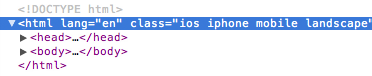
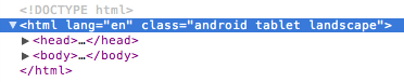
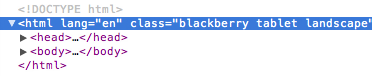
This module inserts CSS classes into the `<html>` element.

#### iPhone

<img src="https://raw.githubusercontent.com/matthewhudson/current-device/master/docs/iphone.png" />

#### Android Tablet

<img src="https://raw.githubusercontent.com/matthewhudson/current-device/master/docs/android.png" />

#### Blackberry Tablet

<img src="https://raw.githubusercontent.com/matthewhudson/current-device/master/docs/blackberry.png" />

### DEVICE SUPPORT

- iOS: iPhone, iPod, iPad
- Android: Phones & Tablets
- Blackberry: Phones & Tablets
- Windows: Phones & Tablets
- Firefox OS: Phones & Tablets

### USAGE

Just include the script. The script then updates the `<html>` section with the
[appropriate classes](https://github.com/matthewhudson/current-device#conditional-css)
based on the device's characteristics.

## Installation

```sh
npm install current-device
```

And then import it:

```js
// using es modules
import device from "current-device";

// common.js
const device = require("current-device").default;
```

Or use script tags and globals.

```html
<script src="https://unpkg.com/current-device/umd/current-device.min.js"></script>
```

And then access it off the global like so:

```js
console.log("device.mobile() === %s", device.mobile());
```

### CONDITIONAL CSS

The following tables map which CSS classes are added based on device and
orientation.

#### Device CSS Class Names

<table>
	<tr>
		<th>Device</th>
		<th>CSS Classes</th>
	</tr>
	<tr>
		<td>iPad</td>
		<td>ios ipad tablet</td>
	</tr>
	<tr>
		<td>iPhone</td>
		<td>ios iphone mobile</td>
	</tr>
	<tr>
		<td>iPod</td>
		<td>ios ipod mobile</td>
	</tr>
	<tr>
		<td>Android Phone</td>
		<td>android mobile</td>
	</tr>
	<tr>
		<td>Android Tablet</td>
		<td>android tablet</td>
	</tr>
	<tr>
		<td>BlackBerry Phone</td>
		<td>blackberry mobile</td>
	</tr>
	<tr>
		<td>BlackBerry Tablet</td>
		<td>blackberry tablet</td>
	</tr>
	<tr>
		<td>Windows Phone</td>
		<td>windows mobile</td>
	</tr>
	<tr>
		<td>Windows Tablet</td>
		<td>windows tablet</td>
	</tr>
	<tr>
		<td>Firefox OS Phone</td>
		<td>fxos mobile</td>
	</tr>
	<tr>
		<td>Firefox OS Tablet</td>
		<td>fxos tablet</td>
	</tr>
	<tr>
		<td>MeeGo</td>
		<td>meego</td>
	</tr>
	<tr>
		<td>Desktop</td>
		<td>desktop</td>
	</tr>
	<tr>
		<td>Television</td>
		<td>television</td>
	</tr>
</table>

#### Orientation CSS Class Names

<table>
	<tr>
		<th>Orientation</th>
		<th>CSS Classes</th>
	</tr>
	<tr>
		<td>Landscape</td>
		<td>landscape</td>
	</tr>
	<tr>
		<td>Portrait</td>
		<td>portrait</td>
	</tr>
</table>

### CONDITIONAL JAVASCRIPT

This module _also_ includes support for conditional JavaScript, allowing you to
write checks on the following device characteristics:

#### Device JavaScript Methods

<table>
	<tr>
		<th>Device</th>
		<th>JavaScript Method</th>
	</tr>
	<tr>
		<td>Mobile</td>
		<td>device.mobile()</td>
	</tr>
	<tr>
		<td>Tablet</td>
		<td>device.tablet()</td>
	</tr>
	<tr>
		<td>Desktop</td>
		<td>device.desktop()</td>
	</tr>
	<tr>
		<td>iOS</td>
		<td>device.ios()</td>
	</tr>
	<tr>
		<td>iPad</td>
		<td>device.ipad()</td>
	</tr>
	<tr>
		<td>iPhone</td>
		<td>device.iphone()</td>
	</tr>
	<tr>
		<td>iPod</td>
		<td>device.ipod()</td>
	</tr>
	<tr>
		<td>Android</td>
		<td>device.android()</td>
	</tr>
	<tr>
		<td>Android Phone</td>
		<td>device.androidPhone()</td>
	</tr>
	<tr>
		<td>Android Tablet</td>
		<td>device.androidTablet()</td>
	</tr>
	<tr>
		<td>BlackBerry</td>
		<td>device.blackberry()</td>
	</tr>
	<tr>
		<td>BlackBerry Phone</td>
		<td>device.blackberryPhone()</td>
	</tr>
	<tr>
		<td>BlackBerry Tablet</td>
		<td>device.blackberryTablet()</td>
	</tr>
	<tr>
		<td>Windows</td>
		<td>device.windows()</td>
	</tr>
	<tr>
		<td>Windows Phone</td>
		<td>device.windowsPhone()</td>
	</tr>
	<tr>
		<td>Windows Tablet</td>
		<td>device.windowsTablet()</td>
	</tr>
	<tr>
		<td>Firefox OS</td>
		<td>device.fxos()</td>
	</tr>
	<tr>
		<td>Firefox OS Phone</td>
		<td>device.fxosPhone()</td>
	</tr>
	<tr>
		<td>Firefox OS Tablet</td>
		<td>device.fxosTablet()</td>
	</tr>
	<tr>
		<td>MeeGo</td>
		<td>device.meego()</td>
	</tr>
	<tr>
		<td>Television</td>
		<td>device.television()</td>
	</tr>
</table>

#### Orientation JavaScript Methods

<table>
	<tr>
		<th>Orientation</th>
		<th>JavaScript Method</th>
	</tr>
	<tr>
		<td>Landscape</td>
		<td>device.landscape()</td>
	</tr>
	<tr>
		<td>Portrait</td>
		<td>device.portrait()</td>
	</tr>
</table>

#### Orientation JavaScript Callback

```js
device.onChangeOrientation(newOrientation => {
  console.log(`New orientation is ${newOrientation}`);
});
```

### Utility Methods

#### device.noConflict()

Run `current-device` in noConflict mode, returning the device variable to its
previous owner. Returns a reference to the `device` object.

```js
const currentDevice = device.noConflict();
```

### Useful Properties

Access these properties on the `device` object to get the first match on that
attribute without looping through all of its getter methods.

<table>
	<tr>
		<th>JS Property</th>
		<th>Returns</th>
	</tr>
	<tr>
		<td>device.type</td>
		<td>'mobile', 'tablet', 'desktop', or 'unknown'</td>
	</tr>
	<tr>
		<td>device.orientation</td>
		<td>'landscape', 'portrait', or 'unknown'</td>
	</tr>
	<tr>
		<td>device.os</td>
		<td>'ios', 'iphone', 'ipad', 'ipod', 'android', 'blackberry', 'windows', 'macos', 'fxos', 'meego', 'television', or 'unknown'</td>
	</tr>
</table>

### BEST PRACTICES

Environment detection has a high rate of misuse. Often times, folks will attempt
to work around browser feature support problems by checking for the affected
browser and doing something different in response. The preferred solution for
those kinds of problems, of course, is to check for the feature, not the browser
(ala [Modernizr](http://modernizr.com/)).

However, that common misuse of device detection doesn't mean it should never be
done. For example, `current-device` could be employed to change the interface of
your web app such that it uses interaction patterns and UI elements common to
the device it's being presented on. Android devices might get a slightly
different treatment than Windows or iOS, for instance. Another valid use-case is
guiding users to different app stores depending on the device they're using.

In short, check for features when you need features, and check for the browser
when you need the browser.

## Contributors ✨

Thanks goes to these wonderful people ([emoji key](https://allcontributors.org/docs/en/emoji-key)):

<!-- ALL-CONTRIBUTORS-LIST:START - Do not remove or modify this section -->
<!-- prettier-ignore-start -->
<!-- markdownlint-disable -->
<table>
  <tr>
    <td align="center"><a href="http://hudson.dev"><img src="https://avatars2.githubusercontent.com/u/320194?v=4" width="100px;" alt=""/><br /><sub><b>Matthew Hudson</b></sub></a><br /><a href="https://github.com/matthewhudson/current-device/commits?author=matthewhudson" title="Code">💻</a> <a href="#maintenance-matthewhudson" title="Maintenance">🚧</a></td>
    <td align="center"><a href="http://rteran.com/"><img src="https://avatars3.githubusercontent.com/u/6477537?v=4" width="100px;" alt=""/><br /><sub><b>Rafael Terán</b></sub></a><br /><a href="https://github.com/matthewhudson/current-device/commits?author=RTeran" title="Code">💻</a></td>
    <td align="center"><a href="https://github.com/winternet-studio"><img src="https://avatars1.githubusercontent.com/u/5200270?v=4" width="100px;" alt=""/><br /><sub><b>Allan</b></sub></a><br /><a href="https://github.com/matthewhudson/current-device/pulls?q=is%3Apr+reviewed-by%3Awinternet-studio" title="Reviewed Pull Requests">👀</a></td>
    <td align="center"><a href="https://martin-wepner.de"><img src="https://avatars3.githubusercontent.com/u/12143284?v=4" width="100px;" alt=""/><br /><sub><b>martinwepner</b></sub></a><br /><a href="https://github.com/matthewhudson/current-device/commits?author=martinwepner" title="Code">💻</a></td>
  </tr>
</table>

<!-- markdownlint-enable -->
<!-- prettier-ignore-end -->
<!-- ALL-CONTRIBUTORS-LIST:END -->

This project follows the [all-contributors](https://github.com/all-contributors/all-contributors) specification. Contributions of any kind welcome!