# json-tree-view-vue3
[](https://www.npmjs.com/package/json-tree-view-vue3)
[](https://github.com/seijikohara/json-tree-view-vue3/actions/workflows/npm-ci.yml)
[](https://github.com/seijikohara/json-tree-view-vue3/actions/workflows/playwright.yml)
[](https://www.typescriptlang.org/)
[](https://bundlephobia.com/package/json-tree-view-vue3)
[](https://opensource.org/licenses/MIT)
A Vue 3 component for rendering JSON data as an interactive, collapsible tree structure.
Inspired by [vue-json-component](https://www.npmjs.com/package/vue-json-component) and [vue-json-tree-view](https://www.npmjs.com/package/vue-json-tree-view), this library provides native Vue 3 and TypeScript support.
## Installation
```bash
npm install json-tree-view-vue3
```
## Usage
```vue
```
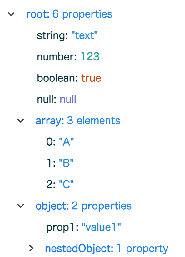
### Example Output
 ## API Reference
### Props
| Property | Type | Required | Default | Description |
|---------------|----------|----------|-----------|------------------------------------------------------------------|
| `json` | `string` | Yes | - | A valid JSON string to be rendered as a tree structure |
| `rootKey` | `string` | No | `"/"` | The label displayed for the root node of the tree |
| `maxDepth` | `number` | No | `1` | The initial depth level to which the tree will be expanded |
| `colorScheme` | `string` | No | `"light"` | Visual theme of the component. Accepts `"light"` or `"dark"` |
### Events
#### `selected`
Emitted when a user selects a value in the tree.
**Payload Type:**
```typescript
{
key: string; // The key of the selected node
value: PrimitiveTypes; // The value of the selected node (string, number, boolean, or null)
path: string; // The full path to the selected node
}
```
## Styling and Customization
The component uses CSS custom properties (variables) for theming, allowing you to customize colors and dimensions to match your application's design system.
### Available CSS Variables
```css
/* Color palette */
--jtv-key-color: oklch(0.55 0.15 240); /* Object/Array key color */
--jtv-valueKey-color: oklch(0.25 0.05 210); /* Primitive value key color */
--jtv-string-color: oklch(0.6 0.12 230); /* String value color */
--jtv-number-color: oklch(0.65 0.1 180); /* Number value color */
--jtv-boolean-color: oklch(0.55 0.15 40); /* Boolean value color */
--jtv-null-color: oklch(0.55 0.12 280); /* Null value color */
/* UI colors */
--jtv-arrow-color: oklch(0.3 0 0); /* Expand/collapse arrow color */
--jtv-hover-color: oklch(0 0 0 / 0.1); /* Hover background color */
/* Dimensions */
--jtv-arrow-size: 6px; /* Size of the expand/collapse arrow */
--jtv-spacing-unit: 4px; /* Base spacing unit */
```
### Custom Styling Example
You can override these variables to customize the appearance:
```vue
## API Reference
### Props
| Property | Type | Required | Default | Description |
|---------------|----------|----------|-----------|------------------------------------------------------------------|
| `json` | `string` | Yes | - | A valid JSON string to be rendered as a tree structure |
| `rootKey` | `string` | No | `"/"` | The label displayed for the root node of the tree |
| `maxDepth` | `number` | No | `1` | The initial depth level to which the tree will be expanded |
| `colorScheme` | `string` | No | `"light"` | Visual theme of the component. Accepts `"light"` or `"dark"` |
### Events
#### `selected`
Emitted when a user selects a value in the tree.
**Payload Type:**
```typescript
{
key: string; // The key of the selected node
value: PrimitiveTypes; // The value of the selected node (string, number, boolean, or null)
path: string; // The full path to the selected node
}
```
## Styling and Customization
The component uses CSS custom properties (variables) for theming, allowing you to customize colors and dimensions to match your application's design system.
### Available CSS Variables
```css
/* Color palette */
--jtv-key-color: oklch(0.55 0.15 240); /* Object/Array key color */
--jtv-valueKey-color: oklch(0.25 0.05 210); /* Primitive value key color */
--jtv-string-color: oklch(0.6 0.12 230); /* String value color */
--jtv-number-color: oklch(0.65 0.1 180); /* Number value color */
--jtv-boolean-color: oklch(0.55 0.15 40); /* Boolean value color */
--jtv-null-color: oklch(0.55 0.12 280); /* Null value color */
/* UI colors */
--jtv-arrow-color: oklch(0.3 0 0); /* Expand/collapse arrow color */
--jtv-hover-color: oklch(0 0 0 / 0.1); /* Hover background color */
/* Dimensions */
--jtv-arrow-size: 6px; /* Size of the expand/collapse arrow */
--jtv-spacing-unit: 4px; /* Base spacing unit */
```
### Custom Styling Example
You can override these variables to customize the appearance:
```vue
```
### Dark Mode
The component includes built-in dark mode support through the `colorScheme` prop. Alternatively, you can customize the dark theme by overriding the CSS variables within your own dark mode class.
## License
This project is licensed under the MIT License - see the [LICENSE](LICENSE) file for details.